


When we were thinking about rebranding, Our mission was clear – to mirror our evolving identity while staying true to the very essence of minimalistic design that we mastered.
So the challenge was, how do we convey it with the most minimal changes?
During this process, we came up with a convincing solution: a change to the design that, despite being simple, had a deep meaning. It shows how we've changed over time.
As you can see, the logo's change is crystal clear.
Why the Shift from 'Cutting Through' to 'Parallel Harmony'
Well, it all comes down to the message we want to convey to you, our dear audience.
It's about evolution and growth.
The original logo, with its cutting triangles, was like a startup – bold, daring, and maybe a tad unpredictable. It spoke of our early days when we were brimming with energy and excitement.
But as time passed, we evolved. We're no longer the new kid on the block. We've matured, refined our processes, and honed our expertise. The new 'M' shape, with triangles and rectangles in parallel harmony, symbolizes stability and reliability. It's like saying, "Hey, we're here to stay. You can count on us."
From Bold Beginnings to Harmonious Maturity
As you can see, we shifted our dynamic yellow triangle, cutting through parallel lines to the center of a diagonal rectangle, achieving balance and modernity, signifying stability and innovation.
We transitioned the vibrant yellow hue from the dynamic triangle, which once cut through parallel lines, to grace the diagonal rectangle. This change represents our commitment to balance and unity, ensuring all elements work harmoniously together.
“In design, as in life, balance is the key to harmony.”
Fahad Ibn Sayeed | COO at Musemind
It also reflects a shift in our approach. We've embraced a more user-centric philosophy. By smoothing out the logo, we've made it more user-friendly and accessible, mirroring our commitment to creating products and services that are easy to use and enjoyable for everyone.
In the process of our evolution, we've reevaluated how we want to represent ourselves. Retaining yellow in our logo while shifting its focus from the triangle to the diagonal rectangle isn't just a superficial alteration; it's a strategic choice.
But it’s not “the end.”
A Palette of Transformation
When it comes to UX design agencies, color is indeed another vital element.
Why did we infuse new colors into our brand? Simple, change is our muse.
It's a recognition that, much like the ever-evolving digital landscape we navigate, we, too, have evolved.
Our decision to expand our color palette isn't merely about aesthetics; it's a testament to our readiness to adapt, our eagerness to embrace diversity and our commitment to crafting a canvas that's richer and more resonant for our journey ahead.
As we unveil our revitalized brand, remember our tagline
Because it shows how our transformation went above and beyond; we didn't stop at logo and colors; we went all in.
“We're not just adding colors; we're adding dimensions to our design language”
Nasir Uddin | CEO at Musemind
Our website got a complete facelift to reflect our evolving identity, and our office relocated to a bigger, vibrant space, echoing our growth and optimism. Also, It encapsulates our commitment to an ever-improving, brilliantly bright future.
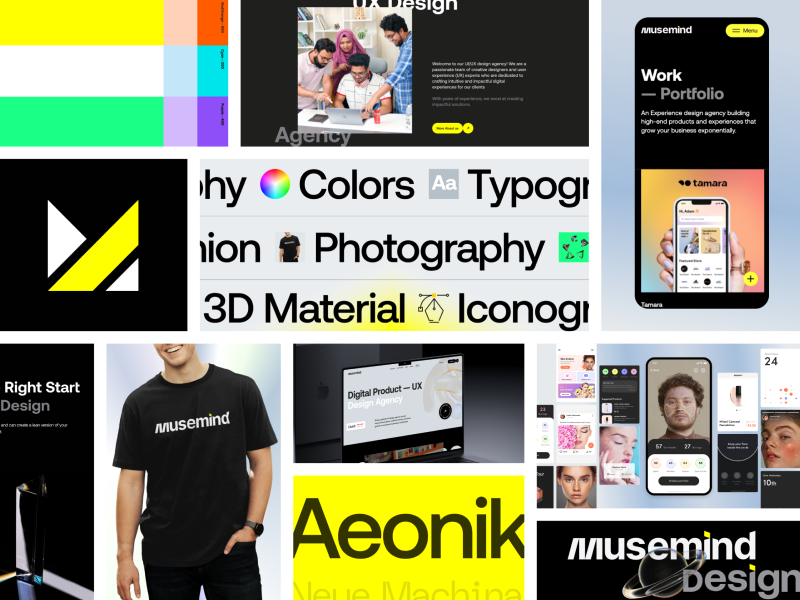
The “M” transition, A Symbolic Representation of Our Four Pillars.
We have also transformed our very own 'M' as well, and it's more than just a letter now. "Our 'M' logo is not just a letter; it's a symbol that embodies our brand's four fundamental pillars.
Minimalism
We have also transformed our very own 'M' as well, and it's more than just a letter now. "Our 'M' logo is not just a letter; it's a symbol that embodies our brand's four fundamental pillars.
Modernity
The forward-leaning orientation of the 'M' signifies our commitment to staying at the forefront of design trends and technology. We embrace the modern world's dynamism and incorporate it into our work.
Mastery
The precision and sharpness of the 'M' symbolize our mastery of design techniques and our dedication to delivering the highest quality work. We're experts in our field, continuously honing our craft.
Mindfulness
The 'M' is a reminder of our mindfulness in design. We consider not only aesthetics but also the user experience, ensuring our creations are thoughtful, intuitive, and meaningful.

So, in essence, the change in shape or color isn't just about aesthetics; it's a visual representation of our journey – from the spirited startup to the seasoned expert. It's a testament to our commitment to serving you better and building trust along the way.