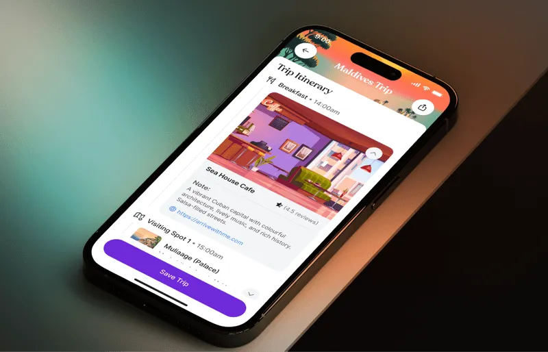
About the Project
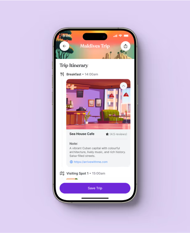
Arrive enhances travel experiences by offering more than just accommodations. It provides users with local attractions, dining recommendations, and navigational aids.
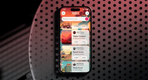
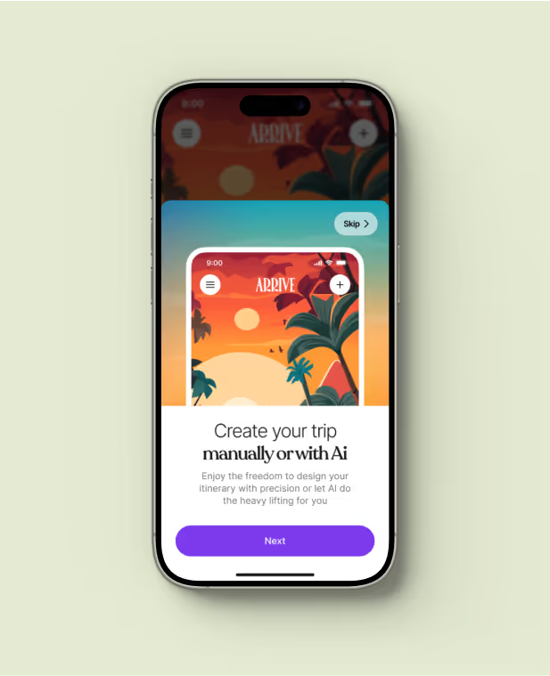
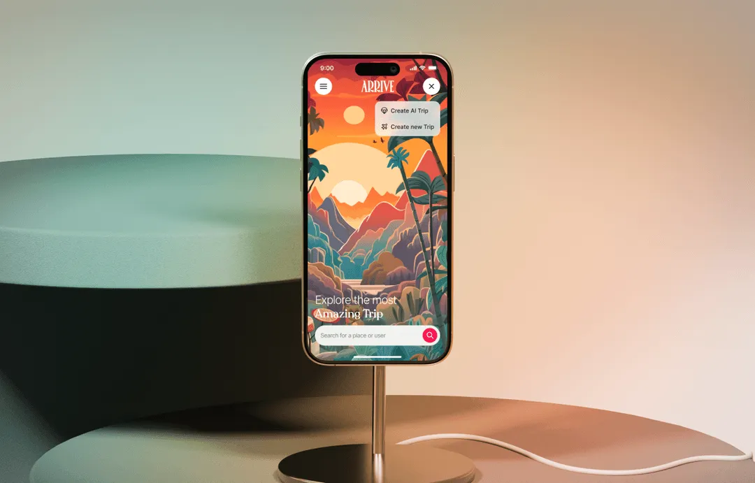
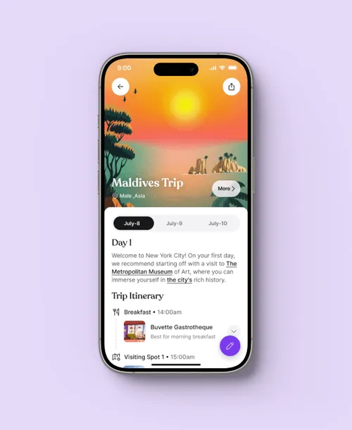
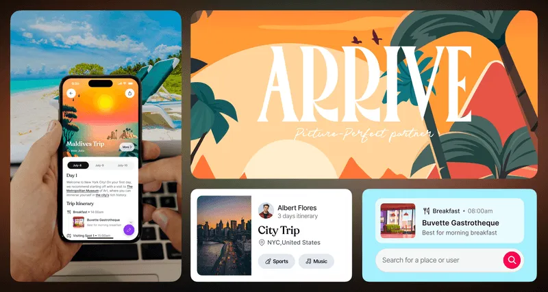
We designed the Arrive app based on the client's concept, providing UX and UI solutions along with custom illustrations.
Requirements
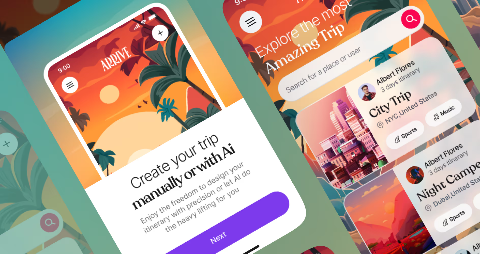
The client wanted a design that featured glassmorphism to create a sleek, modern aesthetic, along with an energetic and vibrant style to match the dynamic nature of the travel experience.
They sought an interface that was both visually appealing and highly functional, incorporating interactive elements that would facilitate seamless navigation.
Solutions
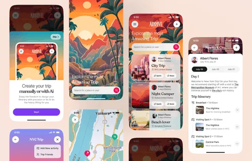
We delivered a design featuring glassmorphism for a sleek, modern look, and vibrant elements to capture the energy of travel.
Our solutions included intuitive navigation, interactive maps, user-generated content integration, and personalized recommendations, enhancing engagement and exploration.
Design System
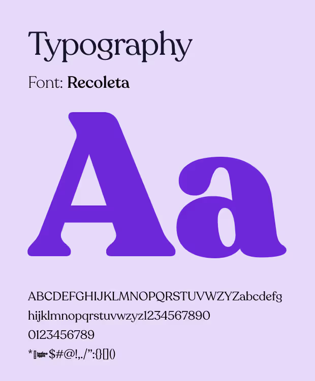
We developed a comprehensive design system for Arrive, ensuring consistency and scalability across the app. This system included standardized components, such as buttons, icons, and typography.
Color Palette
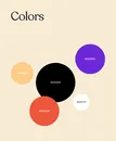
Our color palette was carefully chosen to complement the custom illustrations, ensuring a cohesive and visually appealing design. We selected vibrant and energetic colors that align with the dynamic nature of travel
