Project
Expresstext

ExpressText Web Application

Client
Joshua Kresge
Category
AR/VR
Live view
Visit Website
Timelines
3 Months
SErvice we provided
  • User Research
  • UI Design
  • Development
About the Project

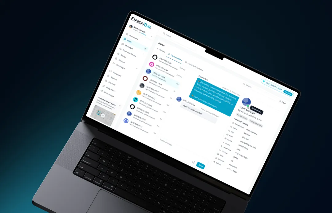
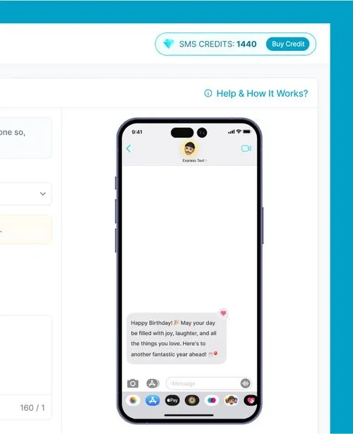
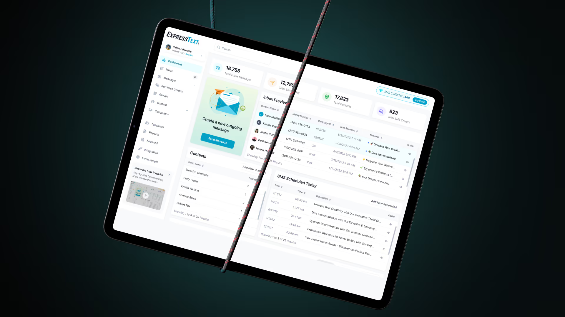
ExpressText is a renowned platform that enables businesses to send mass text messages to their customers efficiently, promoting sales, events, and distributing coupons to build customer loyalty.

Over a four-month redesign project, we revamped its UI/UX for better usability and aesthetics, delivering a user-friendly, intuitive interface.
Problems
The problem with Express Text was its outdated design and complex user experience. The platform's interface was not user-friendly, making it difficult for businesses to use it efficiently.
Challanges
The platform had large scale and extensive data management needs, which made organizing the information architecture complex. Additionally, we encountered technical barriers since the client was not familiar with Figma.
Solutions
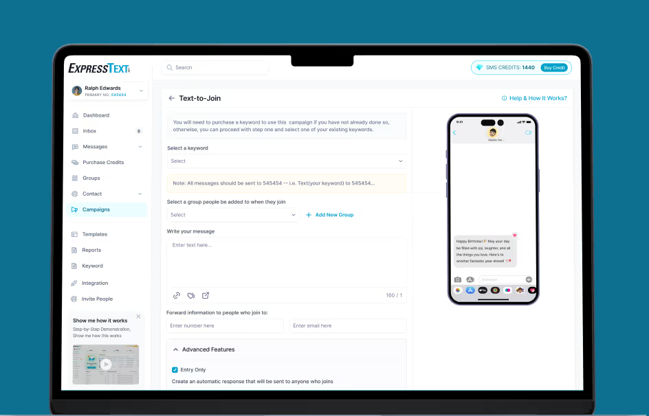
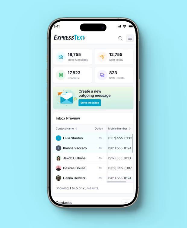
We modernized the UI to refresh the platform's visual appeal. Additionally, we simplified the navigation enhancing overall efficiency and making the platform more intuitive to use.
MuseMind really understood our needs and completely revamped our platform. We got our expected outcome and are satisfied with their delivery. Highly recommended!

Guy Hawkins

CEO, PEERSPARK
View review on clutch
Design
Process
1
Research
In the research phase, we comprehensively study user needs, behaviors, and pain points through methods like interviews and data analysis to inform the design process effectively.
2
Design
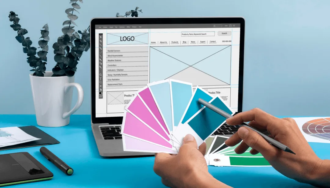
During the design phase, we create wireframes and prototypes, visually conceptualizing solutions. These serve as blueprints for the user interface's structure, layout, and functionality.
3
Testing
In the testing phase, we gather user feedback on prototypes, assess usability, and refine designs. This iterative process ensures the final product meets user expectations and needs.
4
Implementation
In the implementation phase, we focus on translating the designed user interface into a functional product, adhering to the established design guidelines and aesthetics. - implementation
5
Iteration
During the iteration phase, we revisit and refine the design and functionality based on feedback and insights gathered from user testing and evaluation, ensuring continuous improvement
Sketch
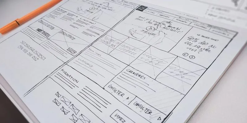
We developed low-fidelity prototypes to ensure we stayed on track. Given the vast amount of data and complex requirements, these prototypes helped us to make informed adjustments early.
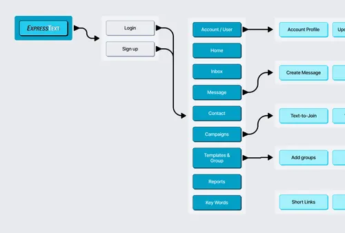
User Flow
We designed clear user flows to simplify managing mass text messages, ensuring users could efficiently navigate tasks—from composing messages to analyzing results—making the platform intuitive and user-friendly.
Style Guide
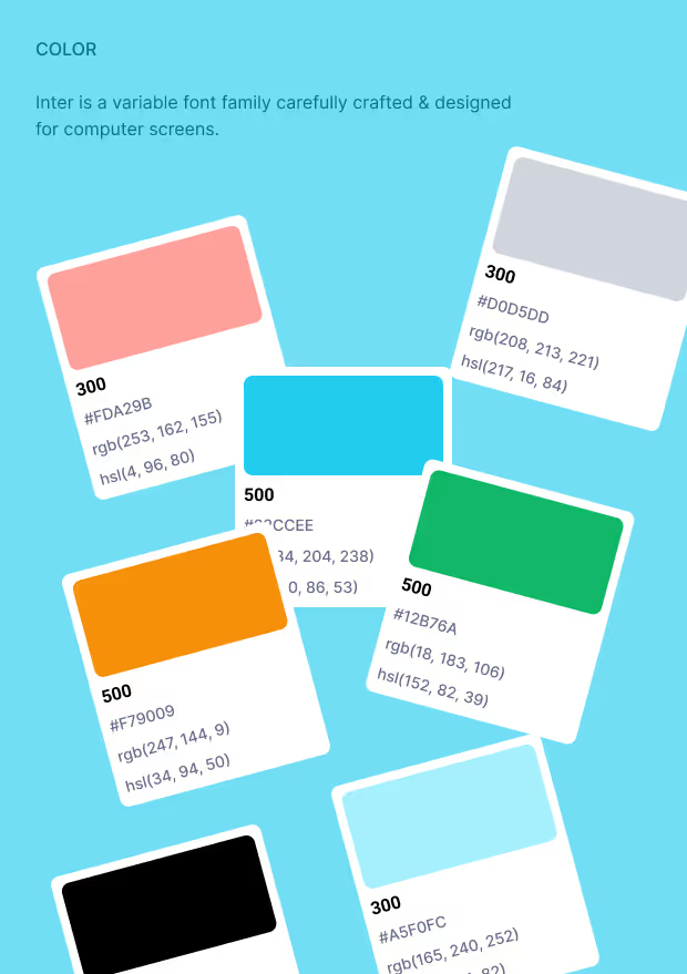
We developed a style guide featuring a multi-color palette to distinguish different functions and data levels. This approach eas taken for clear visual hierarchy and easy navigation across varied features.
Responsiveness
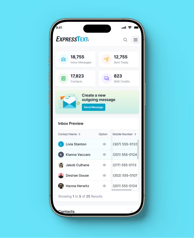
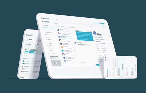
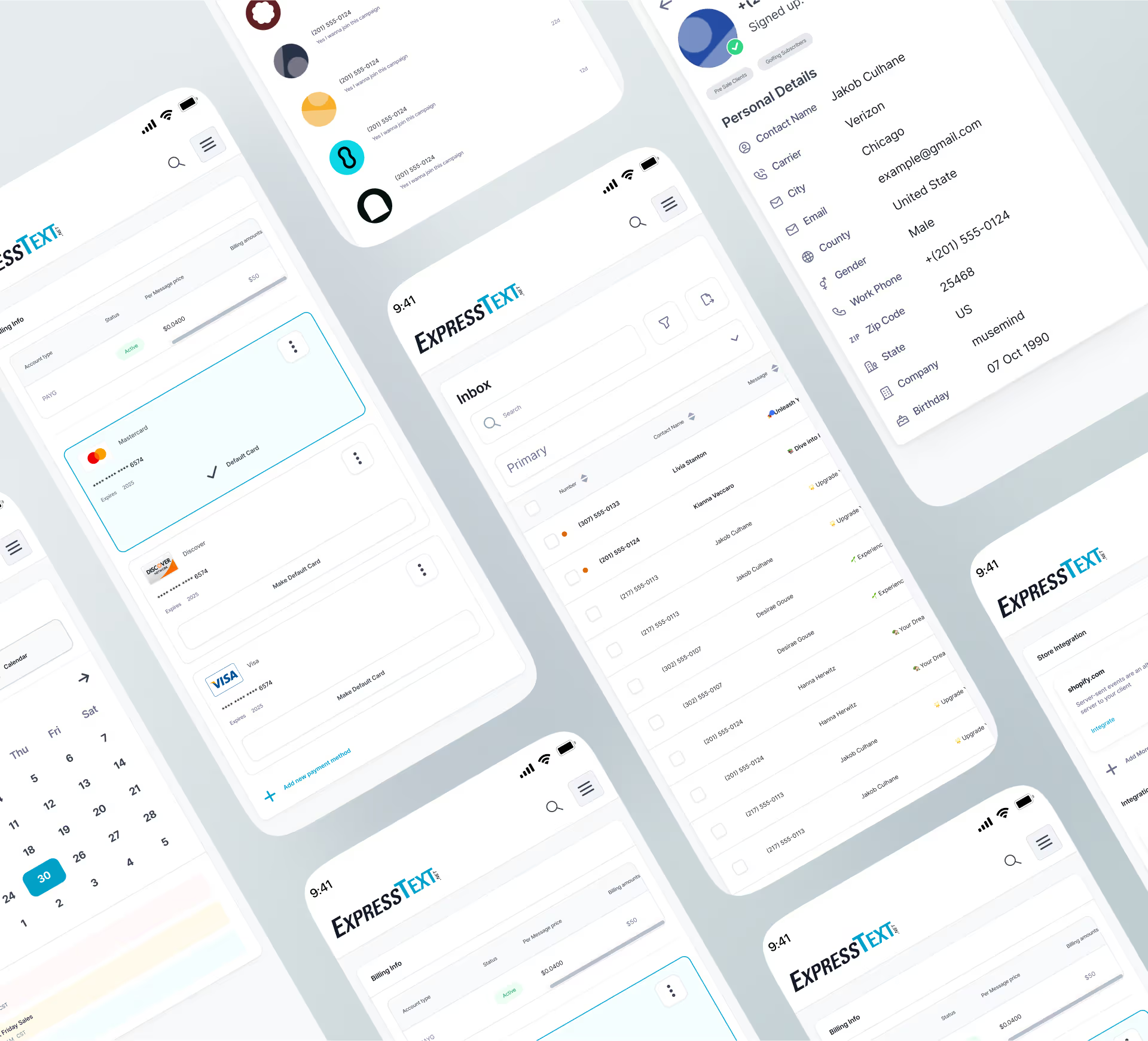
We made the entire ExpressText platform responsive, ensuring that users can manage and send mass text messages seamlessly across all devices, including desktops, tablets, and mobile phones.
Impact
We Created

31

%
Navigation time

Decreased average navigation time by 31% leading to quicker access to key features.

45

%
Feature Utilization

Boosted the use of key platform features by 45%, with better information architecture.

70

%
Customer Satisfaction

Achieved a 70% rise in customer satisfaction ratings, reflecting the successful redesign of the platform.

Have a Project Idea?

Full Name
Company name
Email*
Service required*
Project budget*
Project details*
Thank you! Your submission has been received!
Oops! Something went wrong while submitting the form.
Drag