About the Project
Hoopoe Advisors is a finance and wealth consultancy offering guidance for high-value individuals, global professionals, and families seeking clarity in financial planning. Their brand needed a digital presence that felt confident, structured, and trustworthy. The goal was to build a platform that simplifies complex financial choices through a polished visual system, clear communication, and user-friendly interactions.
Requirement
Hoopoe Advisors approached us with a simple objective: create a brand and interface that reflects expertise. They wanted a seamless identity that works across digital screens, print, and presentation environments with equal precision. From logo design to dashboard layouts, every element needed to present a sense of order and reliability.
Challenges
Finance consulting carries heavy information density, long reading sections, and data elements that must remain readable. Balancing depth with usability was a key challenge. The brand also required a visual tone that feels premium without losing accessibility for new users.
Our Solutions
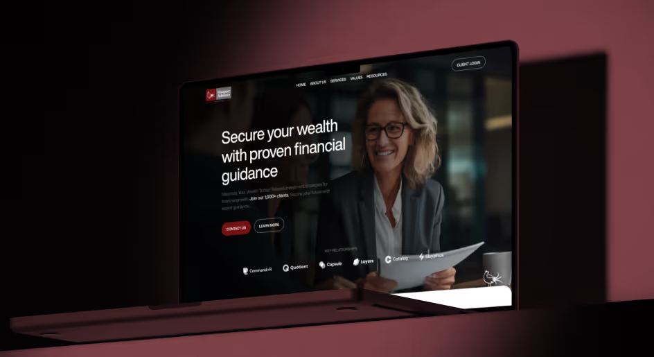
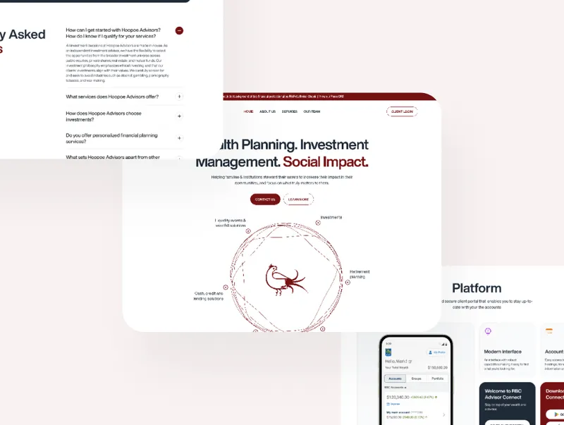
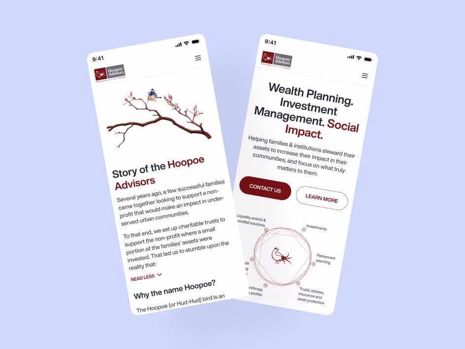
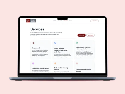
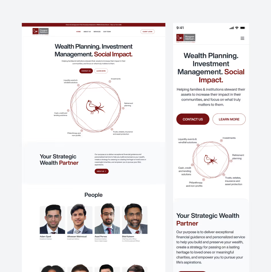
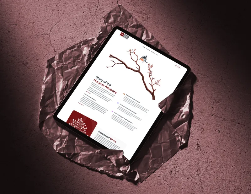
We re-aligned the entire identity around clarity. A refined color palette, structured type system, modular layout foundations, and purposeful iconography formed the core of the brand. The digital interface was built with a focus on friction-free reading, simple navigation, and layouts that make financial content feel approachable.
Hero screens, dashboards, and service pages follow a consistent rhythm, allowing users to move through insights with ease. Every frame is built to communicate trust.
Style Guide
Typography
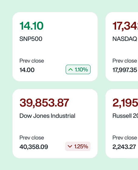
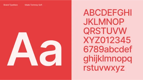
A strong typographic hierarchy was chosen to handle long-form content and data displays. Headings create presence, while paragraph styles remain smooth for extended reading. Numeric characters get special treatment for financial contexts.
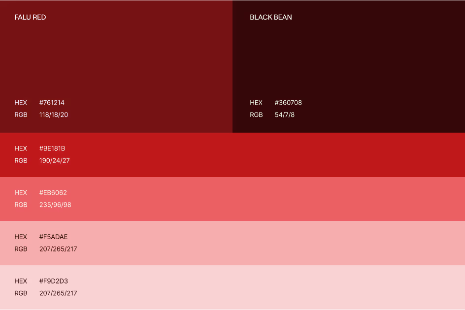
Color System
Warm reds, neutrals, and structured supporting tones frame the identity. Each shade has defined roles for backgrounds, highlights, alerts, and informational content.
Logo System
The mark blends structure with personality. Variants include full lockups, compact formats, dark mode, light mode, and micro-usage forms for favicons and app icons.
Layout Standards
Spacing rules, grid alignment, and component positioning help maintain uniformity across every touchpoint, from mobile screens to long-form reports.
Gamifications
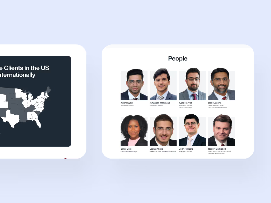
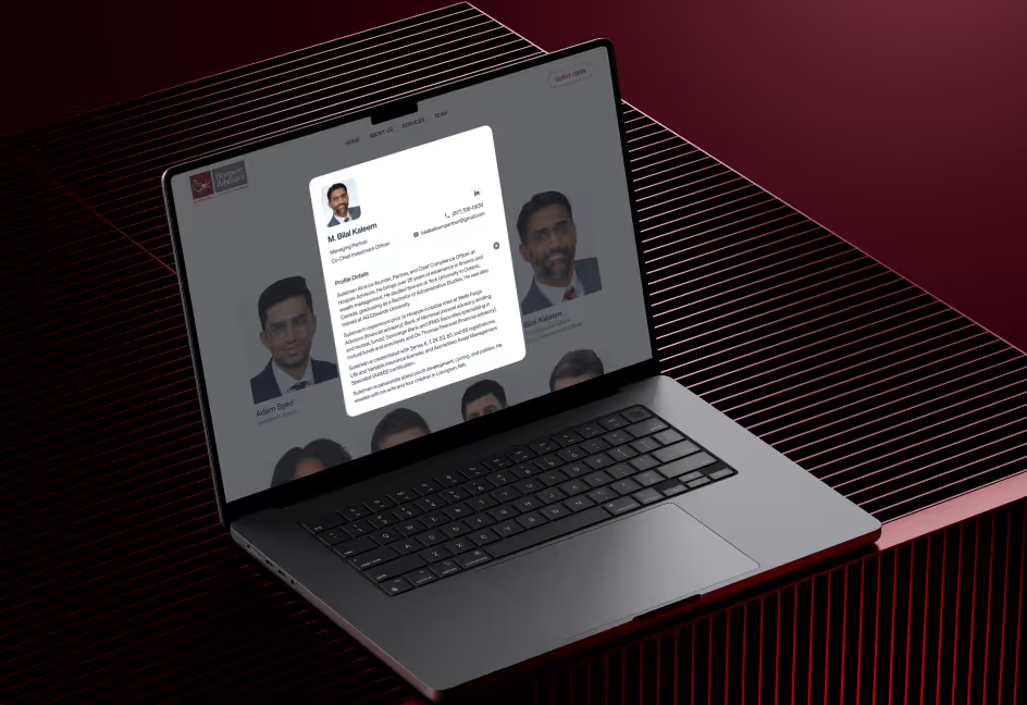
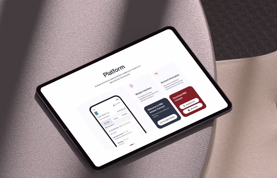
We crafted a dashboard experience where clients can track insights, view advisors, explore service flows, and review strategies without confusion. Data cards, goal progress visuals, and advisor listings are arranged with clean hierarchy and minimal visual noise.
Report screens and client views use modular blocks that scale across devices. The tone is calm, structured, and helpful.
Let’s Build Something Meaningful
Have a concept in mind? Our team can help shape it into a refined digital identity that speaks with confidence. Share your ideas and we’ll get in touch.

.avif)