Project
i_Payout

i_Payout- Pay Your Partners Anywhere.

Client
Dharmendar Mothe
Category
Fintech, B2B, Payment
Live view
Visit Website
Timelines
4 Months
SErvice we provided
  • User Research
  • UI Design
  • Design System
About the Project
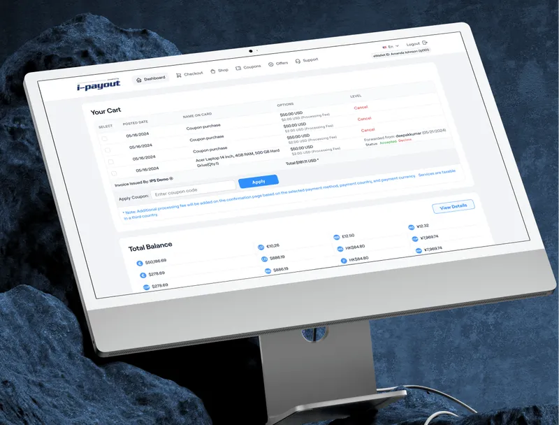
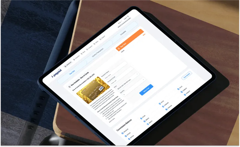
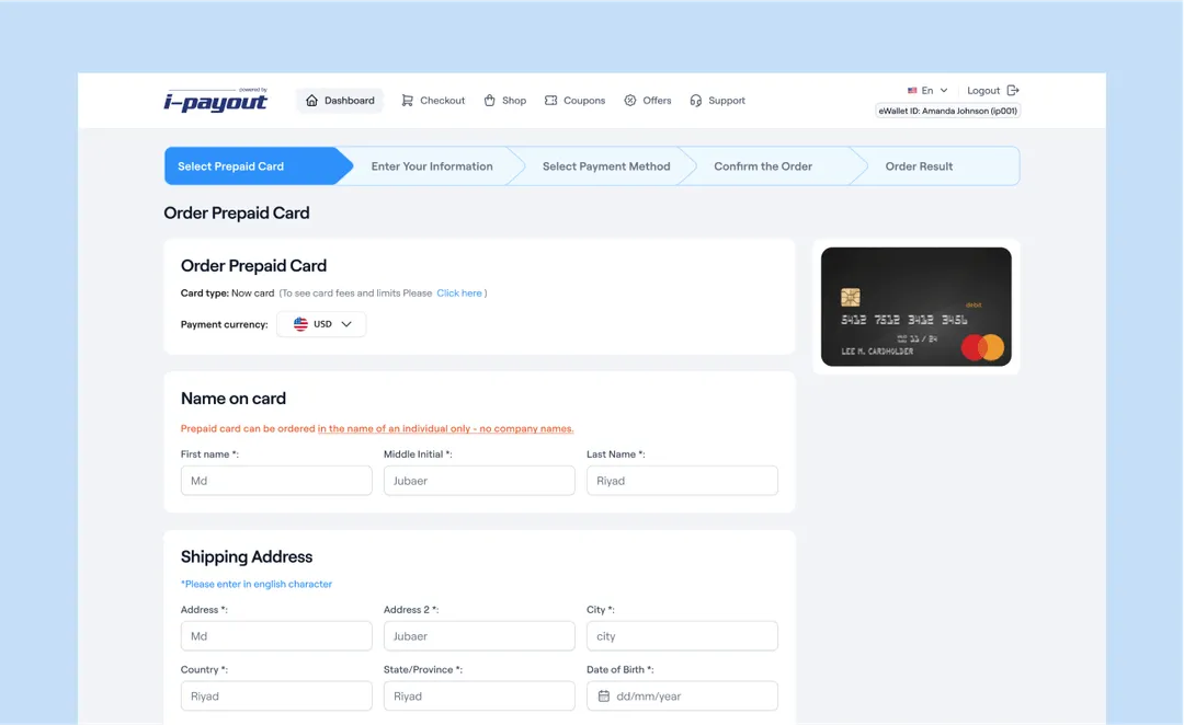
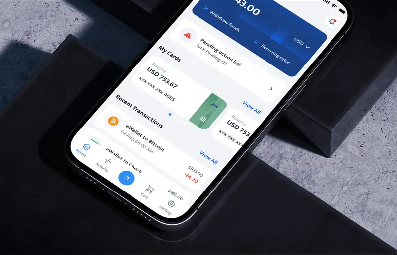
I-Pay Out is one of those projects where we solely worked on the UI of the entire platform. The project came to us for a complete UI redesign.

I-Pay Out is a globally recognized company specializing in building payment rails for almost two decades. They facilitate seamless money delivery for businesses, allowing them to pay collaborators, freelancers, and manage tax payments efficiently.
Objectives
The objective was to modernize  the user interface of I-Pay Out's platform to improve user experience, increase efficiency, and maintain their strong reputation in the global payments industry.
Problem
The existing UI was outdated, making it difficult for users to navigate the platform efficiently. This led to a less than optimal user experience, causing frustration among businesses and collaborators.
Solution
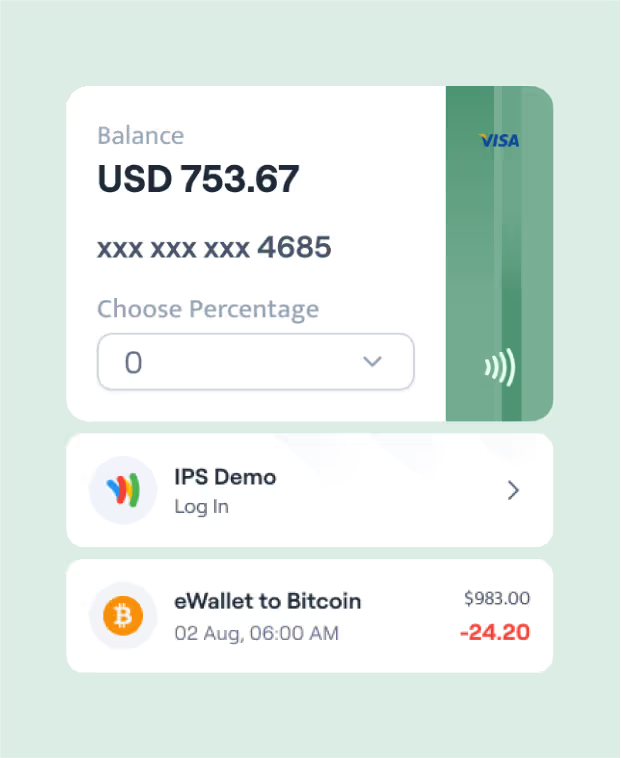
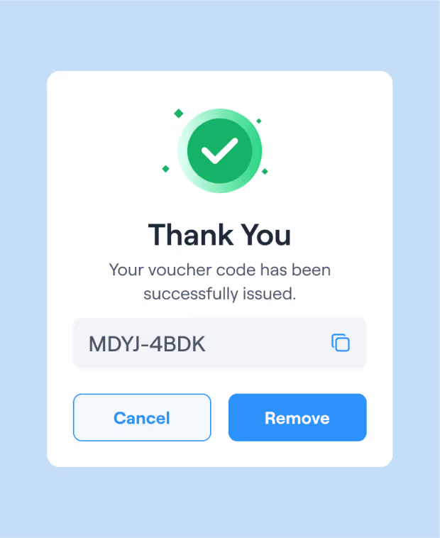
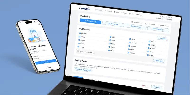
We provided a complete UI redesign for I-Pay Out, focusing on creating a visually appealing and intuitive interface. This included making custom icons, selecting a modern color palette, and refining every UI element for visual appeal.
We approached MuseMind to help us completely redesign our platform's UI, and we couldn’t be happier with the results. We needed to refresh our branding to stay in tune with the new digital era, and MuseMind delivered exactly what we wanted.

Natalia Yenatska

COO, i-Payout
View review on clutch
Design
Process
1
Research
In the research phase, we comprehensively study user needs, behaviors, and pain points through methods like interviews and data analysis to inform the design process effectively.
2
Design
During the design phase, we create wireframes and prototypes, visually conceptualizing solutions. These serve as blueprints for the user interface's structure, layout, and functionality.
3
Testing
In the testing phase, we gather user feedback on prototypes, assess usability, and refine designs. This iterative process ensures the final product meets user expectations and needs.
4
Implementation
In the implementation phase, we focus on translating the designed user interface into a functional product, adhering to the established design guidelines and aesthetics. - implementation
5
Iteration
During the iteration phase, we revisit and refine the design and functionality based on feedback and insights gathered from user testing and evaluation, ensuring continuous improvement
Style Guide
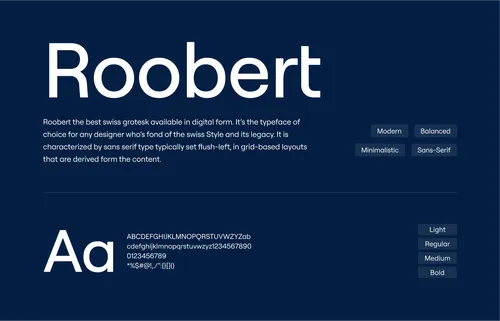
For the style guide, we aimed for a clean and professional aesthetic that reflects I-Pay Out's esteemed global reputation and adheres to international standards.
icons  & illustrations
With custom icons and micro-interactions, we ensured that users have an intuitive and engaging experience
Mobile Responsive
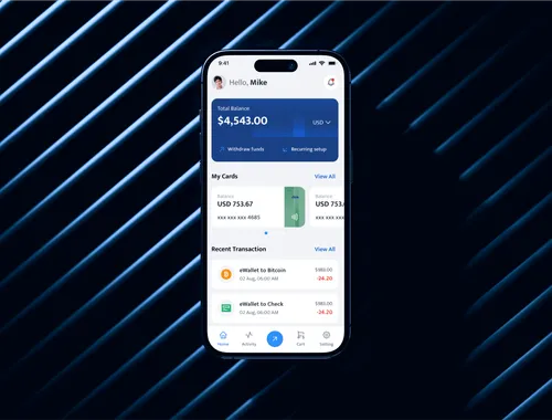
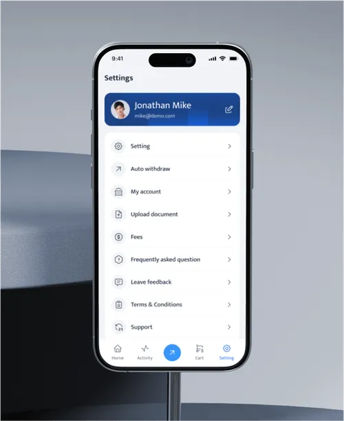
We optimized the UI to ensure a seamless experience across all mobile devices, enhancing accessibility and functionality for users on the go.
Impact
We Created

85

%
User Satisfaction

Achieved a 85% increase in user satisfaction, due to improved visual and functional appeal of the UI.

60

%
Reduced Churn Rate

Reduced the churn rate by 60%, indicating better user engagement and retention.

40

%
User Sign-ups

Saw a 40% rise in new user sign-ups, highlighting the platform’s enhanced appeal and usability.

Have a Project Idea?

Full Name
Company name
Email*
Service required*
Project budget*
Project details*
Thank you! Your submission has been received!
Oops! Something went wrong while submitting the form.
Drag