Project
SaaS Design

Konoom - Location and Review Management Platform

Client
Nedin Zahirovic
Category
SaaS
Live view
Visit Website
Timelines
3 Months
SErvice we provided
  • User Research
  • UI Design
  • Design System
About the Project
Konoom represents a cutting-edge SaaS platform meticulously designed to provide multi-location brands with an exceptional tool for streamlining their customer reviews, ratings, and overall feedback management.

Our involvement in this project encompassed not only the development of an engaging and user-friendly interface but also a comprehensive UX audit and the establishment of a robust design system, ensuring seamless and effective review management..
saas ux web case study
Problems
Multi-location brands faced difficulties in efficiently managing customer reviews and ratings across various online platforms. They needed a centralized solution to streamline this process.
Challanges
While making GoBoos our team found stumbled upon a few obstacles. We had to integrate three separate platforms into one platform and make a clean dashboard to give a clear
Our Solutions
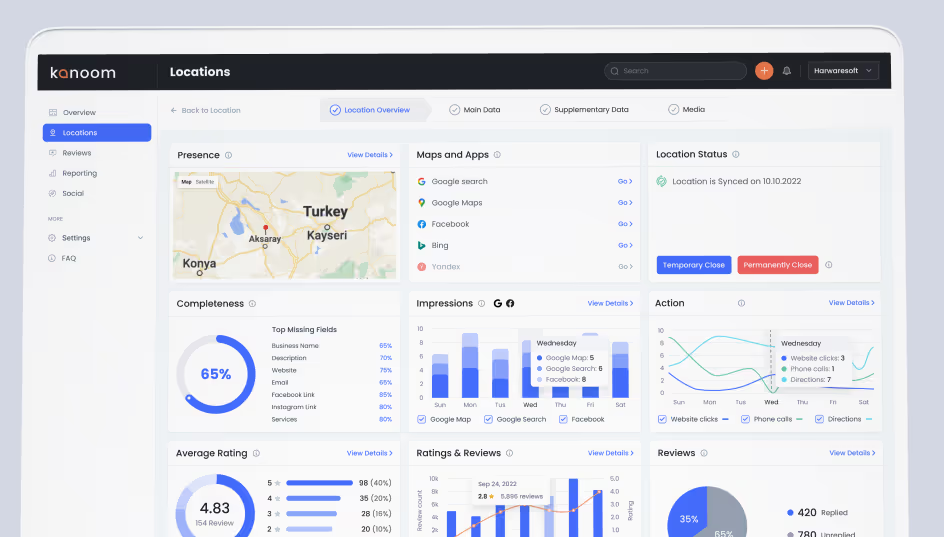
In design solution, we introduced an overview panel in Konoom, offering users a quick view of vital data like ratings, reviews, search trends, and impressions. Additionally, we implemented automation features to significantly reduce the burden of manual tasks.
Happy with the results of Konoom application design. We experienced an increase in user engagement, retention, and overall growth! Thanks to Musemind for their dedicated efforts. All the best to deliver more designs like this.

Nedin Zahirovic

Co-founder, Konoom
View review on clutch
Design
Process
1
Research
In the research phase, we comprehensively study user needs, behaviors, and pain points through methods like interviews and data analysis to inform the design process effectively.
2
Design
During the design phase, we create wireframes and prototypes, visually conceptualizing solutions. These serve as blueprints for the user interface's structure, layout, and functionality.
3
Testing
In the testing phase, we gather user feedback on prototypes, assess usability, and refine designs. This iterative process ensures the final product meets user expectations and needs.
4
Implementation
In the implementation phase, we focus on translating the designed user interface into a functional product, adhering to the established design guidelines and aesthetics. - implementation
5
Iteration
During the iteration phase, we revisit and refine the design and functionality based on feedback and insights gathered from user testing and evaluation, ensuring continuous improvement
Sketch
We crafted a storyboard to visualize user interactions and key features, helping us refine the user experience and ensure a seamless journey for Konoom users.
User Flow
We meticulously designed the user flow within Konoom, ensuring that users can easily navigate the platform to manage reviews, ratings, and customer interactions efficiently
Visual Output
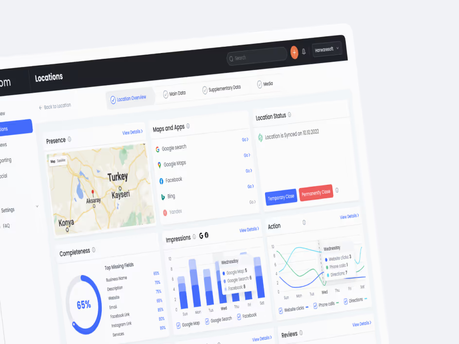
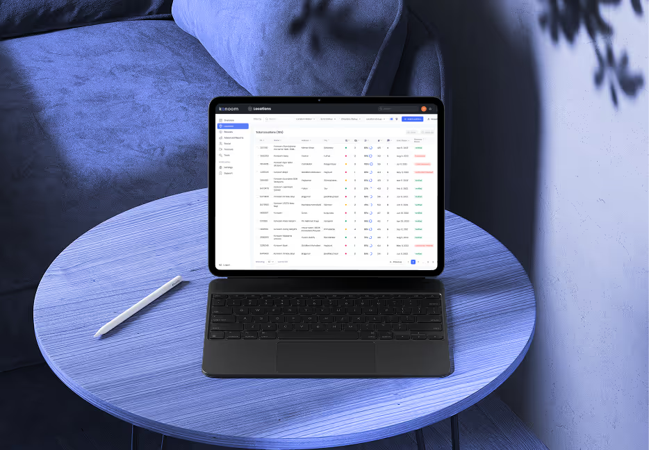
Our visual output for Konoom embodies a sleek and user-friendly interface. We incorporated the elements from our style guide to create a clean and professional appearance that aligns with the platform's purpose.
Dashboard Review
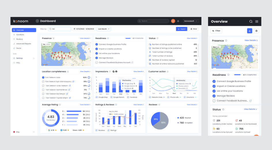
Konoom's dashboard review emphasizes clarity and efficiency, presenting crucial data in a visually accessible manner for multi-location brands to enhance their online reputation effortlessly.
Dashboard Review
Konoom's dashboard review emphasizes clarity and efficiency, presenting crucial data in a visually accessible manner for multi-location brands to enhance their online reputation effortlessly.
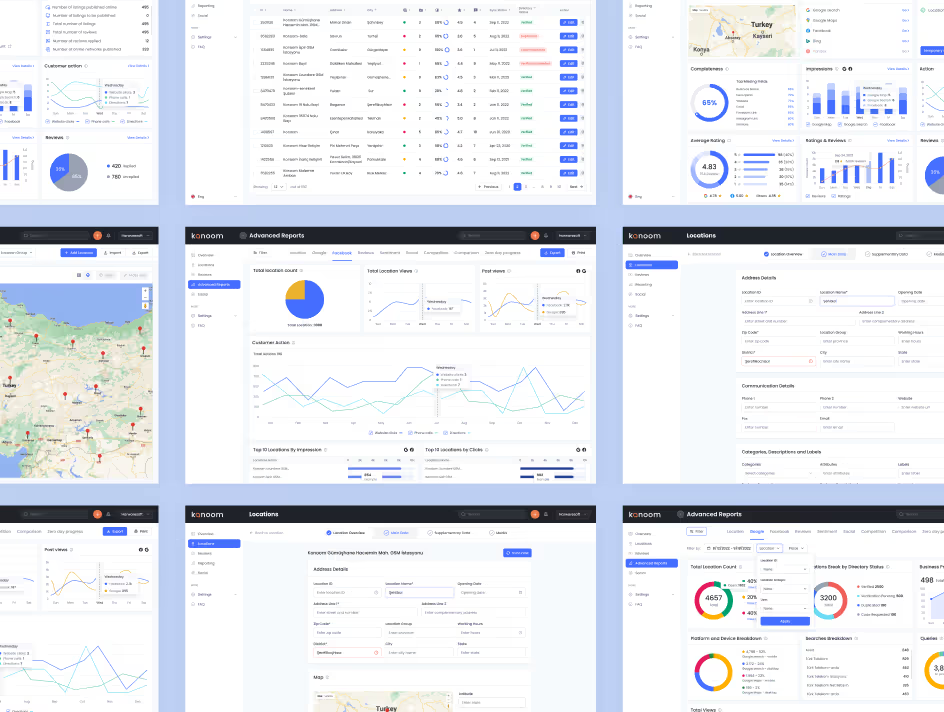
Advance Report Results
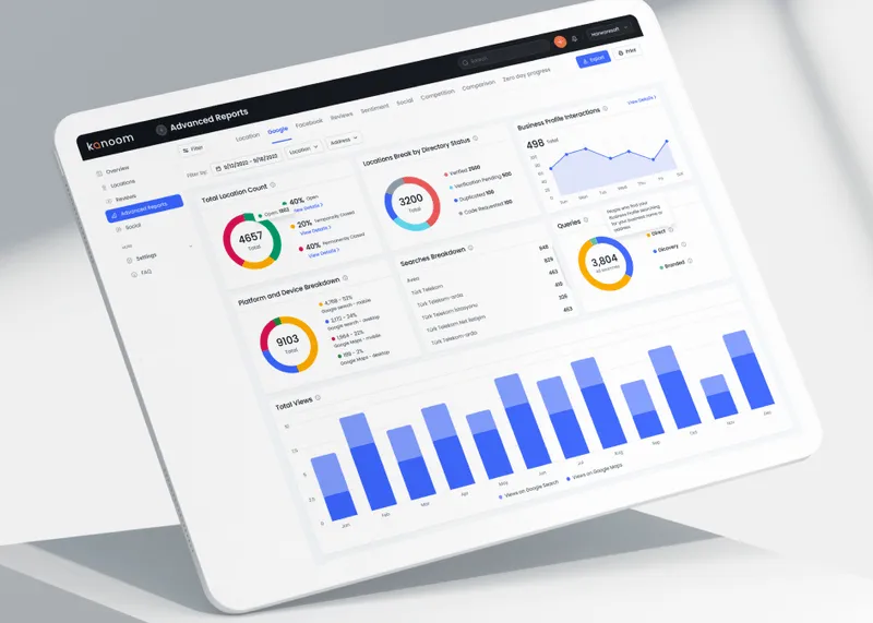
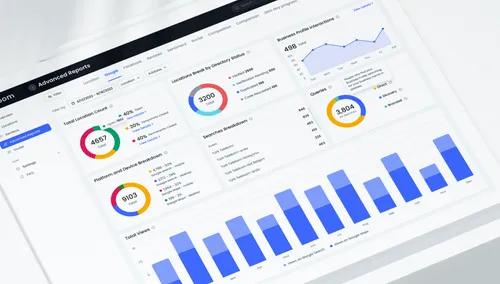
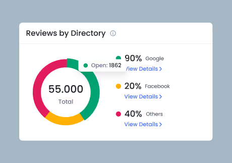
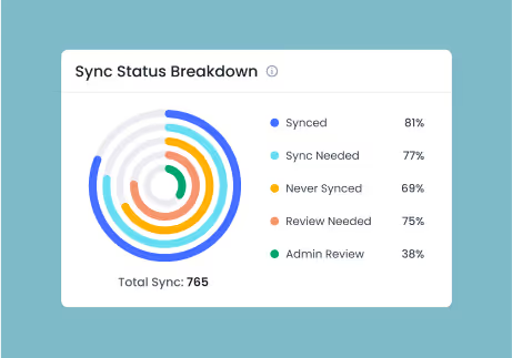
The advanced report analysis in Konoom empowers multi-location brands with comprehensive insights, allowing them to make data-driven decisions and optimize their online presence effectively.
Conclusion
Our journey with Konoom was filled with ideation, collaboration, and dedication. We're proud to have developed a powerful tool that empowers multi-location brands to conquer the challenges of managing customer reviews and ratings.
Impact
We Created

200

k
Raised €200k

Konoom raised  €200,000 after the new design is implemented

20

%
Reduced churn time

Churn rates have decreased by 20%, indicating higher user satisfaction and engagement
Reduced Churn Rate

15

%
Market share growth

Since the new design is implemented, it has led to 15% growth in market share.

Have a Project Idea?

Full Name
Company name
Email*
Service required*
Project budget*
Project details*
Thank you! Your submission has been received!
Oops! Something went wrong while submitting the form.
Drag