Project
Moxey

Moxey- Website Design

Client
Joshua Kresge
Category
Fintech
Live view
Visit Website
Timelines
3 Months
SErvice we provided
  • User Research
  • UI Design
  • Design System
About the Project
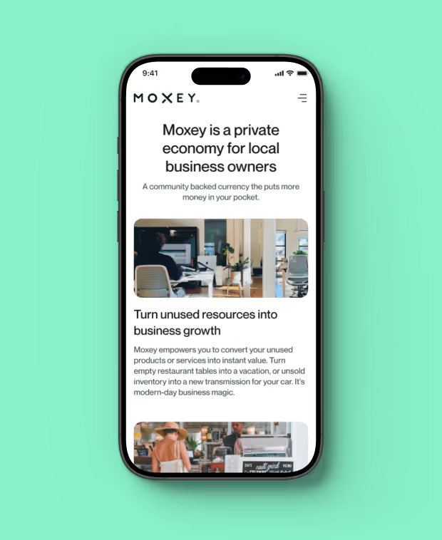
Moxey is a private economy designed specifically for local business owners. It facilitates growth by connecting over 3,000 business owners through a community-backed currency.

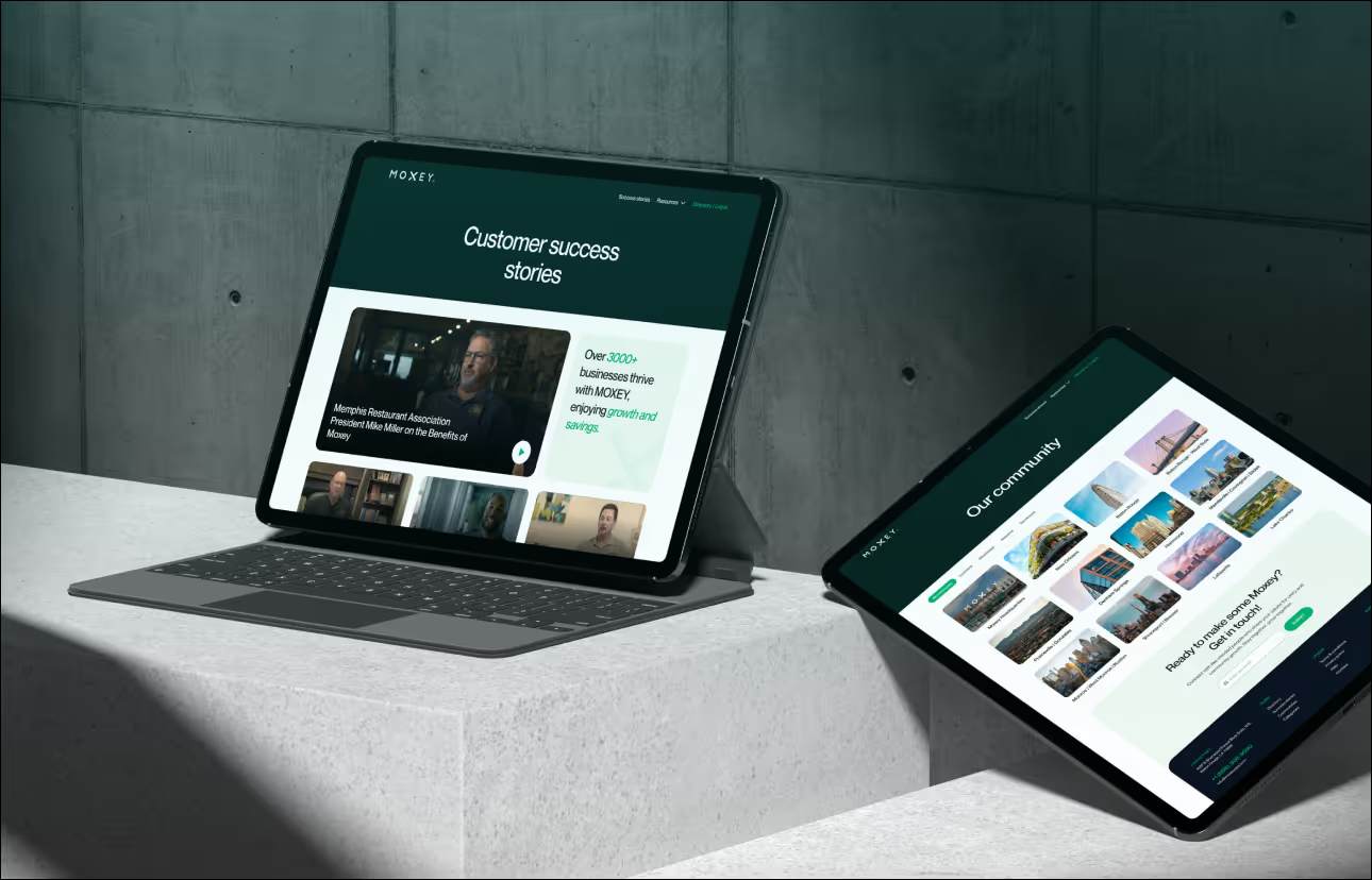
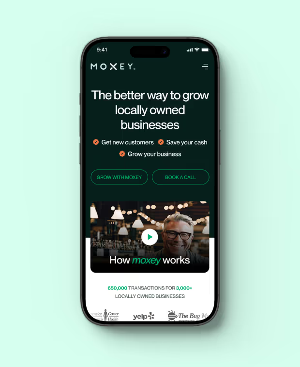
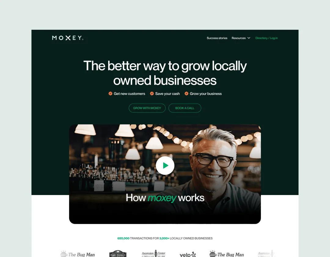
MuseMind worked with Moxey to improve their digital presence. We revamped both their website and mobile app and worked on new features
Requirement
Moxey aims to support local business owners by helping them sell their excess capacity and attract new customers without replacing their existing ones.
Problems
The platform had navigational issues, making it difficult for users to find and access key features efficiently. The interface was cluttered, also they wanted to new features.
Our Solutions
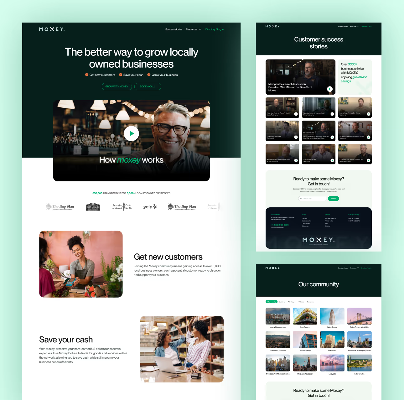
To tackle these issues, we designed a clean layout, enhanced information hierarchy, and modernized the interface. We also streamlined navigation, and optimized user flow for a more intuitive experience.
One thing that really satisfied me was how they took my feedback to heart and improved the entire design based on it. I’m happy they delivered exactly what I expected.

Charlie Davis

Co founder, Moxey
View review on clutch
Design
Process
1
Research
In the research phase, we comprehensively study user needs, behaviors, and pain points through methods like interviews and data analysis to inform the design process effectively.
2
Design
During the design phase, we create wireframes and prototypes, visually conceptualizing solutions. These serve as blueprints for the user interface's structure, layout, and functionality.
3
Testing
In the testing phase, we gather user feedback on prototypes, assess usability, and refine designs. This iterative process ensures the final product meets user expectations and needs.
4
Implementation
In the implementation phase, we focus on translating the designed user interface into a functional product, adhering to the established design guidelines and aesthetics. - implementation
5
Iteration
During the iteration phase, we revisit and refine the design and functionality based on feedback and insights gathered from user testing and evaluation, ensuring continuous improvement
Style Guide
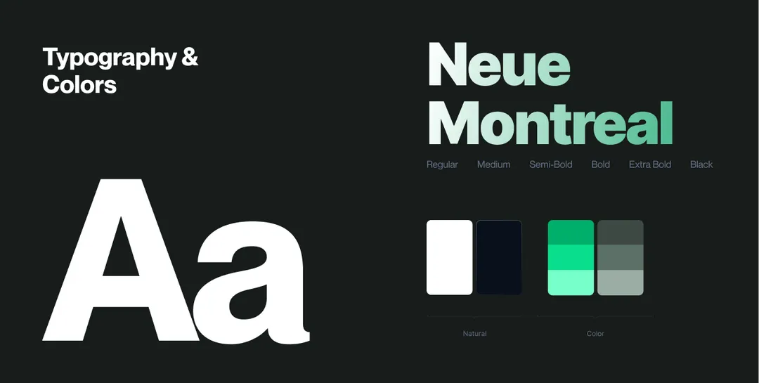
Green and white create a modern, sophisticated look—green for innovation and vitality, and white for a clean, elegant backdrop. This combination aligns with Moxey’s goal of a polished, user-friendly interface.
Mobile Responsiveness
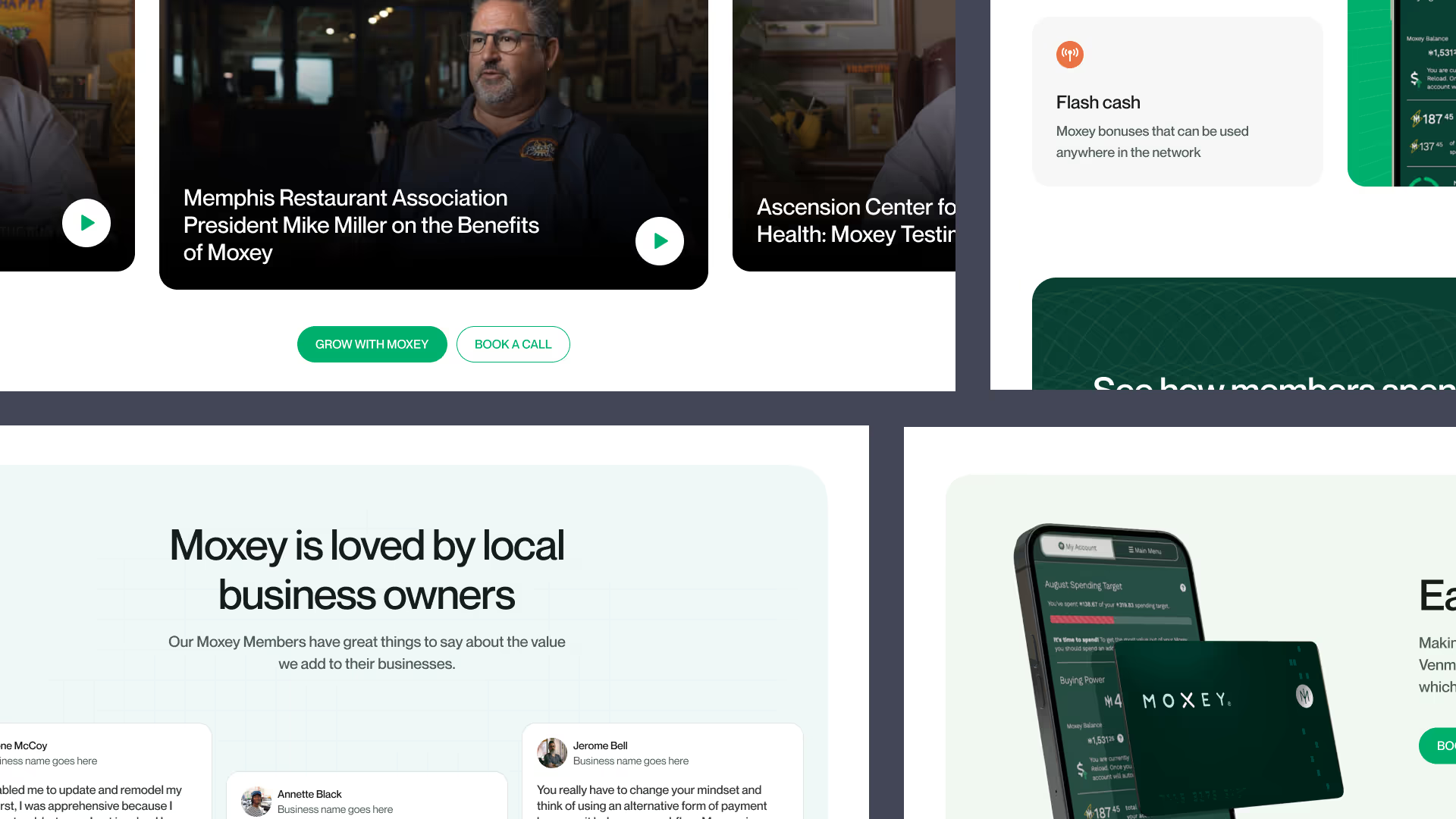
We ensured mobile responsiveness by designing a flexible layout that adapts seamlessly to various screen sizes, maintaining usability and aesthetic consistency across all devices.
How we helped the
ostomy patitients

ncreased user engagement with a sleek, modern design that attracts and retains users.

Enhanced usability through a contemporary interface that simplifies navigation and feature access.

Elevated user satisfaction with a clean, uncluttered layout that improves overall experience.

Improved mobile responsiveness, ensuring a consistent, user-friendly experience across all devices.

Reinforced Moxey’s brand identity with a polished, sophisticated look that reflects innovation.

Have a Project Idea?

Full Name
Company name
Email*
Service required*
Project budget*
Project details*
Thank you! Your submission has been received!
Oops! Something went wrong while submitting the form.
Drag