About the Project
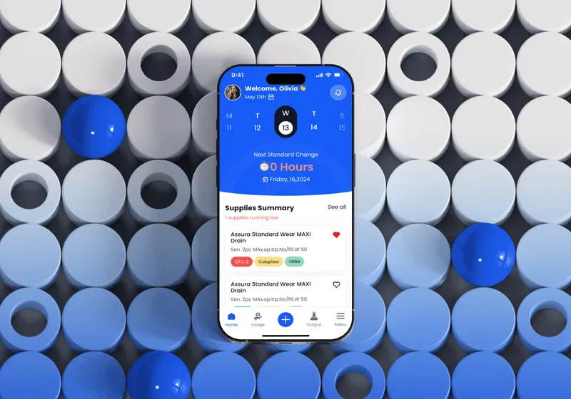
OstoBuddy is a mobile app designed to assist people with ostomies in managing their condition.
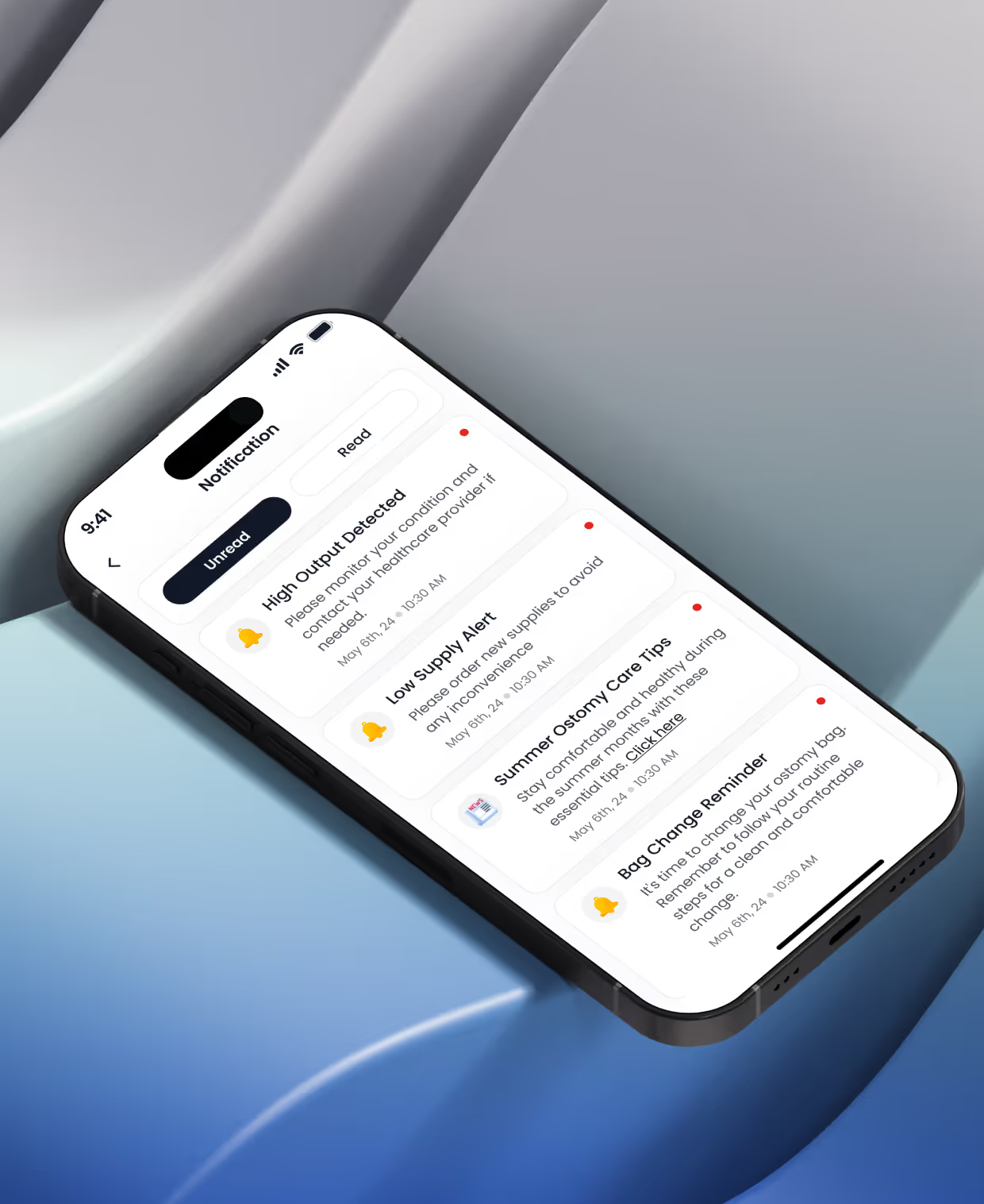
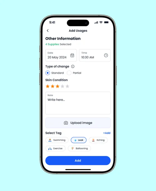
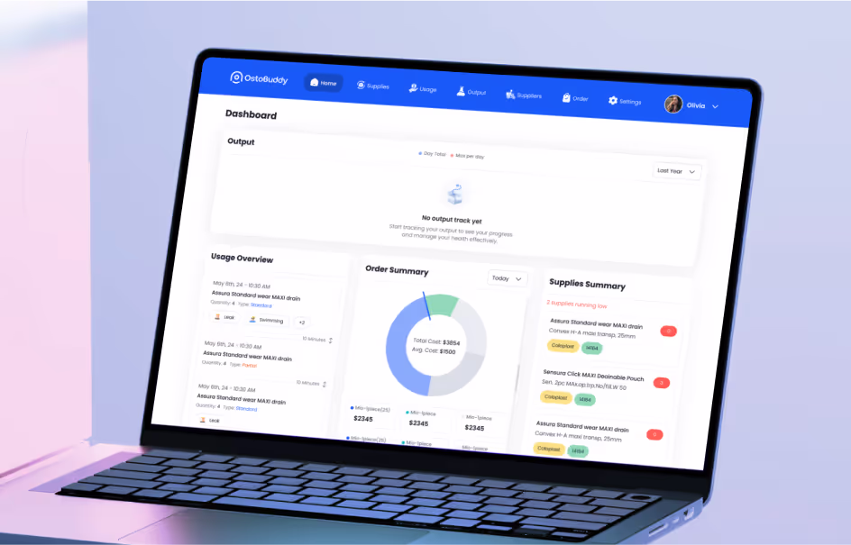
It provides features for tracking medicine supplies, monitoring output, setting reminders, and documenting skin conditions. Users can share information with clinicians for improved communication and care.
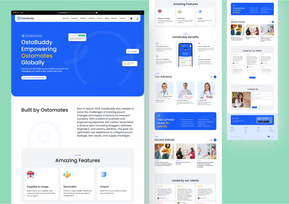
For this project, we redesigned the entire app, created the landing page for their website, and crafted the branding design.
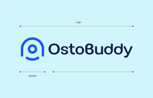
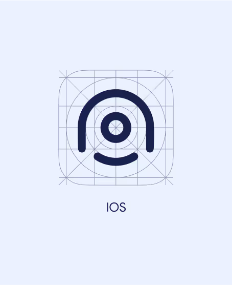
The Logo
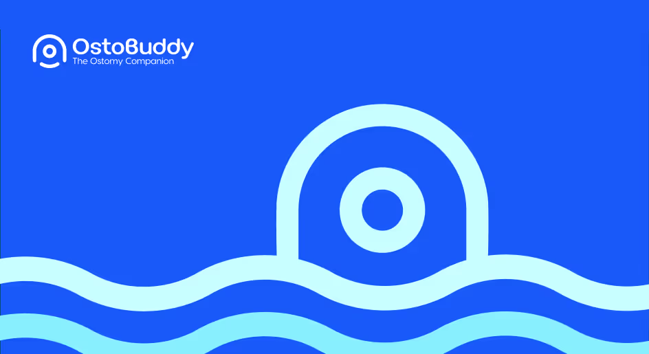
The logo features a simplified representation of an ostomy bag, incorporating a curved line for a caring embrace and a central button for secure closure.
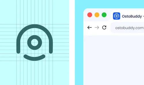
Branding Guideline
We documented branding guidelines for the client, including the dos and don'ts for the logo, word marks, and typography. Additionally, we created social media banners for them.
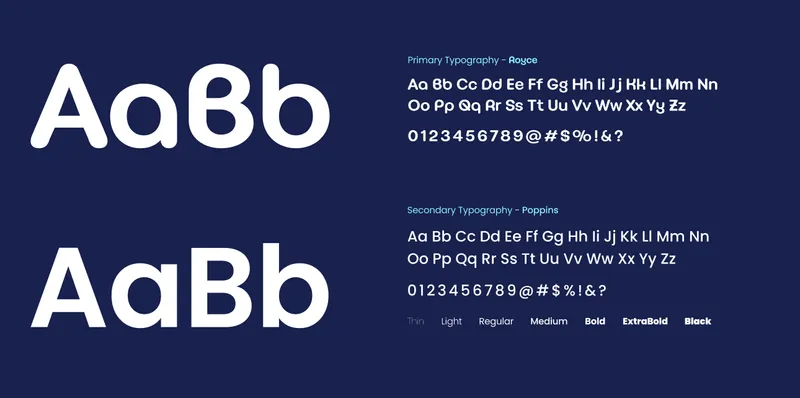
Color pallete
The colour palette includes various shades of blue, chosen for their calming and non-intrusive qualities to ensure it is not sensitive to users' eyes.
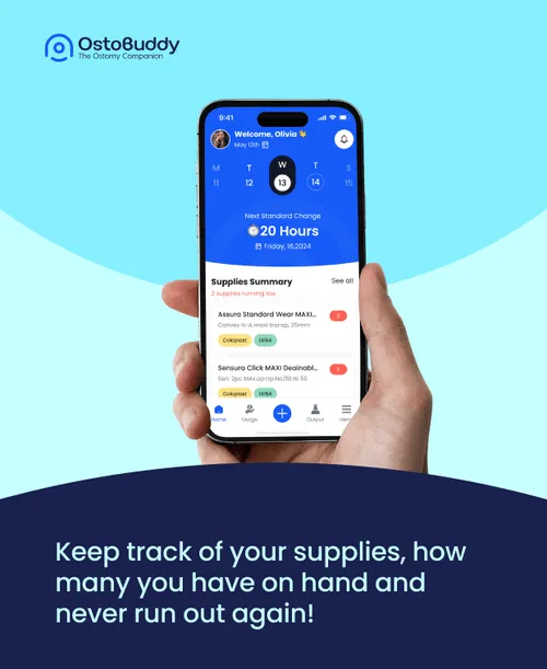
Visual Design
We crafted an intuitive visual design for the app, incorporating detailed user flows to enhance usability. The design focuses on clarity and ease of use, ensuring a seamless experience for ostomy patients.
Icons and illustartions
We custom-designed each icon and illustration to meet the specific needs of the app, ensuring they are both functional and visually aligned with the overall design.
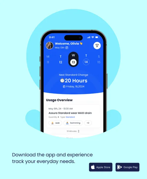
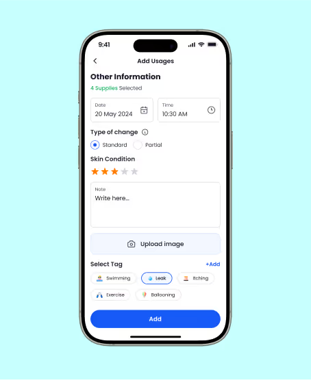
Effective Reminders
Integrated user-friendly reminder systems to help users adhere to their appliance change schedules and manage their condition proactively.
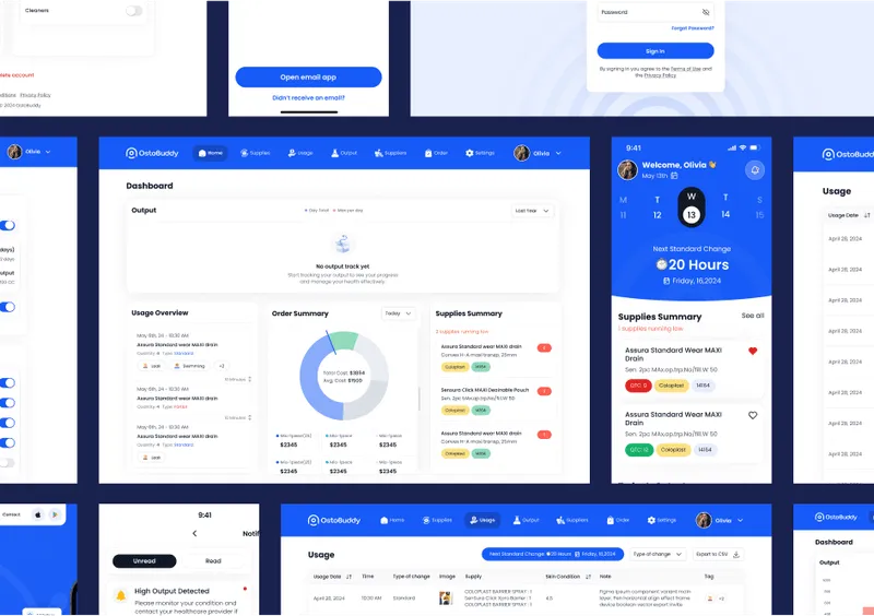
Enhanced Data Tracking
Enabled detailed tracking of medicine supplies, output, and skin conditions, allowing users to monitor their health more accurately.
Streamlined Information Sharing
Facilitated efficient communication with clinicians through well-designed interfaces, improving the quality of care and user experience.

.avif)


.avif)
.avif)