About the Project
Seliton is an e-commerce platform built to help businesses create and manage their online stores easily. The company approached us to revamp their website, which wasn’t meeting the expectations of their users. The goal was to design a clean, intuitive, and flexible platform that worked equally well for small startups and larger businesses. We focused on creating something practical, visually appealing, and easy for users to navigate.
Problems
Seliton’s website had grown outdated. Users found it hard to navigate, especially when searching for products or completing purchases. The design lacked consistency, making the overall experience feel disjointed. As an e-commerce platform serving a wide range of businesses, it also needed a more flexible and scalable structure to adapt to different needs.
Challenges
The challenge was twofold: we had to create a design that looked modern and appealing, while also making sure it was functional and easy to use. Additionally, the website needed to work seamlessly across devices, so mobile and desktop experiences had to be equally smooth. Delivering all this within a limited timeline required careful planning and constant collaboration with Seliton’s team.
Our Solutions
We started with a deep dive into the core issues of the existing website, gathering input from the Seliton team and studying how users interacted with the platform. This research helped us simplify navigation, making it easier for users to find what they were looking for. We also refreshed the visual design, introducing a more modern and cohesive look. To ensure scalability, we adopted a modular design approach that could grow with Seliton as their business evolved.
Sketch
The initial step was to create sketches of key pages like the homepage, product listings, and checkout flow. These sketches served as a blueprint to guide the team and make sure we were aligned on priorities before moving into the next phase.
Wireframe
Wireframes gave structure to the design. They helped us test the layout and placement of elements, ensuring the design was both practical and user-friendly. These early designs were reviewed with the Seliton team, and feedback was incorporated into each iteration.
Style Guide
The style guide laid the foundation for Seliton’s updated visual identity. We chose a clean, minimalistic approach with shades of blue and grey to convey trust and professionalism. Open Sans was selected as the primary font for its readability and simplicity. Subtle icons were added to make navigation clearer without overwhelming users.
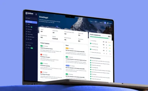
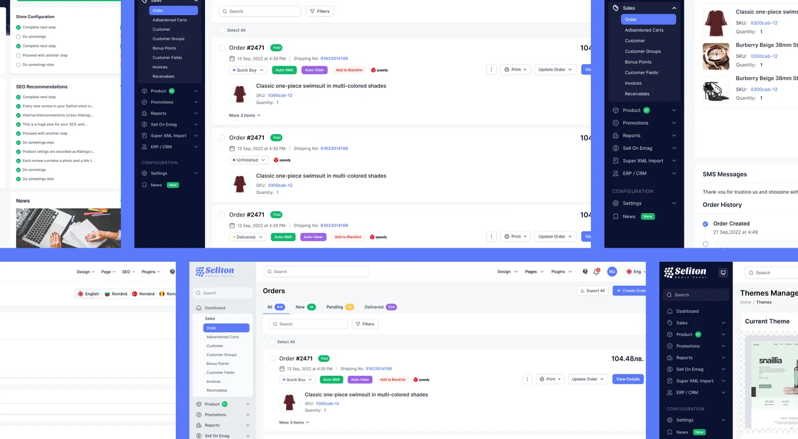
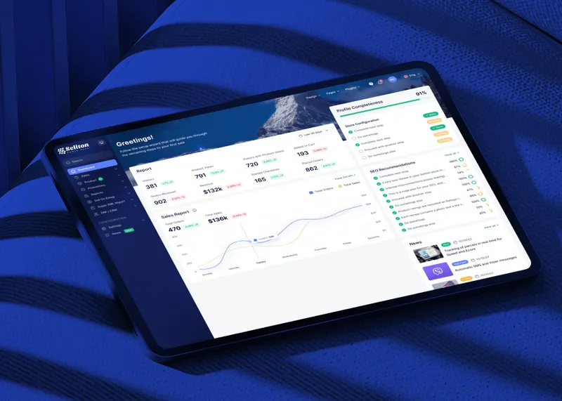
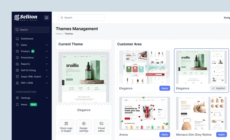
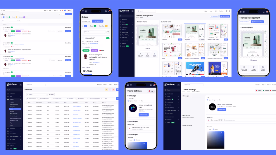
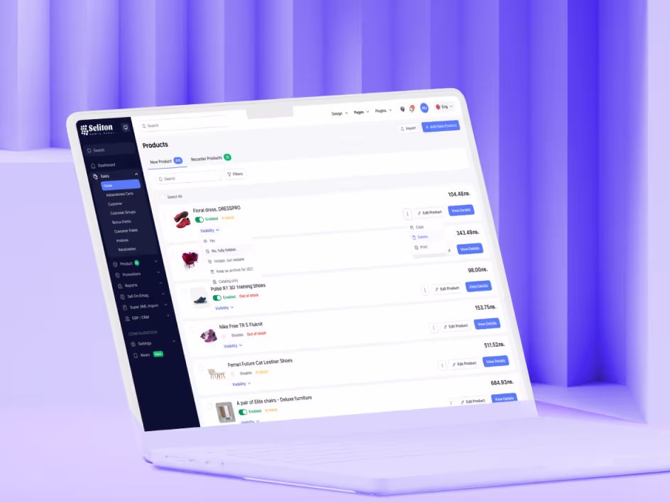
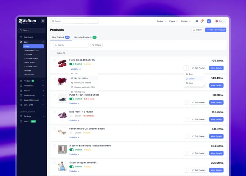
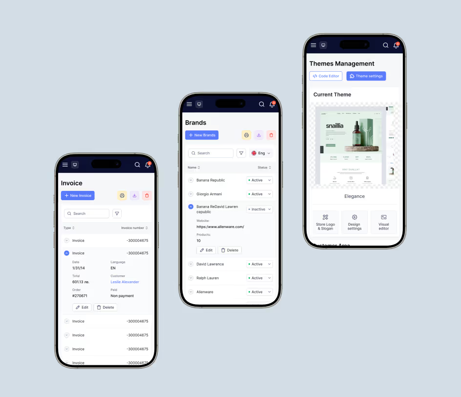
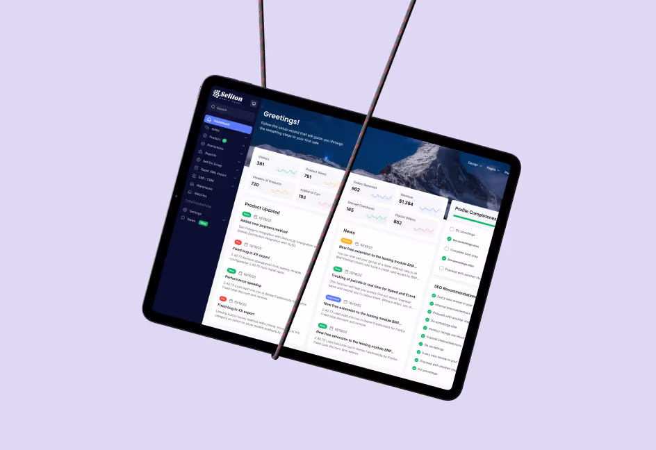
Visual Output
The final website was clean, modern, and designed to make shopping easy. Navigation was streamlined, and key actions like searching, filtering, and purchasing were intuitive. The design also adapted perfectly across devices, ensuring a consistent experience for users on desktop and mobile. Marketing banners and product displays were designed to be visually engaging without distracting from the core user experience.
Conclusion
Seliton’s new website has transformed how users interact with their platform. The updated design is easier to use, visually appealing, and ready to scale as the company grows. By addressing the problems with their old website, we helped Seliton provide a better experience for their customers while building a strong foundation for their future.