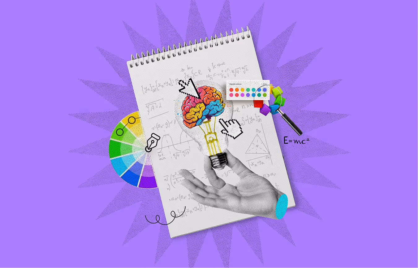
Color theory is a fundamental concept in design that helps create visually appealing and effective compositions. Designers have the knowledge of how colors interact, which is essential for designing a website, a logo, or a marketing campaign.
Understanding the color wheel and harmony is key to choosing the right colors. To get your point over and trigger the feelings you want, it helps to understand how they interact with one another.
Let's learn more about what color theory is, different types of color wheels, schemes, their components, how to use color effectively in design, and more.
Color theory is focused on the interaction of different colors which make for good designs. It is based on three main concepts; color harmony, the color wheel, and color application context.
The color wheel depicts red, blue, and yellow as primary colors while green, orange, and violet, in that order, as secondary colors. Designs can also be balanced by using complementing colors directly opposite to each other on the wheel.
Color harmony refers to the choice of colors that seem to match or go well together. The right selection of colors evokes feelings of calmness, energy, and liveliness.
The context of color application looks into different environments where colors are used. The mood, purpose, and intended audience of a design help dictate the colors to be used. These principles create appealing and effective designs as a result.
A color wheel is used to understand the connection and interaction between colors. It depicts their interactions or how they are related. Sir Isaac Newton was the first to make a color wheel in 1666.
There are two different types of color wheels: additive and subtractive. The primary focus of the additive color wheel relates to light and its various wavelengths. It explains how different hues are formed by merging primary light colors like red, blue, and green.
However, the subtractive color wheel expresses how colors are made by removing light using colorants such as paint and other pigments.
The primary colors on this color wheel are red, yellow, and blue. Artists and designers have used this color wheel to produce different shades and tones.
The Color wheel is an incredibly knowledgeable instrument for understanding the relationships of colors. This tool is beneficial to designers and artists in figuring out appealing combinations. Let's analyze the primary, secondary, and other colors found on the wheel.
The origin and foundation of the color wheel consist of yellow, red, and blue, known as the primary colors. These colors are the building blocks for making all different hues and cannot be created by mixing other colors. Designers use these colors to make a wide array of shades and tones. You can create secondary and tertiary colors by blending the primary colors.
The orange, green, and purple colors are secondary colors positioned between the primary colors on the wheel. These colors provide a greater variety of color schemes, which helps in the development of design projects.
Tertiary colors appear when a primary color is mixed with a secondary color. More complex than primary or secondary colors, tertiary hues fall between the various primary and secondary colors on the color wheel. An example of this would be red mixed with orange, which gives a reddish-orange color; other examples are yellow, green, or blue-violet. Having more levels of colors improves the overall aesthetics of a design since these hues are more dynamic and set the focus on certain elements of the composition.
Analogous colors are next to each other on the color wheel. They are of similar values and hues and, as such, are easy to blend when designing. They often form a palette that does not conflict or clash. One common rule is taken together with secondary colors like orange and yellow. In this case, red is the dominating color, orange is the secondary color, and yellow is the accent. Designs with a calm, warm, and restful feeling will combine these colors.
Complementary colors are pairs of colors that appear on opposite sides of the color wheel. When used together, they are most intense. For example, blue and orange complement each other as they stay on the wheel. Utilizing complementary colors in a design allows certain aspects to protrude and can make an eye-catching, bold design. They are mostly used in designs to attract viewers' attention or achieve strong visual effects.
Different hues can spark feelings and meanings based on their setting and context. Here are some popular relationships with colors:
Neutral colors such as white, gray, brown, and black can be mixed and matched effortlessly. They are suitable for many color combinations and bring balance and order. For example, white can tone down the intensity of hot reds and cool blues and make them easier on the eyes.
Neutrals also tend to reduce the intensity of more dominant colors or constructively balance them. They add crucial flexibility when creating seasonal themes, like using white to balance red and green in Christmas decorations.
Cool colors like blues, violets, purples, and greens usually establish a focus and a relaxed environment. They are permitted in places or settings seeking peace and quiet.
Cool tones always connect with coolness and calm feelings, and make them perfect for spas or therapy centers. A massage parlor, for example, could employ shades of blue and green to put patients at ease. They look perfect together and help portray a sense of space and depth.
Warm colors, including reds, oranges, and yellows, are linked to energy, warmth, and activity. These colors are known for their vibrant and lively qualities. They are often used to stimulate excitement, passion, or enthusiasm.
Warm colors create a cozy and inviting atmosphere, so they are frequently used in environments where energy is needed. For example, a fitness center may incorporate warm tones to motivate people and enhance their focus during workouts.
In a design, color harmony is an arrangement of colors that ensures visual balance and appeal. In simpler terms, it is the method of making a design attractive to the eyes. Cohesive, appealing, and inviting designs are achievable through the skillful use of well-balanced colors, while a poor show can result in a dull and chaotic work of design.
Moderating between these extremes ensures harmony. This type of balance helps give visual stimulation without bombarding the viewer. Creating harmony in the web, logos, designs, and art can create a pleasing experience owing to the balanced visual appeal.
Here are seven harmonious color schemes that can help bring balance and energy to your work.
A triadic color scheme is one of the most popular and balanced combinations. On the color wheel, three colors are spaced evenly apart. This means that each of the three colors is at an equal distance from each other. When you use a triadic scheme, the trick is to make one of the colors dominant while the other two serve as accents.
For example, you might use blue as your primary color and add red and yellow as accent colors. This scheme creates a vibrant and energetic look. But it’s important to balance the saturation and tone of each color so the combination doesn’t overwhelm the viewer.
A tetradic color scheme involves four colors and two sets of complementary colors. On the color wheel, complementary colors are opposite each other. You’ll choose one color and its complementary hue to create a tetradic scheme. Then, you’ll do the same for another pair.
This scheme offers a rich, diverse palette, but it can be tricky to balance. Pick one color as the dominant hue and use the others as accents. Tetradic color schemes are great for designs that require much contrast and complexity.
Similar to the tetradic scheme, the square color scheme uses four colors. However, the difference is that these four colors are spaced evenly around the color wheel, 90 degrees apart. The result is a vibrant and highly versatile palette that works well in bold and subtle designs.
It's often helpful to focus on one or two dominant colors and use the other colors as accents to make the most of the square color scheme. This also creates a lively, balanced look that isn’t too overwhelming.
One of the most classic and widely used color schemes is the complementary color scheme. It consists of one primary color and one secondary color from the color wheel. For instance, red and green, blue and orange, or yellow and purple. These colors are directly opposite each other on the wheel, which creates a striking contrast.
When used correctly, complementary colors can make your design pop. However, be careful with the intensity of these colors; using them in their purest form can be too strong. You can use tints or shades of the colors to balance it out.
The split-complementary color scheme is a twist on the traditional complementary scheme. Instead of using two directly opposite colors, pair one color with the two colors adjacent to its complementary color.
If you choose blue as your base color, instead of using its complement (orange), you could use yellow-orange and red-orange. This creates less tension than a traditional, complementary scheme but maintains a good contrast. It’s an excellent choice for variety and contrast without the intense clash of complementary colors.
As the name suggests, a monochromatic color scheme uses just one hue. The difference comes in how you manipulate that color. You can use different shades, tints, and tones of that color to create variety. For example, if your base color is blue, you can make variations of blue by adding black to get navy, white to get light blue, or gray to get a muted tone.
This scheme is simple and harmonious and perfect for designs that require subtlety and consistency. The monochromatic scheme often exudes calmness and unity.
An analogous color scheme consists of colors next to each other on the color wheel. These colors are naturally blended and create a cohesive and serene look. For instance, you could choose blue, blue-green, and green for your palette.
The key to a successful analogous scheme is to have one dominant color, with the others serving as supporting hues. This color scheme is commonly found in nature, such as in sunsets or forest landscapes, and it brings a peaceful, harmonious feeling to any design.
Color models are mathematical representations that describe how colors can be represented as values or coordinates in a color space. Three widely used color models are RGB, CMYK, and HSL, each with distinct applications and characteristics.
The RGB color model is based on the principle of additive color mixing. This model creates colors by combining different intensities of three primary colors: red, green, and blue. The values for each color range from 0 to 255, where 0 represents no intensity (absence of color), and 255 represents full intensity.
The RGB model is commonly used in digital displays such as monitors, TVs, and cameras because it directly corresponds to how light works in these devices. When all three channels are set to their maximum values (255, 255, 255), the result is white, and when all are set to 0, the result is black.
The CMYK color model is primarily used in color printing. It is based on the subtractive color model, which works by subtracting varying percentages of the primary colors from white light. This model uses four color channels: cyan, magenta, yellow, and black (key).
Unlike RGB, where colors are created by light, CMYK creates colors by subtracting light through ink, with each color subtracting specific wavelengths.
For instance, cyan absorbs red, magenta absorbs green, and yellow absorbs blue. Black is used because combining cyan, magenta, and yellow often doesn’t produce a true black, so an additional black ink is included for depth and clarity.
The HSL color model represents colors in a cylindrical coordinate system and is often more intuitive for humans. It uses three components:
The HSL model is frequently used in graphic design and image editing because it allows for easy adjustments to color without changing its core characteristics, like hue, by adjusting lightness or saturation.
Hue is just another word for color. It's the basic color we see, like red, blue, yellow, or green. Think of a color wheel. Each section is a different hue. So, when someone asks, "What color is that?" they're asking about the hue. Hue is the foundation of color. Every color starts with a hue. Warm colors like red or cool like blue, hue give the color its identity.
A tint occurs when you add white to a color, lighter than the original color. For example, mix red with white. You get pink. That pink is a tint of red. It's the same color but lighter. The more white you add, the lighter the tint becomes. Tints are often used for soft, pastel colors. They look calm and soothing.
In graphic design or painting, you can create a variety of tints to give your work a gentle feel. Adding a tint can make a color feel airy or light-hearted.
A tone is created when you add gray to a color. Gray makes a color less vibrant, adds depth, and softens it. For example, mix blue with gray and you will get a more muted, subtle blue. That's a tone of blue. Tones aren't as bright or intense as the original color. They can make a color look more sophisticated. Tones are great for designs that need to feel calm or professional. Using tones in your designs gives you more variety. Instead of pure colors, you can use tones for a more refined look.
A shade is created by adding black to a color, making it darker. For example, add black to red. You'll get a darker red, like maroon. That darker red is a shade of red. The more black you add, the darker the shade. Shades can add a sense of drama or mystery to your designs. They can also make colors look richer and more profound. In design, shades are used to create contrast and focus. Darker shades stand out more and make a bold statement.
It is very important to select the proper and perfect color scheme to make your design more effective and aesthetically pleasing. Here are the details on how to select the perfect color scheme.
Start by gathering inspiration from various sources. Nature, art, architecture, and daily life can provide excellent color ideas. Look at objects, places, or scenes that catch your eye. Pay attention to how different colors interact in real life. These observations will help spark ideas for your design’s color scheme.
Every design should have a specific mood or feeling. Colors play a significant role in setting that mood. For example, warm colors like red and orange are energetic and bold, while cool colors like blue and green give off a calming and serene vibe. Decide what kind of mood you want to convey. Is it something playful and fun or more professional and sophisticated? This step will allow you to narrow down the color choices to those that best express the mood of your design.
The context in which the design will be seen is also essential. For example, colors that work well for a website may not be suitable for a printed brochure. Consider the medium you’re designing for and how colors will appear in different lighting conditions. A color that looks great on a screen may not have the same effect when printed. Keep in mind how your colors will be perceived in various environments.
A great way to select colors is by using the color wheel. Understanding how colors interact with each other can make the process easier. Complementary colors, opposite each other on the color wheel, create strong contrasts. Analogous colors, located next to each other, produce a more harmonious feel. Triadic schemes, which use three evenly spaced colors, offer balance and variety. Experiment with different combinations to see which ones work best for your design.
After selecting your colors, create some design drafts. Play around with different combinations and placements of colors. Check how they work together in various elements of your design. Ensure the colors and the overall message you want to communicate support each other. Adjust the shades, tones, or palette to make everything fit just right. Don’t be afraid to experiment and make changes until you’re satisfied.
A color scheme conveys much meaning. Let's explore how to pick a color palette that reflects your brand and connects with your audience. Choosing the right colors helps tell your story and create a memorable impression.
Know your audience inside and out before you choose any colors. Color is seen differently by different generations, ethnic groups, and individuals based on their own life experiences. People of a more senior age tend to choose subdued, elegant tones, while those of a younger generation go toward bolder hues. By being aware of these subtleties, you can ensure that your color scheme strikes an emotional chord with your audience.
Do some background reading on your target demographic. Which hues captivate their attention? What do they like? Investigate the color schemes successful companies use in your target market to see what works. How do you make a statement with color that won't go out of style? You must first know who you are designing for to ensure your appropriate color selections.
The field of "color psychology" examines the mental and behavioral effects of various hues. When choosing colors for your brand's visual identity, it's important to have a basic grasp of color psychology. Certain hues are used for industry-specific purposes, and every hue has connotations.
Many financial institutions and IT organizations choose blue because it conveys professionalism, serenity, and trust. Brands often use red when they want people to feel strongly about something or take action because of the positive associations it has with these words. Conversely, the health, wellness, and environmentally conscious sectors often use green because it represents progress, vitality, and longevity.
Consider the feelings you want to evoke in the viewer before selecting colors. Is a sense of calm, vitality, or inspiration what you aim for? If you convey the correct message about your business and connect with consumers on a deeper level, you need to align your color palette with these psychological triggers.
You can refine your options now that you know who you're designing for and how color psychology works. A color palette usually has one primary hue that establishes the mood and character of your brand. This hue will symbolize your brand because of its prevalence in your design.
A selection of accent colors is required in addition to the primary color. Without becoming too dominant, these secondary hues amplify the impact of the primary hue. Use accent colors to draw attention to important parts of your website or app, such as navigation buttons or calls to action.
One primary color, many secondary colors, and a neutral background or text color make up a well-balanced palette. Remember that there are no hard and fast rules; how you mix these colors will reflect the character of your brand and the atmosphere you want to create.
Contrast is key to making things easier to read and use. The level of contrast between the backdrop and text affects design readability, but users may feel overwhelmed by an excess of contrast.
A decent rule of thumb is to set a contrast ratio high enough to highlight important details to avoid eye strain. For instance, you can make explicit, easy-to-read material using a bright background and darker font color. Keep readability in mind when experimenting with accent colors for headers or buttons.
Sometimes, less is more when it comes to color schemes. While using a rainbow of hues may be tempting, sticking to a small palette can provide better results. Too many colors may confuse users, and the design may seem chaotic.
Some time-tested color palettes include monochromatic, similar, or complimentary hues. On the color wheel, opposite each other, complementary hues like orange and blue provide a striking contrast. Blue, blue-green, and green are adjacent on the color wheel and provide a harmonious appearance when used together. Employing varying tones of a single hue in a monochromatic design creates an air of simplicity and minimalism.
Pick a unified design that complements your style. Stick to a muted color scheme to maintain an air of professionalism.
Finally, test your color palette to ensure it works in real-world applications. Screen, lighting, and device variations may affect the perceived color of an object. Find out how your color selections impact the user experience by doing user testing or gathering input from your team.
Keep in mind that a color scheme is always subject to change. Change it up as your brand develops or in response to comments. Maintaining consistency while being open to adjustments as needed is crucial.
A successful design relies on a well-considered color palette. There are some useful tools for this. Below are a few of the best choices:
Coolors stands out as an incredibly intuitive tool for creating color palettes. Fresh color combinations are generated with just a click of the space bar. It allows you to discover new ideas quickly. If you stumble upon a palette you like, fine-tuning each color is simple. The tool also has built-in accessibility features, like color blindness adjustments, ensuring your palette works for everyone. Exporting the palette into different formats makes it convenient for various design projects.
Paletton operates differently by giving you a color wheel with which to work. Start by selecting one base color, and watch the tool generate harmonious shades in schemes like monochromatic, analogous, or triadic schemes. It's convenient for web designers since you can preview how the palette looks within a layout. Testing different combinations on the fly makes it easy to explore all possibilities.
For those designers who have already embedded themselves in the Adobe ecosystem, Adobe Color is a great option. Beyond creating palettes, Adobe Color offers features like color harmony rules to guide your choices and ensure that all your colors are balanced. You can also upload your images, and Adobe Color will pull out a palette based on the photo's dominant colors. It's not just for web and graphic design; it works seamlessly across various design disciplines.
If you're searching for color inspiration based on real-world visuals, Muzli's Colors is a great option. You can upload an image, and the tool will pick out the primary colors to create a ready-made palette. The tool doesn’t just offer colors; it also suggests complementary schemes and helps you make balanced and fresh designs. Perfect for anyone who wants a color palette inspired by real-world images and trends.
Canva is a popular design tool that simplifies color theory for users. It offers pre-made color palettes and a color wheel and helps users choose harmonious color combinations. The canvas palette generator allows you to upload images and automatically create a color scheme based on the image’s dominant colors. The platform also includes a “Color Palette” feature, which shows complementary, analogous, and triadic color schemes. Canva’s user-friendly interface ensures smooth color exploration and application across different design types.
You can find a wealth of carefully selected color palettes on Color Hunt; all it takes is a few clicks to be inspired. It's perfect when you need a color scheme fast but don't want to waste time creating one from scratch. The platform has many browsing options, categorized for various moods and design styles. You can save your favorites for future reference and quickly implement them into your projects.
By using deep learning to create color palettes, Colormind adds artificial intelligence to the mix. The tool's AI is trained to create beautiful color combinations based on popular designs, ensuring you're always in line with current trends. Providing a base color or letting Colormind start from scratch will generate visually appealing and modern palettes. It's an excellent tool for designers looking for fresh, on-trend color schemes without much effort.
Color theory is important in web design and impacts users' interactions with a site and their perception of a brand. Here are some notable benefits of color theory:
Colors are powerful tools that influence emotions and behavior. Choosing the right colors can encourage users to take action, like clicking on buttons or making purchases. For instance, red can evoke urgency and is ideal for sales or promotions. In contrast, calm colors like blue or green can make users feel relaxed and secure, which is important for websites related to healthcare or finance.
Color theory helps establish trust, especially in industries where credibility is key. Banks and financial institutions often use blue to symbolize trust and stability. Likewise, law firms use darker hues like navy blue or maroon to project authority and professionalism. When colors align with industry expectations, they can instantly build confidence in users.
A distinct color palette can strengthen brand identity. Colors are often associated with specific emotions or concepts. For example, green represents sustainability and nature, so eco-friendly brands often use it. Choosing the right colors helps businesses communicate their core values visually, making it easier for users to identify and connect with the brand.
An important part of making a website user-friendly is using color. High contrast between text and background colors ensures readability, while the right color choices can make navigation intuitive. For example, call-to-action buttons are often in contrasting colors to draw attention, prompting users to take specific actions. A well-designed color scheme ensures a seamless and enjoyable user experience.
Multiple cultures assign different meanings to different colors. Red may symbolize luck in some cultures but danger in others. Understanding the cultural context of colors is essential when designing for a global audience. Using culturally appropriate colors ensures that the brand message resonates with users across different regions.
Color psychology is a key element in web design. Certain colors can trigger specific psychological responses. For example, yellow is often associated with optimism, while purple may symbolize luxury or creativity. By understanding color psychology, designers can strategically choose colors that align with their website's goals.
A carefully chosen color scheme can directly impact conversion rates. Colors like green, for example, are linked to positive action and success. A website using colors effectively may see improved engagement and higher conversion rates as users feel more comfortable and compelled to interact with the site.
A user's emotional connection can be evoked via the use of color. Websites that use color thoughtfully can elicit positive emotions and give users a sense of belonging. For example, home décor websites often use warm, inviting colors to make users feel comfortable, encouraging them to explore more and stay longer.
The use of color on a website may aid in creating a sense of visual hierarchy. Designers can use contrasting colors to emphasize essential elements like headers, buttons, and navigation menus. This makes it easier for users to focus on key parts of the page and navigate the site effortlessly.
Color theory is more important than ever in 2026. It is a powerful tool for web designers that helps shape the user experience and convey a brand’s personality and values. Here are some of the latest trends:
In 2026, a minimalist approach to color palettes continues to thrive. A clean, simple color scheme can make a website look modern and sophisticated. Using fewer colors allows the design to remain visually appealing without overwhelming the viewer. Minimalism helps focus attention on key content and enhances readability.
For example, Apple uses a limited color palette of whites, blacks, and grays to emphasize the sleekness of its products. The simplicity creates a calm and seamless user experience. Using a minimalist color palette, brands can highlight their message and allow their products or services to stand out without distractions.
Bold, high-contrast colors are becoming a dominant trend in web design. This technique grabs attention and directs users to essential actions, such as calls to action (CTAs) or key information. Bright, eye-catching colors are used against dark or neutral backgrounds to create a strong visual hierarchy.
Brands like Spotify use this strategy effectively by placing bright green accents on dark backgrounds. This design creates a dynamic and energetic feel. It makes the website more engaging and encourages users to interact with it. High-contrast color schemes make text and elements easier to read for everyone, including those with visual impairments.
Warm, earthy tones are gaining popularity as they evoke a sense of authenticity and connection to nature. Colors like terracotta, olive green, and mustard are being used to create a welcoming and grounded atmosphere. These hues help brands communicate trust and sustainability, which is crucial for healthcare, eco-friendly products, and food industries.
Patagonia, for example, assumes these earthy tones to reflect its commitment to environmental conservation. Using natural colors supports their mission and resonates with customers who value eco-conscious practices. Warm tones can also create a cozy and inviting feel to make users feel more connected to the brand.
Gradients have evolved from a 2010s trend to an essential design tool in 2026. Vivid gradients, where colors transition smoothly from one to another, add depth, movement, and excitement to web designs. This technique can be used as background elements, buttons, or logos.
Instagram is a perfect example, utilizing a purple, pink, and orange gradient to create a dynamic and youthful vibe. Gradients help brands stand out visually while making their sites look more dynamic and fresh. They allow for creative expression and a modern look, providing a sense of depth and dimension that flat colors cannot achieve.
Personalization is the latest key trend, and allowing users to choose their color schemes effectively enhances the user experience. Personalized color options let users create a browsing environment based on their preferences. It makes the website feel more customized and comfortable for them.
For example, Adobe Creative Cloud enables users to adjust the interface's color scheme based on their liking. This feature promotes user engagement by letting visitors feel more connected to the site. Customization options help users with different preferences or accessibility needs enjoy the website in a way that works best for them.
Neon and electric colors have returned in 2026, especially among bold, modern brands. These colors stand out in a crowded digital space, evoking excitement, energy, and playfulness. Neon accents are often used sparingly, highlighting essential elements like buttons, promotions, or key messages.
Nike and Glossier utilize neon accents on their websites to create high-energy designs that resonate with younger audiences. Bright, neon hues can create a sense of urgency, which benefits sales or limited-time offers. Brands looking to make a statement or capture their audience's attention increasingly turn to these vivid, bold color choices.
Color selection is extremely sensitive, but it is vital to branding and marketing. To begin, designers must appreciate the power of colors. Only then will marketing campaigns be backed by color choices that aren't biased toward tradition but aim to maximize emotion.
Choosing a color scheme is only the first step. Understanding how different colors work together is crucial to achieving emotionally engaging and aesthetically pleasing designs that grab the audience's attention. As new tools and design strategies appear, there will always be a need to understand color theory to achieve perfection.
A secondary color is formed by combining two primary colors; in this case, blue and yellow give green, yellow and red give orange, and red and blue form purple. These combinations form the foundation for secondary colors in design.
Secondary colors have the potential to add an extra touch to a design without being overpowering. As such, they can be used effortlessly to enhance a brand's visual identity. Adding a secondary color can make a brand's identity more unique.
Definitely! Secondary colors can be incorporated into logos to garner extra interest and intrigue. While secondary colors refine a logo, primary colors bring directness and saturation. Therefore, they can also overpower a logo's design.
While secondary colors have the potential to be useful in many industries, businesses such as law firms, financial institutions, or even healthcare providers may seem more credible, overriding primary colors such as blue or red.
Secondary colors enhance comprehension by helping distinguish important parts of the design. They set apart the primary aspects of the design, such as the heading, subheading, or buttons, allowing easier navigation through the design.


An Experience Design Agency focusing on building functional, simple, human-centered digital products for future.