Colors are one of the most important parts of design as they affect the feel and the perception of an object or a space. Color theory delineates two main classes of colors: warm and cool colors. Energetic spaces are formed by the warm colors of red, orange, and yellow, which make spaces feel intimate. Blues, greens, and purples are cool colors that engender a sense of calm and peace. Combining colors and their multifaceted attributes enables you to manipulate your designs' feelings. Let's examine the relations between warm and cool colors, their science, and some practical tips for blending them for the utmost impact.
Warm colors remind someone of warmth, energy, and comfort. This color group typically includes red, orange, yellow, and other shades stemming from these colors. A calm sunset, a campfire’s illumination, and the warmth of autumn leaves are all perfect examples of warm colors in nature. Red, orange, and yellow represent warmth and comfort.
Red is connected to passion and excitement, while yellow is linked to happiness and optimism. A mix of red and yellow in orange feels dynamic and inviting simultaneously. Warm colors are utilized in digital design and different forms of art to cultivate a relaxed and intimate feeling, which makes the area feel more lived in.
Few colors manage to get as much attention as red. With its fearless and energetic nature, red epitomizes love, passion, enthusiasm, and even urgency. It also stands out the most when warning signs or notifications are issued in visual formats since it is the first color a person’s eyes will go to.
When used with caution, red evokes an illusion of excitement and prompts consumers to take rapid action, such as pressing a button or making a purchase. Additionally, red can emphasize essential design elements such as warnings or faults. However, balance is key since much red might make the user feel attacked by the design.
While the eyes are usually more careful when exposed to red, just like any intense hue, users combine it with softer colors to adorn walls or paint it alone to avoid visual fatigue. In moderation, red can be paired with soft colors or used alone in more open settings.
Orange combines the vivacity of yellow with the warmth of red to create a vibrant and dynamic hue. Similarly, this makes it a great option in digital design due to the love, passion, inventing, and fun feelings that it represents.
The color orange makes the design stand out and enhances overall comfort for users. It is disguised in areas such as buttons, links, and banners that require focus or action. Softer and more engaging than red, orange is preferred by many. This means orange can be applied as a primary or accent color in designs.
Companies that wish to project creativity, warmth, and even a bit of risk desire orange as the preferred color. Besides, it does not overshadow blue or green because orange goes well with both colors.
Yellow, the brightest warm color, is linked with positivity, happiness, and being in the spotlight. In digital design, yellow best focuses on significant areas like alerts, key features, or promotional material. While easy to spot, those with light sensitivity could find it too glaring.
Like every other color, when overused, yellow can be intrusive. Yellow, when used along with darker or more neutral shades, has the potential to set the perfect mood.
Yellow could be used on health and wellness websites to attract visitors’ attention and make them happy. The color is upbeat and, as a result, friendly and warm, which makes it ideal for creative designs targeting younger audiences. If applied well, yellow can highlight key factors in a design without jeopardizing the welcoming feel of the design.
Cool colors include blue, green, and purple. These colors are also referred to as calm colors, and they are used in creating web pages, graphics, and applications. These colors express calming effects and can be employed in user-friendly designs. Blue is often associated with loyalty and competence. Green is commonly used to represent vigor and well-being. In contrast, purple can help in creating a creative and luxurious mood.
Cool colors help reduce sight fatigue and facilitate prolonged engagement with the content. They also increase legibility, especially in applications and websites where users spend much time looking at the screen. By providing balance and peace, these colors significantly enhance the user experience.
Blue is the easiest color to find in digital marketing. That is not difficult to understand as the color blue represents trust, professionalism, and reliability. In website design, blue is the go-to color for buttons, headers, and links in the finance, technology, and health industries. Because of its calming qualities, blue is great for helping to relieve anxiety which is beneficial when designing user-friendly interfaces.
Shades of light blue are great for backgrounds while medium and dark blue are better for use in text or call-to-action features. Blue is beneficial for both corporate and casual designs, which helps in creating a feeling of dependability and uniformity. In addition to that, blue contributes to a positive user experience which makes it easier to use apps and websites that aim to be user-friendly for a long time.
In addition to blue, green serves as a calming color that is useful for web design and branding. It is suitable for businesses that promote eco-friendly products and services and wellness industries because it is associated with nature. Green is commonly utilized in web design to celebrate the success, since it is the color that indicates positivity in confirmation messages or buttons.
It is also used in health-related mobile apps and websites, fostering harmony and peace. Darker shades of green can be used on text while the background elements or icons can be painted in vivid tones of lighter green. Since green relieves stress on the eyes, it suits well for mobile programs that users consume for extended durations. Green's ability to maintain calmness and balance is necessary when designing a welcoming digital environment.
There is no end to creativity when it comes to purple. The color combines the peace of blue with the stimulating energy of red while being linked with luxury, kings, and creativity. In digital design, purple aids in interfacing elegance and ingenuity.
Darker shades of purple are regal and ephemeral while lighter variations like lavender can be calming. Purple is a fantastic branding color when it comes to beauty, fashion, artistry, or anything luxury as it exudes sophistication. Purple is perfect for call-to-action buttons and icons as it stands out but is not obnoxious.
To determine whether a color is warm or cool, one must look at its tone and base colors. Below is a simple method that will enable you to assess the temperature of a color:
Identify the Primary Dominant Hue: Look at the color and analyze its various ranges to assess its primary hue: red, blue, yellow, or green. This will categorize the color intelligently.
Explore the Undertones: Search for evidence in the color itself. For example, red with some blue is cooler than red with some yellow. This is essential because most colors are not pure solids but warm or cool lean combinations.
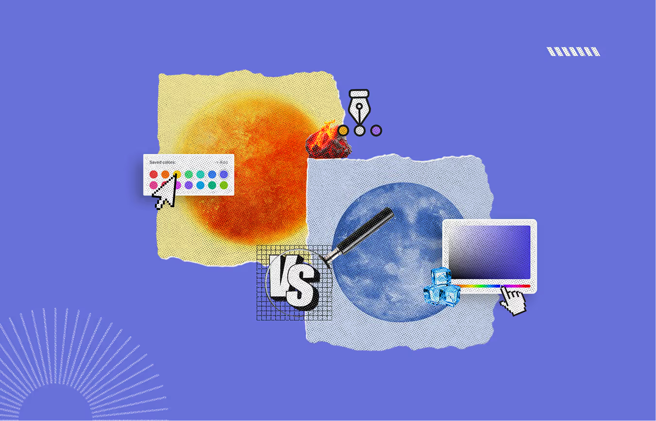
Use the Color Wheel: In areas like interior design and color theory, the wheel is an imperative piece of the puzzle. The left half of the wheel (reds, oranges, yellows) depicts lowers, while the right-hand side (blues, greens, purples) depicts coolers. This illustration can help us understand a color’s temperature to other colors.
Consider Context and Lighting: Temperature is perceived thematically differently by people on the outside than by people inside a room. Sunlight tends to do its magic beneath and hyping colors, while artificial lights do the opposite. Truthfully, colors put side by side affect one another. One may appear dark while the other seems light; one may appear juicy while the other seems feeble.
The following outlines the distinctions between warm and cool colors in digital design, particularly in web design, graphic design, and application design.
Exciting colors like red, orange, and yellow are known for evoking feelings of enthusiasm, warmth, and passion. They depict energy that is spirited and lively. The attention of the target audience can be obtained in a fraction of a second. Such colors can often make the design look inviting and bold as well. Tranquil colors like blue, green, and purple evoke a soothing effect. They assist in tranquilizing moods as well as establishing a feeling of trust. It also makes them perfect for companies looking to express professionalism or calmness.
Warm colors that are likened to the colors of sunlight or fire are associated with warmth. These colors represent a sense of cohesiveness and are usually associated with intensity. Warm colors can also be used to accentuate significant design components on the page, such as buttons or calls to action, which require the audience to pay attention. Cool colors resemble water or the sky, which evokes a sense of coolness. Therefore, these are usually the choice of color for the large areas of background where the inclusion of a spacious, comfortable feeling is desired.
Energetic colors are often employed in the branding of websites or organizations that wish to project passion and liveliness. For instance, McDonald's, fitness brands, or even some gaming websites tend to use red, orange, and yellow as they incite excitement. Those businesses that wish to project professionalism and reliability, like technology firms, banks, and medical sites, usually apply cooler tones. Blue, for instance, is often used since it is thought to depict trust and dependability.
Warm colors offer a high degree of contrast to neutral backgrounds and are, therefore, easy to locate in buttons, headlines, and other visually focal points of an application or website. However, their overuse can be visually displeasing. As cool colors are softer, they are more soothing to the eyes and are therefore preferred for larger amounts of background or text. They help provide balance without overpowering the viewer. Thus, cool colors are, in a way, better when it comes to ensuring prolonged legibility on text-rich websites.
When analyzing space perception, it is clear that warm colors enhance the feeling of closeness and warmth to the viewer, thus drawing closer attention. That is why they are frequently used in design to attract the eye to particular items. In contrast, cool colors tend to push elements away, which increases the perceived size of the region. These colors are used to promote the sensation of openness and purity, especially with newly designed websites and applications.
Using contrasting warm and cool colors adds dimension, depth, and interest to the overall design. Below are some strategies that can enable you to achieve an effective integration of these colors:
In graphic design, warm colors such as reds, oranges, and yellows are particularly effective at grabbing attention. In website or mobile application design, you can incorporate warm colors into important features like icons, banners, and call-to-action buttons. For example, a call-to-action button that reads "Buy Now" can be more engaging if it's colored in bold red or orange. Warm colors are exciting and full of energy which makes them ideal for highlighting features of your design.
Purples, greens, blues, and these more fabulous shades can give depth and distance to a layout. When applied to web and app design, cool colors can be used for background elements or section dividers, which organizes the design and reduces clutter. For example, a website designed with cool-colored backgrounds allows warm-colored foregrounds, such as buttons and text, to be prominent. Further, using cool colors sets a tone of peace and space. They are also suitable for designs that promote tranquility or neutrality.
Employing warm and cool colors in a digital design gives great opposing visual contrast. As a result, the design stays interesting and engaging. In a graphic design or website header, place an orange-orange colored foreground against a blue-cool colored background. The warm orange pops against the blue, resulting in the warm and cool contents drawing more attention to the most vital aspects. By guiding users' eyes to certain elements using balanced warm and cool tones, your design can gain more beauty and focus.
When working with color temperatures in digital design, it is essential to know that the warmth or coolness of color can shift depending on the surrounding colors. For instance, a vivid red may look warmer in contrast to a cooler blue background and may seem cooler than a warm yellow background. This idea is referred to as the relative temperature of colors, and it can easily be used to manipulate users’ emotions by the colors selected for use.
Warm colors can bring buttons, links, and other hover-able elements to focus on digital designs. Because warm colors capture attention, these elements become more noticeable for the user. For example, in a calm blue website, the primary navigation bar can be blue; however, the “Sign Up” and “Learn More” buttons can be placed in warm orange and yellow.
Another important factor in digital design is color psychology. Warm colors can have very positive effects on users’ actions and emotions regarding your site or application. Energy, extreme urgency, and a positive mood are just a few traits associated with warm colors. Therefore, these colors are commonly used in call-to-action buttons, promo banners, or notifications.
Conversely, cooler hues like blue and green evoke serenity, trust, and relaxation, which makes them suitable for background elements, informational content, or services that seek to ease users.
Although there’s much temptation to use digital design in so many colors, maintaining a balance using colors is critical. When there are plenty of contrasting colors, the design can feel unorderly. To prevent this from happening, use a blend of warm and cool shades that go well together. For instance, applying blue shades on your background and warm highlights using orange or yellow for the focal points integrates the overall feel of the design. That design and a well-structured limited color palette present a professional appearance, which benefits the users.
As for web and app designs, cool colors can work as subtle accents. They can offer a relaxing effect in segments that don’t need an intensely high level of focus but still require polish and refinement. A good case in point is the usage of light blue accents in a minimalist website where certain text-heavy sections need to be understated. This helps make the content easier to process and enhances overall readability, crucial in user-centered design work such as blogs or informational websites.
Skillfully incorporating warm and cool colors can make any design project seem well-structured and emotionally engaging. There is beauty in moderation, and combining these colors allows you to achieve a harmonious balance that enhances the overall aesthetic. If you wish to invite attention to specific areas, these colors can help set the mood while creating a subtle visual focus. Using these colors in moderation will direct the viewer's attention to the main elements without overwhelming the space.
To achieve powerful design frameworks, especially when designing a website or even a brand identity, one needs only a little understanding of how to mix warm and cool tones. You'll be surprised how little testing is needed to create a perfect blend for any concept.
Warm colors like red, yellow, and orange make any experience vivacious and enjoyable while also drawing attention to actions that users can take, such as clicking buttons. However, blue, green, and purple have a soothing effect and are thus more relaxing and comfortable to look at.
Definitely! Thus, when used deliberately, cool colors such as cold greens and blues can be complemented by warmer colors to draw attention to key focal points and features that need to be highlighted. Warm colors can also be utilized in the background when cold hues are used as the primary focus to add an impression of calmness and space to the design.
We know warm colors are commonly used in marketing because they easily capture one’s attention and evoke excitement. Red, orange, and yellow are colors many companies in the online gaming industry, fast food businesses, and fitness sector often use as they urge users to take immediate action.
Restrict your use of warm hues to minor details to avoid overstraining your users. Integrate subdued colors and allocate them to critical graphic features like buttons or icons. This balances the designs so they are not overwhelming while focusing on vital aspects.
Cool hues such as green or blue can bring down people’s anxiety so they feel relaxed, which explains why they are so effective. Such websites often use these calming hues to evoke a sense of trust, focus, and calmness, which makes the users feel relaxed.


An Experience Design Agency focusing on building functional, simple, human-centered digital products for future.