Color is crucial in design, from websites and logos to artwork. At the core of every color palette are the primary colors: red, yellow, and blue. These colors form the foundation from which all other colors are created and are essential for visually appealing and harmonious designs.
Understanding primary colors is vital for designers, as they influence brand identity, evoke emotions, and guide user experience. Let's discuss the significance of primary colors in design, their role in branding, and visual appeal.
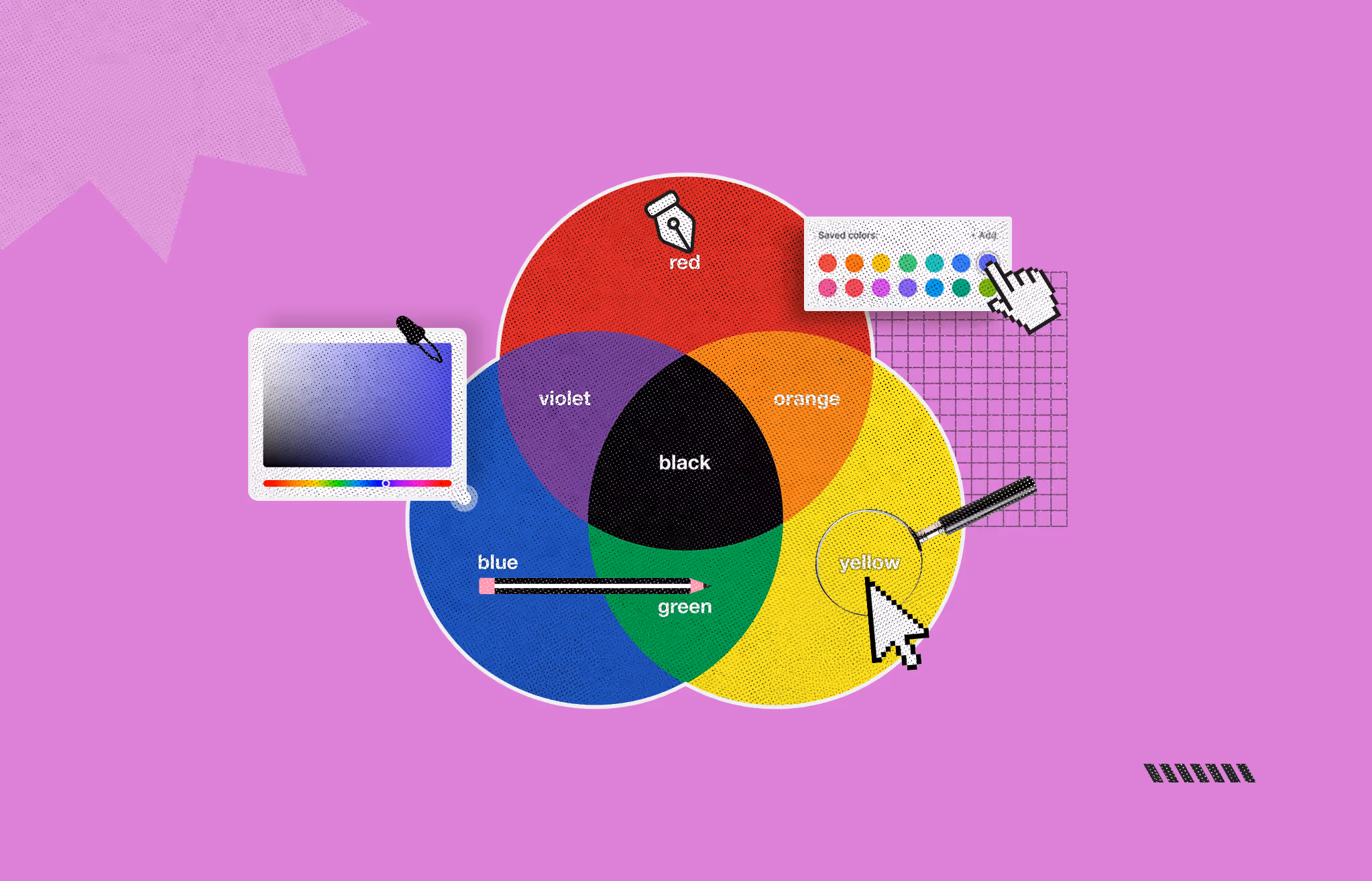
Red, yellow, and blue are the primary colors. They are the simplest colors one cannot obtain by mixing other colors. These are in one of the opposite segments in the color wheel. Mixing these primary colors produces secondary colors like orange, green, and purple.
Combining a secondary color with a primary one gives you tertiary and six other colors. You get each color on the color wheel through various combinations of primary colors. These fundamental shades form a base for different colors in art and design.
Here are the details of 3 primary colors:
Symbolism/Meaning:
Use in Branding
Fast food brands like Coca-Cola use red to stimulate hunger and grab people's attention. It shows energy, power, and excitement.
Hex Code: #FF0000
Symbolism/Meaning
Use in Branding
Yellow is prominent in numerous brands, such as IKEA and McDonald's. It is inviting and attention-grabbing. It is also associated with cheap products and kindness.
Hex Code: #FFFF00
Symbolism/Meaning:
Use in Branding:
Corporations that use blue in their logos, like Pepsi and IBM, have been able to communicate reliability and professionalism. The color is also favored by businesses looking to portray followership and assurance.
Hex Code: #0000FF
Color theory, the study of how colors interact and influence perception, has evolved significantly over centuries. In ancient times, philosophers like Aristotle believed that colors resulted from a mixture of darkness and light. This notion persisted through the Renaissance, where it was commonly accepted that all colors were combinations of black and white.
The 17th century marked a pivotal shift when Sir Isaac Newton conducted experiments with prisms, demonstrating that white light comprises a spectrum of colors. He introduced the concept of the color wheel, arranging these colors in a circular pattern to illustrate their relationships.
Johann Wolfgang von Goethe's "Theory of Colours," written and published in the nineteenth century, provided a psychological analysis of color perception by highlighting its subjective and emotional dimensions. French scientist Michel Eugène Chevreul also made waves in the art and design worlds at the time by investigating the rules of color harmony and contrast.
Albert H. Munsell developed the Munsell color system in the early 20th century. This system categorized colors based on hue, value, and chroma, providing a more systematic approach to color organization. This system laid the groundwork for modern color science and applications.
Today, color theory integrates scientific understanding with artistic practice, guiding disciplines from visual arts to design and psychology, reflecting its rich and evolving history.
In the human eye, color is seen through specialized cells called cone photoreceptors, which are sensitive to different light waves. There are three types of cones: S, M, and L.
The S, M, and L cones are very important for color perception in the human eye.
The S, M, and L cones are stimulated to differing degrees as photons hit the eye. The eye can perceive color because the brain processes signals from all three cones and their combination. This ability to see colors is called trichromatic color vision.
The human eye perceives a wide range of colors because the combination of the signals from the S, M, and L cones forms a multitude of colors. This way of perceiving color is called the Young-Helmholtz theory, which was proposed in the 19th century.
A model often replaces colors with electronic devices like printers and televisions. This enables a systematic arrangement of colors using numbers that can be reproduced in other devices. Professionals in design, printing, and digital media know these models as they are essential for their work.
Monitors and televisions utilize an additive color model that mixes red, blue, and green (RGB) light to produce different colors. Each primary color can be adjusted in terms of intensity, creating a wide range of colors. Black is considered the absence of light, and when it is added, it can produce different colors, which earns this model the name “additive.” When all three colors are used at their highest intensity, the light produced is white.
Paint mixing frequently adopts the subtractive color model, which uses the primary colors of cyan, magenta, and yellow (CMYK). This model is referred to as “subtractive” as it works with the white color of the paper. Using pigments, the color’s wavelengths of light get subtracted to create an array of colors. Blending the primary colors should produce black with the model, but it is much more complicated due to pigment problems. Therefore, more pigmented black ink (K) is added when printing to create a more authentic black and more accurate color reproduction.
The use of other models besides RGB and CMYK serves special purposes, such as:
Every color model has its functions, and the choice is based on the medium and the target result. Thus, RGB works best on monitors, CMYK is intended for printed products, and HSV or HSL models are suitable for processes where color changes must be made visually.
In digital design, the primary colors red, green, and blue (RGB) are very important in color creation and display on screens. These colors form the basis of the RGB color model which is an Additive color system and is used in all digital color displays such as computers, televisions, and mobile phones. Different shades of red, green, and blue light are mixed to create the various colors that appear on the screens. Designers can easily adjust the brightness of each color which grants them the ability to create distinct palettes for different purposes and audiences.
Every pixel on a digital screen today is formed by little components or sub-pixels that light up in red, green, or blue. Designers can always modify the brightness of these sub-pixels, which permits them to create a wide range of colors. A pixel made of pure red and green while having no blue will appear as yellow. This kind of flexibility is great when it comes to color control which is very important in web design, digital art, and user interface design.
Web Design: Colors on the World Wide Web are usually specified using Web Safe colors, meaning designers can easily use hexadecimal codes or RGB values. This makes web design easier, as they do not have to worry about the colors showing up differently on other devices or in other browsers.
Graphic Design: Other data-based artists use the RGB model to produce attractive as well as colorful images and clips. Specialized tools permit the artist to change the value of color channels making the work on complex pictures easier.
User Interface (UI) Design: UI design also hinges on color perception by understanding RGB models in formatting visually appealing and maneuverable interfaces. Enhanced usage of colors in a system increases the user’s experience and the readability of the interface.
Although the RGB color palette works perfectly for a computer screen, it is worth remembering that colors may be shown differently due to different display systems and adjustments made by the user. This is why designers spend much time using color management tools and profiles to help with the issue of crossed borders device’s color accuracy.
Adhering to the triadic color scheme of red, green, blue, or RGB is good practice when designing. These are the primary colors on which every other shade on a screen is based. This should be practiced to maintain a coherent outlook and not adversely compromise the professionalism of the work or the ease of understanding.
The first step is to understand clearly how the RGB model works. These three colors can be mixed in varying degrees of intensity so that any color can be created. The objective should be to ensure that all the choices of colors work together and go beyond being placed on the design together.
Begin by determining the color that singles out the design's feeling. For example, a calm and professional look can swirl around blue as the core color. Next, red and green should be increased while retaining the blue core's value. This permits moderation and balance in the design.
Always ensure that the text, backgrounds, and button color combinations highlight each other. Avoid applying excessively bright or powerful colors, which might distract your design. Use a few shades of red, green, and blue wisely throughout the design.
Ensure all other aspects of one part are incorporated into the design. A cohesive look is equally important for an app, website, or even a digital ad. Make sure that the shade is the same across all screens. Color codes or values must be used to guarantee consistency.
Finally, check how your design looks on different screens. Compare how the colors appear on a phone versus a computer screen; it is a good idea to see how your design looks on many other devices.
Primary colors are essential in graphics and web design. Knowing their importance will help you use them effectively in your designs.
The primary set offers the basis for all colors and their types. By varying the amounts of red, green, and blue light, designers can create a myriad of colors. They can mix light and create endless new colors.
Primary colors raise awareness and enable one to establish a strong brand identity. When it is identified carefully, these colors send certain feelings and associations which would in turn help a user remember the brand.
Primary colors capture the attention of web users. These colors can be used for key areas in the website such as call-to-action buttons which ensure an enhanced experience for the user as well as proficient navigation throughout the website.
The relationships of primary colors outline the basis for achieving composition for a designer’s work from the set of colors pleasing to the eyes and conveying the right message.
Design colors play a considerable role in the impact of a user's emotions and perception. For instance, blue can instill trust and calmness whereas red will probably induce excitement and urgency. Primary colors enable designers to manipulate a user’s emotions and reactions.
Maintaining streamlined branding across different types of platforms and devices is achieved with the use of primary colors. Such uniformity is important for preserving brand consistency as well as providing users with a seamless experience, no matter the point of interaction with the design.
Primary colors are not merely fundamental to the design. Instead, they are vibrant tools that communicate your content, guide opinions, and enrich a user's experience. The importance of primary colors in graphic design, web design, or branding will, without exception, enhance the focus of the desired outcome.
Yellow and blue help create compelling designs that reflect your audience and strengthen your brand. Most importantly, as simple as they are, mastering these colors guarantees appealing, convincing, and unforgettable designs.
Primary colors are largely employed in various designs because of the emotions they evoke. Red can evoke emotional excitement while also creating a sense of urgency. Blue projects trust and calmness, whereas yellow creates an overall feeling of happiness and optimism.
Primary colors help build strong brand recognition. Incorporating primary colors in the brand's logo gives it a particular identity that consumers immediately relate to and recognize without doubt.
Consistency in primary colors can be achieved using color profiles and management tools when displayed across different devices. These tools increase the probability of using the same color on different screens or printed materials by controlling and modifying how the colors are represented.
Primary colors play an essential role in the primary design of a website since they help create a visual structure and information architecture that guides users through the page's interaction. Using primary colors to mark important parts like buttons, heads, navigation, menus, etc., helps users focus on the areas that require attention, improving their experience.
In addition to primary colors acting as the basis, incorporating secondary elements such as type, images, and the layout itself can add to the overall aesthetic. For instance, using a bold primary hue as an accent alongside other neutral tones, textures, or patterns will provide balance and interest to the design.


An Experience Design Agency focusing on building functional, simple, human-centered digital products for future.