
Understanding design basics can change how you see the world around you. Design goes beyond aesthetics; it's a way to solve problems and communicate, crucial in graphic or UI/UX arts and architectural engineering. This guide is created for beginners curious about the principles that make designs practical and appealing.
Let's investigate core design basics such as balance, contrast, alignment, and repetition, which are crucial for creating visually engaging compositions. Learning the basics of design is essential whether you aim to become a professional designer or want to advance your creative projects. It builds a strong foundation in both the art and science of design.
Curious about what makes a design truly effective? It all starts with the basics. Balance is crucial to confirm that the design feels stable and visually pleasing. Contrast, however, helps to spotlight the key parts of your design by setting them apart from others. Emphasis is about drawing attention to the most important element, ensuring it catches the eye first.
Then there's the hierarchy, which helps organize your content so that viewers can easily understand the order of importance. Movement directs the viewer's eye across the page smoothly and intentionally. Pattern keeps things consistent, and proportion assures every part of your design is in harmony with the others.
Don't forget repetition; it reinforces elements, and rhythm introduces a sense of flow. Variety adds interest, preventing your design from becoming dull. And finally, white space gives your elements room to breathe, enhancing clarity. Unity ties everything together and creates a cohesive look. These basics are your toolkit for designing something genuinely compelling.
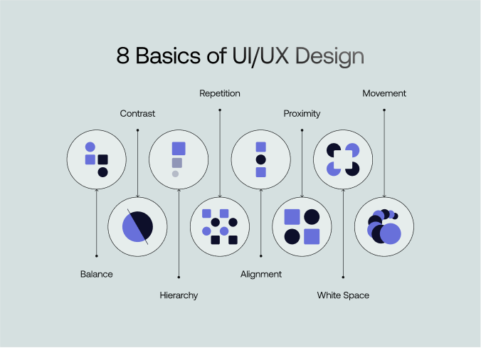
UI/UX or graphic design is crucial in creating products that are functional and enjoyable to use. Understanding its fundamentals can significantly improve user satisfaction and engagement. Here are eight basic rules of design that will help you make a design that performs well and looks engaging.
Balance refers to a design's visual stability, achieved by arranging elements in a way that feels naturally pleasing. It's not about symmetry alone but creating equilibrium in how components interact.
A well-balanced design keeps the viewer engaged. Without balance, layouts feel chaotic, and the message gets lost. Balance directs attention and makes it easier for the audience to focus on what's important. Balancing elements is both an art and a science, which is very important to create compelling visuals.
Contrast is a design principle that involves placing opposing elements together to highlight their differences. This technique enhances the overall impact and readability of the design by creating focal points. Using contrast effectively means understanding how different elements can visually interact. For example, dark text on a light background improves readability and makes the content more accessible. Similarly, large elements can draw attention first, setting the stage for surrounding content.
Contrast is vital for catching and holding the viewer's attention. It makes important information pop, intuitively guiding viewers through the design. By differentiating elements, contrast ensures that the design communicates effectively without overwhelming the audience. Using contrast well can significantly improve a design's look. It makes the layout more engaging and easier to use.
In design, hierarchy organizes content to indicate the order of importance. A clear hierarchy helps viewers know where to look first. It guides them through the content with ease. Good hierarchy improves both readability and usability. This keeps users engaged and directs them to take action.
To implement hierarchy in design, focus on using different font sizes and weights to establish clear distinctions between headings, subheadings, and body text. Additionally, strategic placement and spacing can guide the viewer's eye through the design, first emphasizing the most critical elements.
A well-defined hierarchy is essential in helping the audience decode the message quickly. It prioritizes content, ensuring viewers spend time where designers intend. Without hierarchy, content becomes a flat landscape where everything competes for attention, often leading to confusion and disengagement.
Repetition in design involves strategically reusing the same or similar elements throughout a visual space to create a sense of organized movement and unity. It strengthens the overall aesthetic and enhances building structure and user navigation.
Repetition is not just about doing the same thing over and over. When used thoughtfully, it can greatly enhance the effectiveness of a design. It's essential to create patterns that appeal aesthetically and support the layout's functionality by standardizing how information is processed. It is particularly effective in digital platforms where consistent interface elements enhance the user experience by making interactions intuitive.
Alignment in design involves arranging elements so that every item lines up with another component or group of elements. This creates a clean, organized look that enhances the aesthetic appeal and usability of the design.
Alignment is more than placing elements in neat lines. It organizes content so it feels intuitive and strengthens the design’s message. It helps reduce visual clutter and focus the viewer's attention on the most important parts of your message.
It is also the backbone of a design's structure, essential for maintaining an orderly appearance and ensuring that all design elements coexist harmoniously. This principle is vital in all types of design work, from simple flyers to complex websites, because it affects how quickly and effectively a viewer can understand the presented information.
Proximity is a fundamental design principle that involves grouping related elements together to create a clear visual relationship. This grouping helps users understand which design parts are connected in meaning or function.
Proximity isn't just about placing elements near each other; it's about creating a visual flow that leads the viewer through the content logically and effortlessly. It helps to establish a connection between similar or related elements, reinforcing the overall narrative or purpose of the design.
Effective use of proximity can significantly increase a design's usability and visual appeal. It simplifies complex information and makes it accessible and engaging for the audience. By thoughtfully grouping elements, designers can create cohesive, user-friendly designs that communicate more effectively.
White space, often called negative space, is the area of a design left unmarked; it's the space between visuals, margins, and other elements. White space is a powerful design element that enhances readability and focus.
Incorporating white space requires a thoughtful approach where less can be more. Designers should consider the overall design layout before placing elements, always remembering that the goal is to create a visually engaging and clear presentation. Use white space to create a flow that guides the viewer naturally through the content without overwhelming them with too much information or too many visuals at once.
Movement in design refers to visual elements guiding the viewer's eye through a layout. It creates a visual flow path that can emphasize information, maintain interest, and improve the overall user experience.
Employing movement requires considering the overall design's purpose and how each element guides the viewer through the content. It's important to balance movement with other design principles like balance and alignment to ensure the design remains cohesive and not disorienting.
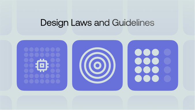
Design laws and guidelines offer a roadmap for creating effective and pleasing visuals. If you're building a mobile app, website, or brand identity, a firm understanding of core design laws can inform better decisions and produce stronger results.
Hick’s Law suggests that the time it takes for someone to make a decision grows with the number of options presented. Too many buttons, links, or menu items in UI and UX can overwhelm users. Simplicity keeps interactions quick. Designers trim unnecessary choices so users remain focused on key tasks. Cutting clutter also improves navigation, making an app or site feel more welcoming.
Fitts's Law states that the time to reach a target depends on size and distance. Larger targets, placed within easy reach, are faster to click or tap. Many UIs feature big buttons for key actions (like “Buy Now” or “Sign Up”) and position them where a user’s cursor or thumb naturally lands. This makes important actions more intuitive and reduces errors.
Gestalt Principles encompass several guidelines that help designers understand how people group objects visually. Key concepts include proximity, similarity, and continuity. Proximity suggests elements placed near each other look related. Similarity implies that items sharing color, shape, or size appear connected. Continuity helps our eyes follow patterns or lines. Designers combine these principles to unify layouts. This approach guides the user's eye in a predictable path, making content easier to scan.
White space (negative space) helps avoid clutter. It separates text blocks, images, and interactive elements, giving them room to breathe. Good typography goes hand in hand here. Readable fonts, clear hierarchy, and appropriate line spacing all reduce strain on the viewer. A neat, legible layout keeps users from feeling overwhelmed.
The design also thrives when it's inclusive. Accessibility guidelines suggest providing alt text for images, sufficient color contrast, and logical tab orders. Keyboard navigation, screen-reader compatibility, and readable color combinations open a product to more people. In UX, these measures cultivate trust by showing that every visitor or user is valued.
Design laws guide initial choices, but testing refines outcomes. Prototypes, user tests, and feedback loops expose hidden problems. Continuous iteration improves overall experiences. Changes include simplifying forms, rearranging menus, or enlarging a button. Over time, a design aligns more closely with real user needs and behaviors.
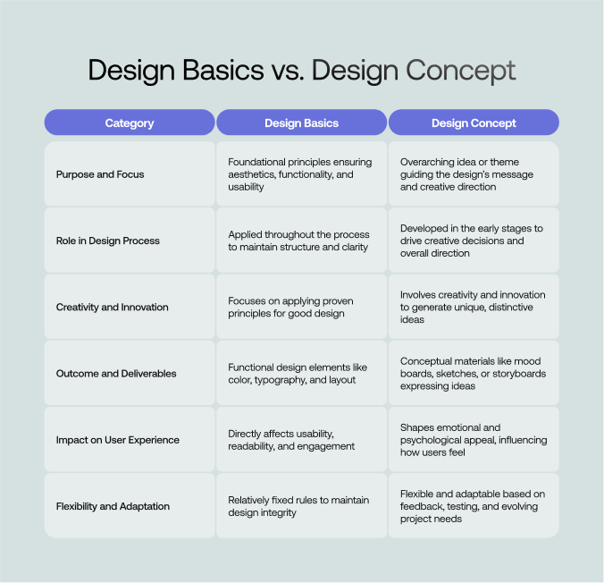
When exploring the realms of design, it’s essential to understand the difference between “Design Basics” and “Design Concept.” Both are fundamental to creating effective design work, but they serve distinctly different purposes and are used at various stages of the design process. Here are some key differences between these two core elements of design:
Every design basics, from balance to movement, is a foundational mechanism. These elements help to create visually appealing and functionally robust designs. We have emphasized the importance of these principles and their role in enhancing user experience and maintaining brand consistency here.
A thorough grasp of these basics allows designers to produce work that stands out for its clarity, aesthetic elegance, and strategic impact. These principles ensure that designers' creations resonate well and encourage meaningful interactions.
Design basics are critical in establishing and maintaining a strong brand identity. They help create a consistent visual language that makes a brand recognizable and trustworthy to its audience, reinforcing its message and values through visual consistency.
Absolutely, design basics such as balance, contrast, and alignment are applicable across all types of design media, including digital and print. The principles ensure the content is accessible, engaging, and effectively communicated, regardless of the medium.
Design basics can be effectively learned by combining theoretical study and practical application. Resources like online courses, workshops, and design books can provide foundational knowledge.
User feedback is crucial in applying design basics. It provides real-world insights into how the audience perceives and interacts with design elements. It helps designers understand whether applying principles such as hierarchy, contrast, and balance meets user needs and expectations.
Design basics significantly influence the user experience by creating a logical and intuitive structure for user interaction. Proper application of these principles ensures that the product is easy to navigate, visually pleasing, and information accessible.


An Experience Design Agency focusing on building functional, simple, human-centered digital products for future.
