Everything we see and interact with around us is designed. This is what makes complex things simple and easy to understand for us. And it's not just about how things look; it's also about how they work and how they function.
With more abstract digital objects, the situation is identical. For instance, SaaS. SaaS product design is concerned with the software's visual look, the user's path through product features, the reasoning behind each button's use, and other essentials. To ensure SaaS is equally visually appealing and user-friendly, you need to understand UX well. This statement leads us to the next question,

Software as a service (SaaS) applications is among the most complex pieces of software that have ever been developed. It is a worthwhile effort that can result in major benefits to implement UX best practices for any SaaS platform, including the following:
This article will cover 5 best practices in detail on how you can improve SaaS design to make it more user-friendly for your users.

What you say will be forgotten by most people. People won't remember what you did to them. However, people will never forget how you made them feel. They will always remember it. The onboarding process helps you create that experience and sets your first impression.
Wyzowl says that 63% of users depend on a good onboarding process to make important decisions after the sale. And almost 86% of customers stick with companies that teach them how to use a product. Hence, it is proven On-boarding can boost your business:
It is also essential to ensure that your customer onboarding strategy is not overpowering, confusing, or overbearing but instead blends effortlessly with your clients' work lives.
Going through multiple pages to join up or register may be time-consuming and tedious. As a result, delivering simple sign-up is one of the most critical parts of SaaS product design. Customers will be more likely to use the app if the registration procedure is simple. On the other hand, a complicated or time-consuming sign-up process will turn off clients.
When improving your registration process, don't forget to consider CTAs (calls to action). Potential users will be enticed by a strong call to action, and bold sign-up buttons will make it easier for them to register.


Have you seen Mailchimp? "Why Mailchimp?" is the first menu item you encounter. MailChimp is a SaaS startup, and one of its key goals is to demonstrate why you should use its product. You define your company's goals by defining your information architecture. The top-level menu elements highlight the information you want to spread the most.
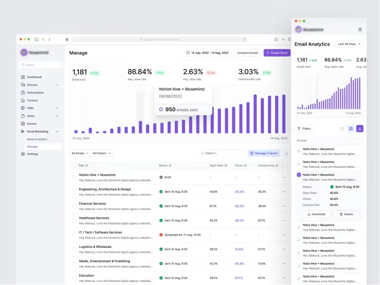
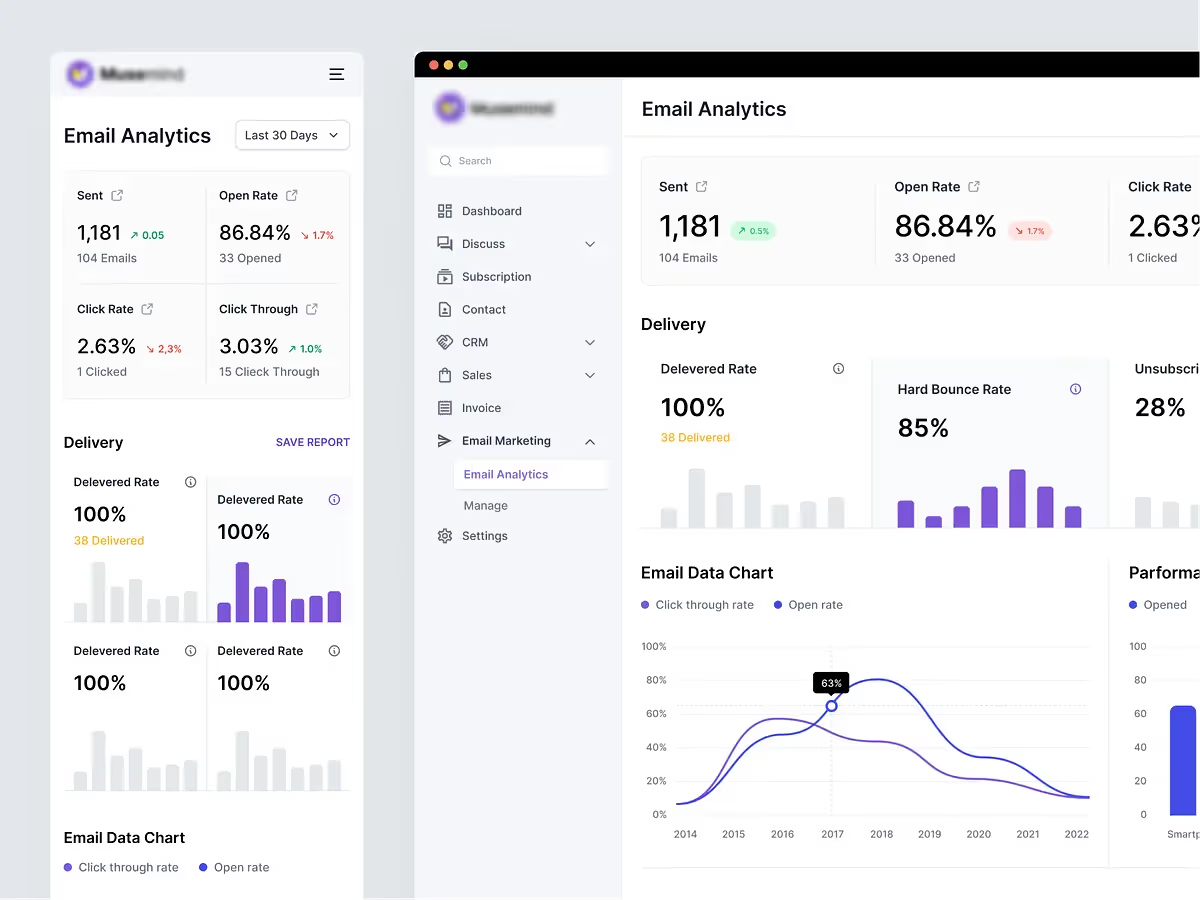
SaaS apps can gain a great deal by enhancing their IA, enabling users to navigate easily and locate relevant content without effort. Even a well-designed product with multiple unique features can fail if users cannot locate all of the necessary information. Check more SaaS dashboard designs by Musemind.
When a customer logs in to a SaaS platform, the dashboard is the first thing they see. As a result, you should invest considerable effort in optimizing the dashboard's design and user experience to ensure a good return on investment.
In Musemind, for smoothly managing tasks, we use ClickUp. It's the perfect example because the dashboard is interactive and interesting, making a delightful user experience. When you are trying to build a dashboard, first be clear about the purpose you are serving. Sometimes it can be confusing as a result; you might add too many or too few elements that users need.
There are usually 3 types of dashboards:

Customers have questions. And they will always. This opens a two-way communication path. “Every customer interaction is a marketing opportunity,” says Stewart Butterfield, CEO at Slack. “If you go above and beyond on the customer service side, people are much more likely to recommend you.”
Also, if you have a custom system, you will be able to resolve issues quickly. This will keep them around and won't easily go to other platforms. Also, try to get their feedback on their experience; this will help you understand their struggles and your scope for improvements.
Here are some ways you can provide customer support based on their needs-
Now that you know what steps you need to take, it's time to build one. You will face another challenge here: deciding which frame is best for you to work with. Choosing one frame among so many popular ones can be daunting, but fear not! The next section will also help you decide which one to choose!

Because SaaS provides more flexibility, transparency, scalability, and simpler connection with third-party applications, the SaaS business architecture outperforms the on-premise model. However, with so many options on the market, product managers may find it difficult to select the finest SaaS application framework.
The platform is a PHP-based SaaS platform with an open-source MVC architecture. It provides templating solutions as well as a large library and database of PHP web apps. Laravel is a strong and mature framework that is ideal for startups and new businesses.
Web development leverages Model-View-Template. Google, YouTube, and Instagram employ this framework to increase batteries-included functionality like authentication and messaging. As security is its major goal, it follows the COC and DRY patterns. Python gives developers the capability to create a secure website or framework.
Meta develops it, one of the most popular SaaS web development frameworks. The framework is a front-end JavaScript library that enables organizations and developers to design scalable user interfaces. Developers can use this library as a framework while adding other tools. Also, developers rely on it because they can quickly construct complicated interfaces.
The frontend framework Angular is popular. Developers like this framework's ease of use. Angular is the third most popular web framework, according to Stack Overflow. Angular includes advanced SaaS development tools like HTML, CSS, Typescript, Karma, Mocha, Visual Studio, etc., making the process and program compilation easier.
Django is the greatest framework for generating powerful SaaS products with a clean, rational architecture for speedier development. It has 64.6k GitHub stars and over 80k websites that use Django. Django lets developers focus on app coding without web development. 1,000,000+ developers like it in 2022. Django builds large data-driven websites and Android apps.
One thing you need to keep doing is iterations! There will always be room for improvement. To stay competitive and ahead, you must come up with the most user-friendly solutions and new features. Mankind a dashboard, or for the first time, can be pretty challenging. The practices mentioned will help you to create an engaging one. And if you need help, we are here to help you! You can just contact us here!


