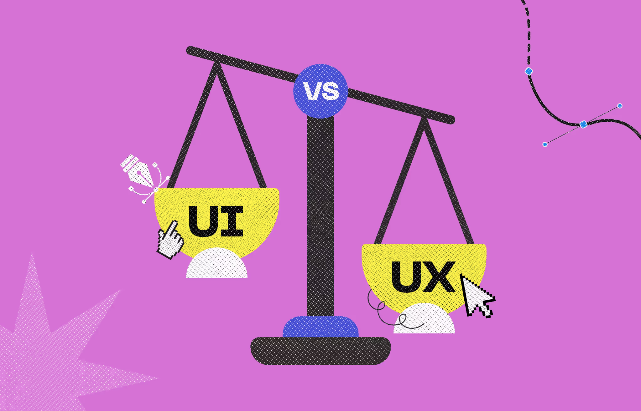
UI and UX are not the same thing. UI is how a product looks on the other hand UX is how it works. People mix them up constantly and that confusion costs product teams real time and money.
User Interface (UI) design covers the visual layer: buttons, color palettes, typography, spacing, and interactive states. User Experience (UX) design covers the research-driven process beneath it: user flows, information architecture, wireframing, and usability testing.
This guide covers both disciplines in full: how they differ, how they collaborate, what product designers do differently, the common mistakes teams make when treating them as separate problems, real-world examples across SaaS, e-commerce, and mobile, and when to hire each type of designer.
UX stands for User Experience. It is the research-driven process focused on understanding user problems and designing a product that solves them efficiently and satisfyingly.
UX design covers the entire user journey - from the moment someone discovers your product to the moment they complete a task or leave. The goal is to make that journey logical, frictionless, and outcome-oriented.
UX designers do not primarily work in pixels. They work in logic, research, and structure.
UI stands for User Interface. It is the visual and interactive layer that translates a UX strategy into the actual product people see and touch. UI design takes the user flows and logic defined in UX and gives them form.
Every element a user interacts with visually is a UI decision: buttons, color palettes, typography, spacing, icon style, motion, and interactive states. UI design is also responsible for ensuring those elements stay consistent across screens and devices.
Analogies are one of the clearest ways to explain the difference. Think of a coffee shop.
A coffee shop with perfect UX but bad UI might be efficient but feel cold and forgettable. A shop with stunning UI but bad UX might look great in photos and frustrate customers the moment they try to order.
Both matter. The most successful coffee shops - and digital products - get both right.
UX and UI are two halves of the same product design process. They overlap, inform each other, and break down quickly when treated as separate problems.
Good UX without good UI: The app works logically but looks dated or inconsistent. Users complete tasks, but they don't trust the product. Brand perception suffers.
Good UI without good UX: The app looks polished but confuses users when they try to do anything meaningful. Beautiful screens don't fix broken flows.
Good UX and good UI together: Users complete tasks quickly, feel confident in the product, and come back. That combination drives retention, referrals, and revenue.
This is one of the most-searched questions related to UI and UX, and the GSC data for this page confirms it. The confusion is real. Here is how the roles actually differ.
In practice, titles vary widely by company. A 'product designer' at one company might do only high-fidelity UI. A 'UX designer' at another might own the full product experience. Always look at the job description, not just the title.
Salary ranges for UI/UX designers and product designers vary significantly by market, seniority, and company stage. For current verified figures, check Glassdoor, Levels.fyi, or the U.S. Bureau of Labor Statistics under "Graphic Designers" and "Art Directors" the closest official occupational classifications.
Most product failures are not caused by bad code. They are caused by teams that skip UX research and jump straight to visual design, or lock in a visual style before the user flows are validated.
Designing buttons and color schemes before user flows are validated is backwards. UI built on unvalidated UX assumptions has to be rebuilt after usability testing reveals structural problems. That rework is expensive.
UX is not something you do once at the start of a project. User behavior changes. Products evolve. UX work needs to continue through launch and beyond - not be treated as a checkbox activity.
Spending the majority of design resources on visual polish while under-investing in user research and flow testing leads to products that look good in stakeholder reviews and fail in real usability testing.
Asking one person to simultaneously own deep UX research and pixel-perfect UI delivery works at very small scale. At product scale, the quality of both tends to suffer. Separate ownership usually produces better outcomes.
Abstract definitions only go so far. Here are concrete examples of how the distinction shows up in actual products.
UX problem: Users cannot find the export button because it is buried three levels deep in the settings menu. The user flow is broken.
UI problem: The export button is easy to find but looks visually disabled. The color and state styling confuse users into thinking it is inactive
UX problem: The checkout has six steps when three would do. Users drop off before completing the purchase. The journey is too long.
UI problem: The checkout is three steps but the 'Place Order' button is positioned below the fold on mobile. Users cannot see it without scrolling.
UX problem: Sending a payment requires five different screens. The information architecture doesn't match how users think about money transfers.
UI problem: The payment flow is logical and fast, but low-contrast text on a white background makes the confirmation screen unreadable for users with visual impairments.
What good UX looks like: Creating a new task takes two clicks. The information hierarchy mirrors how teams actually think about work — projects, then tasks, then subtasks. Users complete onboarding without reading a tutorial.
What good UI looks like: The interface uses consistent spacing, a restrained color system that uses accent color only for actionable elements, and typography that makes dense task lists scannable at a glance.
Tools overlap more than people expect. Figma is now the dominant platform for both disciplines. That said, how each role uses the tools differs significantly.
The answer depends on where your product is in its lifecycle and what problem you are actually trying to solve.
UX design is the research-driven process of understanding users and designing intuitive, efficient journeys. UI design is the visual layer that gives those journeys form through color, typography, layout, and interactive elements. UX defines what the product does and how it works. UI defines how it looks and feels.
UX always comes first. You need to validate user flows, information architecture, and interaction logic before investing in high-fidelity visual design. Building UI on an unvalidated UX structure leads to expensive rework after usability testing.
Yes, and it is common at smaller companies and early-stage startups. A combined UI/UX designer or product designer can own both. At larger product teams or higher-scale SaaS companies, the roles are typically split for quality and depth reasons.
A UX designer focuses on user research, flows, and usability. A UI designer focuses on visual design, components, and brand alignment. A product designer typically owns both disciplines and participates in broader product strategy alongside product managers and engineering teams.
Both disciplines use Figma heavily. UX designers also use Miro for journey mapping, Maze or User Testing for usability testing, and Hotjar for behavioral analytics. UI designers use Figma alongside Adobe XD, Framer, and Principle for advanced motion and interaction design.
Neither is more important in isolation. A product with strong UX but weak UI will feel functional but unappealing and lose user trust. A product with strong UI but weak UX will look good and frustrate users when they try to accomplish anything meaningful. Both are required for a product to succeed commercially.
UI is everything you see on a screen. UX is everything you feel when using it. The buttons, colors, and layout are UI. Whether the flow feels logical, fast, and satisfying is UX.
The process runs in phases. UX designers handle early research, user personas, and wireframes. UI designers take those wireframes and apply visual design. Both collaborate during prototyping and usability testing. In a healthy team, there is continuous feedback between UX insights and UI decisions throughout the project.
Yes. A visually polished product that confuses users will lose them quickly. First impressions depend on UI. Retention depends on UX. If users cannot accomplish their goals efficiently, strong visual design buys you a few extra seconds before they leave.
UX first. Validate the core user flow and information architecture with wireframes and usability testing before spending on high-fidelity visual design. This order saves significant rework cost. Once the flow is validated, UI investment pays off much more reliably.


An Experience Design Agency focusing on building functional, simple, human-centered digital products for future.