Most web projects fail at the structure stage, not the design stage. Pages get added late. Labels confuse users. Stakeholders disagree six weeks in. A UX sitemap prevents all three. It is the structural diagram that locks the architecture of a product before anyone touches a wireframe, and it is one of the cheapest insurance policies in digital design.
This guide covers what a UX sitemap is, the eight steps to build one, the tools that speed the work, and how it differs from information architecture and user flow.

A UX sitemap is a hierarchical visual diagram that maps every page, screen, label, and connection in a digital product before visual design begins. Nielsen Norman Group defines it as a hierarchy of nodes, usually represented as boxes, that signify the pages or content on your website, with arrows or lines demonstrating the relationship between the web pages.
This is distinct from an XML sitemap. An XML sitemap is a machine-readable file you give to search engines so they can index your pages. A UX sitemap is a design artifact you give to clients, developers, and content writers so they can agree on what gets built. Same word, different jobs. The term "sitemap UI design" refers to this design artifact: the visual map used to plan interface structure before UI work starts, not the XML file.
A good UX sitemap does three things at once. It shows total page count, so scope is visible. It shows hierarchy, so navigation can be evaluated before code exists. And it shows labels, so the team can spot vague wording before users do.
The deliverable is intentionally lean. Sitemaps are designed to include only the details that stakeholders need to know for productive conversations and group decision making. You leave content strategy, taxonomy, and metadata out. Those belong to information architecture, which is covered next.
Most teams confuse these three artifacts. The confusion costs time and rework.
Information architecture is the broader discipline of structuring, organizing, and labeling content. A sitemap is one deliverable that comes out of IA work, alongside taxonomies, content inventories, and navigation models. A user flow is a step-by-step diagram of how a user completes one specific task, like checkout or onboarding.
Here is the practical distinction.
The cleanest way to think about it: IA is the blueprint of a house, the sitemap is the floor plan, and the user flow is the path you take from the front door to the kitchen.
A sitemap looks like overhead until you have lived through a project without one. Here is what it actually buys you.
1. Scope stays honest. Every page is visible on one canvas. Clients cannot quietly add 12 pages to the build the week before launch.
2. Stakeholders align before design starts. Marketing, product, and engineering all look at the same diagram. Disagreements surface in a 30-minute review, not in a six-week redesign.
3. Content gaps show up early. Empty nodes signal pages that have no copy plan. You fix that before writers are blocked.
4. Crawlability improves by accident. A clean hierarchy gives search engines a logical path. Pages buried four levels deep get indexed less often, and Google's crawler treats shallow pages as more important by default.
5. Build timelines shrink. Developers can scope sprints against a finished structure instead of guessing.
Four shapes cover almost every use case. Pick the one that matches the product, not the trend.

Visual sitemap. A graphical diagram with boxes, labels, and connecting lines. Best for stakeholder presentations and client reviews where the audience needs to see the structure at a glance.
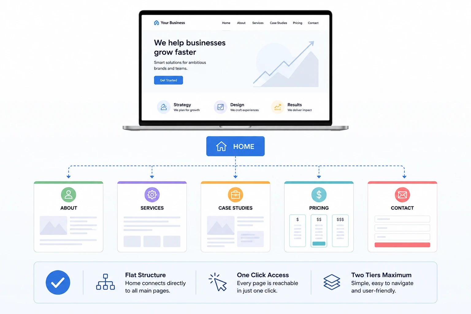
Flat sitemap. One tier under home. Used for small marketing sites with five to seven pages where depth would add zero value.
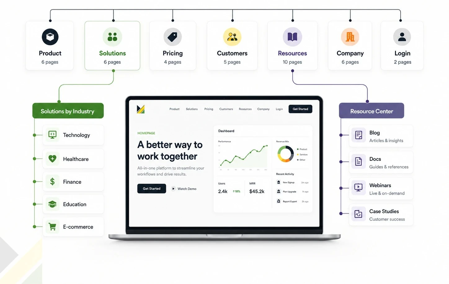
Hierarchical sitemap. Multi-tier tree structure. The default for most B2B websites, e-commerce sites, and content-heavy products. This is what most people mean when they say "sitemap."
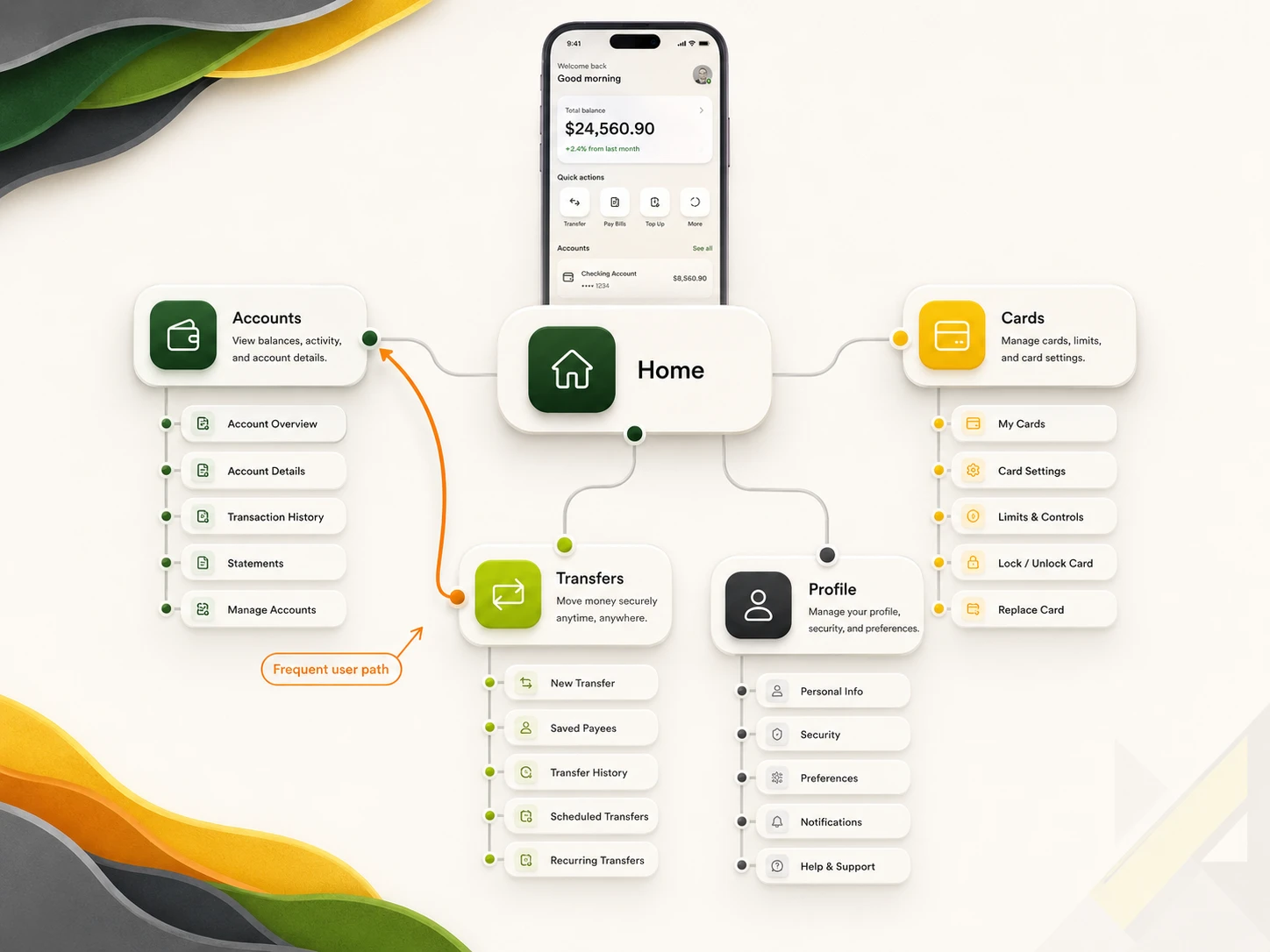
Network sitemap. Pages connect laterally as well as hierarchically. Used for editorial sites, learning platforms, and any product where users move between sibling pages as often as up and down.
The mistake is to default to hierarchical for every project. A blog with rich cross-linking belongs in a network structure. A 5-page consulting site belongs in a flat one.
This sequence works in any tool. Skipping steps is what produces the rework most teams pay for.
You cannot map pages before you know who will visit them. Run interviews, pull analytics, or borrow personas your research team already has. The output is two to four persona summaries, each with one core goal.
Write three sentences. What does the business want the site to do? What does the user want? Where do those overlap? The overlap is what every page must serve.
For each persona, list the top three to five tasks they will complete on the site. Sign up. Compare pricing. Read case studies. Contact sales. These tasks drive the page list.
Group tasks into categories. Each category becomes a top-tier navigation item. Sub-tasks become second-tier pages. Stop at three tiers unless you have a real reason to go deeper. Deeper structures usually signal that your categories are wrong, not that the content needs more nesting.
Add every individual page to the diagram. Include hidden pages like 404 errors, thank-you confirmations, and legal pages. Missing these now causes scope-creep conversations later.
Every node gets a label a real user would understand. "Services" beats "What We Do." "Pricing" beats "Investment." Test labels against the personas from Step 1.
Walk through each persona's top tasks across the sitemap. Count the clicks, if a high-value task takes four or more clicks, restructure. The goal is not three clicks specifically that rule is debunked (covered in the mistakes section). The goal is that every click feels purposeful and the user senses they are getting closer to their destination.
Show the sitemap to one developer, one client stakeholder, and one user. Each will catch a different problem. For complex navigation structures, run a tree test: give users a specific goal and ask them to navigate through the sitemap to find it. Tree testing validates your hierarchy against real user behavior before any wireframes exist. Update. Version. Date the file. Sitemaps are living documents, not static deliverables.
Pick the tool that matches your team's existing workflow. Six options cover most cases as of 2026.
Different products produce different sitemap shapes. Three examples below.
Five mistakes show up in almost every audit we run.
Mistake 1: Designing for the org chart, not the user. Internal team structure does not match user intent. An e-commerce site with separate categories for each business unit looks logical to the company and incoherent to the shopper. Map by user task, not internal silo.
Mistake 2: Over-nesting. Anything past three tiers usually means a category is wrong. Card-sort it again with real users before adding another level.
Mistake 3: Vague labels. "Solutions" tells the user nothing. "Solutions for Healthcare" tells them everything. Specificity wins every time.
Mistake 4: Treating the sitemap as final too early. It is a working document. Date every version. Update after every round of user testing.
Mistake 5: Trusting the 3-click rule. This rule is widely cited and widely wrong. Joshua Porter's 2003 study showed that user drop off does not increase when a task involves more than 3 clicks, and that satisfaction does not decrease. Jakob Nielsen's research found that users' ability to find products on an e-commerce site increased by 600% after products were placed four clicks from the homepage instead of three. Optimize for clarity per click, not for an arbitrary click count.
A UX sitemap is the cheapest piece of insurance against expensive redesign. The work takes hours. The savings are measured in weeks.
Key takeaways:
A UX sitemap is not the same as an XML sitemap. A UX sitemap is a visual diagram designers, developers, and stakeholders use to plan a product's page structure. An XML sitemap is a machine-readable file submitted to search engines so they can index a site faster. Same word, different audience, different format, different job.
A UX sitemap should be created after user research and persona work, but before any wireframes or visual design begin. Building it earlier wastes effort because user needs are not yet clear. Building it later forces rework when content gaps surface mid-design. The sweet spot is right between research and wireframing.
Information architecture is the broader discipline of structuring, organizing, and labeling all of a website's content, including taxonomies and content inventories. A sitemap is one deliverable that comes out of IA work, focused specifically on showing the page hierarchy. According to Nielsen Norman Group, a sitemap is only one part of a site's information architecture.
A UX sitemap should include every planned page, no matter how small. This means primary pages, sub-pages, utility pages like 404 errors and thank-you confirmations, and legal pages like privacy and terms. Missing pages now cause scope-creep conversations later. There is no minimum or maximum count.
A sitemap shows the overall structure of a product. A user flow shows the step-by-step path a specific user takes through specific screens to complete a specific task. Sitemaps answer "what pages exist and how are they organized?" User flows answer "what does the checkout journey actually look like?" You need both, in that order.
You can build a UX sitemap in Figma using rectangles, connectors, and auto-layout, but FigJam is usually faster for early structural work. Figma is better once the sitemap needs to be presented to clients or linked directly to wireframes in the same file. Many Musemind projects start in FigJam and migrate to Figma once the structure is locked.
You still need a UX sitemap even for a small website, but the format should match the scope. A 5-page marketing site needs a flat sitemap that fits on a single screen. The discipline of listing pages, labels, and connections forces decisions that prevent scope drift at any size. A small-site sitemap takes 30 minutes and saves hours of meetings.
A UX sitemap for a small business website typically takes 2 to 4 hours of focused work, including persona review and stakeholder feedback. A mid-sized SaaS marketing site takes one to two days. A complex platform with 100 or more screens can take a full week, especially if card sorting and tree testing are folded into the process. The variable is research depth, not drawing time.
Read a UX sitemap from the top down. The topmost node is the homepage. Each tier below represents a navigation level. Nodes connected directly to home are top-tier pages, usually your main navigation items. Nodes connected to those are second-tier sub-pages. Lines or arrows show how pages relate. Labels on each node show the page name users will see. Version numbers and dates in the file title show which draft you are reviewing.
A mobile app sitemap maps screens rather than pages, and typically uses a network structure rather than a strict hierarchy. Users on mobile move laterally between core screens (dashboard, transfers, profile) more than they navigate up and down a tree. App sitemaps also include state variations like empty states, loading screens, and error messages that web sitemaps usually omit.


An Experience Design Agency focusing on building functional, simple, human-centered digital products for future.