Wireframing is how design teams turn a vague product idea into a testable structure before a single pixel of visual design gets created. It sits between user research and visual design, giving designers, developers, and stakeholders a shared blueprint to react to and refine.
The value is practical. A wireframe change takes minutes. The same structural change made after development begins costs real money and days of rework. Getting the layout, navigation, and content hierarchy right at the wireframe stage removes the most expensive category of design mistakes from the project.
This guide covers the full picture: what wireframes are, the three types and when to use each, a step-by-step process for creating them, how to wireframe in Figma, best practices that separate good wireframes from bad ones, and real-world examples you can learn from.
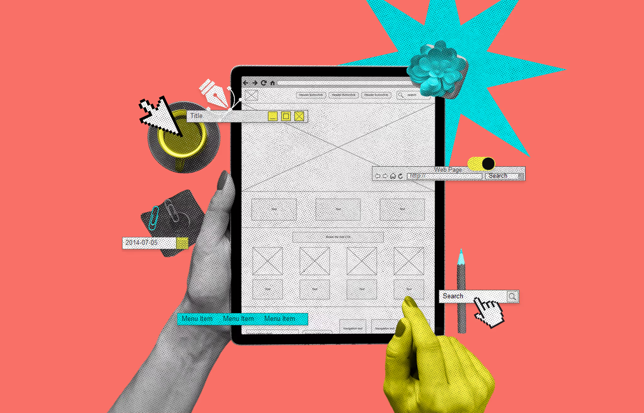
A wireframe is a simplified visual layout of a digital product: a website, app, or SaaS interface. It represents structure, not style. You will see gray boxes where images go, horizontal lines where text will live, and labeled buttons that show function without visual polish.
Think of it the way an architect approaches a building. Before any brick gets laid, they draw the floor plan. The floor plan does not show paint colors or furniture choices. It shows where the rooms are, how large they are, and how people move between them. A wireframe does the same thing for digital products.
Wireframes are almost always created in grayscale. That is intentional. Removing color forces everyone to focus on what matters during the early design stage: does this layout make sense, does the navigation flow naturally, and are the most important elements in the right places?
Wireframing is the process of planning and building those structural blueprints. It happens after user research and before detailed visual design work begins. A designer translates user needs, business goals, and technical constraints into a page layout that can be reviewed, tested, and revised before anyone writes production code.
The output is not the final product. It is a communication tool. Wireframes give designers, developers, stakeholders, and clients a shared reference point to align on structure, user flow, and functionality. Visual design decisions stay out of the conversation until the structure is validated.
Wireframes come in three levels of fidelity. Each serves a specific purpose depending on where you are in the design process.
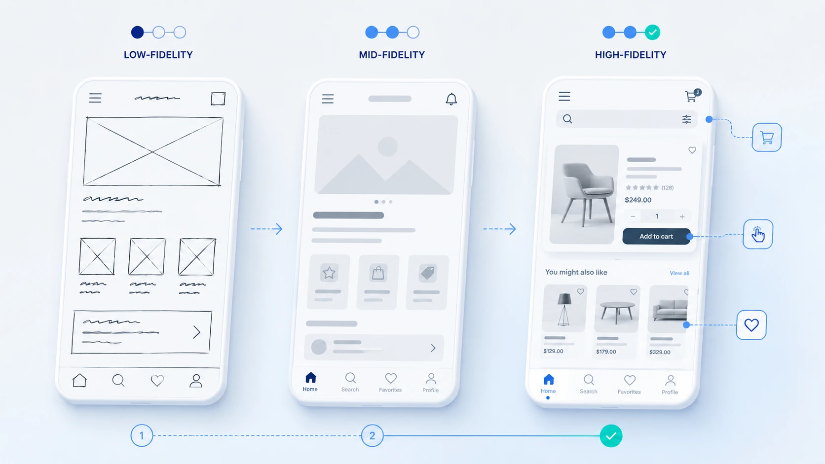
Low-fidelity wireframes are the roughest form. They use basic shapes, lines, and text placeholders with no accurate spacing or real content. They are quick to create, often sketched by hand or knocked out in minutes using a tool like Balsamiq.
Use them for early brainstorming, team alignment sessions, and testing multiple layout concepts before committing to one direction. Because they require minimal investment, they are easy to throw away and redo without friction.
Mid-fidelity wireframes add structure without going into visual design. They show more accurate spacing, clearer hierarchy, simple placeholder icons, and a realistic sense of content weight and proportion.
This is the most commonly used fidelity level in professional UX workflows. Mid-fi wireframes are detailed enough to test navigation and user flow, but light enough to modify quickly based on feedback.
High-fidelity wireframes look close to the final product. They include precise layouts, actual content or near-final copy, and sometimes clickable interactions. Some teams skip this stage entirely and jump directly to prototyping in Figma.
Use high-fidelity wireframes when you need to present a near-final design to stakeholders or run usability tests that require realistic content.
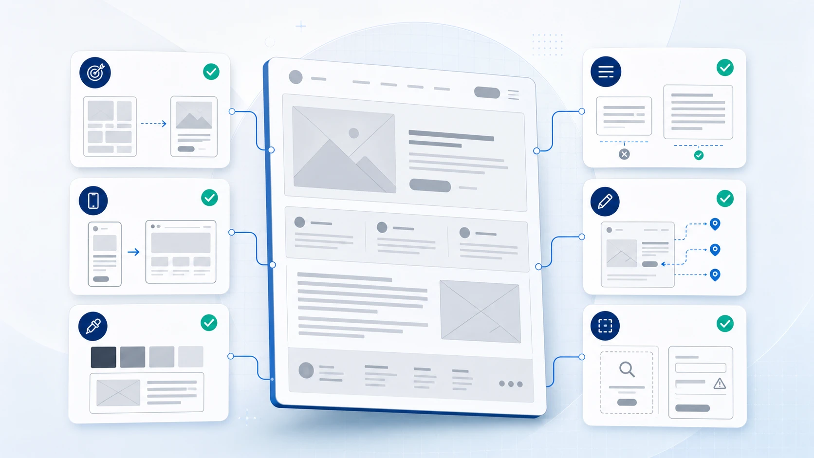
Effective wireframes include more than just boxes and lines. Here are the core elements that make a wireframe useful.
Wireframes are not just a design ritual. They exist because catching a structural problem in a wireframe costs almost nothing. Catching the same problem after development has started can cost thousands of dollars and weeks of rework.
When a designer shows a client or stakeholder a wireframe, everyone reacts to structure and logic, not aesthetics. This removes the feedback that derails design reviews and keeps discussions focused on what actually matters at that stage.
A wireframe change takes minutes. Moving a navigation bar or restructuring a content section in a low-fidelity wireframe requires dragging a box. The same change in a fully designed mockup might require multiple hours of work across multiple files.
Developers need to understand intent, not just final visuals. A wireframe with annotations explains how components should behave, what states they need to support, and how the layout should respond to different screen sizes.
You can run usability tests with wireframes before you have visual design or real content. Users can still navigate, identify confusion, and give meaningful feedback on whether the layout serves their goals.
Wireframes make scope visible. When a client requests a quick change in development, showing them the wireframe often reveals that the change touches five different screens. That visibility helps manage expectations and timelines.
Before you open any tool, write down answers to three questions: What is this screen trying to accomplish? Who will use it? What do they need to do here? Every layout decision flows from these answers.
List the content and features that belong on each screen. Group related items. Prioritize ruthlessly. If you put everything on one screen, nothing is important. Good information architecture is the foundation of a good wireframe.
Start with the dimensions that match your primary audience. Standard starting points: desktop at 1440px wide, mobile at 375px wide, tablet at 768px wide. Many teams wireframe mobile first, especially for products where most users are on phones.
Sketch three or four rough layout options before committing to one direction. Hand sketches are fine here. The goal is to generate options quickly, not polish a single idea. Pick the best one and move forward.
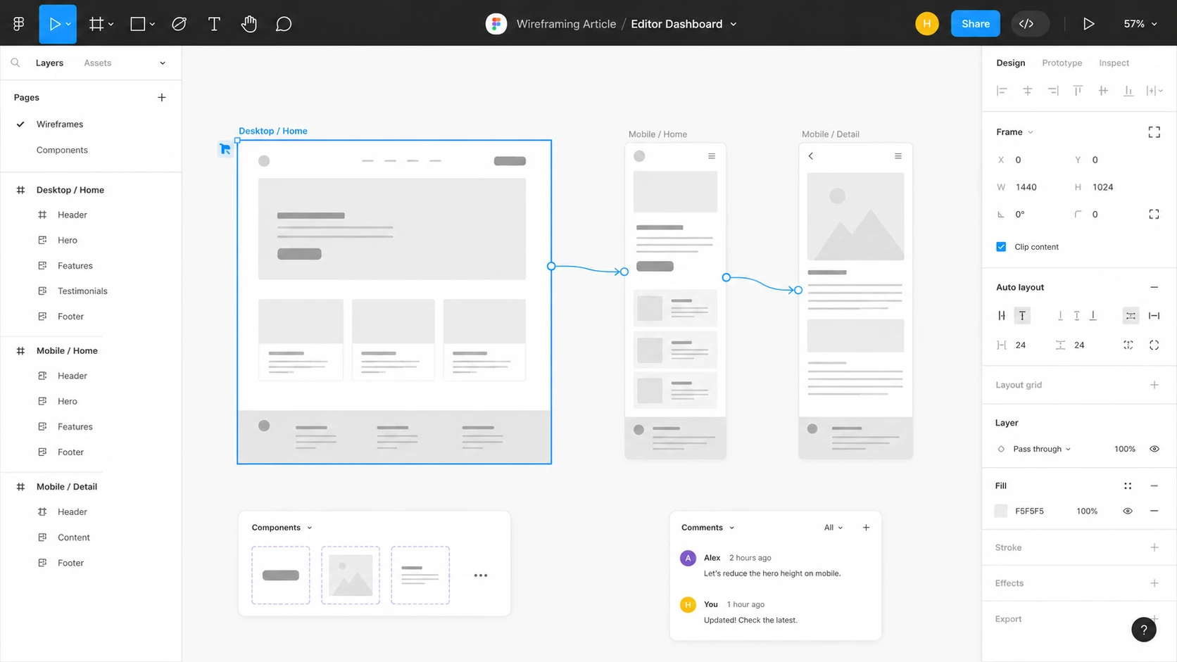
Move your sketch into a tool like Figma. Add accurate spacing, clear labels, placeholder text, and content hierarchy. Show navigation, interactive elements, and user flow connections between screens.
Write short notes that explain any behavior that is not visually obvious. Label what happens when a user clicks a button, how a form validates, what an empty state looks like, or how a component responds to different content lengths.
Share the wireframe with your team and relevant stakeholders before moving forward. Keep the review session focused on structure and logic, not visual preferences.
Update based on feedback. If the structure is complex or high-stakes, run a quick usability test with real users before moving to visual design. Structural changes are cheap at this stage. They are not cheap later.
Figma is the most widely used wireframing tool in professional product design. It is free for individuals, browser-based, and allows real-time collaboration. Here is a basic workflow to get started.
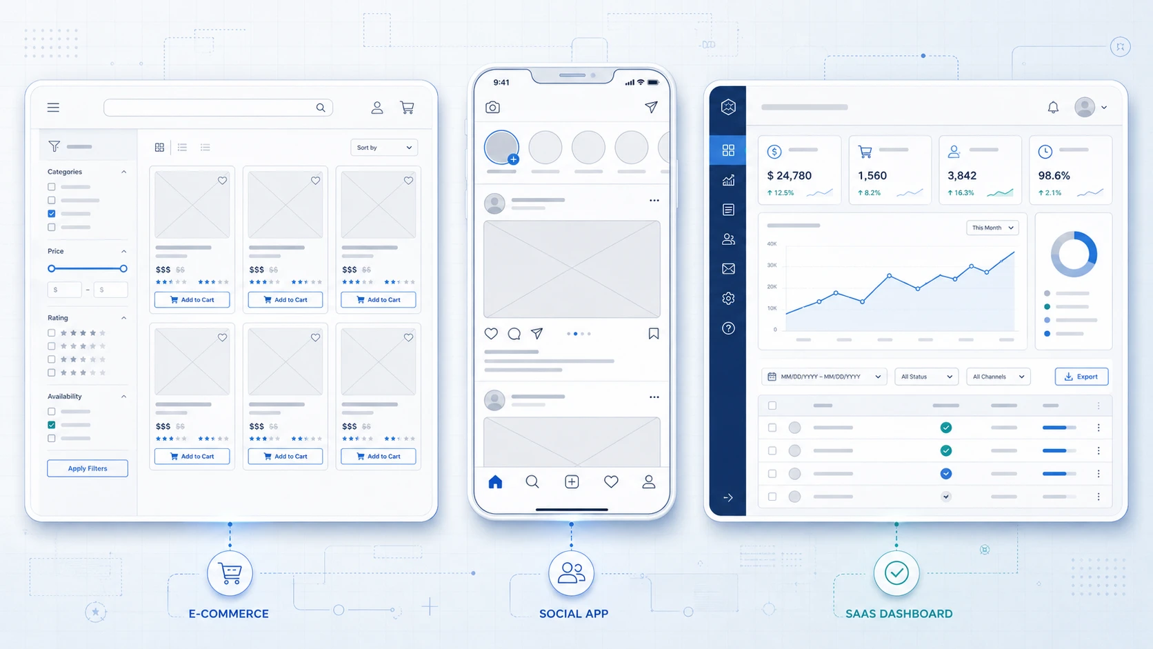
An e-commerce wireframe for a product listing page prioritizes four elements: the filtering sidebar, the product grid, individual product cards with clear CTA placement, and the pagination or infinite scroll control. The wireframe needs to answer: how many products appear per row? Where does the Add to Cart button sit relative to the product image and price? What does the filter state look like when multiple filters are active?
Getting this structure right in a wireframe prevents a costly discovery late in development: the product card cannot accommodate long product names, or the filter sidebar pushes the grid off-screen on tablet.
A mobile app wireframe for a social feed needs to resolve the navigation pattern first: bottom navigation bar or hamburger menu? How many items? The wireframe also needs to show the individual post card structure with profile image, username, timestamp, content, and action icons. Every element in that card competes for vertical space, and wireframes are where those tradeoffs get made.
SaaS dashboard wireframes are some of the most structurally complex. They need to answer: what metrics appear above the fold? How are tables and charts balanced? How does the sidebar navigation behave when collapsed? The wireframe also needs to show the empty state for first-time users and the data-heavy state for power users. Getting both right at the wireframe stage prevents rebuilding the layout twice after launch.
These three terms get mixed up constantly. They are not interchangeable.
Wireframing is manageable in-house for simple products. But for SaaS platforms, MVPs, and products where user experience is a core part of the value proposition, the structural decisions made in wireframes have a direct impact on product performance and conversion.
Musemind specializes in experience design for SaaS products, MVPs, and digital platforms. The wireframing and prototyping work is not an isolated deliverable. It is integrated into a broader design process that includes user research, information architecture, visual design, and developer handoff. If you are building a product where the UX needs to be right from the start, that is exactly the kind of work we do.
Wireframing creates a structural blueprint for a digital product before visual design begins. It aligns teams on layout, navigation, and user flow, making it cheap to catch and fix problems before development starts.
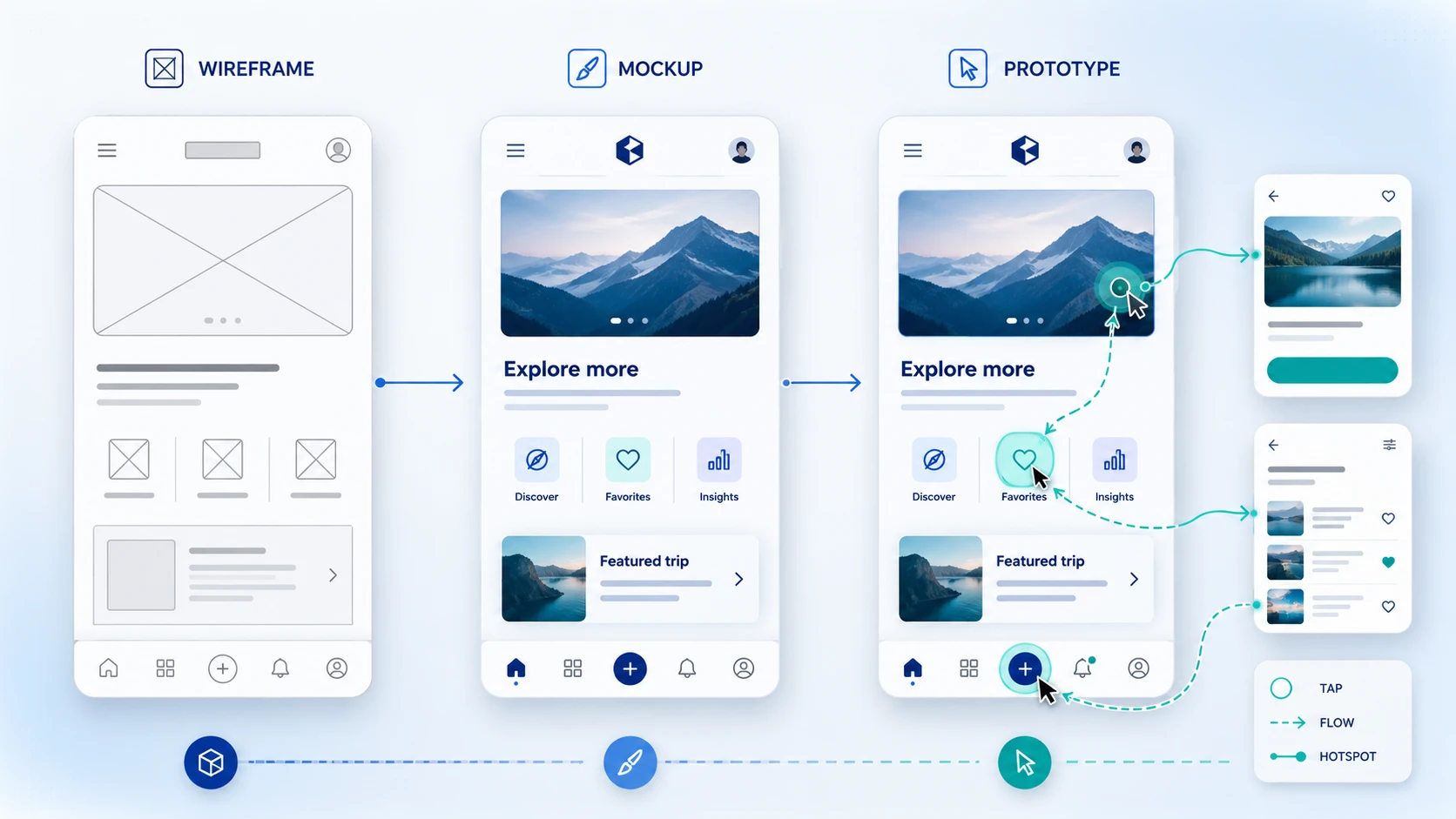
Low-fidelity (rough sketches focused on structure), mid-fidelity (more accurate layouts showing spacing and hierarchy), and high-fidelity (detailed wireframes close to the final design, sometimes interactive).
A wireframe shows static structure: where elements are placed and how pages connect. A prototype is interactive and simulates how the product behaves. Prototypes typically follow wireframes in the design process.
A wireframe is grayscale and shows layout without visual design. A mockup applies real colors, typography, and imagery to show what the product will look like visually. Mockups follow wireframes in the design workflow.
A low-fidelity wireframe for a single screen can take less than an hour. A complete mid-fidelity wireframe set for a multi-screen product might take one to three days depending on complexity. High-fidelity wireframes for complex products can take a week or more.
Figma is the most common choice for most teams today because it handles wireframing, prototyping, and developer handoff in one place. Balsamiq is popular for fast low-fidelity work. Axure RP is preferred for enterprise products with complex conditional interactions.
Wireframes make structural problems visible and fixable before they become expensive. They also give every team member a shared reference point for discussing layout and user flow without mixing in aesthetic preferences.
Yes. Wireframes are essential for mobile app design. They help plan the navigation pattern, content hierarchy, and user flow for small screens. Most professional teams wireframe mobile screens alongside desktop screens, or start mobile-first.
In web design, wireframing is the process of planning page layouts, navigation structure, and content placement before visual design begins. It applies to both simple marketing sites and complex web applications.
Wireframes create a shared visual reference that any team member can respond to, regardless of their technical background. Discussions become concrete rather than abstract, and feedback can be captured and acted on before the cost of changes increases.
A complete wireframe should include the overall page layout, navigation elements, content hierarchy, placeholder content, interactive element placement, annotations explaining behavior, and responsive breakpoints for different device sizes.
Information architecture (IA) is the higher-level organization of content and navigation across the entire product. Wireframing translates that IA into screen-level layouts. IA decisions should be made before wireframing begins, since the wireframe is where those decisions take visual form.


An Experience Design Agency focusing on building functional, simple, human-centered digital products for future.