
Your brand isn’t your logo. It’s not your color palette or your tagline. It’s the full set of signals your company sends every time someone encounters your name, your product, or your people. And most companies get it wrong, not because they don’t care, but because they skip the strategic groundwork and jump straight to design.
Building a unique brand identity takes more than picking a color you like and writing a catchy slogan. It takes audience clarity, a defensible position, a consistent visual system, and the discipline to enforce all of it across every touchpoint. Done right, it earns recognition, builds trust, and makes every marketing dollar work harder. Done wrong, it creates confusion and costs you customers you should have won.
Brand identity is the complete system of visual, verbal, and experiential elements that tells the world who your company is. It includes your logo, but also your color palette, typography, tone of voice, imagery style, messaging, and how all of those work together across every channel.
The logo gets the most attention because it’s visible. But it’s the supporting system that does the actual work. Nike’s swoosh means something because the brand behind it stands for something specific, repeats that message consistently, and delivers an experience that matches the promise. Without the system, the symbol is just a shape.
A well-built brand identity creates recognition, builds trust over time, and makes your marketing more efficient. When people recognize your brand at a glance, you spend less time explaining yourself and more time selling.
In reality, building a successful company takes more than just a stroke of luck. It requires careful planning, a solid strategy, and hard work. The journey to success consists of well-structured steps, which may vary depending on the products and services your brand offers. But in general, here is how to build a unique brand identity in 7 steps.
Most teams skip this step. They go straight to designing a logo or picking colors. Then they wonder why the brand feels disjointed six months later.
A brand audit forces you to understand where your brand stands before you decide where it’s going. It covers three things: how your audience currently perceives you, how your visual and verbal presentation actually looks today, and how you stack up against competitors.
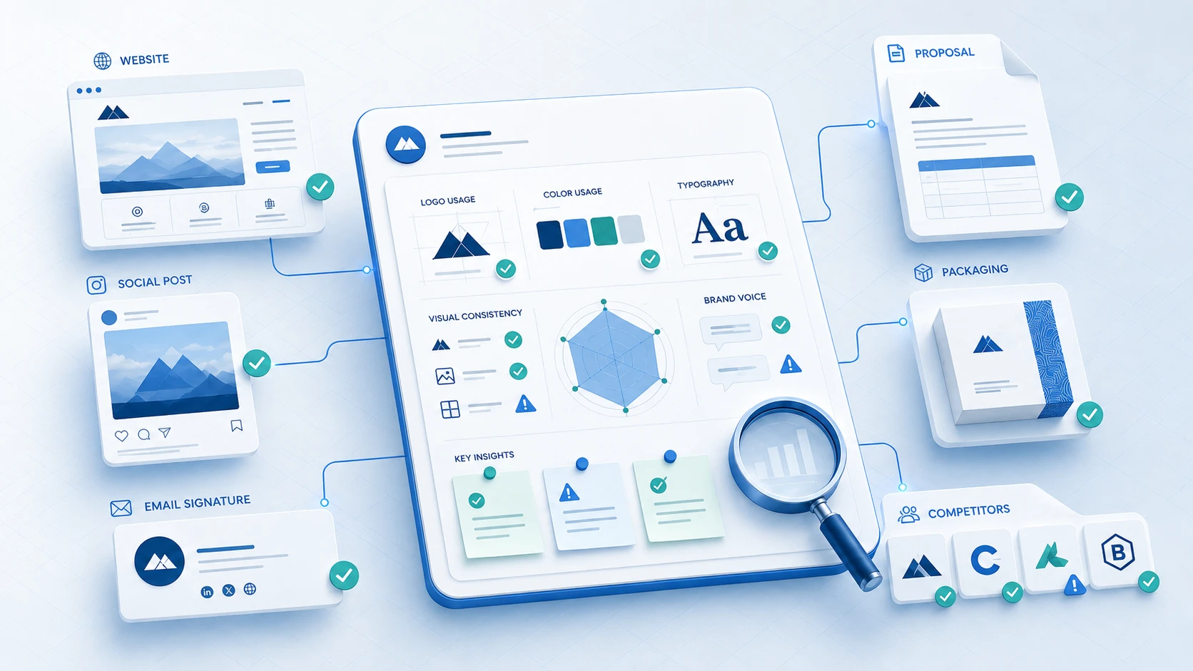
What to audit:
If you’re building a brand from scratch, the audit becomes discovery work. You’re mapping the competitive landscape before you plant your flag.
Where to start: Spend one session collecting screenshots of every customer-facing surface your brand appears on. Lay them side by side. If they don’t look like they belong to the same company, you have a consistency problem that needs to be solved at the strategy level, not the design level.
Every design decision that follows this step has to answer to something. That something is your brand’s foundation: what you do, why you do it, and what you stand for.
Mission statement: What your company does and for whom, expressed in one or two sentences. It should be specific enough to make decisions with. “We help founders” is not a mission. “We design digital products that turn complex ideas into intuitive software experiences” is closer.
Vision statement: Where the company is heading. This is forward-looking and aspirational, but it has to be grounded enough to be useful internally.
Core values: The principles that guide how your team operates, makes decisions, and treats customers. Limit these to four to six. Values that appear on a poster and nowhere else are not values. They’re decorations.
Brand personality: Your brand has a personality just like a person does. Patagonia is committed, no-nonsense, and environmentally driven. Apple is precise, minimalist, and aspirational. Mailchimp is friendly, quirky, and approachable. Defining yours shapes every writing, design, and communication decision you’ll make.
One useful exercise: write down five adjectives that describe your brand as if it were a person. Then ask: do our current marketing materials actually reflect those adjectives? If not, there’s your brief.
This isn’t about collecting general industry data. It’s about understanding the specific people you’re trying to reach and the specific brands you’re competing against.
Audience research: Get specific. Who is your primary buyer? What problem are they solving? What do they read, watch, and trust? What makes them distrust a vendor before they even meet them? The goal is to understand what your audience values, then build a brand that signals alignment with those values.
For a B2B SaaS brand, the buyer might be a VP of Product who values clarity, precision, and track records. For a direct-to-consumer wellness brand, the buyer might be a 32-year-old professional who values transparency, clean ingredients, and brands that don’t take themselves too seriously. Same framework, completely different brand output.
Competitor research: Analyze your three to five closest competitors. For each one, document:
The goal isn’t to copy what’s working. It’s to identify what’s already claimed in your category so your brand can occupy a distinct position. If every competitor uses blue and corporate language, that’s useful information about what differentiation looks like for your brand.
Your value proposition is the clearest statement of why your brand exists for your target customer. It answers one question: why should someone choose you over every alternative, including doing nothing?
A useful value proposition structure: [Your brand] helps [specific audience] achieve [specific outcome] by [specific mechanism or approach] without [specific frustration or cost].
This isn’t your tagline. It’s your internal compass. It drives every headline, every product decision, and every sales conversation.
Brand voice is how your brand speaks. It’s distinct from tone, which changes based on context. Your voice is consistent. Think of it as your brand’s verbal fingerprint.
To define your brand voice, document:
Subway’s “Eat Fresh” works not because the words are clever, but because they match the brand’s core claim precisely and repeat it across every context. Your messaging should do the same: say the same true thing in every format, consistently.
The visual identity system is not a list of elements. It’s a set of components that work together to create a recognizable, consistent brand experience. Each element has a specific role and rules for how it behaves.
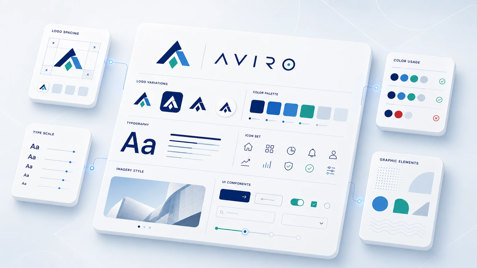
Your logo is the most portable asset in your brand system. It appears on everything from a website favicon to a trade show banner. Design it to work at multiple sizes, in black and white as well as color, and in contexts you might not anticipate.
A few rules worth following: avoid complex gradients or fine detail that disappears at small sizes. Don’t lock it into a single orientation if horizontal and stacked versions would both be useful. And as a general principle, a simple, well-executed mark ages better than something that chases current design trends.
Your color palette usually includes a primary color, one or two secondary colors, and neutrals. Each color should have a specific application rule: primary color for CTAs and hero elements, secondary for accents and supporting graphics, neutrals for text and backgrounds.
Colors carry consistent psychological associations across cultures (though not identical ones). Blues tend to read as trustworthy and professional. Greens signal growth or sustainability. Reds convey urgency or energy. These aren’t rigid rules, but they’re signals your audience will receive whether you intend them or not.
Define your palette in hex (web), RGB, and CMYK. This prevents drift across teams and vendors.
Your type choices signal personality as clearly as color does. Serif typefaces tend to read as established, traditional, or editorial. Sans-serifs read as modern, clean, and approachable. Geometric sans-serifs lean technical or minimal. Script fonts signal creativity or luxury, but need to be used sparingly.
Define your type system with: a primary display typeface for headlines, a secondary typeface for body text, and size/weight guidelines for each context.
Your brand’s imagery style, the types of photos you use, the illustration style, and the way you treat graphics, needs to be as intentional as your logo. Define it clearly. Reference brands or photographers whose visual language aligns with your brand personality.
Icons, patterns, data visualization styles, and motion guidelines all belong to the visual identity system. Brands that define these elements consistently look far more professional than those that let individual contributors make these calls independently.
Every element you’ve designed is only as useful as the rules for using it. Brand guidelines (sometimes called a brand style guide or brand book) document those rules so your whole team, and any external partners, can apply the brand consistently.
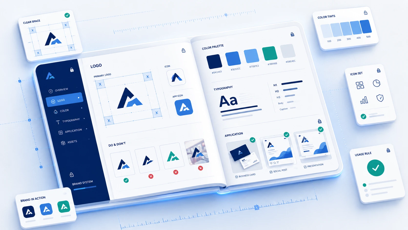
What to include in brand guidelines:
Brand guidelines don’t need to be a 100-page PDF. They need to be specific, accessible, and enforced. A lean brand guide that gets used beats a comprehensive one that lives in a shared drive no one opens.
When your brand guidelines are clear, your team makes consistent decisions without running everything through a bottleneck. That consistency compounds. It’s what turns a brand into a recognizable entity over time.
Brand identity is not a launch event. It’s a living system that evolves based on feedback, market conditions, and company growth.
After launch, track the signals that tell you whether the brand is landing:
Collect this feedback consistently and act on patterns, not isolated comments. Most brand systems need small refinements within the first year: a color adjustment, a revised headline formula, or a cleaner logo variant for small applications. Major rebrands are expensive and disruptive, so iterate early and often before issues compound.
The brands that stay recognizable for decades (Coca-Cola, IBM, Apple) are not the ones that never change. They’re the ones that change deliberately and protect the core system while they do it.
Designing before defining. This is the most common one. Teams go straight to logo exploration without deciding what the brand stands for. The design ends up solving the wrong problem.
Too many typefaces or colors. Every addition to the visual system creates a new element to maintain and a new way for the brand to drift. Restraint is a feature, not a limitation.
Ignoring consistency at the touchpoint level. Your website looks polished but your email signature uses a different font. Your proposal uses an older version of the logo. These small breaks accumulate into a brand that doesn’t feel established.
Defining a brand personality but writing like everyone else. If your brand personality says “bold and direct” but your homepage copy says “we are committed to delivering exceptional solutions for your business,” there’s a gap. The voice guidelines aren’t doing anything.
Treating brand guidelines as a deliverable instead of a tool. Brand guidelines exist to be used. If no one on your team knows they exist, they’re a cost without a return.
You can build a brand identity internally if you have design expertise, clear strategic thinking, and enough distance from your own product to make objective decisions. Most early-stage teams don’t have all three at once.
Consider bringing in an experienced agency or design partner when:
A brand identity agency brings process, external perspective, and execution capacity. The best ones also push back on assumptions your team has held for too long. That friction is part of the value.
Brand identity design is the process of creating the visual and verbal elements that represent a brand, including the logo, color palette, typography, imagery, and brand guidelines. It also covers the brand’s voice, messaging, and personality. When designed as a system, these elements work together to create a consistent, recognizable presence across every customer touchpoint.
A standard brand identity project for a startup or SMB typically takes 6 to 12 weeks, depending on scope and decision-making speed. Full rebrands for established companies with more complex systems and more stakeholders can run 12 to 20 weeks. The research and strategy phase (which most teams underinvest in) usually accounts for the first 2 to 4 weeks of that timeline.
Brand identity is what your company intentionally creates and controls: your logo, colors, voice, and guidelines. Brand image is what your audience actually perceives. The goal of brand identity work is to close the gap between the two, designing an identity that reliably produces the impression you want your audience to have.
A complete brand identity system includes: a primary logo and logo variations, a color palette with defined codes, a typography system, an imagery style, supporting visual elements (icons, patterns, graphic devices), brand voice and tone guidelines, and core messaging. These are documented in brand guidelines so the system stays consistent across all applications.
Measure brand recognition through customer surveys (do new customers accurately describe what your brand does and stands for?), track engagement patterns on branded content, and monitor the consistency of feedback from your sales team about how the brand supports or complicates deals. An identity is working when customers can recognize your brand across channels without seeing your name, and when prospects clearly understand who you are after a single visit to your website.
Yes, but with tradeoffs. A small budget limits your execution options. You may start with a more limited visual system or rely on a smaller toolkit. What can’t be skipped, regardless of budget, is the strategy phase: defining your mission, values, audience, and positioning. Getting those right costs time, not money. A lean, well-defined brand executed consistently outperforms an expensive, inconsistent one.
Brand voice is the consistent personality and style your brand communicates across all written and spoken content. It does not change based on context. Your voice is the same on your website, in your emails, and in your customer support replies. Tone adjusts (more formal in legal communications, lighter in social content), but the core voice stays constant. Define your brand voice by choosing three to five personality qualities, writing examples of what each looks like in practice, and documenting what the opposite of each quality sounds like so your team knows what to avoid.
The most common reason is skipping the strategy phase and going straight to visual design. Teams spend weeks on logo options while still having unresolved questions about who they’re serving, what they stand for, and how they’re positioned relative to competitors. Without that foundation, no logo will feel right, because the real problem isn’t the design. The second most common reason is creating brand guidelines and not enforcing them, which causes brand drift within months of launch.
Yes, but carefully. Brands evolve because companies grow, markets shift, and customer expectations change. The goal is to evolve intentionally, preserving the core elements that carry your recognition equity while updating what’s genuinely dated or no longer accurate. Nike’s swoosh has been largely unchanged since 1971, but their campaign language, imagery, and digital presence have evolved significantly. Know which elements are structural and which are surface-level.
A logo is one element within a brand identity. Brand identity is the full system: logo, color, typography, voice, messaging, imagery, and guidelines. A logo without a brand identity system is just a mark. A brand identity without a logo is still a brand. Companies frequently over-invest in logo design and under-invest in the system that makes the logo meaningful.


An Experience Design Agency focusing on building functional, simple, human-centered digital products for future.