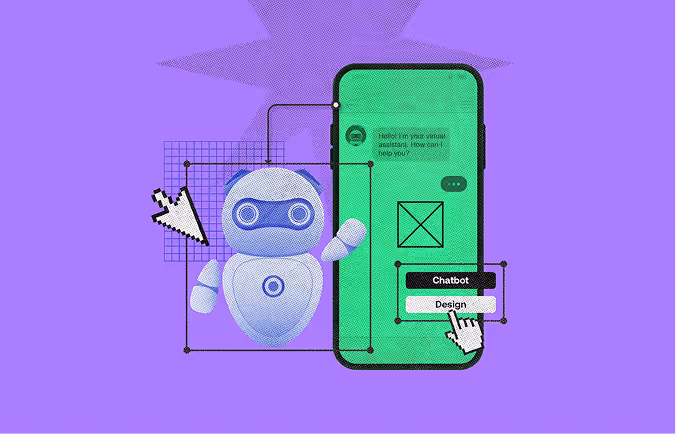
Most chatbots fail not because of bad technology, but bad design. A bot that cannot handle unexpected input, hand off gracefully to a human, or communicate its own limitations clearly will frustrate users regardless of how advanced the underlying model is. These are design problems, not engineering ones.
That is why the chatbot design process matters. Nielsen Norman Group research confirms that chatbot success comes down to small, repeatable design decisions, not AI sophistication. This guide covers all seven steps: from defining scope and mapping flows to UI design, testing, and iteration. Whether you are building your first bot or redesigning one that is not working, the process is the same.
A successful chatbot is not designed by writing random replies. It follows a structured UX process that moves from strategy and user research to conversation flow, interface design, testing, and continuous improvement.
The seven steps below show how to design a chatbot that understands user intent, handles errors gracefully, and supports real business goals without frustrating users.
Before anything else, answer one question: what specific problem does this chatbot solve?
A chatbot trying to handle everything handles nothing well. The most effective bots focus on one or two defined use cases. Domino's Pizza chatbot on Facebook Messenger placed orders. Progressive's Flo chatbot generated insurance quotes. Neither tried to be a general-purpose assistant.
Define these three things before moving on:
Skipping scope definition is the single most common reason chatbots get rebuilt from scratch six months after launch.
A chatbot that does not understand its users defaults to generic responses that frustrate everyone. User research here does not need to be elaborate, but it has to happen.
Start with existing data. Pull support tickets, live chat logs, and sales call recordings. Look for the questions that repeat. Those are your chatbot's first conversation threads.
Build two to three user personas. Each persona needs: a demographic snapshot, their goal in using the chatbot, their likely starting point in the conversation, and their most common frustration. A persona for a SaaS onboarding bot looks very different from one for an e-commerce returns bot.
Map the user journey. Trace the full path a user takes before reaching the chatbot, during the conversation, and after they get (or do not get) an answer. This reveals where the bot can intervene, where it should stay out of the way, and what handoff points to design.
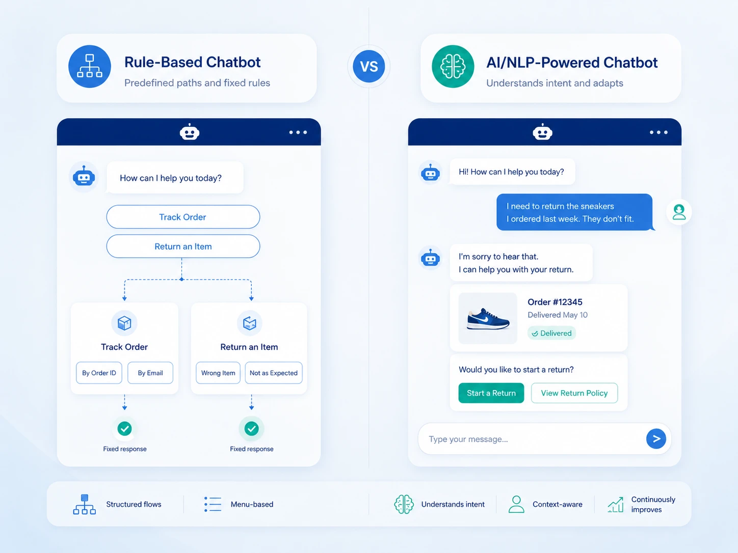
The interaction model determines the entire design approach. There are two primary types.
These use predefined decision trees. The chatbot presents options, the user picks one, and the bot follows the corresponding path. There is no guessing about user intent.
Rule-based bots are reliable and fast to build. They work well for bookings, FAQs, order tracking, and any task with a finite number of paths. The tradeoff: they break down the moment a user asks something off-script.
These use natural language processing to interpret open-ended input and respond contextually. Users can type freely instead of clicking buttons. The bot learns from interactions over time.
AI chatbots handle ambiguity better but require more training data, more testing, and more ongoing maintenance. They are the right call for customer support at scale, complex onboarding flows, or any context where users arrive with varied and unpredictable needs.
Many production chatbots combine both: NLP for intent detection, rule-based flows for structured task completion.
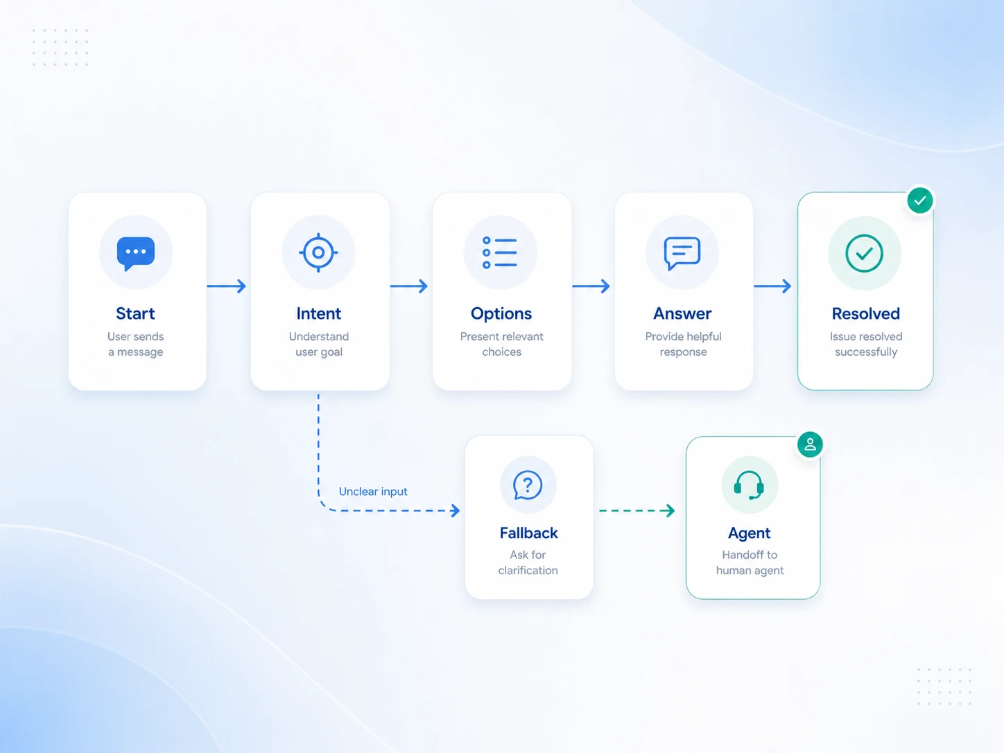
This is where the actual UX design work begins. The conversation flow is the blueprint for everything the chatbot can say, ask, and do.
Map the ideal conversation first: the path a user takes when everything goes as expected. A support bot's happy path might look like: greeting > issue category selection > specific question > resolution > confirmation.
Use mind mapping tools like Miro or Whimsical to lay these out visually before writing any copy. Tools like Figma also support conversation flow mapping with component libraries built for this purpose.
Every conversation has off-ramps. What happens when a user asks something the bot does not understand? What if they abandon mid-flow? What triggers a handoff to a live agent?
Design explicit fallback messages: responses the bot sends when it cannot interpret input. A good fallback does three things: acknowledges the failure, offers a clear next option, and does not pretend the failure did not happen.
Bad fallback: "I'm sorry, I didn't understand that." Better fallback: "I'm not sure I caught that. Here are the things I can help with - pick one or type 'agent' to reach a person."
The bot's tone should match the brand and the context. A healthcare bot should feel calm and clear. A retail bot can be warmer and more casual. Whatever the tone, it must stay consistent across every message.
Keep messages short: two to three sentences maximum per bubble. If the answer is complex, break it into multiple messages sent in sequence with a short pause between them. This mimics human typing rhythm and reduces cognitive load.
Avoid jargon. Use the same language your users use in support tickets and social comments, not the language your internal teams use.
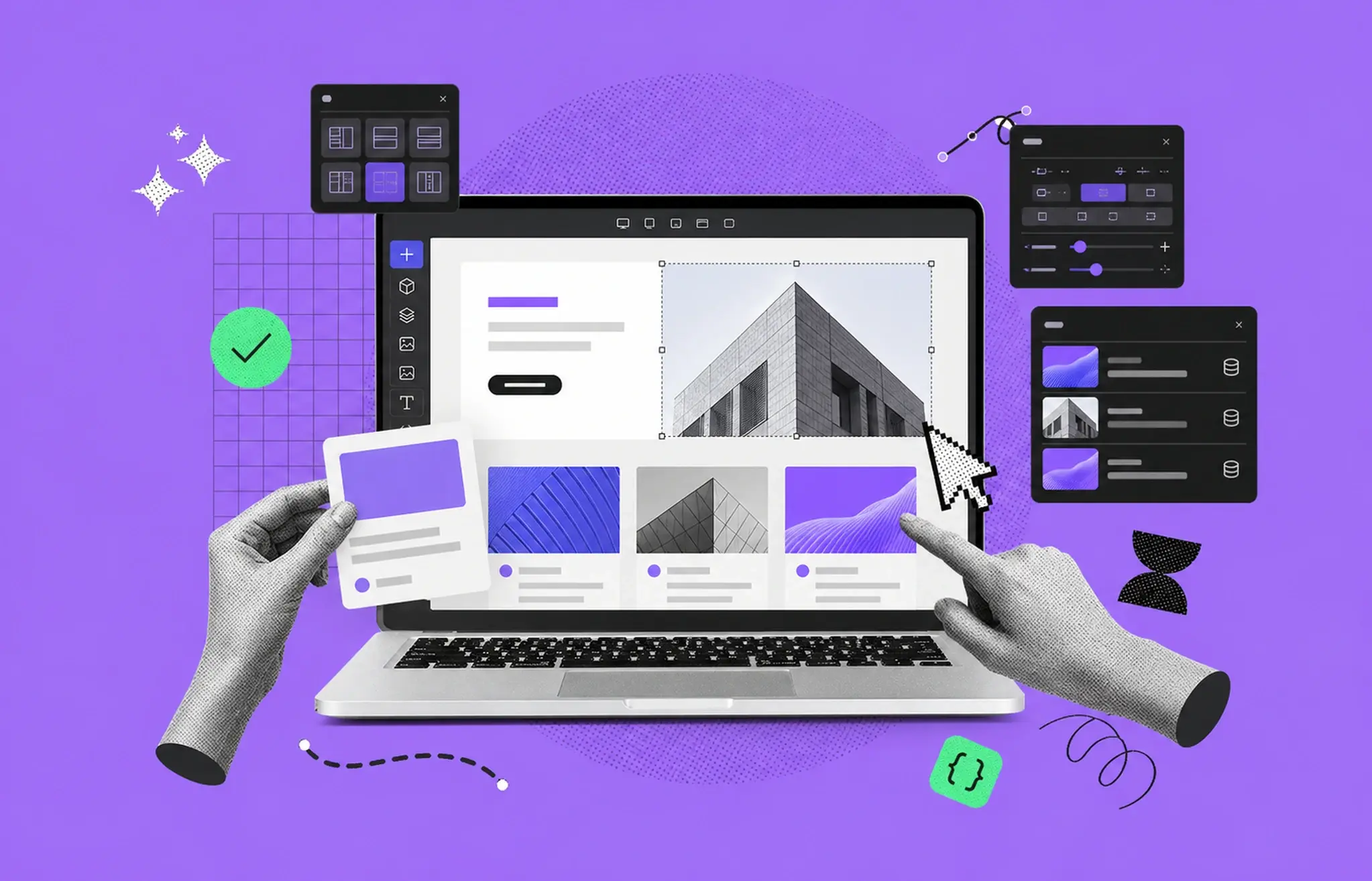
Chatbot UI design is distinct from general UI design. The canvas is narrow, the interactions are sequential, and the user's attention span inside a chat window is short. Research consistently shows that small UI decisions (not the underlying AI) determine whether users engage with a chatbot or abandon it.
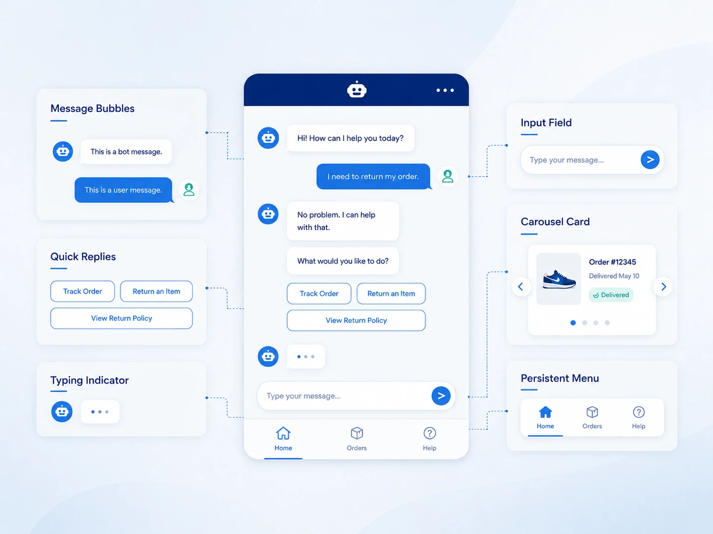
Core UI elements to design:
For color, limit the palette to two to three tones. The bot's bubble color should contrast with the background without competing with your brand's primary color. Accessibility matters: maintain a minimum 4.5:1 contrast ratio for text (WCAG 2.1 Level AA).
Carousel formats (horizontal scrollable cards with images and buttons) work well for product recommendations, service selections, or multi-option decisions. Use them sparingly. A carousel presented at the wrong moment feels like an ad.
If your site has multiple chat options (a product assistant, a live chat widget, a support bot), users should not have to figure out which one to use. Home Depot's site offered both "Magic Apron" (product assistant) and "Live Chat" (customer service), positioned differently with no clear distinction. Users in research sessions consistently failed to find the right entry point. Merge chat options into a single entry point with escalation capabilities built in. Internal architecture should never be visible to the user.
Users expect the chatbot to follow them as they browse. Redfin's AI search was accessible only via the search bar; once users navigated to individual listings, the chatbot disappeared. One research participant noted: "Usually, I'll see it in the corner somewhere." If a user starts a conversation on the homepage and continues browsing to a product page, the chatbot should persist. For multi-page tasks like property searches, product comparisons, or service bookings, a disappearing chatbot breaks the flow entirely.
Vague greetings destroy engagement before the conversation begins. Turo's generic "Ask me anything" approach set unrealistic expectations and left users unsure where to start. Williams Sonoma's AI Sous Chef performed significantly better by listing specific help areas upfront: finding cookware, discovering recipe essentials, and looking up recipes.
Go further by tailoring the opening message to context. Amazon's Rufus displayed broad suggestions on the homepage but switched to product-specific questions when users landed on a product page, immediately signaling that the bot knew where the user was and what they likely needed. Match the opening message to the page the user is on, not just the site they are visiting.
When you want to guide users toward certain questions, present those questions as tappable buttons, not inline text suggestions that look like part of the bot's response. Buttons reduce effort, eliminate ambiguity about what is clickable, and measurably increase engagement over typed alternatives.
Update suggested buttons contextually as the conversation progresses. Buttons that repeat or become irrelevant after the first exchange feel pushy. One Redfin participant grew frustrated when the chatbot repeatedly surfaced features she had deliberately excluded from her search. If a user has signaled a preference, the next round of suggestions should reflect it.
Text-only responses underperform for any task that involves physical objects, spatial relationships, or visual choices. A Home Depot user appreciated seeing paint color swatches alongside product links. A Williams Sonoma user wanted product pictures when receiving cookware recommendations. One participant who asked about P-trap installation during a DIY plumbing task received only a text description of a connector, when a diagram would have resolved the question immediately.
For product recommendations: embed product images directly in the chat response rather than linking out. For instructional content: include diagrams or step-by-step visual breakdowns within the message. For process flows: a numbered visual beats a numbered list in a text bubble every time.
The extra implementation effort pays back in reduced follow-up questions and higher task completion rates.
Long responses dumped into a single message overwhelm users and push earlier context out of view. Amazon's Rufus included a "More details" link, but clicking it generated a new message at the bottom of the conversation, forcing users to scroll back up to re-read context. One participant described the ideal behavior: "It would be nice if it shows you the details, and then you say okay, cool, get rid of that, and just like collapse it."
Implement progressive disclosure using in-place accordions. When a user taps "More details," the expanded content appears within the same message bubble: collapsible, without disrupting the conversation's scroll position. This pattern keeps the chat readable and the user oriented.
Some chatbots autoscroll to the end of a response as it streams in. Mississippi's government chatbot, MISSI, scrolled users to the bottom while the response was still generating, forcing them to scroll back up to read from the beginning. This is disorienting regardless of how good the response content is.
Keep the user's scroll position anchored to the top of the new message when a response starts. Let the user scroll down at their own pace. Do not move the page for them while they are still reading.
The default chat window size is a constraint, not a design choice. Scouting America's chatbot, Scoutly, displayed an interactive map inside the chat that was nearly unusable at the default window size, but immediately useful once expanded. Chatbots that display product carousels, maps, tables, or detailed lists need more real estate than the standard widget provides. Build in a resize handle or a maximize option. Users should control the workspace, not work around it.
A Williams Sonoma user who found a sourdough recipe in the chat wanted to email it to her family. The chatbot offered no way to do that. Any chatbot that generates content users would want to keep (recipes, DIY instructions, property summaries, product comparisons) needs save and share options. Add download, email, or copy-to-clipboard functionality for generated content. This is low implementation cost with high perceived value.
Voice-to-text input is not a convenience feature; it is an accessibility requirement for users with motor impairments, repetitive strain injuries, or low literacy. One Redfin participant stated: "Please, please have a voice-to-text option. It's going to help me a lot," adding that she would abandon the chat after three minutes of typing. Integrate voice input as a standard option in the chat input bar, not an experimental add-on. Reference WCAG 2.1 Success Criterion 2.1.1 when making the case internally.
No conversation flow survives first contact with real users unchanged. Prototype before you build.
High-fidelity prototypes using Figma or ProtoPie let you simulate full chatbot conversations without writing code. Test with five to eight users from your target persona group. Watch for where they hesitate, misread options, or abandon the flow.
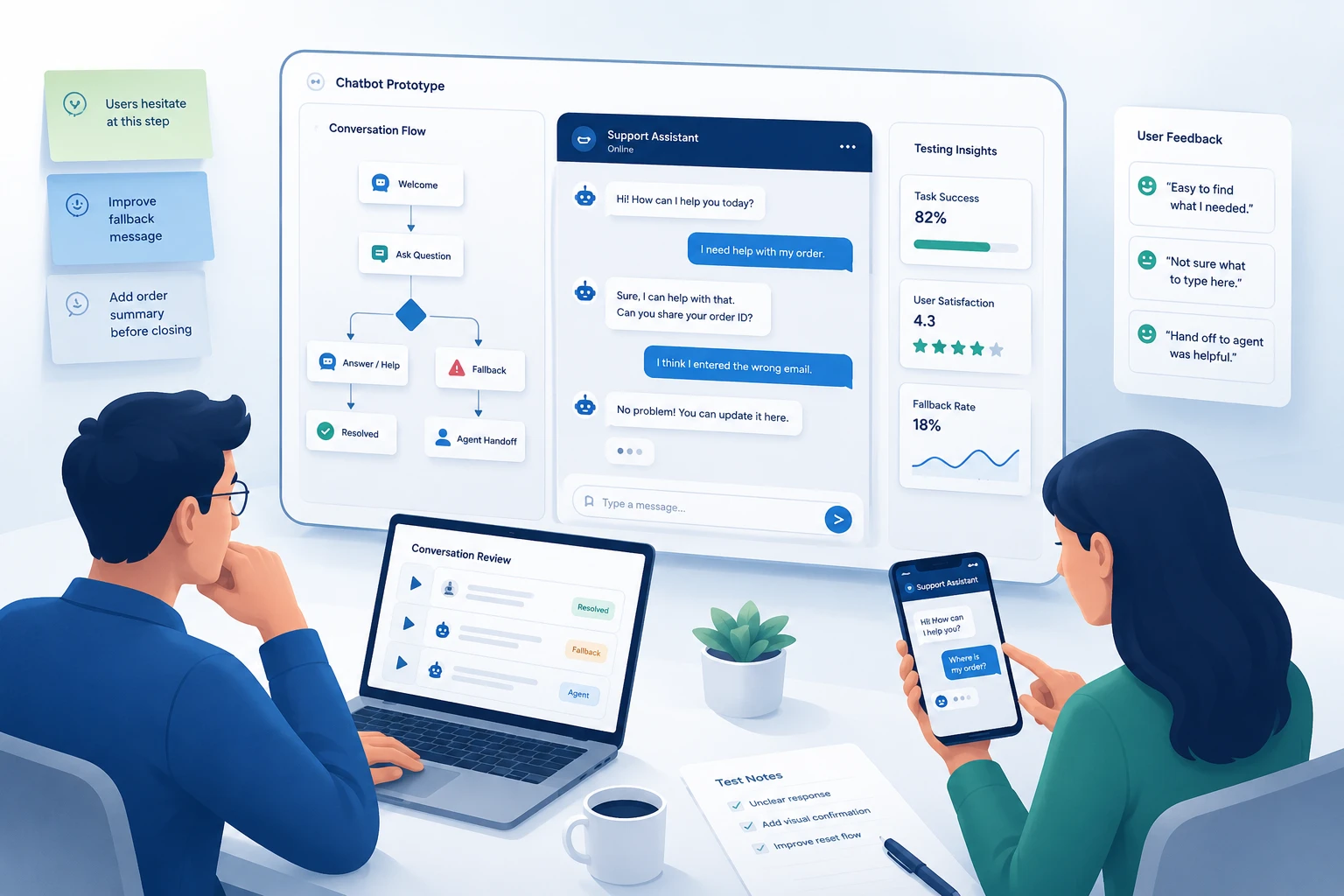
Key things to test:
Run at least two rounds of testing with fixes in between. First-round testing almost always surfaces structural problems. Second-round testing catches copy and flow issues.
Document every session. Note what users say out loud and what they do not say but show in their behavior: hesitation, rereading, unexpected inputs.
Launching is not the end of the design process. It is the beginning of the real one.
After launch, monitor:
Set a review cycle: weekly at first, monthly after the first 90 days. Use actual conversation logs to identify new user intents the bot was not designed to handle. Add those flows in the next iteration.
The best chatbots are not set-and-forget products. They are living interfaces that improve every sprint.
AI has shifted chatbot design from scripting fixed paths to shaping dynamic conversations. Understanding this shift changes how designers approach every step of the process.
Current role: AI models now power intent detection, contextual response generation, and real-time personalization in modern chatbots. Designers no longer write every possible answer; they define the boundaries, tone, and escalation logic while the AI fills the gaps. This makes conversation design more strategic and less scripted.
How AI empowers designers: AI-powered chatbots handle input variations that rule-based bots would fail on entirely. A user who types "my package hasn't arrived" and one who types "where is my order" are asking the same thing. AI resolves both without requiring the designer to anticipate every phrasing. This frees designers to focus on edge cases, fallback quality, and the handoff experience.
Future impact: Multimodal AI (combining voice, image recognition, and text) is collapsing the boundary between rule-based and AI chatbots. Future chatbot design will require designers to account for voice-first interactions, image-based queries, and real-time context from user behavior. The process does not change; the inputs and outputs become richer.
Practical application: When designing for AI chatbots specifically, plan for streaming response behavior (users read as the bot types), hallucination risk (the bot may state incorrect information confidently), and context window limits (long conversations can degrade response quality). Each of these creates specific UX challenges that the conversation design and UI design steps must address directly.
Whole Foods on Facebook Messenger lets users search recipes by ingredient. The interaction is simple: user sends a food emoji, bot returns recipes featuring that ingredient. The scope is narrow, the interaction is delightful, and it stays within a well-defined lane.
Amazon Rufus demonstrates context-aware suggested prompts at scale. On the homepage, Rufus displays broad discovery suggestions. On a specific product page, it switches to product-focused questions, immediately signaling that the bot knows where the user is and what they are likely evaluating. The design adapts to user context without requiring users to re-orient themselves.
Williams Sonoma's AI Sous Chef outperforms generic chatbot greetings by listing specific capabilities upfront: finding cookware, discovering recipe essentials, looking up cooking instructions. Users know immediately what the bot can do and start faster. The unresolved gap: when users find recipes they want to keep, there is no save or share option, which research participants flagged directly.
Home Depot's Magic Apron uses contextually updated button suggestions after each user response, keeping suggested actions relevant as the conversation progresses. The approach reduces the need for users to type and keeps them within a structured flow even when their questions shift between categories.
Adrian Zumbrunnen's portfolio chatbot replaced a traditional portfolio with a conversational experience. Visitors interact with the site through a chat interface that reveals his work, process, and background. The example shows how conversation flow design can replace standard navigation in creative contexts.
UPS Ask UPS handles package tracking, shipping rate lookups, and service center locations through a structured rule-based flow. It is not trying to replace a full support team; it handles the highest-volume, most repetitive queries so the team does not have to.
Each of these works because the scope was defined first and the conversation was designed to serve one clear user goal.
Skipping the fallback design. Every bot encounters input it cannot handle. Designing for the happy path only means the bot fails visibly and frustratingly when it hits the edge.
Writing a personality before writing the flows. Brand voice matters, but not until the structure is solid. A chatbot with great copy and a broken flow still drives users away.
Over-promising scope. A chatbot that claims it can help with anything and then fails to answer a basic question destroys trust immediately. Define scope and communicate it clearly at the start of every conversation.
Using a vague opening message. "Ask me anything" is not an invitation; it is a dead end. Users who do not know what the bot can do will not use it. Greet users with specific, contextual capability signals, not a blank prompt.
Hiding the chatbot after page navigation. A bot that disappears when users move between pages forces them to start over or give up entirely. Persist the chatbot across all pages relevant to the task the user is completing.
Autoscrolling during streaming responses. Moving the user's viewport while they are still reading the beginning of a message is disorienting. Keep scroll position at the top of each new response and let the user control their own reading pace.
Ignoring the handoff. The transition from bot to human is a critical moment. A bad handoff (long wait, no context transferred, user has to repeat everything) erases whatever goodwill the bot built.
No exit option. Users need to feel in control. Always give them a way to reach a human or restart the conversation.
Offering no way to save generated content. Users who receive recipes, instructions, comparisons, or personalized recommendations want to keep them. A chatbot that generates valuable content but offers no save, copy, or share option wastes the value it just created.
If your chatbot is customer-facing, handles a high volume of interactions, or is part of a product experience, it deserves the same design rigor as any other interface. DIY conversation design works at small scale. It breaks down at product scale.
A UX team brings user research methods, conversation design expertise, prototyping tools, and testing discipline to the process. Musemind has designed conversational interfaces across SaaS platforms, customer support tools, and digital product experiences. If you are building a chatbot that has to perform, talk to our UI/UX design team before you start coding.
The chatbot design process is a structured workflow that covers defining the bot's purpose, researching users, mapping conversation flows, designing the UI, prototyping, testing with real users, and iterating after launch. It is essentially UX design applied to conversational interfaces.
The core steps are: (1) define scope and goals, (2) research users and map their journey, (3) choose between rule-based and AI/NLP models, (4) design conversation flows including fallbacks, (5) build the visual UI, (6) prototype and user-test, and (7) launch and iterate based on performance data.
Conversation design is the practice of scripting and structuring what a chatbot says, asks, and does at every point in an interaction. It covers message tone and length, quick reply options, fallback responses, handoff logic, and the overall narrative arc of the conversation.
Rule-based chatbots follow fixed decision trees and only respond to programmed options. AI/NLP chatbots use natural language processing to interpret free-text input and respond contextually. Rule-based bots suit structured tasks; AI bots suit open-ended conversations. Many production bots use both.
A simple rule-based chatbot with a defined scope can be designed and tested in two to three weeks. A more complex AI-powered chatbot with multiple conversation branches, fallback handling, and thorough user testing typically takes six to ten weeks before launch-ready.
Common tools include Figma or Sketch for UI design and prototyping, Miro or Whimsical for conversation flow mapping, Botmock or Botsociety for chatbot-specific prototyping, and Google Analytics or Dashbot for post-launch performance monitoring.
A fallback message is what the bot says when it cannot interpret or respond to the user's input. A well-designed fallback acknowledges the failure, explains the bot's limitations, and offers a clear next step: a menu of options or a route to a human agent. Fallback design is one of the most important and most neglected parts of the chatbot design process.
A chatbot user flow is a visual map of all the possible paths a user can take through a conversation. It shows every branching point, conditional response, fallback state, and exit option. User flows are designed before writing any copy and updated based on real conversation data.
Test the chatbot using high-fidelity prototypes with users from your target persona group. Run moderated sessions where you observe users interacting without guidance. Look for hesitation, confusion, fallback triggers, and early abandonment. Run at least two rounds of testing with fixes between them.
Successful chatbot UX starts with a narrow, well-defined scope, follows with clear conversation flows and honest fallback handling, and improves continuously based on post-launch data. The bot should feel helpful and honest: clear about what it can and cannot do.
The opening message should state clearly what the chatbot can help with, not just invite the user to ask anything. Effective opening messages list two to four specific use cases and, where possible, adapt to the page context the user is on. A chatbot on a product page should open with product-specific questions, not generic homepage prompts.
Yes. Voice input is both a convenience feature and an accessibility requirement. Users with motor impairments, repetitive strain injuries, or low literacy rely on voice-to-text as their primary input method. A chatbot that requires sustained typing excludes a significant portion of its potential users. Integrate voice input as a standard option, not an experimental one.


An Experience Design Agency focusing on building functional, simple, human-centered digital products for future.