A user flow is the step-by-step path a person takes through your app or website to complete one specific task. In UX design, it is one of the first things a team maps before any screen gets built. Get it right early and you catch friction, dead ends, and broken decision points on paper. Get it wrong and those problems ship straight into production.
Most designers understand the basic concept. Fewer know how to pick the right type of flow, use the correct symbols, or build one that holds up across a full product team. That gap is what this guide closes.
You will learn what a user flow is in UX design, how it differs from a user journey map and a sitemap, the three main types every designer should know, the standard flowchart symbols, a seven-step process to build one from scratch, real-world examples, common mistakes teams make, and the tools most teams are using in 2026.
A user flow is a diagram of every step, screen, and decision a person passes through inside a digital product to reach one specific outcome. The flow starts at an entry point such as a homepage, push notification, or search result. It ends at a goal such as a confirmed order, a saved file, or a successful login.
Think of it as the wiring diagram behind a feature. Before any UI gets designed, the team agrees on which screens exist, what branches a user can take, and where the path ends. A clean flow saves redesigns. A messy one ships confusion straight to production.
Two specifics worth nailing down:
People mix these three up constantly. They serve different purposes.
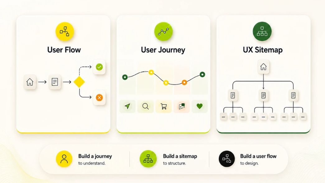
Quick rule of thumb: build a journey first when you want to understand the user. Build a sitemap when you want to understand the product. Build a user flow when you are ready to design the screens.
Designers use three formats depending on how much detail the flow needs to carry.
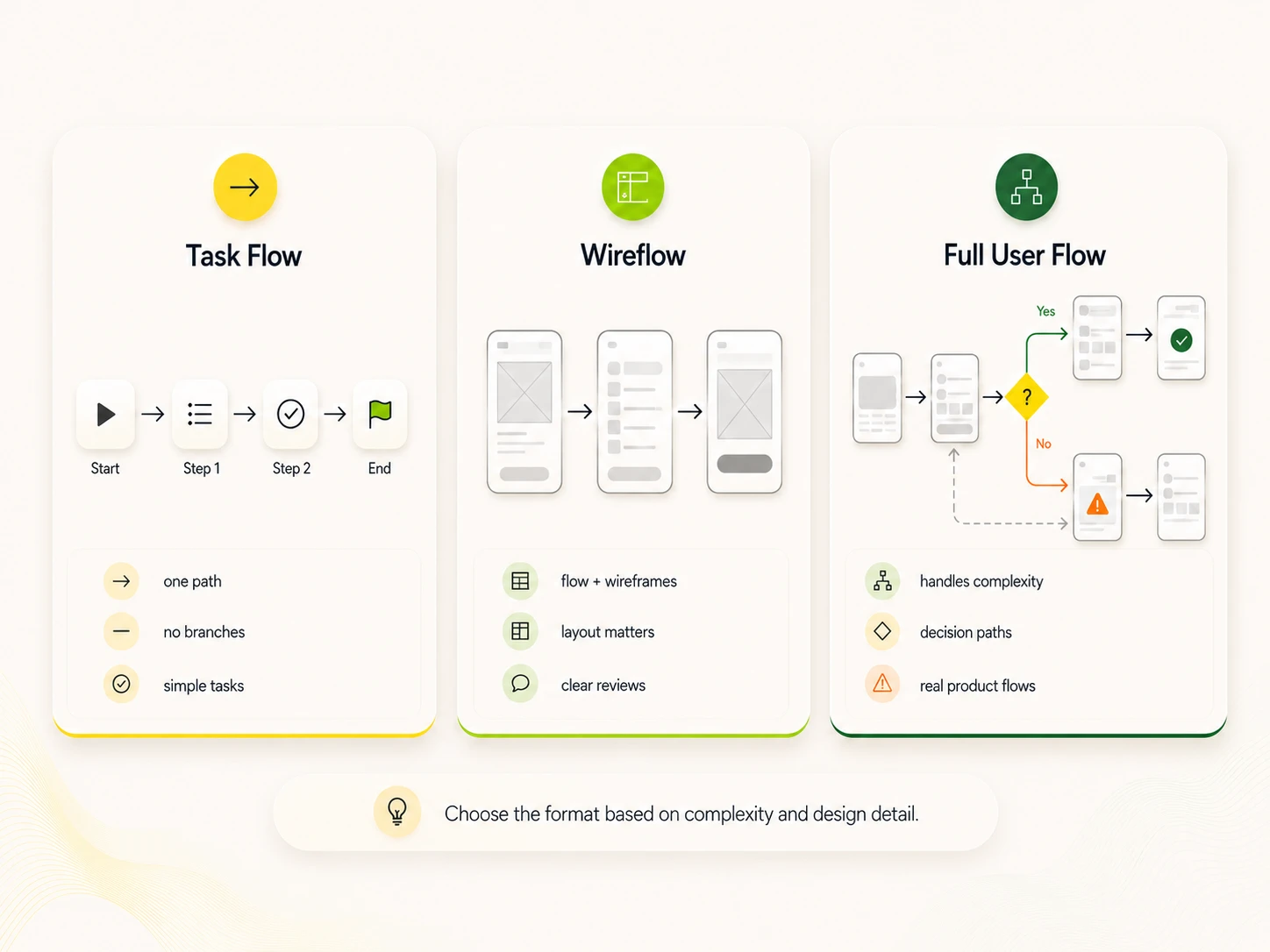
A task flow shows one path through one task and assumes every user does it the same way. No branches. No alternate routes. Just the happy path.
Use it when you need a simple shared reference for an obvious sequence such as "enter email, get verification code, confirm." Stakeholders read it fast and engineers can scope from it directly.
A wire flow swaps the abstract shapes for low-fidelity wireframes connected by arrows. The Nielsen Norman Group coined the term, and the format works best for mobile screens where the screen sketch already shows the action.
Pick this format when the layout of each screen matters to the decision. It is heavier to produce but it kills ambiguity in design reviews because what you see is what gets built.
The full user flow accounts for branches, conditions, alternate routes, and error states. It often ties to a specific persona and entry point. Different users may start in different places, but the goal stays the same.
This is the format you reach for when the feature has real complexity. Onboarding with social login plus email, checkout with guest plus account, or password recovery with multi-factor auth all live here.
Most user flows use a small set of shapes from the ISO 5807 flowchart standard. You only need five for almost every flow.
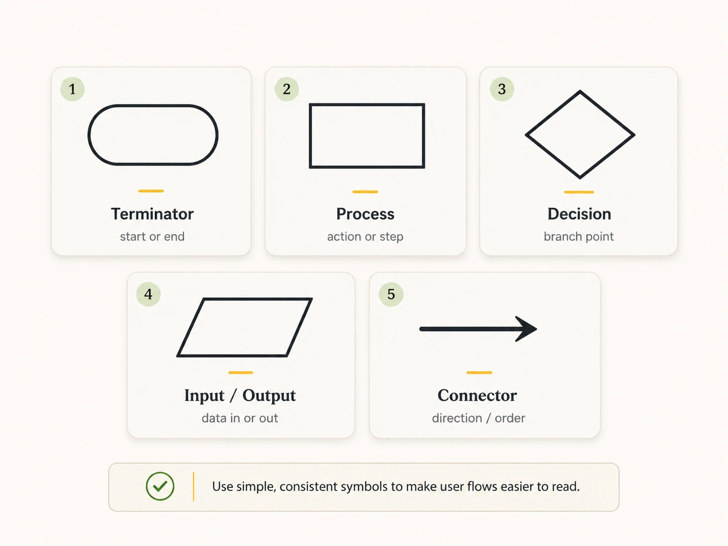
A few rules that keep flows readable:
If you bring in less common shapes (document, manual input, off-page connector), add a legend. Designers across teams should not have to guess.
Use this process to take any flow from a blank canvas to a stakeholder-ready diagram.
Pick a single outcome. Sign up, place an order, reset a password, share a file. One flow, one goal. If you find yourself drawing two endings, split it into two flows.
A flow starts somewhere. Search result, push notification, deep link, paid ad, homepage hero, in-app banner. The entry point shapes context, expectations, and the first screen the user lands on. Skip this step and the first screen never quite fits.
If you have multiple user types, pick the one this flow serves. A returning customer with saved payment info needs a different flow than a first-time guest. Mixing them produces a flow that fits nobody.
Write the steps as a numbered list before you open Figma or Miro. Each step is one screen, one action, or one decision. The list surfaces holes faster than a diagram does and keeps you from sketching twice.
Now turn the list into a diagram. Use diamonds for decisions, rectangles for actions, and ovals for entry and exit. Add error states, empty states, and recovery paths. A login flow needs "wrong password" and "account locked" branches, not just the success path.
Walk product managers, engineers, and content writers through it. PMs catch missing business rules. Engineers catch impossible states. Writers catch confusing labels. Each pass tightens the flow before it becomes wireframes.
Run the flow past real users with a clickable prototype. Watch where they hesitate. Update the diagram and label the version. Flows are living documents. The first draft is almost never the shipping draft.
Three examples show how the format scales from simple to complex.
Entry: Email invite link
Entry: Product page "Add to cart"
Entry: "Forgot password" link
All three are shapes you will draw weekly as a designer. The level of detail matches the complexity of the task.
Most flow problems trace back to the same six errors.
A flow that survives review usually ships in something close to its diagrammed form. A flow that does not survive review never should have been wireframed.
Pricing changes often. Check each vendor before you commit a team. The right pick depends less on features and more on where your team already works. A design team in Figma should pick FigJam. A product team in Notion or Slack should look at Whimsical or Miro. An ops team in Microsoft 365 should default to Visio.
A user flow is one artifact inside a bigger product design process. Founders and PMs often draw the first flow themselves, then hit a wall once the product has more than three or four parallel features. That is the point where flows turn into design systems, information architecture, and shipping wireframes.
Musemind builds user flows as part of full UI/UX design engagements for SaaS, MVPs, and B2B products. The team works from research to wireframes to launched Webflow or production code. If you have an early-stage flow that needs a sharper structure or a full product that needs a rethink, talk to our design team.
A user flow is a map of the steps a person takes through a product to finish one task, drawn as boxes, diamonds, and arrows.
It surfaces friction before design and code start. Fixing a flow on paper costs minutes. Fixing it after launch costs sprints.
After user research and persona work, before wireframes. The flow tells you which screens you need to design.
A user flow shows behavior inside one product. A user journey shows emotions, touchpoints, and stages across the full experience. Build a journey to understand. Build a flow to design.
Task flow (single linear path), wire flow (flow drawn with wireframes), and the full user flow or UI flow (diagram with branches, decisions, and error states).
Five core shapes from the ISO 5807 flowchart standard: oval for start and end, rectangle for actions, diamond for decisions, parallelogram for input and output, and arrows for flow direction.
Best practice is one flow per persona when the paths diverge. If the personas share the same path, one flow is fine. Branches inside one flow get unreadable past two personas.
Figma plus Fig Jam for design-led teams, Whimsical for fast flowcharts, Miro for cross-functional workshops, and Lucid chart for detailed business diagrams. Pick based on where your team already works, not feature count.
A wireframe is one screen at low fidelity. A user flow is the sequence of screens connected by actions and decisions. Wireframes show layout. Flows show movement.



A digital transformation agency bringing strategy, design, and development together to build useful digital products for ambitious businesses.