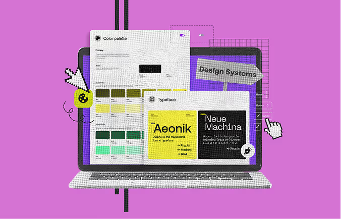
When we talk about design systems, we essentially mean a comprehensive guide for designing. These systems offer a structured approach to developing digital products, which is vital in creating efficient, consistent, and scalable solutions.
Initially, only tech giants embraced design systems. However, as time passed and competition grew, so did the need to build a unique identity.
Today, nearly all companies with a digital presence embrace design systems. This is why it's crucial to understand what design systems are and how to implement them in your project.
With that in mind, let's take you through the essential steps to build a successful design system.
A design system is a collection of all design resources that a product design company stores so that they can create the user interface of their app, website, eCommerce store, or any other UI design they need to create.
Take Google's Material Design System, for example - it's a wealth of resources, from Starter Kits to Typography guidelines.
In simple terms, a design system is a handy collection of ready-to-use patterns and style guides. You plug these into your software projects to keep everything looking consistent.
It's not just about pretty visuals, though. Design systems cover the whole shebang - from code and documentation to style guides and reusable bits and pieces for web design.
They can even help with content, ensuring it fits your brand's tone and style. Think of it as a tool that makes design and development a smooth and strategic partnership.

According to Elizabeth from Designer Up:
“Beyond creating and implementing designs, design systems are tremendous untapped resources for better user experiences and interfaces just by studying them.”
The modern design system consists of 3 parts :
Most designers are likely familiar with the significance of these components. However, if you're new to this, here's a breakdown:
A style guide is a document that tells you how to use a brand's graphic style, colors, fonts, icons, images, and principles. It also has rules about how to use its graphic style, colors, fonts, iconography, images, and principles. Style guides answer the questions "What should something look like?" and "Where should it be used?"
A pattern library is a collection of components that designers use to address usability issues; a navbar may include a logo, links, a search bar, and a call-to-action button. This library contains patterns for both molecules and organisms. User interface (UI) patterns can be found in a design system's pattern library.
A component library is a library of user interface elements that can be used with a given design framework. Atomic component library: a component is a modular piece of code that can function independently or as part of different UI patterns, for instance, a button.
As you can see from the explanations, the difference between a pattern library and a component library is the difference in atomics methodology, so what each of the components means is given below:
Atoms: Atoms are the building blocks of design that can't be broken down any further. Buttons, icons, forms, and so on are all examples.
Molecules: Molecules combine atoms to make more significant UI components or patterns like navigation, breadcrumbs, etc.
Organisms: Organisms are complicated user interface patterns made up of atoms and molecules. These patterns shape the user interface with cards, navigation bars, logos, search fields, etc.
Templates: Templates Full layouts and wireframes that include atoms, molecules, and organisms. A template starts to look like pieces of a website or app.
Page: A page lets you see everything on one screen.
Read Also: Top UI UX Blogs For Designer To Follow For Inspiration
Now that you understand what these terms mean and how they interact. Let's quickly look at how to create a design system.
Identify your project's goals and make sure every team member knows them. Implement team values to develop a shared mindset. Make sure to communicate changes to goals and values.
Establish design principles because they are the roadmap that helps teams realize the product's true potential. Teams can simplify and streamline the product's design without sacrificing functionality or aesthetics.
Note all the edit regulations. It should include language tone and voice, specific words to highlight across all products and marketing materials, and capitalization and punctuation guidelines. These ensure all company communications convey brand-consistent messages.
List all the design patterns currently used in your interface, and note any inconsistencies you find. It should include all the elements, components, annotations, modules, and layouts.
In a color palette, it is crucial to specify both the number of colors and their respective tones with utmost precision. As a result, developers and designers can easily refer to the system's defined colors, ensuring accessibility for all stakeholders. Having a consistent color scheme, fewer user variables, and fewer duplicates is a quick and advantageous win.
You can do this by optimizing it to fit the existing styles or creating a harmonious scale using the golden ratio or major second. When constructing the scale, remember that you are setting the font size, weight, line height, and other properties.
Select which icons from the UI library will be implemented consistently, and make that your standard.
This is a never-ending project. Patterns should always reflect either the truth about the product or its aspirational state in the near future.
Having a style guide comes with a number of benefits, including the following:
It helps maintain uniform visual consistency throughout the entirety of your product and brand. This contributes to developing a trustworthy relationship with your users or audience.
If you have a style guide for your brand, it will help you easily onboard new designers or team members. This also makes participating in or making design decisions simpler for them.
In addition to specs of UI components, guidelines also describe best practices. It makes it easier for a reader to make the right choice.
The bugs and need for testing will decrease as more applications and teams use the same design system and user interface controls. This will result in faster development of applications, as well as more stable applications with fewer issues.
A design system ensures that the entire organization speaks the same language. Since all team members are referring to the same source, team communication is enhanced. There is no need to debate a component's functionality and arrive at a solution.
The secret to enhancing your products is Re-iteration. Having a design system in place makes it simple to update it in accordance with new standards and fashions. The teams can always talk about how to include new elements, define new rules, and improve the usability and comprehension of a design system for users.
When multiple people are contributing to your brand’s content development, it can be challenging to maintain a consistent, recognizable, and ownable brand identity without a style guide. Spending the time and energy necessary to create a comprehensive and accurate style guide is essential for protecting the business’s image.


