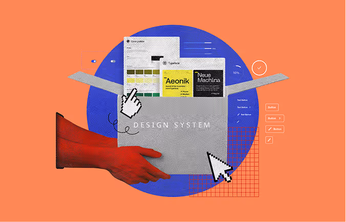
Most websites have design decisions. Very few have a design system. The gap shows in every inconsistent button state, every mismatched heading size, and every developer who hardcodes a hex value because they can't find the "right" color. A UI design system closes that gap. This guide walks you through eight concrete steps to build one that actually gets used from audit to implementation.
If your team spends time every sprint debating button styles, chasing down "the right" font size, or rebuilding components a developer already asked for last month, that's not a workflow problem. That's a missing design system.
A UI design system is a structured, governed set of design decisions including tokens, components, patterns, and documentation that guides how a digital product looks, behaves, and evolves over time.
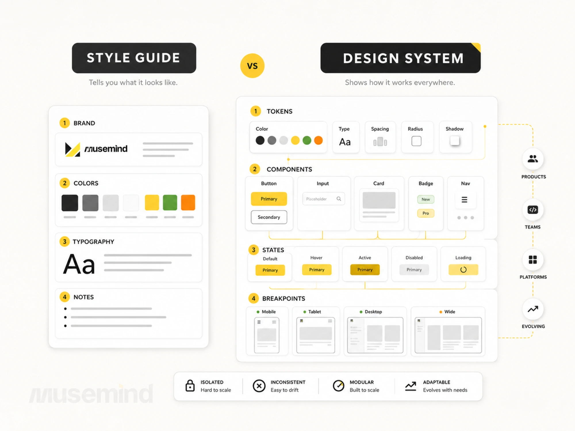
That definition matters because it rules out what a design system is not. It is not a Figma file. It is not a style guide. It is not a component library. Those are all parts of a system, but none of them alone constitutes one.
Companies like IBM (Carbon), Google (Material Design), and Apple (Human Interface Guidelines) have published their design systems publicly. These aren't just inspiration resources they're case studies in how a system prevents inconsistency across thousands of product decisions.
A style guide tells your team what blue to use. A design system tells them how that blue behaves across every state, screen, and breakpoint and what happens when the brand changes.
Style guides break at scale because they're static. The moment a second designer joins, or a second product launches, or a new platform requires adaptation, the style guide can't answer the questions that arise. Teams fill the gap with judgment calls, and judgment calls compound into inconsistency.
According to In Vision's Design Maturity Model, companies with a formalized design system ship new features significantly faster and report fewer QA-stage rework cycles than those relying on informal documentation.
A design system answers the "when," "why," and "how" that a style guide leaves open. That's the practical advantage and it shows up directly in product quality and team velocity.
Even though you won’t find a single design approach that works for all situations, you would need to start with a step on the correct path. It’s essential to remember that every design system is built differently.
With the entire team’s help, you can develop a design system by roughly following these steps:
Skipping the visual audit is the most common reason teams end up maintaining two systems instead of one.
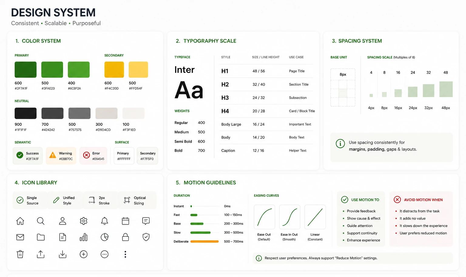
The audit is straightforward: catalog every reusable visual element currently in your product. That means colors, typography, spacing values, icons, button styles, form elements, motion patterns, and anything that appears more than once. Use a spreadsheet or a dedicated Figma page. The goal is a complete inventory, not a clean one.
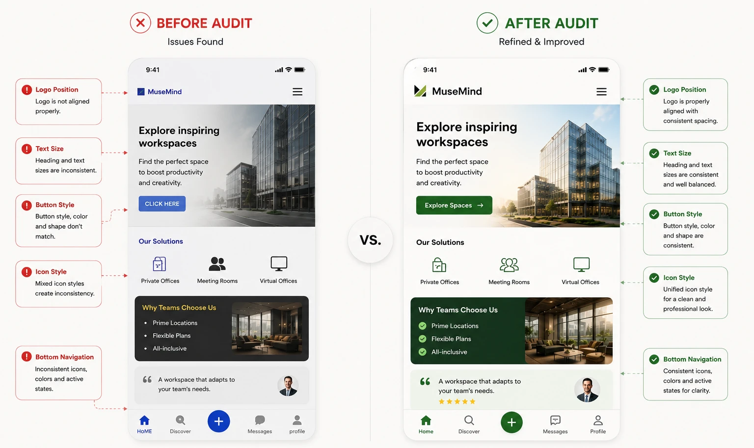
What you'll find almost always includes color inconsistencies (three slightly different grays serving the same purpose), font weight duplication, and icon sets pulled from multiple sources with no unified style. That catalog is your argument for building the system and your starting material for building it right.
Ask two questions as you audit:
Once you have answers, you have the raw material for every step that follows.
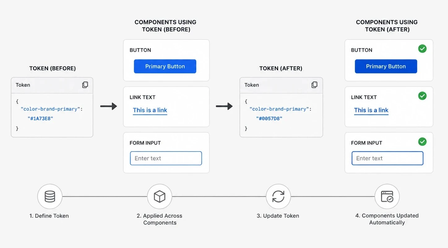
Design tokens are the single biggest concept missing from most "how to build a design system" guides and skipping them is what forces teams to rebuild components manually every time a brand evolves.
A design token is a named variable that stores a raw value. Instead of hardcoding #1A73E8 in every component, you define a token: color-brand-primary. The component references the token. When the brand color changes, you update the token once. Every component inherits the update automatically.
Common token categories:
Tools like Tokens Studio for Figma and Style Dictionary (open source) let you manage tokens at scale and sync them between design and code. If your system doesn't have a token layer, it's a collection of assets not a system.
Build components before you define tokens, and you'll redo every component when the brand evolves. Define tokens first, and component updates become a one-line change.
Design principles are not a feel-good exercise. They're the decision filter your team uses when the system has no explicit rule.
A principle like "clarity over cleverness" answers dozens of micro-decisions: Is this animation too subtle? Should this error message be technical or plain? Is this layout elegant but confusing? Without a principle to reference, these decisions get made by whoever argues loudest. With one, they get made by the system.
Here's what a usable principle looks like in practice.
Suppose your product serves non-technical users. A principle like "plain language over precise language" immediately answers whether an error message should say "Authentication failed" or "Incorrect email or password." One is technically accurate. The other is actually useful. That one sentence saves your team the same argument in every sprint review. Write principles that do that work. If a principle doesn't rule out at least one bad option in the next design decision your team faces, rewrite it.
With principles set, you have the intent layer. The visual language builds on top of it.
Visual design language is what makes a product identifiable before a user reads a single word. It's why you recognize Airbnb's interface before you see their logo.
Your visual design language is the complete set of visual decisions that define the product's look and feel:
Airbnb's Design Language System (DLS) and IBM's Carbon design system document each of these layers in full, with usage rules at every level. That level of documentation is what allows a team of 50 to ship a consistent product without a weekly design review for every decision.
The visual design language is the foundation every component will reference. Define it once, reference it everywhere.
Components without usage rules are organized assets. A pattern library is what makes them a system.
Start with the components your product uses most often. For most websites, that means:
For every component, document all interactive states: default, hover, focus, active, disabled, and error. This is non-negotiable for development handoff and for accessibility compliance.
Speaking of accessibility: every component in a production system must meet WCAG 2.1 Level AA standards at minimum. That includes 4.5:1 contrast ratio for normal text, visible focus states, and keyboard navigation support. Accessibility is not a feature to add later, it's a structural requirement that affects token decisions, spacing, and component architecture from the start.
Once individual components are documented, build patterns from component combinations. A pattern solves a recurring UX problem - a login flow, a data table with filters, an onboarding sequence. Patterns are where your design system delivers its highest value.
An undocumented design system is a tribal knowledge problem waiting to happen.
Documentation is not a list of components with their names. Strong documentation answers three questions for every element in the system:
Here's what that looks like for a primary button:
btn-primary token set. Minimum touch target 44x44px. Focus ring must use focus-ring-brand token for WCAG 2.1 AA compliance.That's the format. Scale it to every component in your library.
The best design system documentation IBM Carbon's, Atlassian's reads like a reference manual, not a marketing deck. It acknowledges edge cases. It shows don't-do examples alongside do examples. It has a changelog so the team knows what changed and why.
Documentation also serves a purpose most teams overlook: onboarding. A new designer or developer should be able to understand your system's rules without a handholding session. If that's not possible with your current docs, the docs are incomplete.
A design system owned by one person is a bottleneck, not a system.
Effective design systems teams include:
For smaller teams, these roles can overlap. A two-person startup can run a functional system with clear role separation - one person owns design decisions, one owns the code. What matters is clarity of ownership, not headcount.
The contribution model also needs definition: who can propose new components? What's the review process? What makes a pattern eligible for the library vs. a one-off? These governance questions determine whether the system grows in a controlled way or turns into a dumping ground.
Most design systems fail at implementation not design.
The reason is usually the same: the system gets built, announced in a team meeting, added to a Notion page, and then left alone while the product keeps moving. Six months later, components have diverged. A year later, no one uses the system because it no longer matches what's actually in production.
Roll out the system in phases:
Run training sessions. Not to explain the system to show how it speeds up their work. That framing drives adoption faster than any mandate.
Treat versioning seriously. Use semantic versioning (v1.0, v1.1, v2.0) so teams know when changes are additive vs. breaking. Document deprecations with a migration path. Schedule quarterly system reviews to catch drift before it becomes debt.
A design system that never gets updated is a style guide in disguise.
The audit, the tokens, the documentation teams get the build right and still end up with a system nobody maintains. Governance is what separates a design system from a design artifact.
A production-grade UI design system is not a single project with a finish line. It's a product within your product. Here's what separates the ones that work:
If you're building a product that needs to scale and you're still working from a style guide or an informal Figma library the cost of not having a system compounds with every sprint.
A UI design system is a shared set of design rules including visual styles, reusable components, and documentation that ensures every part of a product looks and behaves consistently. Think of it as a single source of truth that both designers and developers pull from on every project.
A style guide defines visual rules like colors and fonts. A design system includes those rules plus reusable components, design tokens, coded implementations, usage documentation, and governance. A style guide is a subset of a design system not a replacement for one.
A foundational system tokens, 10–15 core components, and basic documentation typically takes 6–10 weeks for a focused two-to-three person team. A complete, production-ready system with full accessibility coverage and a coded library takes 12–20 weeks depending on product complexity.
Yes. Design systems scale down effectively. Even a two-person team benefits from named design tokens, a shared component library, and documented spacing rules. The earlier a team establishes the system, the less rework they face when the product grows.
Figma is the most widely used design tool for building and maintaining design system component libraries. For token management, Tokens Studio (formerly Figma Tokens) is the standard plugin. For coded implementations, teams use Storybook to document and test components. Style Dictionary handles token-to-code transformation across platforms.
Design tokens are named variables that store raw values colors, spacing, typography, radius used throughout a design system. They abstract the raw value from the component that uses it. When a brand color changes, updating the token updates every component that references it automatically. Tokens are what make a design system maintainable at scale.
Schedule quarterly system reviews. Assign a designated owner either a design lead or a dedicated systems designer responsible for approving changes and managing the roadmap. Use semantic versioning so teams know when updates are additive (v1.1) vs. breaking (v2.0). A system with no owner and no update cadence becomes a style guide within 12 months.


An Experience Design Agency focusing on building functional, simple, human-centered digital products for future.
