
What impression does your app leave on users? People today expect their mobile experiences to be smooth and easy to use. If your mobile interface isn't well designed, it's easy for them to leave.
Research shows that nearly 50% of consumers view poor mobile design as a sign that a company doesn't care about their business. That is why a user-friendly interface doesn't just function; it engages and retains users.
Furthermore, 58% of smartphone users are more likely to have a positive impression of a brand when their preferences are remembered. With high stakes and rising expectations, this guide will walk you through essential steps for creating a mobile app interface for both iOS and android to connect with your audience and keeps them coming back.
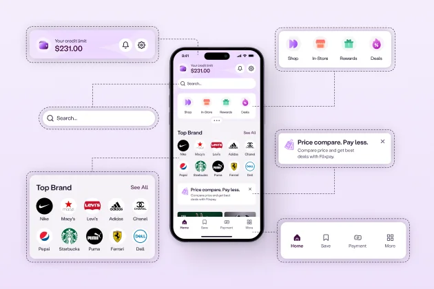
Mobile app interface design, or UI design, refers to the visual and interactive elements users use on their mobile devices. It includes the layout, buttons, icons, text, navigation, and other elements that form the app's look and functionality.
UI design ensures users can easily interact with the app, providing a seamless and intuitive experience. While closely related, user experience (UX) and UI design are distinct. UX focuses on the app's overall experience, ensuring it meets user needs, while UI design explicitly addresses the interface and how users interact with the app. A well-designed UI directly influences the app's attractiveness and usability.

An effective user interface mobile app design requires clear guiding principles. These principles simplify the UI designer’s task, making interfaces more predictable and reducing user confusion. To deliver an optimal user experience, designers must understand what users want to achieve and shape the UI to meet these goals.
Organize the interface by grouping related items and separating unrelated ones. Use consistent models that users can quickly identify. This makes it easier for users to quickly understand the structure and find what they need.
Simplicity allows users to complete tasks easily. Use familiar language, offer shortcuts, and avoid unnecessary details. Keep it clear and direct, allowing users to perform everyday actions without extra instructions.
Provide only the information users need at any given moment. Avoid clutter and unnecessary choices. This makes it easier for users to focus on completing tasks without feeling overwhelmed.
Consistency is essential for creating a smooth user experience. Reuse elements and behaviors across the app so users don’t need to relearn each part. This reduces cognitive load and builds familiarity.
Allow flexibility in user input and anticipate possible errors. Design with undo and redo options lets users recover from mistakes without frustration.
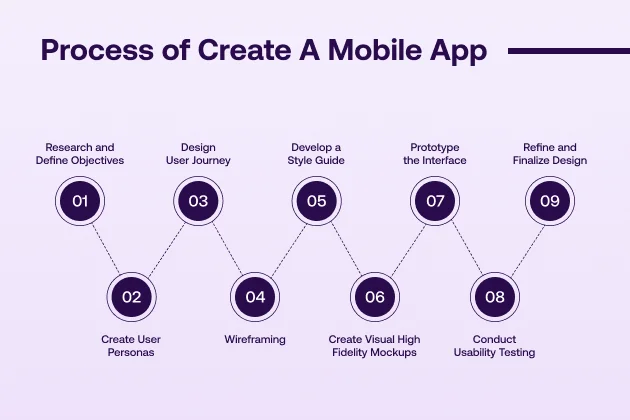
Here is the step by step process of making a visually appealing mobile app interface design:
To create an excellent mobile app interface, research and define objectives. First, clarify the app’s purpose. Understand what problem it solves or the need it fulfills. Make a list of the main goals your app will achieve.
Next, identify the target audience. Ask questions like, “Who will use this app?” and “What are their preferences?” Knowing your audience helps you design a user-friendly interface.
Gather insights into similar apps in the market. Explore their strengths and weaknesses, and note what you like or dislike about them. This helps you find inspiration and avoid common design mistakes.
Also, consider any unique requirements for your app. Think about the platform or devices your app will support, such as iOS or Android. Make sure your objectives align with these technical details.
Finally, create a summary of all findings. Write down the main goals, target audience, and design inspirations. This document will guide you through the design process, ensuring your app stays focused and purposeful.
To design an effective mobile app, create clear user personas. A user persona represents a fictional profile of your ideal user. Start by gathering details about your target audience, like age, interests, and tech habits. Think about what motivates them to use your app. Identify their pain points or challenges.
Consider specific needs or preferences that might shape the design. For example, young users may prefer bold visuals, while older users might want more straightforward navigation. Try to imagine what each persona values most in an app. Define each persona's name and background story to help make the profile realistic.
Creating user personas will guide you through the design choices. Keep these personas in mind when planning each feature and screen. Reminding you of the person you're creating for helps you make user-centered choices. In this step, you ensure your app feels valuable and logical.
The user journey maps out the steps a user takes within your app. It shows how users navigate from one screen to another. First, to design this journey, outline the main tasks users want to complete. These tasks might include signing up, browsing products, or purchasing.
For each task, define the series of screens or actions required. Consider where users might enter and exit the app. Visualize the flow, starting with the home screen and ending with the desired action. Think about how each interaction leads to the next.
Keep the user experience (UX) smooth and intuitive. Avoid unnecessary steps or confusing paths. Add key elements like buttons, icons, and menus at each stage to support navigation. Use visual cues to guide users toward essential actions, like “Add to Cart” or “Submit.”
Creating a straightforward user journey helps prevent frustration and drop-offs. Test the journey from a user’s perspective to ensure it feels logical. With a well-designed user journey, users can accomplish their goals efficiently, creating a positive experience with your app.
Wireframing is the blueprint of your app’s interface. It shows the layout and structure of each screen. Start by sketching basic frames for the critical screens in your app. Focus on elements like buttons, text fields, and images. Don’t worry about colors or detailed design yet. If you are unsure about the design principles, you can refer to the what are the effective interface design principles.
Use wireframing tools like Figma, Sketch, or Adobe XD. These tools help you create interactive mockups to visualize the app’s flow. For each screen, define the placement of essential features such as menus, icons, and call-to-action buttons.
Wireframing helps you organize the user interface (UI) without distractions. It also ensures consistency in design across all screens. Before moving to more detailed stages, you can test different layouts and navigation paths.
Once the wireframe is complete, review it with your team. Gather feedback on usability and adjust the design accordingly. Wireframes act as the foundation, ensuring your app’s interface is easy to use and intuitive.
A style guide defines the visual elements of your app. It ensures consistency throughout the design. Start by selecting a color palette that fits your brand and app purpose. Use contrasting colors for buttons and calls to action to make them stand out.
Next, choose the right typography. Pick fonts that are easy to read on mobile screens. Define font sizes, line heights, and spacing for headings, body text, and buttons. Consistent typography helps users navigate your app smoothly.
Icons are another critical element. Select a style that matches the overall look and feel. Keep icons simple and intuitive, whether flat, outlined, or filled. Make sure they are easily recognizable.
The style guide should also cover imagery. Decide on the types of images and illustrations you’ll use. Ensure they align with the app’s tone and brand identity.
Finally, include guidelines for spacing and layout. Specify margins, padding, and grid systems. A straightforward style guide is a reference for designers and developers, keeping the design process organized and consistent.
Visual mockups are high-fidelity designs that show the final look of your app. After completing wireframes and defining your style guide, it's time to bring your app to life visually. Start by applying your style guide's colors, fonts, and layout. Ensure each screen matches the overall look and feel of the app.
Focus on critical elements like buttons, navigation bars, and icons. Use authentic images or placeholders for any visual content. Design with mobile screen sizes in mind. The app should look good on various devices like phones and tablets.
Interactive elements like forms, sliders, and menus should be incorporated. Visual mockups should demonstrate how users will interact with each screen. Make sure the design aligns with the user journey you've mapped out.
Tools like Sketch, Figma, and Adobe XD allow you to create interactive mockups. These tools help simulate the user experience so you can test the flow before development begins. Once the mockups are ready, share them with your team for feedback. Refine the design until it's polished and prepared for the next steps.
Prototyping is the next step after creating visual mockups. A prototype brings your design to life by adding interactivity. It shows how users will navigate through the app and interact with features. Connect your mockups to a prototype tool like Figma, InVision, or Adobe XD.
Define clickable areas such as buttons, links, or menus. Simulate user flows so the prototype mimics the real app experience. Test transitions, animations, and how different screens connect. Ensure that everything is smooth and intuitive.
Prototypes help identify any usability issues early in the design process. They allow you to see if the layout and navigation feel natural. Share the prototype with your team and potential users for feedback. Observe how they interact with it and make any necessary adjustments.
A working prototype also serves as a visual reference for developers. It helps them understand the intended user experience, ensuring the final app meets design expectations. Once the prototype is refined, you’re ready to move into development.
Usability testing helps ensure your app is easy to use and intuitive. After creating a prototype:
Use specific tasks, such as signing up or making a purchase. This helps identify if users can complete actions smoothly. Take note of any areas where users hesitate or make mistakes.
During testing, focus on both the design and functionality. Check if the buttons are easy to tap and if the text is readable. Ensure that navigation flows logically and that users don’t get lost. After testing, gather feedback from participants. Understand their frustrations and areas for improvement.
Refine your app based on their input. You may need to make design adjustments, like changing button placement or simplifying navigation. Re-test after making changes to confirm the improvements. Usability testing ensures that your app delivers a smooth and enjoyable user experience.
Once you've gathered feedback from usability testing, it's time to refine and finalize the design. Begin by reviewing all the feedback you received from users and stakeholders. Identify common issues or areas of improvement. Make necessary changes to the design to improve user experience.
Focus on visual elements like color schemes, typography, and iconography. Ensure consistency across all screens. If certain elements cause confusion or frustration, modify them to clarify them. Simplify any complicated steps or interactions in the app.
Ensure that your app is fully optimized for different screen sizes and resolutions. This will help improve the app's performance across devices like phones and tablets. Double-check the app's responsiveness and fluidity of transitions.
Create the final design files if you're satisfied with the design adjustments. Export them in appropriate formats for developers. Provide precise specifications for the layout, colors, fonts, and interactions.
With the design finalized, your app is ready for iOS and Android app development. A well-refined design guarantees that the user experience will be smooth, intuitive, and visually appealing when the app is launched.
Image Alt Text: Mobile app interface with clean design and vibrant colors.
Creating a mobile app with an outstanding interface requires a blend of simplicity, functionality, and user experience (UX). Here are seven essential tips to make your mobile app interface design stand out.
One of the most effective ways to design a mobile app interface is through simplicity. Avoid clutter and focus on critical features. Stick to a clean layout that lets users quickly find what they need.
A minimalist design doesn't mean removing features; it's about prioritizing essential elements and ensuring the app doesn't overwhelm the user. Limit the number of buttons and organize content with a clear visual hierarchy for both iOS and Android. Simple navigation helps users focus on their tasks and prevents frustration.
Consistency in design is crucial for a smooth user experience. Use a cohesive color palette, fonts, and icons throughout the app. The colors should align with your brand's identity and evoke the right emotions.
Stick to a maximum of 3 primary colors to maintain balance. For typography, choose readable fonts and set clear rules for headings, subheadings, and body text. Icons should also be consistent in style, whether flat, outlined, or filled. Consistency reduces confusion, enhances usability, and gives your app a professional appearance.
The best designs keep the user at the center of every decision. Understanding your users' needs, pain points, and behaviors will guide your design choices. Use user personas and journey maps to help you design with the user in mind.
Ensure the most important features are easily accessible and the navigation flows logically. Test your design with real users to uncover usability issues before launching. A user-centered design improves satisfaction, increases engagement, and reduces bounce rates.
Navigation is key to a great mobile app experience. Users should be able to move through the app effortlessly. Avoid deep menus or complicated navigation paths. Use clear labels on buttons and make sure they are easy to tap.
Prioritize everyday actions like "Home," "Search," and "Settings" in prominent places. Navigation should feel natural so users can quickly find what they want. An intuitive navigation system prevents frustration and ensures users can easily complete their tasks.
Your app must perform well across various devices. Different screen sizes and resolutions require responsive design. Use a flexible layout that adjusts to the device's screen size, whether a small phone or a large tablet.
Some common screen resolutions for mobile in 2024 are:
Test your design on different devices to ensure it looks great on all of them. Ensure buttons and text are appropriately sized for touchscreens and that the app is usable in both portrait and landscape modes. Responsiveness enhances the app's usability and user satisfaction.
A strong visual hierarchy guides users' attention to the most important elements. This can be achieved by strategically using size, color, contrast, and spacing. For example, larger buttons or text draw more attention, so place them where users need to focus.
Use contrast to differentiate primary and secondary actions, like a bright "Submit" button against a neutral background. White space also plays an important role. It helps to reduce cognitive overload and allows users to process information more easily. A well-defined visual hierarchy improves the overall navigation experience.
Even the most beautiful app design is useless if the app runs slowly. Speed is critical for a positive user experience. Slow load times or laggy performance can lead to frustration and app abandonment. Optimize images and assets to reduce loading times without compromising quality.
Implement smooth animations that don't hinder performance. Consider the app's responsiveness to different devices and ensure that transitions and interactions are fast and fluid. A soft, fast app ensures users stay engaged and encourages them to return.
Different tools and resources come together to ensure that the design of a mobile app interface is effective. Here are some tools that you cannot do without when designing a mobile application interface:

For designers working on user interfaces and user experiences, Sketch is an indispensable tool. There are more features to interface creation than just flexible artboards, reusable symbols, and customizable grid systems.
Sketch's easy-to-learn program interface and relatively uncomplicated design processes allow designers to build and refine mobile designs quickly. Its notable features include integrating several handoff and prototyping platforms, allowing designers to work closely with developers and other project stakeholders.

Figma is a design solution created for the cloud that fosters cooperation by allowing different users to work simultaneously on the same element in real-time. No need to describe why such functionality might be necessary for mobile app design projects.
Furthermore, components leveraging Figma's design system can be transferred from one screen to another, guaranteeing that the UI will be consistent. Figma also allows designers to develop and test prototypes so that clients do not have to wait until the final deliverable to observe the application in action.

Adobe XD provides responsive assets, grids, and prototyping tools, allowing quick and effective mobile interface design and evaluation.
Adobe XD is beneficial for designers who have been operating in Adobe's universe and other tools like, for example, Photoshop and Illustrator. With excellent project management tools, Adobe XD allows the design to be presented and reviewed and the assets to be embedded without much effort.

Designers can turn static displays into interactive media with the help of InVision, a popular prototyping and collaboration tool. InVision allows designers to build clickable versions of the screens of mobile application interfaces even when the application construction hasn't begun.
The presence of a tool known as Freehand in InVision captures the simultaneous brainstorming and design sprints, making the tools best for teams geared towards iterative design. Further, the application allows the tools to gather feedback and make adjustments regarding their team members and clients in the first place.

ProtoPie is a prototyping tool that helps designers create interactive prototypes without using code. It is simple yet robust in design and helps demonstrate complex interactions such as gestures, animation sequencing, or conditional logic, which are essential in mobile app UI/UX design.
ProtoPie's WYSIWYG enables designers to closely replicate the completed application's behavior, giving a true-to-life presentation of the end user experiences. It integrates well with Sketch, Figma, and Adobe XD, bringing the ease of import and enhancement of the designs to include responsive animations.
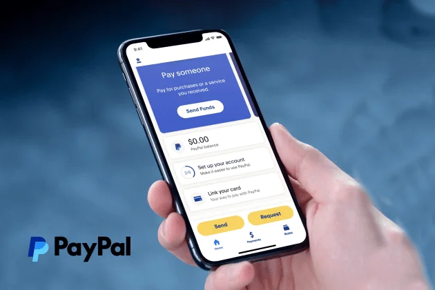
PayPal’s app stands out with its sleek, clean design. It has a bright, modern feel that makes financial transactions look more appealing.
The app uses blue as its primary color, but other accents add a vibrant touch. Unlike typical banking apps, PayPal’s UI is colorful and engaging. Its user interface (UI) is simple yet functional.
Key features are easy to access, and call-to-action (CTA) buttons are well-placed for ease of use. The app also has different backgrounds for each screen, giving it a dynamic, engaging appearance. It blends style with practicality, ensuring users can send money quickly and securely.
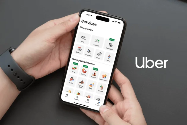
Uber is known for its simplicity and user-centric design. The app is incredibly intuitive, making it easy to book a ride. The layout is clean, with a search bar, a map, and a list of nearby taxis. Everything is streamlined to ensure fast interactions.
Its design focuses on a minimalist approach, keeping the user experience straightforward. This helps users navigate with ease, making booking a ride effortlessly. Also, the map interface and real-time updates provide a seamless experience, ensuring riders can track their journeys accurately.

BigBasket’s app is an excellent example of a clean, user-friendly design. It makes grocery shopping easy with simple navigation. The UI is intuitive, allowing users to search and add products to their cart without hassle.
The design prioritizes ease of use, making it accessible even for new users. Key elements are displayed, guiding users through placing an order. BigBasket’s interface ensures that the grocery shopping experience is smooth and convenient.
An attractive user interface for a mobile app results from meticulous preparation and focus on detail. Each element—layout, color, typography, and navigation—is crucial in building a smooth user experience. Also, testing each phase, from wireframes to final mockups, ensures the app meets user needs and expectations.
Balancing aesthetics with usability keeps the interface visually appealing without sacrificing functionality. Remember, a well-designed app interface doesn’t just look good; it helps users achieve their goals efficiently.
For interactive, high-quality, and engaging mobile app design, you can contact Musemind. We offer expert solutions to meet your app’s unique needs.
A well-designed mobile app interface is critical for user retention and satisfaction. It enhances the user experience by providing clear navigation, reducing confusion, and helping users complete tasks efficiently.
To ensure a user-friendly interface, focus on simplicity, clarity, and responsiveness. Keep the design clean with minimal distractions and use intuitive navigation. Make sure buttons and menus are easy to find and interact with.
Testing is vital in identifying usability issues early in the design process. Prototypes, wireframes, and high-fidelity mockups should undergo multiple rounds of user testing to gather feedback and refine the interface.
Prioritize elements impacting user experience, such as navigation, load time, and interactivity. Focus on what users need to accomplish and eliminate unnecessary features or content that might clutter the interface.
Common mistakes include overcomplicating the design with too many options, poor navigation, and inconsistent styling. Failing to optimize for various screen sizes and neglecting user feedback during testing are also critical missteps.


