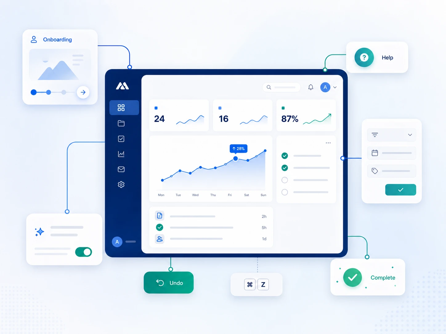
Interaction design (IxD) is fundamentally how your product feels when users interact with it every day. It's the critical difference between a checkout flow that drives conversions and one that causes cart abandonment. Every button, form, micro-interaction, and error message either builds user trust or destroys it.
Most SaaS founders focus primarily on features. Interaction design takes a different approach, focusing on behavior and user psychology: how users accomplish their goals with minimal friction. This distinction matters enormously for business success. Poor interaction design can tank conversion rates by 30-40%; thoughtful interaction design increases task completion by 50% or more.
Your product's checkout is costing you 30% of conversions. Your forms are confusing. Your buttons aren't clear. This guide shows you exactly why, and how to fix it with 11 interaction design principles that actually work.
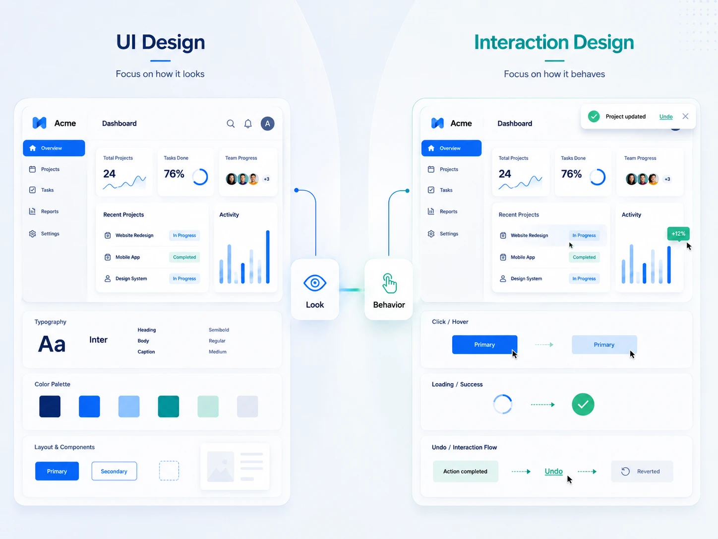
Interaction design is the behavioral layer of your product. It's the layer that determines how your product responds to user actions. While UI design focuses on how things look and visual appearance, interaction design focuses on how things work and how the system responds when someone interacts with it.
UI design is about aesthetics. Interaction design is about behavior. Both matter, but they're different disciplines.
Example that illustrates the difference: A delete button in your product. UI design determines that the button is red and labeled "Delete." That's visual design. But interaction design determines what happens next. Does the delete happen immediately with no confirmation?
Does it ask the user "Are you sure?" Does it show a success message afterward? Does it allow undo? Is the undo button visible or hidden? These behavioral choices define whether users feel safe or terrified of the delete action. These choices are interaction design.
Interaction design draws from psychology, cognitive science, neuroscience, and human-computer interaction research. It's informed by how humans think, how memory works, and how people learn new tasks. When interaction design is done well, it's invisible to users. Everything feels natural and intuitive. Users don't think about the design. They just use it. When interaction design is done poorly, users feel frustrated, confused, hesitant, and most importantly, they abandon the product for a competitor.
Business impact: Cart abandonment rates in e-commerce average 70 percent. Poor checkout interaction design accounts for a significant portion of that. Users abandon checkouts not because the product is missing features but because the checkout process is confusing, has too many steps, or makes them unsure if they're making the right choices. In SaaS, every confusing form field, every unclear error message, every missing confirmation state, every slow interaction pushes users toward churn. Users switch to competitors because the interaction design makes them feel unsupported.
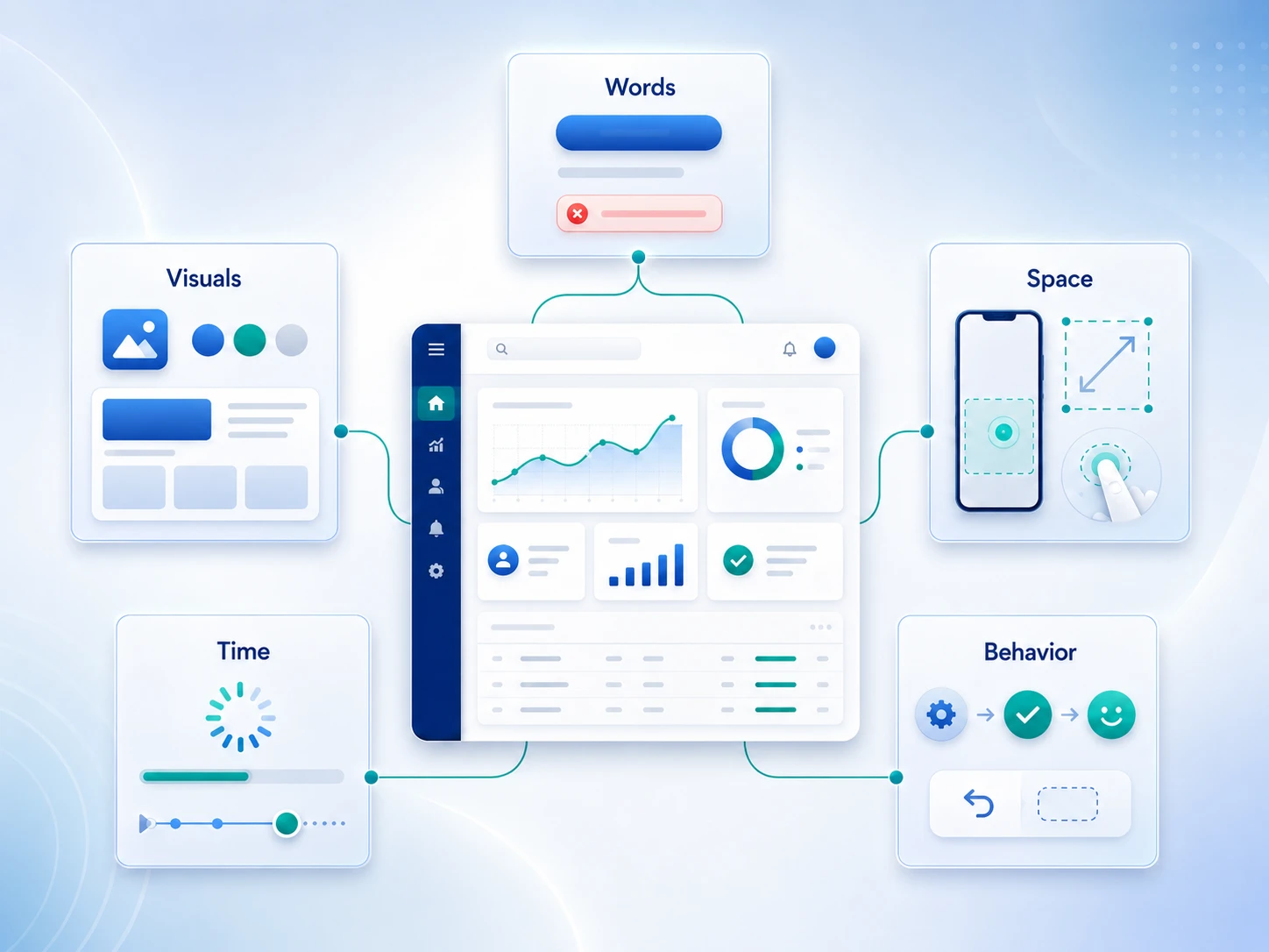
Before diving into the 11 principles, you need to understand the structural framework that underpins all interaction design. Interaction designer Gillian Crampton Smith and technologist Kevin Silver introduced the five dimensions model. This framework provides a systematic way to evaluate and design interactive experiences across multiple layers and dimensions:
Most design conversations focus only on 1D through 3D (words, visuals, physical context). These are visible and tangible and easy to discuss. But real interaction design lives in 4D and 5D. Time and behavior are where the magic happens.
This is also why interaction design is so often undervalued in organizations. It's harder to see, harder to measure, and harder to discuss. But its impact on user satisfaction and product success is enormous.
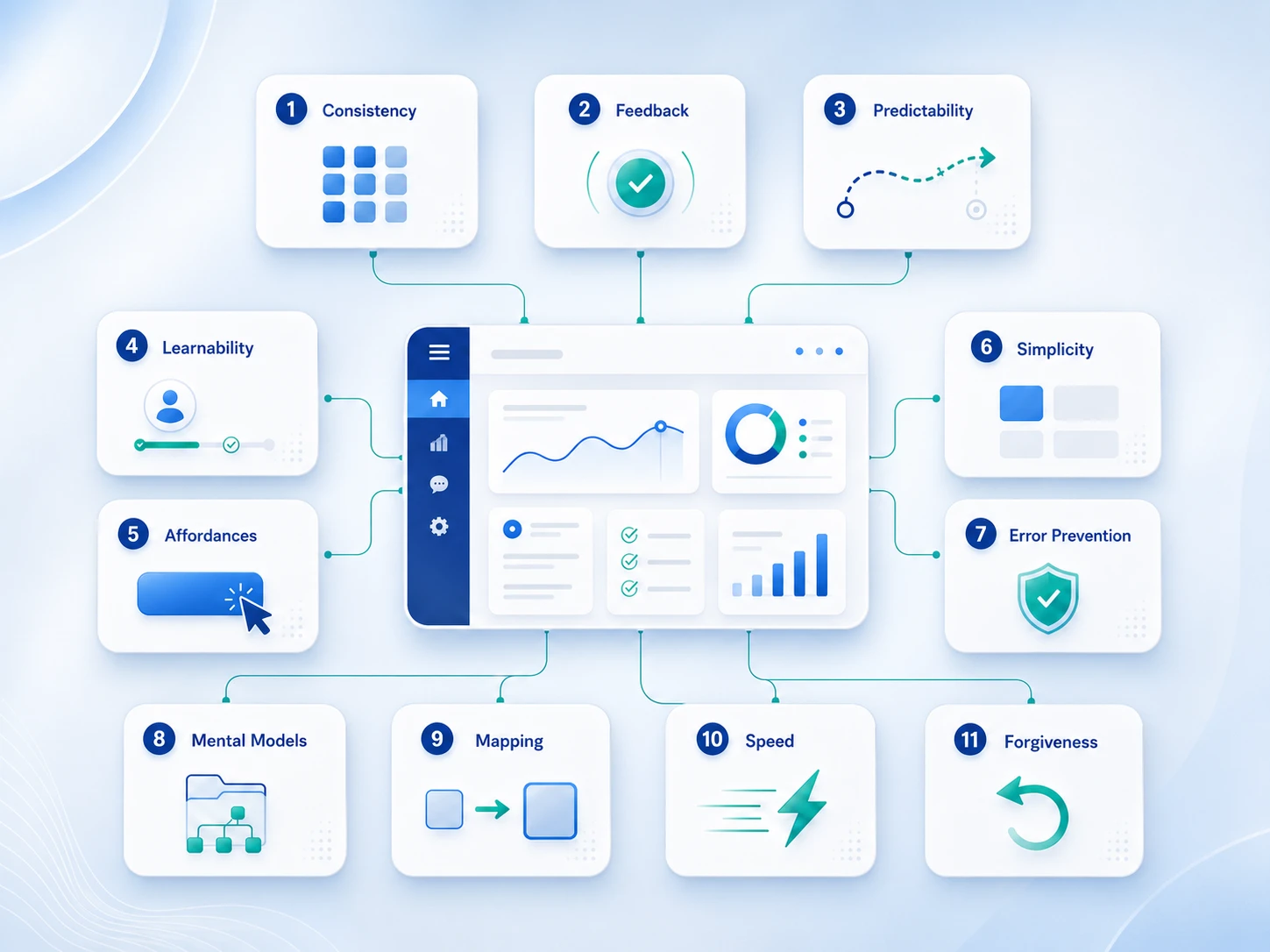
The 11 Core Interaction Design Principles
Definition: Reuse the same patterns, workflows, and interactions across your product.
Consistency reduces cognitive load significantly. When users encounter the same delete pattern, confirmation dialog, or form layout repeatedly, they stop thinking about how to use each interaction and instead develop muscle memory.
This mental shortcut is powerful: users move from conscious effort (thinking about what to do) to unconscious competence (just doing it). Once a user learns how delete works in one place, they expect and predict the same behavior everywhere else in your product. This predictability creates trust and speed.
Why it matters: Each new interaction pattern forces users to consciously think and learn a new behavior. This cognitive load slows them down and increases mistakes. Consistency eliminates this learning burden by reusing proven patterns.
When interactions are consistent, users operate on autopilot, which dramatically speeds task completion and reduces errors. Inconsistency, by contrast, makes users hesitant and cautious because they can't predict what will happen.
Example:
How to audit: Map all similar interactions in your product: delete, save, create, export, archive, share. Write down exactly how each behaves.
If the delete action in one place works differently from delete in another place, you have an inconsistency problem. Audit these patterns across your entire product and standardize them.
Definition: Acknowledge every user action with clear, timely feedback.
Users need immediate confirmation that their action registered and was received by the system. Without this feedback, users experience uncertainty and doubt. They wonder: Did I actually click the button? Is the system processing my request?
Will something happen, or did my click get lost? This uncertainty causes stress and hesitation. Users who don't get feedback often click the same button multiple times, create duplicate entries, or refresh the page, thinking the first attempt failed.
Why it matters: Missing feedback creates uncertainty, which triggers repeated actions, frustration, and confusion. Users flood your support team with "why didn't my action work" tickets. Feedback costs nothing to implement but solves a massive user experience problem.
Clear, timely feedback signals to users that the system is alive and working, which builds confidence and trust.
Types of feedback:
Example:
How to audit: Disable all animations and test your product in slow motion. Can you clearly tell the system is responding to your actions even without animations?
If the answer is no, you need more feedback. Every interactive element should have visible feedback within 200ms of interaction.
Definition: Behavior should match user mental models. Users should predict what will happen before they act.
Users come to your product with deeply ingrained expectations from other products they use. When users see a blue underlined link, they expect it to open a new page or jump to a new section. When they see a button labeled "Save," they expect their work to save immediately. When they see a trash icon, they expect delete.
These expectations are not unique to your product. They're built from years of using other products. When your product violates these expectations, you break trust and create confusion. Unpredictable behavior makes users second-guess themselves and treat your product like a puzzle they need to figure out rather than a tool that works.
Why it matters: Unpredictable behavior forces users to be cautious, read every label carefully, and think hard before every action. They slow down and hesitate. Task completion time increases. Error rates increase because users aren't confident in their actions.
Support tickets increase because users don't understand why the product behaves unexpectedly. Predictability eliminates this friction and lets users move confidently through your product.
Example:
How to audit: Ask 5-10 users who are unfamiliar with your product: "What do you think will happen if you click that button?" Before they click. If their prediction matches the actual behavior, you have predictability. If their predictions don't match what actually happens, you have a design problem that needs fixing.
Definition: New users should be able to figure out how to use your product without extensive instruction or onboarding.
Learnability is fundamentally about reusing proven patterns that users already understand from other products. Don't invent new interactions to look innovative or different. Instead, use interaction patterns that users encounter daily in products they already know and love.
This principle is counterintuitive for many designers who want to create novel, unique experiences. But novel interactions create friction for new users. They force users to consciously think about how to interact with your product instead of relying on muscle memory from other products.
Why it matters: Users don't read manuals, watch video tutorials, or attend training sessions before using a product. They expect your product to work like other products they already use. If your product uses non-standard interactions, new users will be confused, move slowly, and make mistakes.
Novel interactions might win design awards at conferences, but they slow down adoption and increase support costs. Familiar patterns speed adoption because users have already learned them elsewhere.
Pattern examples:
How to audit: Show your product to a designer or product person from a completely different company. Give them a task to complete. Don't explain anything or show them how. Just observe. Can they figure it out without instruction?
If they get stuck, ask confused questions, or try random things, you're inventing too many novel patterns. Go back and align with standard patterns users already know.
Definition: Visual affordances are design signals that clearly show users what they can interact with and how to interact with it.
An affordance is a property of an object that suggests how it can be used without explicit instruction. A button looks clickable because it has depth, shadow, or raised appearance that suggests pressing. A text input field looks typeable because it has a border, background color, or cursor that suggests you can type in it.
A slider looks draggable because it has a handle that looks graspable. Good affordances communicate what action is possible without requiring the user to read labels or think about how to interact. Users should see what's interactive and how to use it instantly, without hesitation or confusion.
Why it matters: If users can't see what's interactive in your product, they won't interact with it. Features become invisible and invisible features don't drive revenue. Conversion rates drop. Users get frustrated because they can't find the actions they need.
If a button looks like regular text, users scroll past it without clicking. If a clickable element looks like decorative text, users ignore it. Poor affordances make features invisible, which tanks engagement and conversion.
Example:
How to audit: Heatmap your product and watch where users click. Are they clicking the correct interactive elements? Or do they hunt for buttons, forms, and links? Do they try to click on decorative elements that look interactive but aren't?
If users are hunting for interactive elements or clicking the wrong things, your affordances are poor. Improve them.
Definition: Remove every unnecessary step, option, and piece of information. Show users only what they need to accomplish their specific goal right now.
Every additional field in a form adds cognitive load and friction. Every option in a menu increases decision paralysis. Every step in a workflow is another opportunity for users to get confused and abandon. Simplicity means ruthlessly eliminating anything that doesn't directly serve the user's primary goal.
This doesn't mean your product lacks features. It means hiding advanced features, optional fields, and secondary actions behind progressive disclosure so beginners see a simple path and experts can access power features.
Why it matters: Complexity dramatically slows down task completion time. Users take longer to finish their goal. Complexity increases error rates because users are overwhelmed by options. Complexity increases support costs because confused users contact support.
One of the biggest drivers of cart abandonment in e-commerce is checkout complexity. Stripe figured this out. Every extra field in a checkout form reduces conversion. Simplicity removes friction and increases task completion.
Goal-driven approach:
Example:
How to audit: Measure your primary workflow step by step. Count form fields, menu options, and steps. Can you reduce it by 50 percent?
Try it. Test the simpler version with users. Measure task completion time and errors. Most of the time, simpler workflows have higher completion rates, fewer errors, and faster task times.
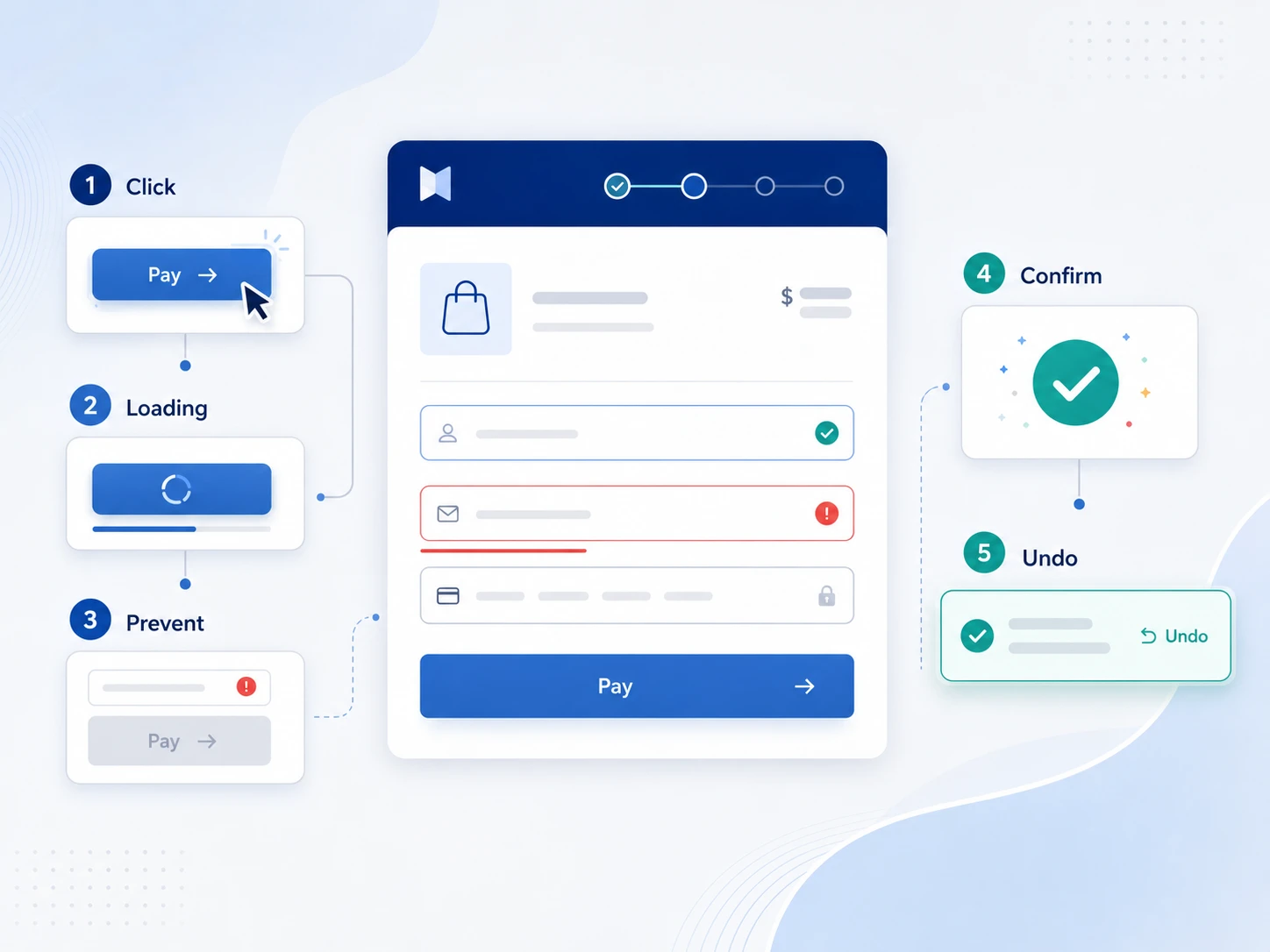
Definition: Prevent errors before they happen. When errors do occur, make them easy and fast to fix.
Error prevention is vastly superior to error recovery. A system that prevents users from accidentally deleting important work in the first place is better than a system that requires users to recover from the trash afterward.
Prevention reduces user stress. Recovery creates stress. An ounce of prevention is worth a pound of cure, and this principle applies directly to interaction design. When users can't accidentally create an error, they move faster and feel more confident.
Why it matters: Errors cost time. Users must stop what they're doing, realize an error happened, take time to fix the error, and resume their task. Errors create frustration and reduce satisfaction. Errors increase support burden because confused users contact support asking how to fix problems.
Prevention is cheaper than recovery because prevention eliminates the problem entirely. An error that never happens doesn't need support.
Prevention strategies:
Example:
How to audit: Systematically try to create errors in your product. Can you accidentally delete something important? Can you submit a form with invalid data? Can you send something you didn't mean to send?
For each error you create, ask: Did the system prevent this error before it happened? Or did it force me to recover after the fact? If you're recovering rather than preventing, that's a design improvement opportunity.
Definition: Your product's organizational model and interaction model should match how users already think about the problem, not how your engineers chose to build it internally.
Users come to your product with preexisting mental models based on their life experience and prior products they've used. A "folder" metaphor for organizing files works brilliantly because users have used physical folders for decades.
They understand that files go inside folders, folders can be nested inside other folders, and you can move things around. A custom file organization system that doesn't use the folder metaphor requires users to learn an entirely new mental model from scratch. Most users won't invest that effort. They'll give up and use a competitor's product instead.
Why it matters: When your product's mental model mismatches user expectations, users become confused and second-guess themselves. They make mistakes. They work slowly. They contact support asking "how do I organize my files?"
A product that aligns with user mental models feels intuitive and natural. A product that violates mental models feels broken and confusing, even if it's technically superior.
Example:
How to audit: Watch users discovering your product for the very first time. Observe whether they naturally understand your organizational model without explanation. If they ask questions like "where do my files go?" or "how do I organize this?" or "what's the structure here?" your mental model might be misaligned with their expectations.
If they naturally understand the structure and navigate confidently, your mental model is working well.
Definition: The relationship between a user's action and the system's response should be immediately obvious and unambiguous.
A control should map clearly and directly to its effect. If a user clicks a button, the effect should be immediately obvious from the button's label and appearance. If you have multiple buttons in a dialog (Save, Cancel, Delete), the user should instantly know which button does what without reading documentation.
If you have toggle switches (on/off, enable/disable), the user should understand what is being toggled, what the current state is, and which direction is "on" and which is "off." Clear mapping eliminates confusion and hesitation.
Why it matters: Unclear mapping between user actions and system responses causes mistakes and hesitation. Users freeze when they see a toggle switch and don't know which way to switch it. Users hover over buttons trying to figure out which one is correct. Users become afraid of clicking because they don't understand what will happen.
This hesitation slows task completion. Unclear mapping increases support burden because confused users contact support asking "what does this button do?" Clear mapping removes ambiguity and lets users move confidently.
Example:
How to audit: Show every interactive element to someone unfamiliar with your product. Ask them: "What will happen if you interact with this button/switch/link?" without any explanation. If their prediction matches reality, you have good mapping.
If they're confused or their prediction is wrong, you have a mapping problem that needs fixing. Don't rely on hover states or tooltips. The mapping should be clear from the element itself.
Definition: Responsiveness and performance are interaction design choices, not just engineering problems.
When a user clicks a button, how long until something happens? This timing is critical to the user's perception of your product. 100 milliseconds feels instant and satisfying. 500 milliseconds feels noticeably slow and sluggish. Two or more seconds feels broken, like the system didn't receive the click. Speed is not just about engineering efficiency.
Speed is a design principle because it directly affects user perception, confidence, and satisfaction. Slow interactions make products feel broken even when they're technically working correctly.
Why it matters: Every millisecond of latency reduces user satisfaction and task completion rates. Users begin to distrust slow systems. In e-commerce, research from Amazon and Google shows that every second of checkout latency reduces conversion by 1 to 7 percent.
A two-second checkout is worth less than a one-second checkout. For SaaS products, slow interfaces reduce feature adoption because users think features aren't working when they're actually just slow. Speed is directly tied to revenue and user retention.
Where speed matters most:
Example:
How to audit: Measure interaction latency precisely. Measure the time from when a user clicks a button to when visible feedback appears.
Anything over 200 milliseconds should show explicit loading feedback (spinner, progress bar, status message). Don't let users wonder if their click registered. Provide immediate visual feedback.
Definition: Let users reverse their actions without negative consequences or complex recovery processes.
Users make mistakes. This is inevitable. Good interaction design assumes users will make mistakes and builds in forgiveness so mistakes can be easily reversed. Undo, redo, and reversible actions aren't nice-to-haves. They're table stakes in modern products. A product without undo is a product that makes users feel afraid of making changes.
Why it matters: When users fear they'll lose important work with a single click, they become extremely cautious and slow. They read every label three times before clicking. They hesitate before taking actions.
This fear prevents them from experimenting, moving quickly, and being productive. Forgiveness removes this fear. When users know they can undo their actions, they move faster, take more action, and accomplish more. Forgiveness enables confidence and productivity.
Forgiveness strategies:
Example:
How to audit: Can users undo the last 10 actions in sequence? If not, undo is insufficient. Can users recover accidentally deleted items from trash?
If not, add a trash feature. Are there any actions in your product that are truly irreversible? If yes, those actions should have confirmation dialogs and possibly recovery windows.
Interaction design should be measurable. You can't improve what you don't measure. Use the HEART framework, developed by Google, to assess whether your interaction design is working:
H: Happiness. Is the experience satisfying? (Survey: "How likely are you to recommend this product?")
E: Engagement. Are users using your product? (Metric: Daily/monthly active users, feature adoption rate)
A: Adoption. Are new users successfully onboarded? (Metric: % of signups who complete first task)
R: Retention. Do users come back? (Metric: % of users active 30 days, 90 days after signup)
T: Task Success. Can users complete their goal? (Metric: % of users who successfully complete primary workflow)
In practice:
Example: You redesign your checkout to be simpler. You measure:
If all five improve, your interaction design change was successful.
Understanding which interaction design principles drive which HEART metrics helps you prioritize your design improvements. This mapping shows the business impact of each principle:
Fastest Path to Improved HEART Metrics:
Stripe applied these principles strategically:
Changes Made:
HEART Metrics Impact:
Business Result: +$2.3M annual revenue from checkout interaction design improvements alone.
This demonstrates why interaction design is not a nice-to-have. It directly impacts revenue.
SaaS products face unique interaction design challenges that are different from consumer apps or marketing websites. These challenges require specific interaction design strategies and solutions.
High stakes: In SaaS, users make decisions about money, data security, and business workflows. When users make mistakes, the consequences are serious. A misconfigured setting might accidentally expose data. A misunderstanding about permissions might block important users from accessing critical information. This high-stakes environment means your interaction design must be extremely clear about consequences and must prevent accidental errors.
Complex workflows: SaaS products often involve multi-step processes. Users might need to create a project, configure settings, invite team members, set up permissions, and then start working. Each step in this workflow is an opportunity for users to get confused and abandon the product. Interaction design must make each step obvious and simple.
Onboarding under time pressure: Users approaching your SaaS product for the first time are often under time pressure to see value and get to work. They don't have patience for lengthy onboarding flows or complex interaction patterns. If your interaction design is confusing, they give up immediately and try a competitor.
Power users and complete novices in the same product: The same SaaS product must work for complete beginners on day one and power users who use the product every day. If your interface is too simple, power users get frustrated navigating menus and hunting for options.
If your interface is too complex, new users are overwhelmed. The solution is progressive disclosure combined with keyboard shortcuts and advanced features hidden behind settings.
Interaction design solutions for SaaS:
SaaS interaction design examples:
Musemind designs products where every interaction earns its place in the interface. We don't invent novel interactions just because they look cool in a design conference presentation.
We design for clarity, conversion, and user trust. Every interaction design decision is grounded in research, user testing, and measurable outcomes.
Our proven approach to interaction design:
When to work with Musemind on interaction design:
UX design is the broad umbrella covering research, strategy, information architecture, interaction design, visual design, and usability testing. Interaction design is the layer that defines how the interface responds to user actions. Think of UX design as the full product experience and interaction design as the behavioral layer that defines how the product feels.
Study leading products (Figma, Stripe, Slack, Loom) and ask: "Why did they design this interaction this way?" Read interaction design frameworks (HEART, 5 dimensions). Practice designing interactions, getting feedback from real users, and measuring the impact with HEART metrics.
Yes. Prioritize the highest-impact interactions (checkout, primary workflow, most common error). Redesign those first, measure the impact, then move to the next priority.
Depends on your product. For e-commerce, improving checkout interaction design can increase conversion by 5-15% (worth millions). For SaaS, better onboarding interactions can reduce churn by 3-5%. Measure with HEART metrics.
When principles conflict, prioritize simplicity and user goal accomplishment. If consistency conflicts with simplicity, choose simplicity. If learnability conflicts with power, create a simple path and an advanced path (progressive disclosure).
Measure with HEART metrics. Happiness (satisfaction), Engagement (usage), Adoption (onboarding), Retention (repeat use), Task success (completion). If these improve, your interaction design is working.
Yes, if they serve a purpose: provide feedback, guide attention, or show transitions. No, if they're purely decorative. Every animation should answer the question: "Why does this animation exist?" If the answer is "it looks cool," remove it.
Make sure interactive elements are keyboard-accessible (tab, enter, arrow keys). Ensure buttons and links are visually distinct from non-interactive elements. Test with screen readers. Provide clear error messages and success feedback. Accessibility is a design principle, not an afterthought.
Interaction design defines how the interface behaves (what happens when a user clicks). Motion design defines how movement and animation communicate that behavior. Both are important, but they're different disciplines.
Measure task completion rates and drop-off points. Focus on the interactions with the lowest completion rates or highest abandon rates. Those are your highest-impact improvements.


An Experience Design Agency focusing on building functional, simple, human-centered digital products for future.
