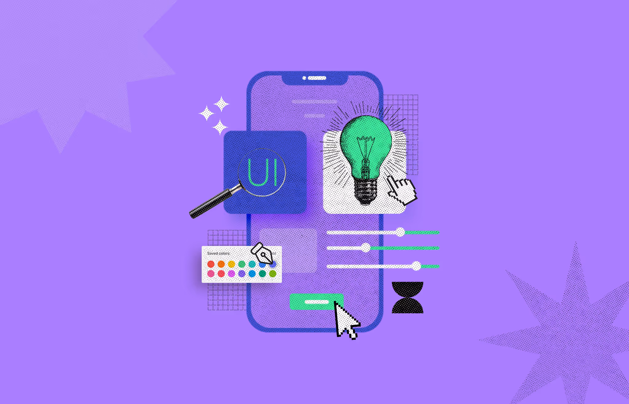
Illustration of an interactive user interface design process showing a smartphone screen with a UI icon, a color palette, toggle sliders, cursor clicks, a glowing lightbulb, and animated visual cues representing usability and user engagement
Remember when having a good-looking interface was all a digital interface took? Those days are long gone. Nowadays, users have become more selective and sophisticated. Put yourself in their shoes for a moment. Would you like an interface that doesn't say where to start? Or one that shows you what's next? Surely the second one, right? Getting lost in a digital product is one of the most frustrating things for a user.
As users have an unlimited number of alternatives, they tend to ditch a product as soon as they get frustrated. That's why it's crucial to make interfaces interactive. To achieve that, we stick to these guiding principles.
We are going to discuss those interactive UI design principles today so that you can make your design interactive as well.
Let’s go-
You may have heard about many design principles for designing an interactive user interface (UI).
But do they work accordingly?
Well, the answer could be different in terms of different designers. However, today, I’ve come up with eight scientifically proven principles. These principles have been found in scientific research by Paul M. Zender, MFA, professor at the University of Cincinnati.
These were highly effective for us as well.
Establishing a clear starting point (e.g., sign-in) is a primary principle in designing an interactive user interface. It can reduce users' confusion and minimize the effort to complete a task within a digital product. Let’s say you entered a shopping mall but struggling to find the way to your desired shop. Isn’t it frustrating for you? I'm sure it is. In such cases, you might opt for a different shopping destination with easier accessibility.
Just like this real-life example, user psychology works similarly for the digital product as well. There must be a clear indication of the starting point, allowing users to understand immediately where to begin. Without this principle, it’s not really possible to make an interaction design interactive and user-centric.
To integrate this principle into your design, you must use interface design elements sensibly. There should be relevant and understandable navigating typography and iconography. And it all should be from the user's perspective.
In interaction design, the internal consistency within a product is the key to making a design interactive. After getting the starting point, it’s crucial to maintain consistency throughout a process so that it feels easier to complete a task for a user. Inconsistent design is confusing, and consequently, it hampers the user journey. There should be a clear indication of what to do next and why that’s necessary.
If the icons, actions, or functions within the app are not uniform, it can cause navigation issues. For example, the "Back" button in some sections uses a left arrow icon, while it uses a word label in others. This inconsistency makes it difficult for users to identify common actions quickly. So, you should strictly avoid this inconsistency while designing a product's UI.
To incorporate the principle of consistency in your design interface design, you should maintain-
When designing a product's interface, it is essential to incorporate familiar elements rather than introducing rare or entirely new ones. This ensures that users can easily relate to the interface and intuitively understand the functionality of specific elements.
If your design elements leave users uncertain about how to interact with them, it cannot be considered user-centric design. Familiar elements play a crucial role in facilitating a user's journey to accomplish tasks within a platform.
In this context, your first step should be to identify your target audience and then select elements that are familiar to them. For instance, when designing for a specific region, it is important to use design elements that are well-recognized within that region. Likewise, if your target audience comprises older individuals, consider incorporating retro design elements.
To maintain this familiarity, it is crucial to pay attention to the following factors:
You must provide a clear error message to enhance the user experience and increase interaction. The user should immediately understand the exact issues with their process after they occur. For instance, when filling out information to sign up to Google, a red mark will highlight the gap if you forget to complete one section. Consequently, it becomes easy for users to identify and rectify the missing area.
Some of the best practices for creating error messages include
By following standard rules and guidelines, errors can be handled in a helping way instead of scolding the user for their mistakes.
Creating a user-friendly interface is super important because it can make or break a product or system's success. When people use an interface, they should be able to easily figure out how to use it and what it offers. Think of visual elements like patterns, spacing, text, and color as helpful signs that guide users through the interface and make it intuitive.
Buttons and menus, which you can actually click or interact with, play a big role too. They give you feedback and encourage you to explore more. Designers use tools and techniques to try out different design ideas efficiently, which helps them come up with better solutions.
Also, in the beginning stages of designing a user experience (UX), designers dig deep into the problem and what the users are all about. This info guides the design process, making sure the interface meets users' needs and encourages them to explore. And when users are happy exploring, that usually means a happier overall experience.
Prioritizing simplicity in UI design is crucial in making it interactive. It’s the foundation for a great interactive user experience. Keeping things simple in your design positively affects how users interact with the interface.
First and foremost, simplicity enhances usability. Users can easily grasp navigating through the interface and completing tasks by minimizing complexity. When users find something easy to use, they're more likely to stay engaged, explore further, and convert into loyal users or customers.
Moreover, simplicity accelerates goal achievement. When you design simply, you're streamlining the user's path to their objectives. This means they can accomplish tasks more swiftly and efficiently, ultimately enjoying a smoother and more satisfying experience.
Simplicity also adds a touch of aesthetics to your design. Clean and straightforward interfaces tend to be more visually appealing. When users find a design visually pleasing, they're more likely to stay engaged and take the desired actions, whether purchasing or signing up for a newsletter.
Clear navigation is another benefit of simplicity. Simple designs prioritize making navigation intuitive and obvious, ensuring users can easily find what they want. This clarity minimizes frustration and keeps users engaged with your product or website.
Lastly, simplicity involves trimming away unnecessary elements, reducing visual clutter, and focusing on what truly matters. This approach creates an intuitive and effective design, making it easier for users to understand how to interact with your product or website.
Making your design forgiving is highly important for creating an interactive user interface. It's natural for humans to make errors, and when a user engages with your product to accomplish a task, they may unintentionally make a mistake.
In such cases, they might have to restart the process from the beginning, which can be extremely frustrating for them. To prevent this type of user frustration, keeping to the principle of forgiveness is crucial, allowing users to resume where they made the mistake.
This approach significantly enhances the overall user experience and has become a prominent principle in products prioritizing user satisfaction.
Giving prompt feedback in UI design basically means giving users quick and meaningful responses when they're using a product's interface. The feedback should be crystal clear so users can easily understand what's happening due to their actions. And it's got to be noticeable so users know their clicks and swipes aren't going unnoticed.
Now, why is prompt feedback such a big deal? Well, it's all about making things easier for users. It helps them achieve what they want without any unnecessary hassles, improves their experience, and keeps them coming back for more. Think about things like error messages, loading spinners, or those little icons that tell you what's happening – that's all part of UI feedback.
When you're asking users for feedback, ask specific questions about their experience with the product. And do it in a way that makes them feel connected and in the loop. Give them some context so they know what you're looking for.
Another thing: ask for feedback after they've done something to the product. Don't interrupt them when they're in the middle of something important. Keep it subtle and hidden so it doesn't get in the way of what they're trying to do. That way, you'll get valuable insights without disrupting their flow. This will significantly enhance the user’s experience.
Coming up with a great design is not just about random efforts but a structured process. With this process, you must follow some proven principles that actually make a difference. There are a lot of principles that the designers practice. But the issue is every principle isn’t similar to everyone’s perspective. However, we’ve discussed some scientifically proven principles needed to make a design interactive and user-friendly.
The basic principles of UI design are clarity, consistency, feedback, efficiency, flexibility, and error prevention/recovery. These principles ensure that the UI is clear, consistent, provides feedback, is efficient, adaptable, and helps prevent and recover from errors, resulting in a user-friendly system or application.
The golden rule of user interface (UI) design, also known as the "one-click rule," is the principle that users should be able to complete a task with just one click or action. This means that the UI should be designed to minimize the number of clicks or steps required to complete a task, making it easy and efficient for users to achieve their goals. Following the golden rule of UI design can greatly enhance the user experience by reducing complexity and improving usability.
The two main components of a user interface (UI) are input and output. Input involves how users interact with the system, while output refers to how the system responds to user input and provides information or feedback. Both components are crucial for creating a usable UI.


An Experience Design Agency focusing on building functional, simple, human-centered digital products for future.