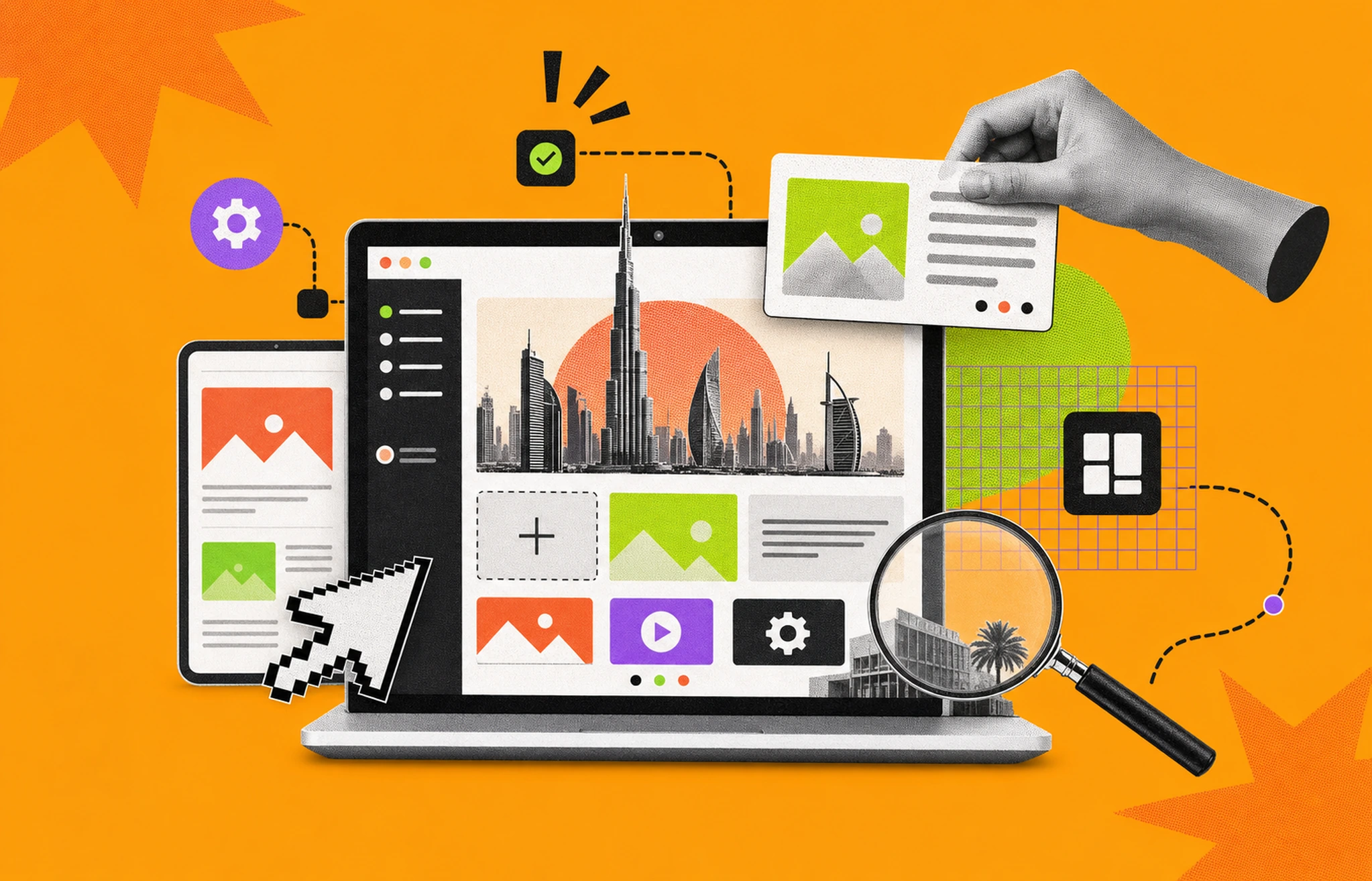
A UX storyboard is not a comic strip, it is a research instrument. The teams that treat it that way ship designs stakeholders actually understand, and they cut review cycles in half. Most teams skip storyboarding because the version they learned in school looked like a movie pitch with stick figures. That is the wrong reference. This guide shows you how UX storyboards actually work in 2026, what to put in them, and the tools designers reach for when sketching in Figma is not enough.
A UX storyboard is a sequence of illustrated panels that shows how a single user moves through a real-world scenario while using your product. Each panel captures one moment: the context, the action, the emotion. Designers use storyboards to translate raw research into a story the whole team can see at a glance.
The form comes from animation. Walt Disney Studios developed storyboarding in the early 1930s, and the 1933 short Three Little Pigs was the first film completely planned this way (Wikipedia; Walt Disney Family Museum). UX teams borrowed the method because it does something wireframes cannot: it puts a human inside the flow.
Nielsen Norman Group defines a storyboard as a story told through images in chronological panels, built on three elements: a specific scenario, visuals, and corresponding captions (NN/g). That definition matters. It separates UX storyboards from sketches, from journey maps, and from UI mockups.
Storyboards force product teams to defend their assumptions. A wireframe shows you a screen. A storyboard shows you why someone would tap on it at 7:42 a.m. while their toddler is screaming. That distinction drives three concrete wins.
They reduce stakeholder confusion. Visuals are processed by the brain roughly 60,000 times faster than text on average, according to a widely cited (though heavily disputed) figure attributed to a 3M-funded study at the University of Minnesota in 1986. The exact multiplier is shaky, but the broader pattern holds: peer-reviewed research consistently shows pictures are recognized and recalled more reliably than equivalent text (Picture Superiority Effect, Wikipedia). For a non-designer stakeholder, a storyboard panel beats a paragraph every time.
They surface broken flows before code is written. When you sequence the user’s actions, the gaps reveal themselves. A login flow that “works” on paper falls apart when you draw a panel showing the user squinting at a 2FA code on a separate device.
They build empathy that survives sprint pressure. Personas get filed away. Wireframes get redlined. A storyboard taped to the wall keeps the user visible.
NN/g’s framework is the cleanest starting point. Every UX storyboard, at minimum, contains a scenario, visuals, and captions.
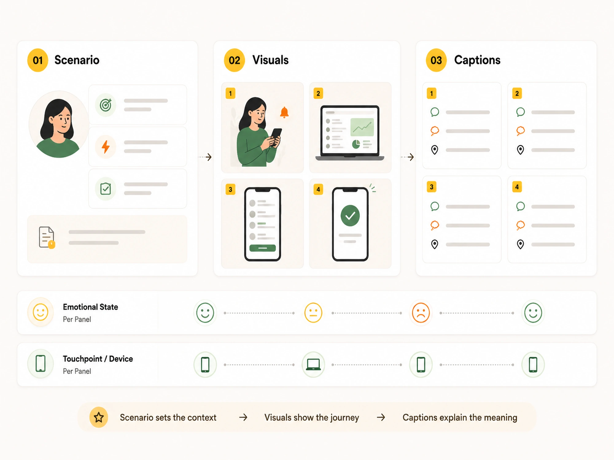
The scenario names the persona, the trigger, and the outcome in one or two sentences. Anchor it at the top of the storyboard so anyone can understand the story before looking at a single panel.
Example: Maya, a new freelance designer, needs to send her first client invoice and is worried she’ll get the tax fields wrong.
That sentence does three things. It identifies the user. It states the goal. It hints at the emotional stake.
Visuals are the panels themselves. Each one captures a single moment in the sequence: an action, a decision, an emotional shift. Sketches work. Stick figures work. NN/g explicitly says advanced illustration skills are not a prerequisite, only clarity.
Most UX storyboards land in one of three fidelity ranges:
Pick the lowest fidelity that gets the point across. Over-investing in visuals is the most common reason teams abandon storyboarding after one round.
Captions sit under each panel and describe what is happening, what the user is thinking, and any environmental context. Keep them to one or two short bullets. The image carries most of the weight. If a caption needs more than two lines, the panel is doing too much and should be split.
Most real storyboards add a fourth and fifth layer:
Those two additions move a storyboard from “nice illustration” to “research artifact.”
Storyboards have a sweet spot. They are most valuable in three moments.
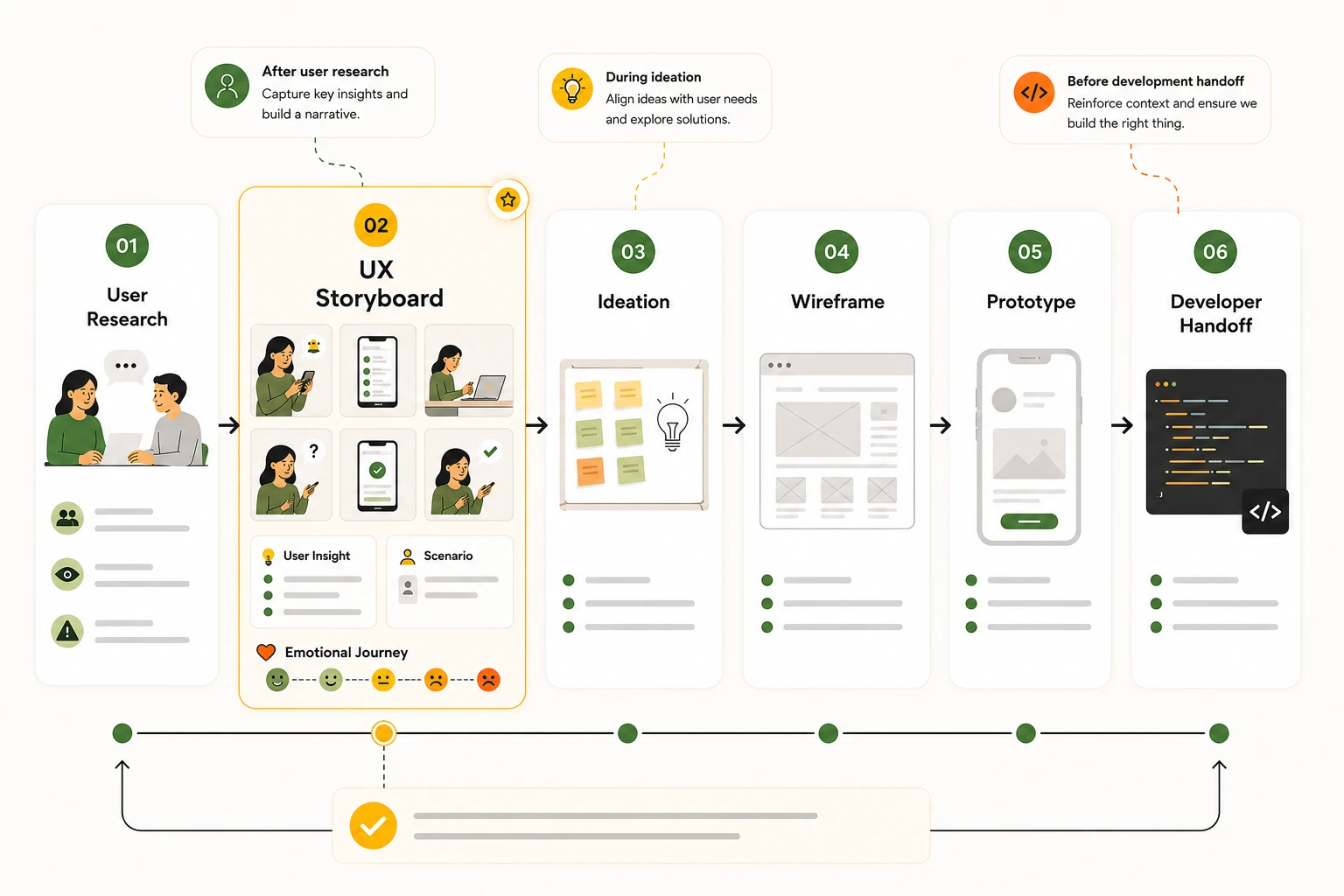
After user research, before you define the problem. This is where storyboards earn their keep. Once you have interview transcripts, observational notes, or survey data, a storyboard turns that mess into a clear narrative the team can argue with. Interaction Design Foundation positions storyboarding as a tool that lives between research and ideation for exactly this reason (IxDF).
During ideation, when you have multiple solutions on the table. Draw each option as a storyboard. The weakest ones reveal themselves immediately, usually because the panels stop making sense halfway through.
Before development handoff, when the team needs context wireframes cannot provide. A storyboard explains why a feature is shaped the way it is. Developers who see the user behind a flow build it differently than developers who only see a Figma file.
Storyboards lose value when you treat them as deliverables. They are thinking tools first.
This is the workflow we use at Musemind. It is built around UX research, not film production, so it skips camera angles and shot lists.
Before you draw anything, write down what you know about the user. Pull from interviews, usability tests, support tickets, analytics, or field observations. If the source data is thin, the storyboard will be a guess in costume. Figma’s resource library makes the same point: review engagement metrics and qualitative feedback before you sequence anything (Figma).
UX storyboards feature one protagonist. If you have multiple personas, draft one storyboard per persona rather than mashing them together. Write the scenario as a single sentence with a clear trigger and outcome.
Before sketching, list the user’s steps in plain prose. Number them. Six to twelve steps is the realistic range. Fewer and you will skip nuance. More and the storyboard becomes a wireframe in disguise.
Walk through your numbered list and label each step with an emotion: confused, confident, frustrated, relieved. This is the single highest-value step in the process. The emotional shifts are where design opportunities live.
Now draw. One panel per step. Stick figures are fine. Spend roughly 90 seconds per panel for low-fidelity work. Resist the urge to polish here, because the goal is sequencing, not finished art.
Under each panel, add one or two bullets: what the user is doing, what they are thinking, and any environmental factor that matters. Skip narration. The image should carry the action.
Walk a non-designer through the storyboard without explaining it. A product manager, an engineer, a customer success lead. If they can tell you the story back, the storyboard works. If they ask three clarifying questions, fix those panels.
Storyboards are cheap. Make two or three variants if the team disagrees on the path forward. When the team converges, save the chosen version to your design repo and link it from the relevant Figma file. That link is how storyboards stay alive past kickoff.
The fastest way to internalize this is to see what real storyboards cover. These five scenarios are common starting points.
1. Onboarding a first-time user. Six to eight panels showing the user from “received the invite” to “completed their first meaningful action.” Best for surfacing drop-off risk in signup flows.
2. Recovering from a failure state. Show what happens when a payment is declined, a file fails to upload, or a search returns nothing. These panels expose the empathy gaps in error handling that wireframes almost always miss.
3. A multi-device journey. Phone in the morning, laptop at the office, tablet at night. Storyboards are uniquely good at showing context shifts because they include the environment, not just the screen.
4. A research playback. Take a usability test session and reduce it to ten panels. Pull a real quote into one or two captions. This is the single most persuasive artifact you can put in front of a skeptical executive.
5. An “as-is” vs “to-be” comparison. Two parallel storyboards of the same scenario, one showing the current product experience and one showing the proposed redesign. Pair them in a deck and the case for the redesign writes itself.
For more inspiration, NN/g publishes a downloadable storyboard template that pairs the persona, scenario, and panel grid into one printable artifact (NN/g template).
These four artifacts get confused constantly. They answer different questions.
A clean way to remember it: the journey map is the country, the storyboard is a road trip, the user flow is the route map, and the wireframe is what is inside the car. You need all four for different reasons.
The most common confusion is storyboard vs journey map. NN/g draws the line cleanly: journey maps tend to be macro, organization-wide tools used across departments, while storyboards are typically narrow, detail-oriented tools used inside a single team.
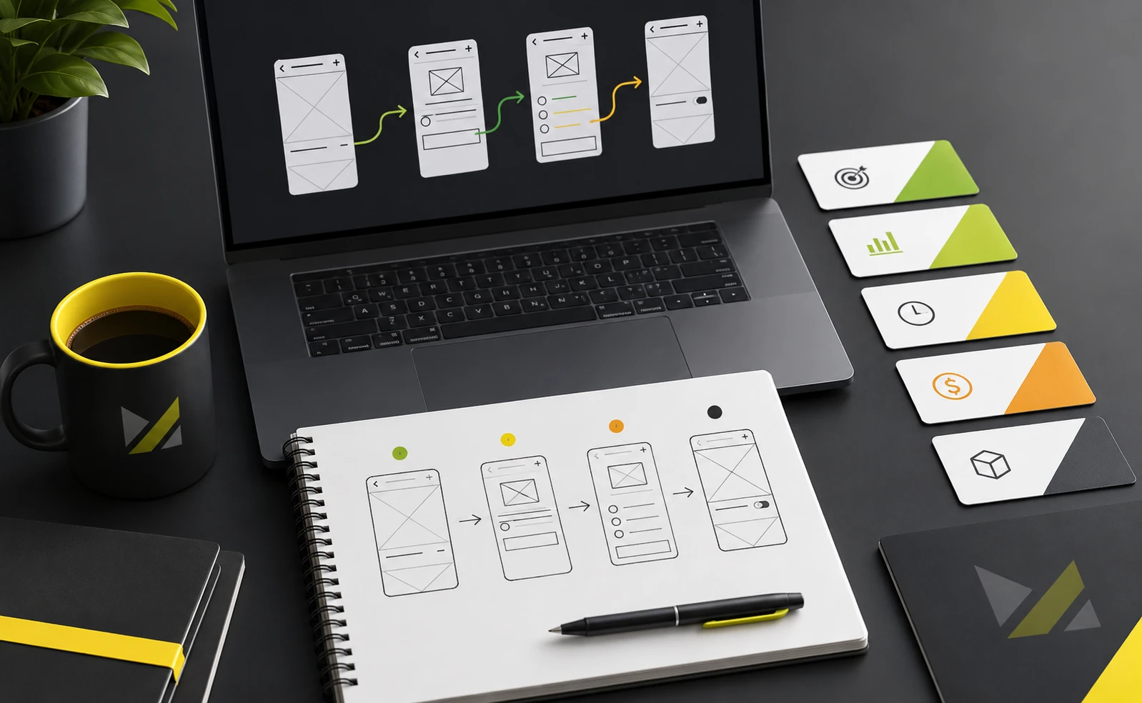
The original 2023 version of this article listed film production software, including the now-discontinued Adobe Spark (rebranded as Adobe Express in December 2021 per Adobe). That list never matched how UX teams actually work. The reality in 2026 is that most UX storyboards are built inside collaborative whiteboards or design tools your team already uses.

FigJam is Figma’s whiteboard product, included in standard Figma plans. It has a UX storyboard template and direct integration with your Figma design files, so panels can pull real screens. Storyflow’s tool roundup names it the obvious choice for product and UX teams already in the Figma ecosystem (Storyflow). Pricing starts free for individual use.
Miro is the canvas of choice for cross-functional teams that storyboard during live workshops. As of April 2026, Miro has over 100 million registered users, and the platform offers UX-specific templates including journey maps and storyboards. Pricing starts around $8 per member per month for paid plans (Match-VS). It is overkill if all you need is a quiet solo session, and excellent if you are running a distributed remote workshop.
Boords is purpose-built storyboard software with a UX-friendly workflow. Their own guide walks UX designers through the same scenario-to-sequence process most teams already follow (Boords). Strongest when your storyboard needs to feel like a film, weakest when you want to stay inside your design tool.
Mural runs neck and neck with Miro for workshop facilitation and tends to win on structured templates and facilitator controls. Choose Mural when storyboarding is one act of a longer design sprint, not a standalone task.
Excalidraw is open source, requires no account, and produces hand-drawn aesthetics that match low-fidelity storyboard intent perfectly. For a quick storyboard during a research debrief, nothing beats it. Free, with real-time collaboration.
Whimsical pairs flowchart and wireframe tools with a sticky-note canvas that suits storyboarding. Useful when your storyboard naturally extends into a flow diagram.
Storyboard That uses pre-made character libraries and drag-and-drop scene builders. UX designers rarely need it. Cross-functional partners (product managers, content strategists, customer success leads) sometimes find it easier than a blank canvas.
Honorable mentions: Figma itself for high-fidelity storyboards built from finished UI; Notion or Coda for storyboard tracking databases; MakeStoryboard and StudioBinder for film-style boards that occasionally creep into UX work.
The right tool is the one your team already opens daily. A storyboard built somewhere nobody visits is a storyboard that dies in a tab.
Six failure patterns show up across teams of every size.
1. Storyboarding before research. A storyboard built on hunches becomes a vehicle for confirmation bias. Do the research first, even if it is only five user interviews.
2. Drawing for show instead of clarity. Polished illustrations slow you down and signal to the team that the storyboard is a deliverable. Keep it rough until the work is done.
3. Cramming multiple users into one storyboard. One protagonist per storyboard. If the experience genuinely involves multiple actors, draw a second storyboard from the second person’s view.
4. Skipping the emotional layer. Storyboards without emotion are just sequenced wireframes. The emotional beats are where design decisions live.
5. Treating it as a one-and-done artifact. Storyboards age fast. Revisit them at each major design milestone and either update or archive them.
6. Confusing storyboards with the design. A storyboard explains intent. It does not specify pixels. Hand it off with that boundary made explicit, or developers will treat it as the spec.
Three takeaways to leave with:
Most teams treat storyboarding as optional. The ones that do not ship faster, argue less, and design products people actually understand.
A UX storyboard is a sequence of illustrated panels that shows one user moving through a specific scenario with your product. Each panel captures an action, a thought, or an emotion. Designers use storyboards to turn user research into a clear visual story that the whole team can understand at a glance.
A UX storyboard shows the user inside their real-world context with emotions and environmental factors. A wireframe shows the layout of one screen. Storyboards answer “why is this user here and what are they feeling,” while wireframes answer “what goes on this screen and where.” Most product teams use both, in that order.
According to Nielsen Norman Group, every UX storyboard contains three elements: a specific scenario that names the persona and goal, visuals that depict each step of the journey, and captions that explain the action, emotion, or environment behind each visual. Most teams also add an emotional state label per panel.
A practical UX storyboard usually contains six to twelve panels. Fewer than six and you risk skipping the moments where design decisions matter. More than twelve and the storyboard turns into a wireframe in disguise. If your story needs more, split it into two storyboards covering different scenarios.
Yes. Most designers use FigJam, Figma’s whiteboard product, because it integrates with your Figma design files and lets you pull real UI screens into storyboard panels. You can also build storyboards directly inside a Figma design file using frames, though FigJam is the better fit for early, low-fidelity work.
No. Nielsen Norman Group is explicit that advanced illustration skills are not a prerequisite for effective storyboards. Stick figures, basic shapes, and rough sketches all work. The goal is to communicate the user’s journey clearly, not to produce gallery-quality art. Many of the most useful UX storyboards are hand-drawn on a whiteboard during a research debrief.
Use a storyboard when you need to focus on one specific user scenario in narrative detail. Use a journey map when you need to show the full lifecycle across stages, channels, and touchpoints. Journey maps are strategic and organization-wide. Storyboards are tactical and team-focused. Most product teams build the journey map first and use storyboards to zoom into the critical moments.
Excalidraw is the strongest fully free option. It is open source, requires no account, and produces hand-drawn visuals that match low-fidelity storyboard intent. FigJam also has a free tier limited to three shared files, which is often enough for solo or small-team work. For teams already on a paid Figma plan, FigJam is included.
Storyboards sit between user research and wireframing. After you have completed interviews, surveys, or usability tests, a storyboard converts the raw findings into a narrative your team can review and discuss. It also returns later in the process as a stakeholder alignment tool during reviews and as a context document for engineering handoff.
Yes. Storyboards have grown more relevant as remote teams replace in-person workshops. Tools like FigJam, Miro, and Mural have made distributed storyboarding fast and collaborative. The fundamentals have not changed since Walt Disney Studios developed the form in the 1930s. What has changed is how easily teams can produce and share them.
A user flow is a logic diagram showing every path a user can take, including decision points and dead ends. A storyboard is a narrative showing one path with emotional context. User flows are about completeness. Storyboards are about empathy. Use a flow to verify the system works for all cases. Use a storyboard to verify the experience works for one specific person.


An Experience Design Agency focusing on building functional, simple, human-centered digital products for future.