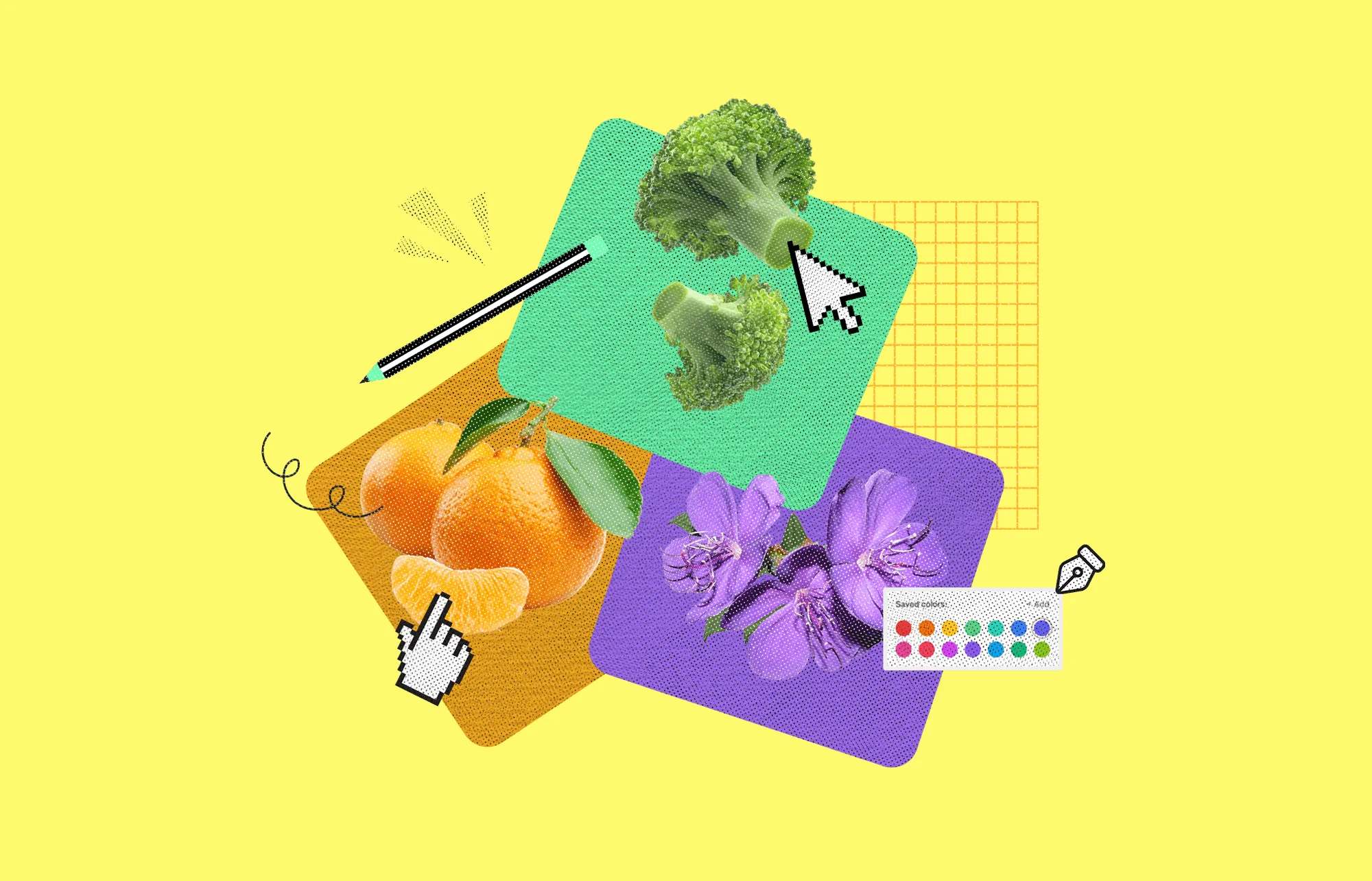
Colors shape how we see and feel about things. Secondary colors are an essential part of the design. They are made by mixing two primary colors.
With these hues, each piece of art gains dimension, contrast, and harmony. When used correctly, they can significantly improve the appearance of any project, whether it is a website, logo, landing page, or even a room's décor.
If you know how secondary colors function, you can create attractive graphics. The right color combination can make a design stand out. However, using them incorrectly can make things look messy. So, how do you use them correctly? Let's break down what secondary colors are and more.
Secondary colors are created by mixing two primary colors. The primary colors are red, blue, and yellow. When these colors are combined in equal amounts, they produce secondary colors. Here’s a breakdown of how they form:
Secondary colors serve as the foundation for a wide range of hues in color theory. They help develop different shades and tones and contribute to balanced and harmonious color schemes in design and art. Understanding how secondary colors work is essential for creating visually appealing compositions.
Secondary colors are formed by mixing two primary colors. The primary colors are red, blue, and yellow. Combining them in different proportions creates three secondary colors: orange, green, and purple. These colors form the basis for a wide range of hues and are key to color theory in art and design.
Orange is created by mixing red and yellow. When you blend equal parts of red and yellow, you get a standard orange. However, the shade of orange can be adjusted depending on the ratio of the two colors. More red produces a more profound, warmer orange, while more yellow creates a lighter, brighter orange. Because of its adaptability, orange is a hue that a designer can use with ease.
Green is the result of mixing blue and yellow. Just like orange, the exact shade of green depends on how much of each primary color you use. If you add more yellow, the green becomes yellow-green, which is lighter and warmer.
On the other hand, more blue will create a blue-green, which is darker and cooler. A wide range of hues, from bright forest green to pale lime, are possible because of these variances.
Purple is made by mixing red and blue. A balanced mix gives you standard purple. However, adjusting the amounts of red and blue changes the color. More red will provide a warmer, reddish-purple, while more blue results in a cooler, bluish-purple. Purple is a rich and complex color that can appear royal or subdued, depending on the mixture.
Secondary colors are important because they fill the space between the primary colors. They help create balance and contrast in a color palette. For example, when you combine secondary and primary colors, you can produce tertiary colors, which offer even more possibilities for design and artwork.
These colors also help in understanding color harmony. Artists often use secondary colors to create visually appealing compositions, using complementary color schemes (where secondary colors are paired with their opposite primary colors) to create contrast and interest.
Secondary colors play a crucial role in the design and offer a wide range of benefits that contribute to visual compositions' overall effectiveness and appeal. Here are some key benefits of secondary colors in design:
You can create strong contrasts that make text or key elements stand out by introducing secondary colors into a design. For instance, pairing a vibrant orange with dark text increases legibility. This contrast grabs attention and ensures that content is easier to read, especially in advertising or marketing materials.
Incorporating secondary colors into a palette helps maintain harmony in a design. When used alongside primary colors, they help balance the intensity, preventing the layout from feeling too sharp or jarring. For example, mixing green with red can create a softer visual flow than using only intense primary shades.
Secondary colors have a unique ability to evoke specific emotional responses. For example, orange, a mix of red and yellow, radiates warmth and energy. Such mixing makes it ideal for energizing spaces or products. On the other hand, green, created by blending yellow and blue, often conveys calmness, nature, and growth.
Introducing blended hues like purple, green, or orange adds layers of depth to a design. Unlike pure primary colors, these combinations create a more sophisticated visual appeal. The different variations of secondary colors allow for rich, dynamic palettes that give designs complexity.
In branding, secondary colors can help establish a unique identity and set a company apart. For example, a company might use purple (a blend of blue and red) to communicate creativity or luxury. Carefully selecting secondary colors in a brand's color scheme can enhance its memorability and instantly communicate its values.
Secondary colors in more intricate layouts or websites can tie different sections together, ensuring the design feels cohesive. For instance, using a blue-green gradient to transition between two sections of a website can create a smooth visual flow. It guides the viewer's eye without abrupt changes.
Strategically placing secondary colors within a design can help direct the viewer's focus. For example, a soft purple hue can lead the eye from one element to another, maintaining interest while subtly guiding attention. This approach works particularly well in user interface design or product displays where visual direction is key.
Secondary colors are everywhere in real-world design and play key roles in creating memorable, engaging experiences. Let's take a look at how they work in different fields:
Regarding branding, secondary colors are like the perfect sidekick to a hero. They don't always steal the show but make the primary brand color pop and feel more dynamic. Think of how many brands use a bold color like red but mix in softer secondary tones like green or purple for accents. The visually appealing and distinctive brand is elevated by the addition of depth and variance brought about by these hues.
On websites, secondary colors are your silent guides, leading the visitor's eye to where it matters most. For example, a bright orange call-to-action (CTA) button stands out on a white or blue background, creating an instant focal point. The use of contrasting colors enhances usability and motivates users to take action, such as subscribing to a newsletter or clicking on a button.
The right mix of secondary colors in interior design can completely shift a space's vibe. Let your mind wander to a tranquil space decorated in soothing colors of green. Alternatively, a pop of vibrant orange can bring energy and excitement into a room. Secondary colors allow designers to fine-tune the atmosphere, whether it's to inspire relaxation or boost productivity.
In packaging, secondary colors help products stand out on crowded shelves. A splash of purple on an otherwise neutral-colored product can grab attention without overpowering the main design. This use of secondary colors draws the eye and creates a sense of balance and harmony. It also makes the product more appealing to potential buyers.
Fashion designers use secondary colors to bring variety to their collections. While primary colors often dominate the runway, secondary tones like teal, coral, or mustard add unexpected pops and create contrast. This adds richness and depth to the overall look, making the designs more dynamic and wearable.
In advertising, secondary colors help set the emotional tone. For instance, a blend of yellow and purple can create excitement and creativity, perfect for ads targeting a youthful audience. These colors enhance storytelling by subtly influencing our feelings about the product or services.
Before exploring the magic of secondary colors, let's first understand the two major ways to mix colors: RGB and CMYK. Whether designing a website or crafting a print masterpiece, these models will guide your color choices.
RGB (Red, Green, Blue): This model is the foundation for digital designs. It's all about light; how it mixes and blends on a screen. The more light you add, the brighter the colors become.
This additive process is how screens (think TVs, phones, and computers) display vibrant, lively colors.
CMYK (Cyan, Magenta, Yellow, Key): The CMYK model is a whole different world, perfect for printing. It works with inks to absorb certain wavelengths of light. The result? A rich mix of pigments that creates secondary colors:
In print, black ink is added to deepen the hues, bringing richness and clarity to your design.
Now that you know the models, let's talk about mixing! Whether using RGB or CMYK, the process involves blending two colors to create a completely new one.
In the Digital World (RGB):
Mixing Light: Think of your screen as a magic palette. You get exciting new shades when you blend the right amounts of red, green, and blue light. This is how websites, apps, and graphics come alive.
Quick Tips for RGB Mixing:
In the Print World (CMYK): Mixing Pigments: In print, you will not add light but absorb it. The secondary colors you mix result from how the ink absorbs different wavelengths.
Quick Tips for CMYK Mixing:
Here are expert tips on how to make your design more balanced, meaningful, and intentional using secondary colors.
Have you ever seen a design that feels right? That's the 60-30-10 rule in action. It keeps colors in check- 60% neutral, 30% dominant, and 10% for accents. This method prevents chaos and creates a polished look.
Not everyone sees color the same way. Secondary colors help create contrast and make designs easier to read and interact with. Keep accessibility in mind so your design is visually inclusive and user-friendly.
Colors have a language of their own. Warm tones feel energetic, cool tones bring calm, and earthy tones create trust. Pick secondary colors that reinforce your brand's personality and shape people's feelings about your message.
Want to draw attention to a call to action or an important detail? Play with different shades and tints of secondary colors. They help create visual structure and assure the viewer's focus lands precisely where it should.
Finding the right mix of colors can be tricky. A quick trick? Use a color wheel to see which shades complement your primary color. Tools can also help. A well-thought-out palette makes your brand instantly recognizable.
Using secondary colors correctly isn't about following rigid rules but making your design work. Keep it balanced, meaningful, and intentional; your visuals will always stand out.
Secondary colors are more than just blends of primary shades. They bring harmony, energy, and emotion to any design. They affect people's feelings and behaviors, whether overt or covert. A good color choice can make a design look polished and professional.
But too much contrast or the wrong mix can feel overwhelming. The key is balance. Experiment with different combinations, but keep the purpose in mind. Every color tells a story, so choose wisely. With the right approach, secondary colors can turn an ordinary design into something truly captivating.
Yes! When secondary colors are combined with primary or secondary colors, they form tertiary colors. For example, mixing orange and red creates red-orange, while blending blue and purple results in blue-violet. These variations expand the color spectrum and provide more design possibilities.
Different cultures associate colors with various meanings. For instance, purple symbolizes royalty in Western cultures but represents mourning in some Asian traditions. Similarly, green is linked to nature and growth in many places but may hold religious significance in others.
Yes, colors can appear differently on screens (RGB model) than on printed materials (CMYK model). A bright purple on a digital display may look muted when printed, as ink absorbs light differently than a screen emits. Designers should always test color outputs before finalizing designs.
Absolutely! Colors evoke emotions and can impact consumer decisions. For example, orange creates a sense of urgency and is popular for discount tags. Green is used for eco-friendly branding. Choosing the right secondary color can enhance brand perception and customer engagement.
In minimalism, muted or pastel versions of secondary colors work best. Instead of bold orange, try peach; instead of deep purple, use lavender. This approach maintains visual interest without overpowering a clean, simple aesthetic.


An Experience Design Agency focusing on building functional, simple, human-centered digital products for future.