RGB is the color model behind every screen you design for. It builds color from red, green, and blue light, with each channel running from 0 to 255, which together produce about 16.7 million colors.
That much you can find anywhere. What most guides skip is how those numbers behave once you are inside Figma, shipping a design system, or checking contrast before launch.
At Musemind, our team works with RGB every day across SaaS dashboards, mobile apps, and brand systems, and the same questions keep surfacing. This guide answers them in order: the scale, color profiles, accessibility, and the exact values professional teams rely on
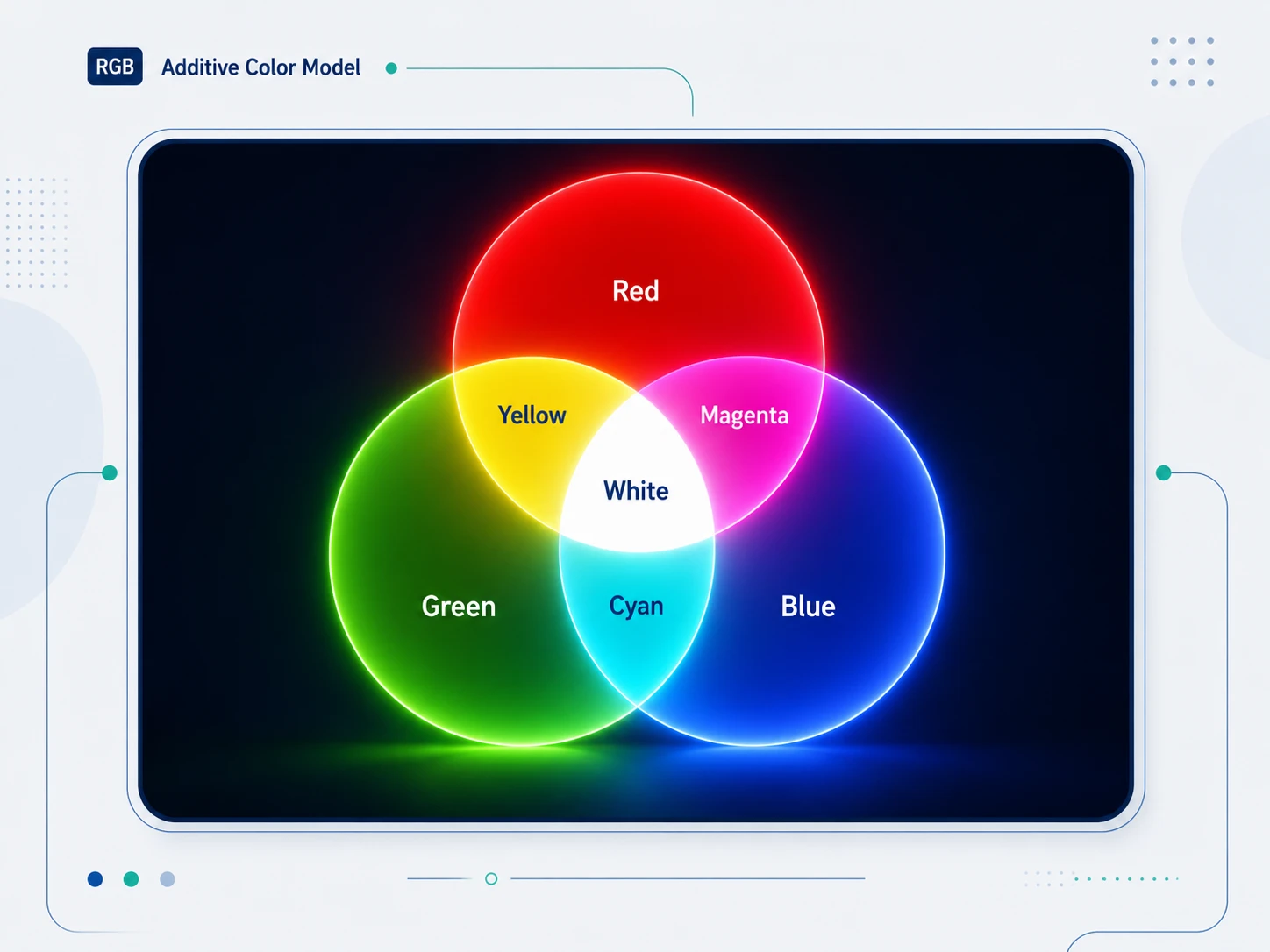
RGB stands for Red, Green, and Blue. It is the color model used by every digital display to produce color by combining light from three channels. Each channel is assigned a value between 0 (no light) and 255 (maximum intensity). By mixing these three channels at different intensities, screens can produce over 16.7 million distinct colors.
RGB is an additive color model, one of the core ideas in color theory: adding more light produces brighter, lighter results. At maximum intensity across all three channels, RGB(255, 255, 255) produces white. At zero intensity across all three, RGB(0, 0, 0) produces black.
This is the opposite of how paint or ink works. Mix all ink colors together and you get dark, muddy brown. Mix all RGB light channels at full intensity and you get pure white.
One detail trips up most designers: RGB is device-dependent. The triplet RGB(255, 0, 0) does not name one fixed red. It tells a screen to fire its red channel at full intensity, and every panel does that a little differently based on its hardware and its age.
Two monitors can open the same file and still not match. This is the reason color profiles exist, and it is why the same hex code can look punchy on one display and flat on another. We come back to profiles later. For now, hold onto the core idea: the numbers are instructions, not absolute colors.
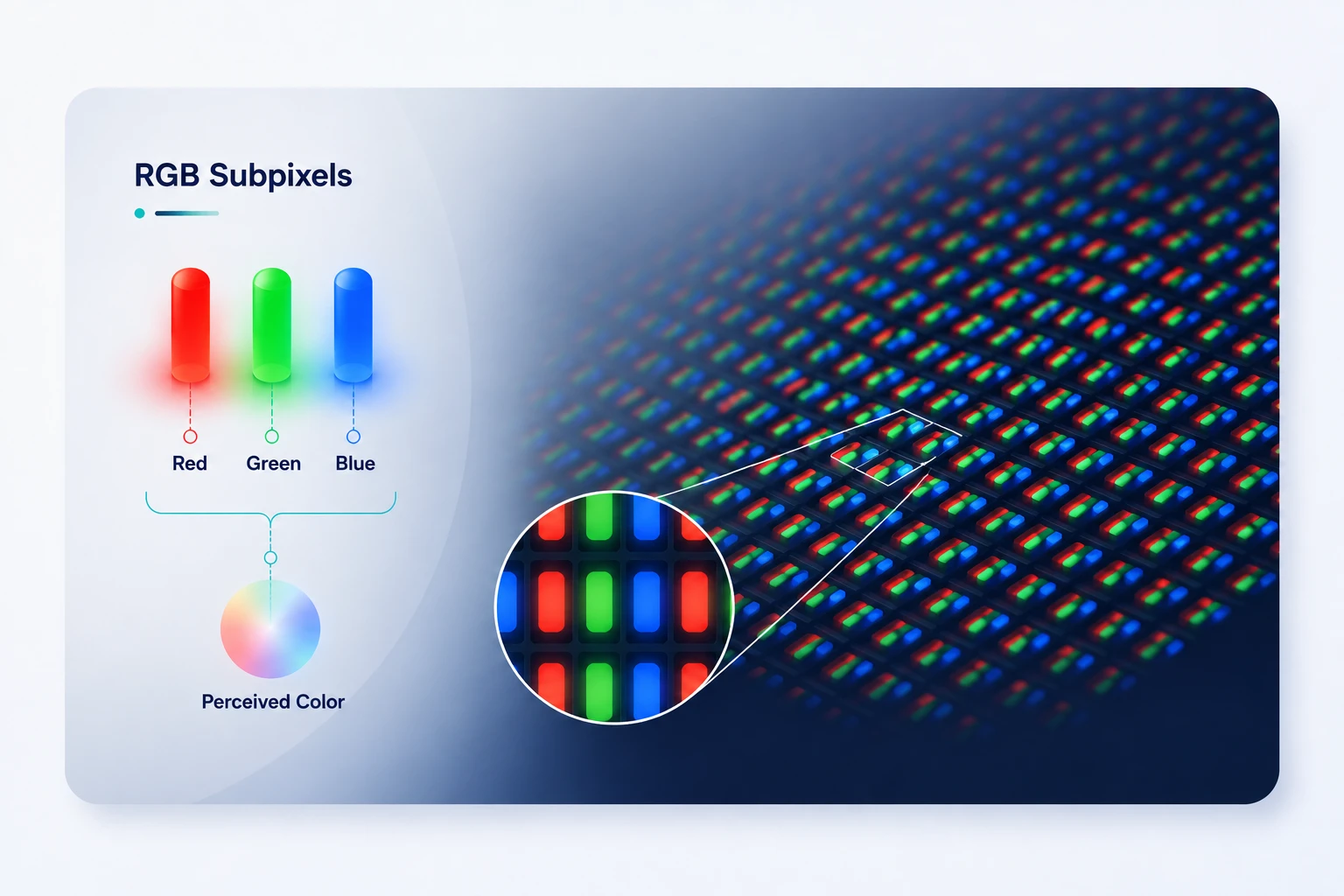
When your monitor displays a color, it fires microscopic red, green, and blue subpixels at specific intensities. Your eye blends these light emissions into a single perceived color. This happens at a scale too small to see without magnification.
The mixing rules for RGB follow additive light physics:
This is why RGB is called additive: you are adding light wavelengths. The more you add, the closer you get to white.
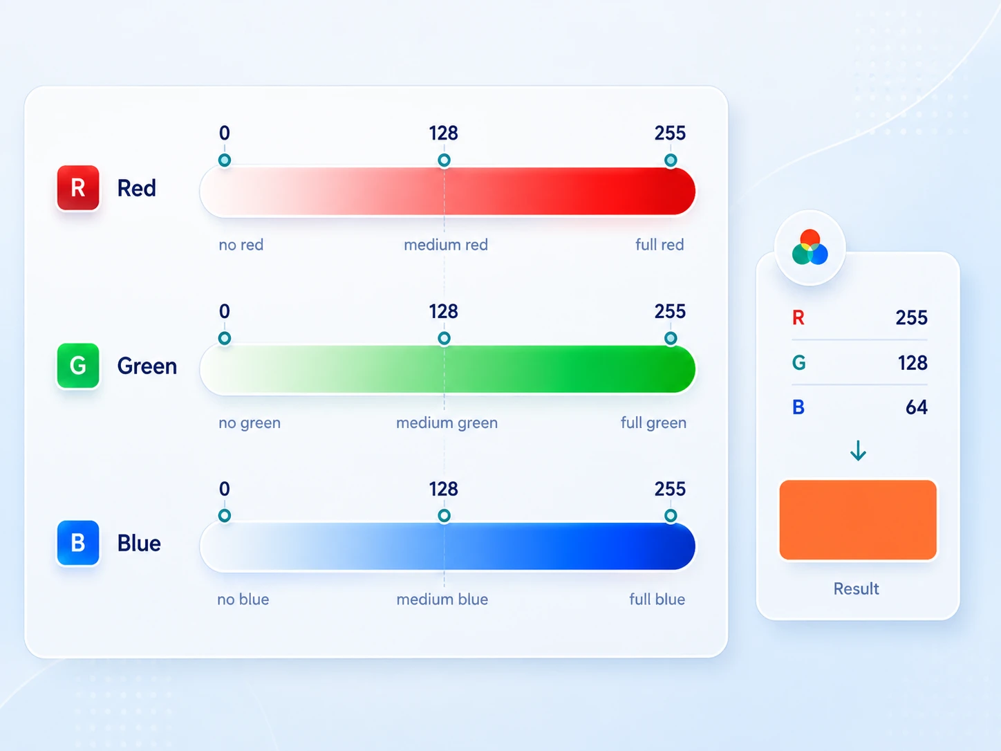
Each of the three RGB channels accepts an integer from 0 to 255. This gives 256 possible values per channel. The reason for 256 steps, not 100 or 1000, is rooted in how computers store data: 8 bits can represent exactly 256 values (2 to the power of 8). Three 8-bit channels give 256 x 256 x 256 = 16,777,216 possible colors.
In practice, the scale behaves differently for each channel. A green value of 200 looks brighter than a red value of 200 because human eyes are more sensitive to green light. This matters when you adjust colors by feel: equal numeric shifts do not produce visually equal changes.
The 0 to 255 scale looks linear, but your screen does not treat it that way. Display values are gamma-encoded, which bends the signal to match how human vision handles brightness. We read fine detail in dark tones and less in bright ones, so the encoding gives darker values more room on the scale.
The practical effect: a channel set to 128 sits near the middle of the number range, but it renders at roughly 22 percent of full brightness on a standard display, not 50 percent.
This matters in two places. First, it explains why nudging a value by 10 near the dark end shifts the look more than the same nudge near the top. Second, it is the reason contrast math is not a plain subtraction of RGB numbers.
WCAG converts each gamma-encoded channel back to linear light, then weights the channels, before it produces a ratio. Those weights show up in the accessibility section. The takeaway: trust a contrast checker over the raw numbers, because the numbers hide the curve.
These are the pure channel values every designer should recognize on sight. They map directly to the primary colors and secondary colors of light:
Note that pure green in RGB, RGB(0, 255, 0), looks nearly neon. It is not the natural green you see in printed design.
Most design systems use a desaturated, adjusted green like RGB(52, 168, 83) or RGB(34, 139, 34) because pure RGB green is visually aggressive on screens.
The answer depends entirely on the output medium:
The mistake designers make most often: exporting a design from Figma (RGB) to a print vendor and assuming the colors will match. Bright screen blues and neon greens frequently cannot be reproduced in ink.
If you design for both screen and print, design in RGB for the screen-first deliverable, and let your print vendor convert with a proper ICC profile.
In product and UI design, you will almost never need CMYK. Every screen-facing deliverable (web, app, social, digital advertising) uses RGB.
RGB is the underlying color model for:
In CSS, you can define RGB colors in two ways.
RGB notation:
color: rgb(255, 87, 51);
Hex notation (compressed RGB):
color: #FF5733;
Hex code is just RGB expressed in base-16 (hexadecimal). #FF5733 breaks into:
FF = 255 (Red)
57 = 87 (Green)
33 = 51 (Blue)
RGBA adds opacity through an alpha channel:
background: rgba(255, 87, 51, 0.75); /* 75% opacity */
The fourth value is the alpha channel. It sets opacity from 0 (fully transparent) to 1 (fully opaque), which is why the model is often written as RGBA when transparency is in play.
CSS also supports HSL, which many designers find more intuitive because you adjust Hue, Saturation, and Lightness rather than three light channels. Under the hood, the browser converts HSL to RGB for rendering.
Modern CSS color spaces:
CSS reaches wider color through oklch() and the display-p3 color space. Browser support is broad. Safari shipped display-p3 first in 2020, and all major browsers reached wide-gamut color support in 2023.
color: color(display-p3 0.9 0.3 0.2);
This lets web designs reach the wider P3 gamut on capable displays instead of staying capped at sRGB.
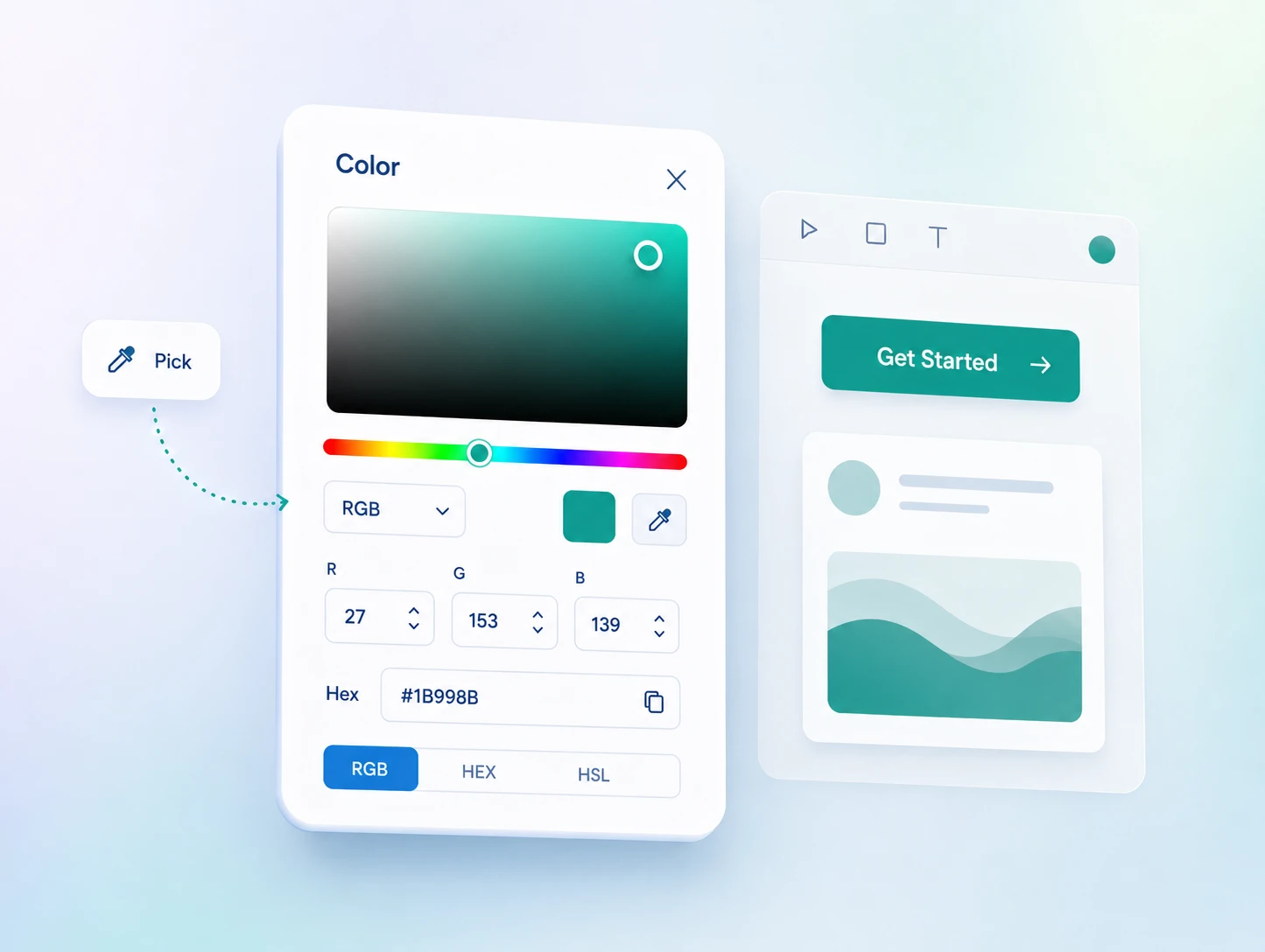
In Figma, the color picker defaults to HEX, but you can switch the color mode dropdown to RGB, HSL, HSB, or CSS. For most design work, either HEX or RGB is fine. Switch to HSB when you want to adjust brightness without shifting the hue.
Practical tips for RGB in Figma:
In Sketch:
The color picker works identically. The Global Colors in Sketch's shared libraries store RGB hex values.
In Adobe Illustrator:
Switch document color mode to RGB for all screen-facing work (File > Document Color Mode > RGB Color). Illustrator defaults to CMYK on a new document, which causes color-shift problems if you do not change it upfront.
This is the section most "what is rgb" guides skip, and it is the one that causes real problems in professional design work.
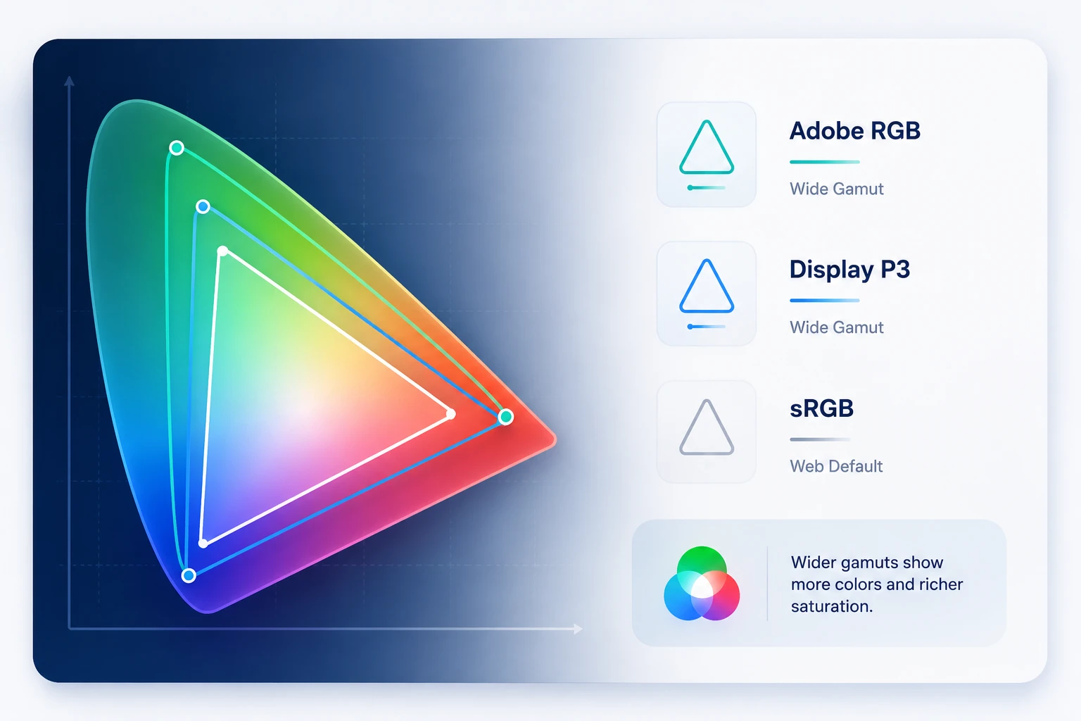
sRGB (standard RGB) is the default color space for the web. It was defined in 1996 for CRT monitors and has been the web standard ever since. When a browser displays a JPEG or PNG, it assumes sRGB unless the file has an embedded color profile. When Figma exports, it uses sRGB.
Display P3 is Apple's wide-gamut color space, used in iPhone, MacBook Pro, and iMac lines for years. It covers approximately 25 percent more colors than sRGB, specifically in the green and red ranges.
When you design a vibrant green button on a P3 display, it looks more saturated than it will on a standard sRGB monitor.
Adobe RGB covers a similarly wide gamut, shaped toward print colors, and you mostly see it in professional photography. For screen design, you rarely encounter it.
What this means for your design work:
If you design on a MacBook Pro with a P3 display and export to sRGB for web, some of your most vibrant colors will look slightly duller on sRGB-only screens. This is not a bug. It is a gamut-mapping limitation: some colors you can see on your P3 screen simply cannot be represented in sRGB.
The practical fix: when your design has very saturated colors (vivid greens, electric blues, neon oranges), check it on an sRGB-only screen before shipping. Windows displays and older monitors typically render in sRGB.
One more axis sits beneath the profile: bit depth. Standard screen design runs on 8 bits per channel, the 256 levels covered earlier. Modern HDR and many wide-gamut displays push to 10 bits per channel, which gives 1,024 levels and over a billion possible colors.
More levels reduce banding in gradients and smooth skies, and HDR needs that headroom to hold detail in very bright and very dark areas at once. For most UI work, 8-bit sRGB is still the right export target. The time to care about 10-bit is when you design HDR media or ship to displays built for it.
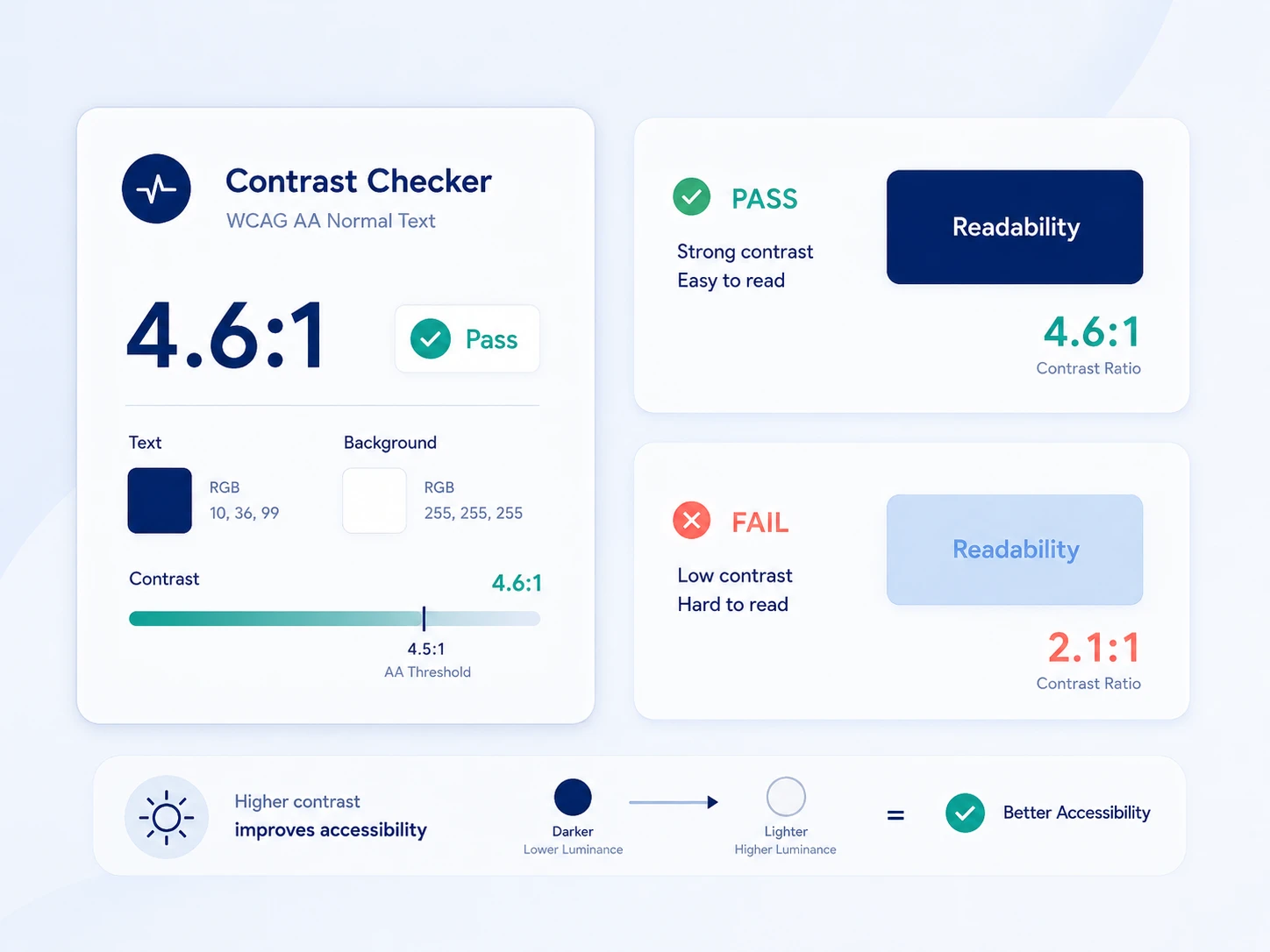
WCAG 2.1 contrast ratio requirements are calculated from RGB values. The formula uses relative luminance: a measure of how bright a color is when perceived by the human eye.
Luminance accounts for the fact that human eyes are more sensitive to green than to red or blue. The formula weights each channel differently:
This is why white text on a dark blue background often passes contrast requirements even though dark blue has substantial blue saturation. Blue's low luminance weight means it reads as dark regardless of its channel value.
WCAG AA minimums:
WCAG AAA (enhanced):
In practice: do not guess at accessibility with RGB values. Use a contrast checker. Figma has a built-in checker in its Accessibility plugin, and the WebAIM Contrast Checker accepts hex or RGB input.
Common failure patterns:
These values appear consistently in professional design systems. For building full palettes, see our guides on color palette types and choosing UI color.
Neutrals (text, backgrounds, and borders):
Colors frequently used in UI:
hexadecimal number from 00 to FF. For example, RGB(255, 87, 51) becomes #FF5733. Red 255 converts to FF, green 87 converts to 57, and blue 51 converts to 33. In real design work, you usually do not need to convert this manually because tools like Figma, Photoshop, and CSS editors handle it automatically.
Still, understanding the logic helps you see that Hex and RGB are just two different ways of writing the same color. For example, #FF5733 and rgb(255, 87, 51) represent the exact same color. CSS also supports shorthand Hex when both digits in each color channel match, such as #FFFFFF becoming #FFF, #000000 becoming #000, and #AABBCC becoming #ABC.
To convert RGB to CMYK, you need to adjust the colors from an additive model (RGB) to a subtractive model (CMYK). Here’s a simple step-by-step guide to help you:
1. Normalize the RGB values
First, you must convert the RGB values between 0 and 255 into a range between 0 and 1. You can do this by dividing each RGB value by 255. For example, if your RGB is (255, 0, 0), you divide each by 255, resulting in (1, 0, 0).
2. Find the CMY values
Next, calculate the values for Cyan, Magenta, and Yellow. Use this formula:
3. Calculate the K value
K, or Black, is determined by finding the minimum value between C, M, and Y. This helps to decide how much black ink is needed in the print. K = min(C, M, Y).
4. Adjust the CMY values
Now subtract K from each of the CMY values:
The above simple process helps you effectively convert digital colors from screen to print!
They represent the same color model in different notation. RGB(255, 87, 51) and #FF5733 are identical colors. Hex is just RGB values expressed in base-16. Design tools convert between them automatically.
Use whichever your workflow needs: hex for CSS and most design tools, RGB when entering values manually or working with token systems that store numeric channels.
The range comes from binary storage. One byte (8 bits) stores exactly 256 values (0 through 255). Three bytes for three channels give 256 x 256 x 256 = 16,777,216 possible colors. This is also why RGB is sometimes called 24-bit color (8 bits per channel times 3 channels).
Both describe color in different terms. RGB defines color as amounts of red, green, and blue light. HSL defines it as Hue (position on the spectrum, 0 to 360 degrees), Saturation (intensity, 0 to 100%), and Lightness (brightness, 0 to 100%).
HSL is more intuitive for adjustments: raise Lightness to lighten, lower Saturation to mute. CSS supports both, and HSL is converted to RGB for rendering.
RGB works as a starting point, but print requires CMYK. The RGB gamut is larger than CMYK inks can reproduce, so bright neons, electric blues, and vivid greens often look duller in print because the matching ink mix does not exist. For print work, use your printer's ICC profile to preview how RGB colors will translate.
Pure black RGB(0, 0, 0) on RGB(255, 255, 255) gives a 21:1 contrast ratio, well past WCAG AA (4.5:1) and AAA (7:1). Many design systems use near-black such as RGB(33, 33, 33) or RGB(18, 18, 18) for a softer feel while still passing AA and AAA comfortably.
sRGB is the default color space for the web and most screen design. It defines what specific RGB values look like in real-world terms.
On a wide-gamut P3 display, colors can look more saturated than they will on sRGB-only screens. For most web and app work, export in sRGB unless you have a specific reason to use a wider space.
Pure white can feel harsh, so most designs use a slight off-white for large areas: RGB(250, 250, 250), RGB(245, 245, 245), or a warm RGB(254, 252, 248).
For dark mode, Material Design recommends RGB(18, 18, 18) over pure black, which reduces eye strain and allows surface elevation through subtle lightness changes.
RGB is not just a technical spec. It is the operating language of every interface you design. The 0 to 255 scale, how hex maps to channels, how sRGB and P3 profiles change what clients see on different screens, and how luminance values decide accessibility: these are the practical dimensions that separate designers who work confidently with color from those who guess and adjust until it looks right.
The tools handle most of the conversion. What they cannot do is tell you when a profile mismatch will dull your brand colors on a client's Windows laptop, or whether your gray text passes WCAG AA on the background you chose. That judgment comes from understanding what the numbers mean.


An Experience Design Agency focusing on building functional, simple, human-centered digital products for future.
