Color plays a pivotal role in creating visually appealing compositions. One of the most striking and harmonious ways to use color is through a triadic color scheme. A triadic color palette consists of three colors evenly spaced around the color wheel, creating a balanced yet vibrant look. This scheme is ideal for designs that must be dynamic and full of contrast yet maintain a sense of harmony.
When working on UI/UX design, brand identity, or digital product visuals, understanding how to combine triadic colors elevates your project, giving it a bold yet cohesive feel. In this post, we’ll discuss what are triadic colors and the best ways to use them effectively.
Triadic colors are three colors evenly spaced around the color wheel, forming a triangle shape. They are often vibrant and balanced. Common examples include primary colors like red, blue, and yellow. Triadic colors create a colorful yet harmonious look.
They work well together and offer both contrast and unity. When used properly, they can make designs look lively and engaging. This color arrangement is prevalent in art, design, and branding for its dynamic and balanced appeal.
A triadic color scheme uses three colors from the color wheel, spaced evenly apart, to form a triangle. This scheme creates a balanced yet vibrant look by combining primary, secondary, or tertiary colors. The result is a design full of contrast and energy.
Designers use triadic schemes to make their work stand out without feeling chaotic. Balancing each color's intensity, a triadic scheme keeps the visual flow smooth and engaging. It's a go-to choice for lively, colorful designs.
Triadic colors can create a harmonious yet vibrant effect, but their psychological impact can vary based on how they are balanced in a design. Here are six psychological impacts that the triadic color scheme brings into play:
Triadic color schemes naturally offer a balance between different hues, thanks to the equal spacing on the color wheel. This balance leads to a sense of stability and harmony in a design. Psychologically, it evokes feelings of completeness and calmness. The triadic color scheme maintains a balanced color palette, preventing one hue from dominating. As a result, the viewer's eye can rest and feel comfortable.
Triadic color schemes include three distinct colors, making them inherently vibrant. This vibrancy can stimulate excitement and energy, which is why triadic colors are often used in designs that need to grab attention. The combination of warm and cool tones in such schemes can create a lively atmosphere, often encouraging action or evoking a sense of playfulness and creativity.
The triadic scheme allows bold color contrasts to enhance the design's visual appeal. The psychological effect here is one of dynamism and tension. This contrast can engage the viewer's attention and make the design feel more striking and memorable. However, adjusting the saturation and brightness of the hues used is essential to prevent the colors from clashing.
The triadic color scheme is versatile, allowing for various moods. The choice of colors within the triadic set can dictate whether the mood is more playful (using bright primaries), calm (using soft pastels), or intense (using darker shades). This flexibility makes triadic schemes suitable for various contexts, from corporate branding to artistic expression.
Using three distinct colors can evoke a sense of creativity, balance, and innovation. The triadic scheme works well in designs that convey fresh ideas or forward-thinking concepts. The psychological effect here is that the viewer perceives the design as inventive and well-thought-out, making it ideal for artistic endeavors, brands focused on innovation, or modern marketing campaigns.
The specific colors can also influence the emotional response to a triadic color scheme. For instance, a combination of blue, red, and yellow can trigger feelings of alertness and excitement due to the mix of warm and cool tones. Alternatively, using softer hues like pink, lavender, and mint can create a soothing effect, offering a sense of tranquility and balance.
The color wheel can be divided into primary, secondary, and tertiary colors. Each group offers distinct characteristics that can be combined to form triadic palettes.
The primary triadic color scheme is often considered the most straightforward and classic combination. Red, yellow, and blue are the foundation of the color wheel, derived from all other colors. While these colors are bold and vibrant, using them creatively can avoid overwhelming the viewer. Softening the shades or using muted tones can create a more refined look, ideal for spaces that need energy but also a sense of maturity.
The secondary colors are orange, green, and violet, and they form another triadic scheme. These colors, which result from mixing two primary colors, naturally balance each other well. This triadic combination is perfect for vibrant designs, especially for spaces or projects that grab attention. You can use one dominant color and complement it with the other two as accents. For example, a deep violet wall with green furniture and orange decor can provide a striking look that feels energetic and lively.
Tertiary colors—created by mixing a primary and a secondary color—offer more subtle variations and expanded possibilities. For instance, the combination of red-orange, yellow-green, and blue-violet can create a sophisticated and slightly more muted palette. This combination provides a unique twist on the traditional triadic scheme and can work well in spaces or designs that require more complexity without going overboard.
The final triadic combination uses yellow-orange, blue-green, and red-violet. This palette offers a modern twist on the traditional color wheel, mixing warm and cool tones. The combination of these colors allows for versatility in design if you want to create a warm, inviting space or a calm, more serene environment. These tertiary hues allow for greater flexibility in adjusting the intensity of each color, which can help create a balanced and aesthetically pleasing outcome.
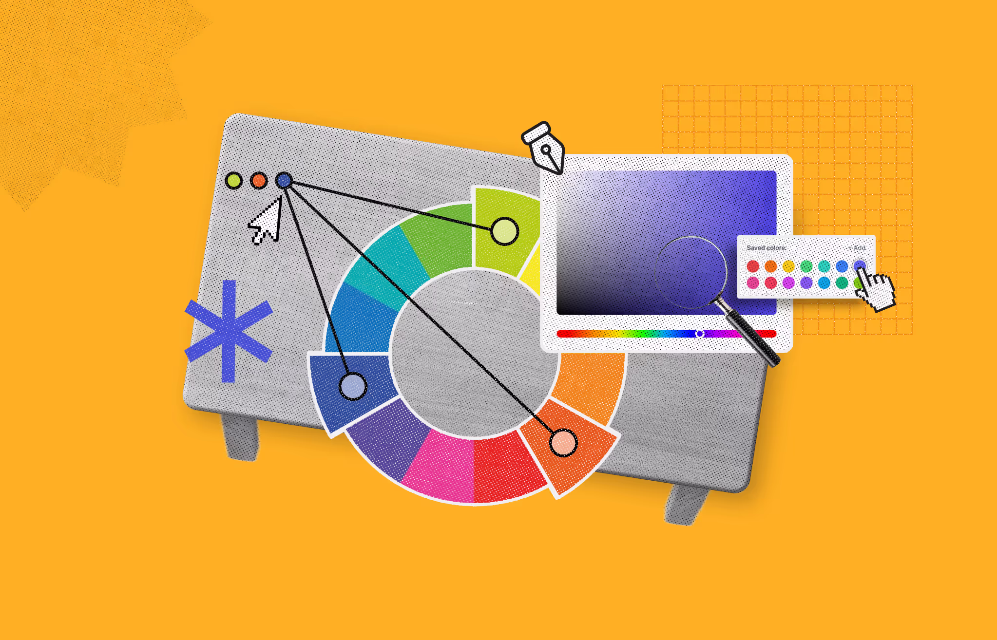
Combining triadic colors involves using three hues evenly spaced around the color wheel. This method creates a vibrant, energetic palette while maintaining balance. By strategically using these colors, designers can add depth and harmony to their work.
A triadic color scheme consists of three colors spaced 120 degrees apart on the color wheel. This arrangement ensures a harmonious yet lively palette. For example, the primary colors (red, blue, and yellow) form a classic triadic combination.
When combining triadic colors, one color should dominate the design. It will set the tone of the composition and draw the viewer's attention first. It is essential to pick this color carefully, as it will influence the mood and atmosphere of your design. The other two colors should act as secondary and accent colors. The secondary color supports the dominant hue, while the accent color provides small bursts of contrast to keep the design from feeling too flat or monotonous. When used thoughtfully, this distribution ensures that no color overpowers the others, keeping the design visually pleasing and balanced.
Not all triadic colors need to be vibrant and saturated. Balancing bold colors with muted tones can create a more sophisticated and calming atmosphere. For instance, you could use pastel shades of the primary triadic scheme—pale yellow, soft blue, and light red—to create a soothing yet energetic environment. On the other hand, dark or muted hues, like burgundy, mustard, and navy, can lend a more refined and subdued aesthetic.
Triadic colors often have strong contrasts because of their distance on the color wheel. To prevent them from clashing, adjusting their saturation and brightness is key. Lighter or darker versions of the colors can be used to create depth and prevent the design from feeling too overwhelming. By adjusting the intensity of each color, you create a more harmonious balance, allowing the colors to work together seamlessly. Designers often make the dominant color brighter or more saturated, while the accent colors can be softer or muted.
A helpful guideline for applying triadic colors effectively is the 60-30-10 rule.
A common guideline in design is the 60-30-10 rule:
This principle suggests that the dominant color should cover 60% of the design, the secondary color should take up 30%, and the accent color should only account for 10%. This structure helps create a visually appealing design that doesn't overwhelm the viewer. It's a rule that works across different design areas if you're designing a website, creating a logo, or developing an interior design concept. Following this rule, you can ensure that your triadic colors remain balanced and aesthetically pleasing.
While the triadic color palette offers incredible vibrancy, incorporating neutrals can help ground the design. Whites, blacks, grays, or even metallics like gold or silver can be great balancing agents. For example, a triadic color scheme of red, yellow, and blue can be paired with white walls or gray furniture to allow the colors to pop without becoming overwhelming.
Understanding color temperature is essential when working with triadic colors. Colors can be either warm (red, orange, and yellow) or cool (blue, green, and purple). Combining warm and cool colors within the triadic scheme can create an exciting contrast that draws attention to key areas.
Alternatively, colors with the same temperature can produce a more subtle, harmonious effect. Balancing these temperatures is essential for achieving the desired emotional impact. Warmer tones often create a sense of energy, while cooler tones bring a calming or peaceful feel.
When working with multiple triadic color combinations, it’s important to limit the number of combinations to avoid chaos. For example, using both primary (red, yellow, blue) and secondary (orange, green, violet) triadic schemes in the same space can quickly overwhelm the viewer. Choose one triadic combination per project and let it shine while adding a touch of contrasting hues from other color combinations as accents.
Finally, once you've selected your triadic colors and applied them to your design, it's time to test and refine. Use design tools or color palettes to visualize how the colors interact. Make minor adjustments to ensure the colors complement each other without overwhelming the composition. This testing phase allows you to fine-tune the balance of colors in your design, ensuring that they evoke the right emotional response and create the desired visual effect. Experimenting with different combinations and proportions can help you achieve a more personalized and polished result.
For a visual demonstration and further insights, you might find this video helpful:
Triadic color schemes are powerful for brands looking to create a vibrant, energetic, and visually striking identity. Here are five renowned brands that have successfully used triadic color schemes in their logos and marketing materials:
Pepsi's logo is one of the most recognizable in the world, and it uses a triadic color palette of red, blue, and white. The primary colors, red and blue, create a dynamic, high-energy contrast, while white provides a neutral space, giving the design clarity and balance. This combination helps convey a feeling of fun, refreshment, and youthfulness, which is core to Pepsi's brand identity.
Burger King employs a triadic color scheme with red, yellow, and blue in its logo. The red represents energy and excitement, the yellow evokes warmth and comfort (often associated with food), and the blue adds a touch of trustworthiness and stability. The mix of these primary hues creates a lively and striking logo that conveys an inviting, carefree atmosphere while appealing to a wide demographic.
Fanta, a Coca-Cola product, uses a triadic color scheme of orange, green, and purple. This fun and playful combination is visually striking and speaks to Fanta's vibrant and energetic brand personality. The orange is directly tied to the flavor (citrus), while the green and purple add an unexpected twist that helps the brand stand out from competitors. It's bold and unconventional, matching Fanta's youthful and adventurous vibe.
Microsoft's logo, especially in its recent minimalist style, uses a combination of red, yellow, green, and blue, a variation of a triadic color scheme. The balanced use of these colors in the four quadrants represents the brand's dynamic and multi-faceted approach to technology. Red evokes energy, blue stands for trust, green suggests innovation, and yellow brings warmth and optimism. Together, they embody the brand's approach to providing solutions that are both functional and accessible for everyone.
Using a triadic color plan can improve your project's look and usefulness. Here are the main advantages:
Triadic color schemes are based on adequately spread colors on the color wheel. As a result of this natural equilibrium, the design is harmonious, and the composition feels one. The uniform spread of the colors stops one from being too strong, letting all three colors look good together.
A significant advantage of the color scheme is its bright and lively appearance. The colors are spread apart correctly, making them stand out without looking bad together. A sense of vitality and energy is infused into your design using this contrast. It's great for making designs that grab attention, whether creating a brand, an advertisement, or a website.
A triadic color scheme gives you a lot of options. Using three different colors allows you to try out various tones and shades of each color, giving you many options for your design. Since it permits both overt and covert methods, it is adaptable to a wide range of tasks. You can change how noticeable each color is based on the feeling or message you want to express.
Using three colors might seem complicated, but a triadic scheme helps balance the colors. Unlike complementary color schemes, triadic colors blend well without being too strong or clashing. This keeps your design looking good and well-balanced.
Triadic color schemes are great for showing a brand's attitude. Whether you're creating a fun brand or a strong product, these colors can show a specific mood or feeling. A mix of red, yellow, and blue can create a sense of creativity, joy, and youthful energy. A blend of green, orange, and purple can create a feeling of excitement and individuality.
A triadic color design is great for grabbing attention. The strong difference between the colors grabs attention but still looks nice together. Triadic colors are great for designs that need to stand out, such as ads, products, or websites.
Incorporating a triadic color scheme into your designs creates the perfect balance between energy and harmony. Selecting and combining three colors spaced evenly on the color wheel results in visually striking and well-balanced compositions. Choosing vibrant primary colors or subtle tertiary hues offers flexibility and variety without sacrificing cohesion. Applying principles like the 60-30-10 rule or adjusting color intensity helps create engaging and memorable designs that stand out while maintaining unity.
Triadic color schemes are versatile and can be used across various design projects, including graphic design, web design, branding, and interior decor. When creating a bold or subtle look, triadic colors can be adjusted in saturation and intensity to fit different design needs.
Not necessarily. While combining three colors might seem complex, triadic schemes naturally offer balance due to their equal spacing on the color wheel. To make balancing easier, follow the 60-30-10 rule. One color should dominate, covering 60% of the design. The second color is an accent, making up 30%, while the third is used sparingly for highlights, at just 10%.
Triadic color schemes consist of three colors evenly spaced on the wheel, creating harmony with contrast. In contrast, complementary colors directly oppose each other on the wheel, producing a high contrast level. While complementary schemes are bold and striking, triadic schemes are more balanced and versatile.
Using lighter or darker shades and tints of your triadic colors allows for more subtle variations, giving you greater flexibility. This helps avoid overwhelming the design while maintaining the vibrant harmony of the triadic scheme.
Triadic color schemes can enhance brand identity by creating a vibrant, energetic, and memorable look. By choosing three well-balanced colors, brands can convey a sense of harmony while standing out in the market. Triadic colors can evoke emotions, enhance recognition, and make a lasting impression on customers.
Yes, triadic colors can be used in minimalist designs, but the key is to use them thoughtfully. You can apply the colors in muted tones or use the 60-30-10 rule to keep the palette simple and elegant, ensuring the design remains clean and visually appealing without overwhelming the viewer.


An Experience Design Agency focusing on building functional, simple, human-centered digital products for future.