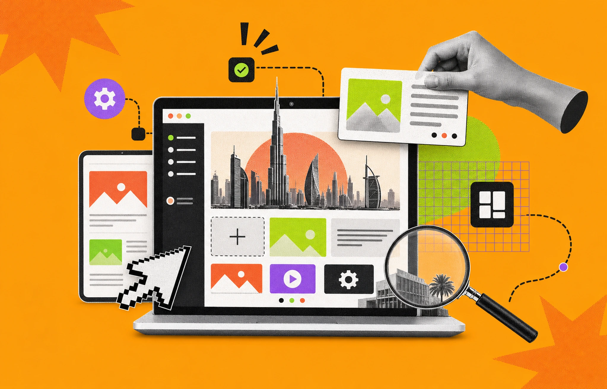
The purpose of a wireframe is to get a sense of how your website will be structured and the way you’ll use space without bothering with design elements like color, typography, etc.
Having said that, wireframes can be elaborate and include text, color, images, etc., and even interactive elements. It’s up to you and the project’s complexity how much you want to plan out before you start the development process.
So, there’s a choice to be made here.
Here’s what you need to know to get started and the 21 best websites wireframe examples for inspiration.
Creating wireframes makes you analyze the purpose of your website and think of it as a whole before coding. It helps developers the same way as outlines help a writer by providing a blueprint, which is especially helpful for beginners.
Wireframes provide a clear visual blueprint of the page structure, showing the arrangement of key elements such as headers, footers, content areas, navigation, buttons, and forms.
You can put down all the ideas you have and see what works together and what doesn’t. That way, you get to manage space more optimally.
Wireframes are very useful if you’re working with a client. Whatever vision your client shared with you and what you took away from them may be hard to talk about in purely abstract terms.
When you have a physical reference of what you want to do for a particular project, it becomes easier for the client to grasp and visualize the concepts.
Moreover, you can get some clear feedback and make changes.
Wireflows are visual representations that map out the sequence of screens or pages a user interacts with while navigating through a website or application.
Simply put, it’s a flowchart of individual wireframes or pages.
When creating a workflow, you first start thinking of the user experience as well as the interface.
If you have a clear idea of what you want before you start coding, you are likely to make fewer mistakes.
You’ll be working on a design that’s already approved by your client, which makes revisions unlikely. This way, you can end up saving a lot of time.
Having an interactive prototype that users can test can give you incredible insights. You can adjust your wireframes as per user feedback and have a better-finished product.
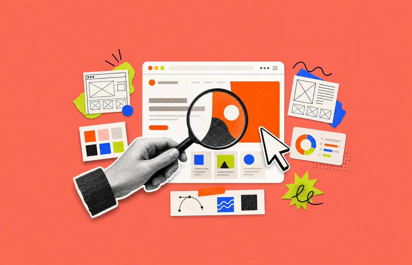
Now that you know wireframes are pretty much un-skippable for most projects, you need to decide how detailed you want the wireframe to be. Here are the various types of wireframes based on the level of detailing.
Low-fidelity wireframes are solely focused on the structure and layout of the website. This can be a quick sketch on pen and paper or the use of basic design tools. It’s done entirely in black and white.
They typically use simple shapes, lines, and placeholders to represent headers, content areas, buttons, and navigation menus without any detailing. You can come up with a low-fidelity wireframe within a few minutes and they are easy to revise.
When to Choose:
Medium-fidelity wireframes bridge the gap between basic sketches and detailed designs that perfectly mimic the website.
They provide a more refined layout and functionality with specific element placements, gray-scale color schemes, and some basic typography.
This is to give a clearer sense of the user interface without delving into final design elements like colors, fonts, or images. They often incorporate some level of interactivity to illustrate user flows and navigation paths more effectively.
When to Choose:
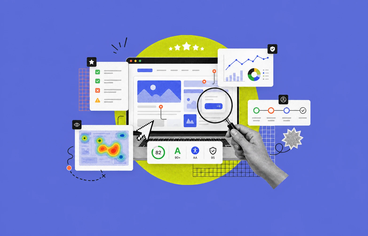
A high-fidelity wireframe resembles the finished product as closely as possible. Design elements are specified, including colors, typography, images and videos used, icons, and any other graphic elements.
It’s also very good at providing a realistic preview of how the website will function and the user experience. It usually features interactive elements.
When to Choose:
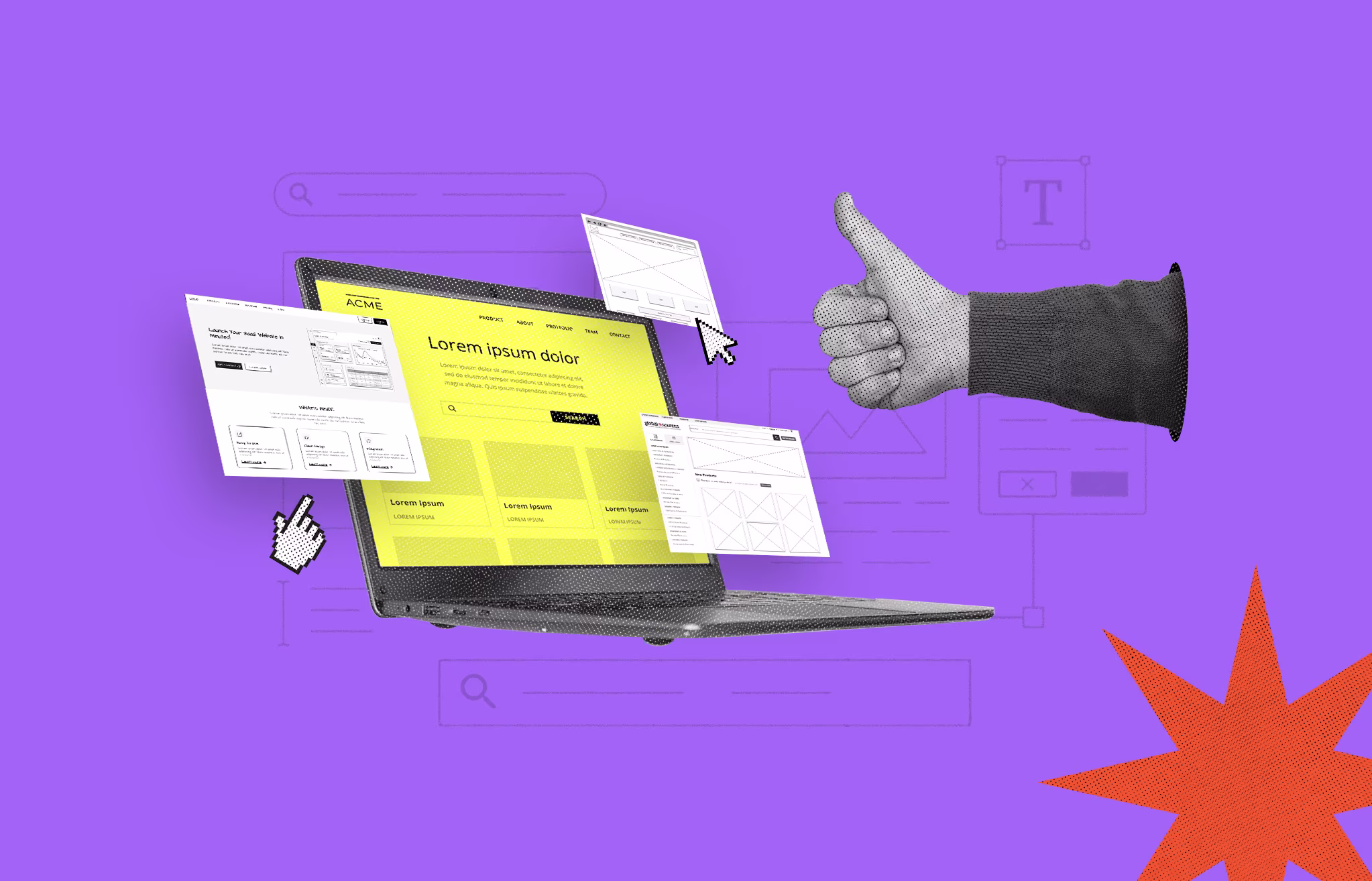
When creating a wireframe, you’ll be using different tools. While no one tool excels at everything, you do get tools that shine in specific areas.
Here are some of the best tools you can try.
Moqups offers plenty of templates for mobile app designs, landing pages, flowcharts, dashboards, and more.
With limited experience, you can start working on a project. Moreover, it’s also affordable, with plans starting at $9/month for solo creators.
For those with a limited budget, Figma is a very helpful tool as it allows you to access a lot of useful features for free.
It’s fairly simple to use and you can create your own artboard and get to designing. You can add shapes, text, and some interactive elements for prototyping as well.
UXPIN has a lot of advanced features that allow you to create high-fidelity wireframes and prototypes.
You can easily take your low-fidelity wireframe and drag and drop it into UXPIN’s canvas.
The software can read Photoshop files as well as any sketches you made, making it possible for you to improve the detailing and quality easily.
Justinmind allows designers to add advanced interactions, animations, and conditional logic, enabling the creation of realistic user experiences.
You can add a dropdown, radio buttons, etc. in single clicks. Also, it doesn’t take much effort to learn to edit on this platform due to its simple and intuitive organization.
Here are 21 best website wireframe examples for you to follow, whether you’re making a low-fidelity sketch or a high-fidelity, realistic wireframe.
The hand-drawn sketch below shows a sequence of wireframes that gives a basic idea of the user interface and layout.
All these screens are interconnected with red arrows, indicating the navigation flow between them and you get a basic idea of the user flow and interaction.
From here, the designer still has a lot of work to do, but the foundation of layout, structure, and user interaction is laid out.
.png)
This sample wireframe is a few screens from an e-commerce app. It’s a mid-fidelity design with gray tones and basic texts and icons.
You can take inspiration as to which elements to flesh out when you are in the intermediary stages of designing a project.
As a beginner, take common niches like e-commerce, SaaS, corporate websites, healthcare apps, etc.
.png)
Podcasts are here to stay for a very long time. You may want to practice using this wireframe design example.
Its use of thumbnails, icons, quotations to interest listeners, and podcast and episode summaries will provide a good user experience.
From the design, you can tell it will be easy to search and find new content that may interest you without wasting much time.
.png)
The wireframes below are screens from an app to find friends.
These four wireframes provide a glimpse into a friend-finding app. They showcase the user experience (UX) through different screens:
With just these wireframes, you can grasp the app's core functionalities and how users will navigate it.
.png)
The landing page for a digital marketing agency likely brings most of the business. It’s how you get discovered by new clients organically.
So, a lot of emphasis and resources are put into the design.
The wireframe example below uses a lot of media to capture viewers' attention while the text offers relevant information and calls to action.
It’s a pretty simple layout with enough white space to give a clean look.
.png)
This wireframe showcases a product page for a toy store's e-commerce website. It prioritizes user-friendliness with a clean design:
This wireframe emphasizes clarity and provides all the essential information for a smooth online shopping experience.
.png)
This payment app keeps things straightforward, focusing on what you need most. The login screen is clean and clutter-free, with just the essentials: email, password, and a signup option if you're new.
Once you're logged in, the dashboard gives you a clear overview of your finances. You'll see your account balances in different currencies displayed prominently, along with recent transactions. This way, you can easily check your financial situation at a glance.
In short, this app is designed for ease of use without sacrificing functionality. It's a simple and effective tool for managing your online payments.
.png)
The wireframes below show how to transform a low-fidelity wireframe into a higher one. The first image specifies the space each element will take, the shapes, and the layout. The second image adds colors, icons, texts, and images.
.png)
This wireframe showcases a landing page for a chewy honey snack brand. The design is playful and quirky, perfectly matching the unique product itself.
The landing page dives right in, explaining what the snack is and how it can benefit you. You'll also find information about where to buy it and what other customers are saying about their experience.
In short, this landing page gives you all the essentials to pique your interest and learn more about this innovative honey treat.
.png)
This wireframe showcases a friendly and inviting landing page for a pet care service. It uses a cheerful color scheme and adorable pictures of pets, owners, and veterinary staff.
The layout is clear and easy to navigate. You'll see a list of the services offered, each with a clear call-to-action button that makes it simple to learn more or book an appointment.
The overall design, with its pleasing typography and colors, creates a positive first impression that pet owners will appreciate.
.png)
The design offers a glimpse into a coffee shop app with a simple and intuitive design. The color scheme is warm and inviting, reflecting the mood of a cozy coffee shop.
With only three tabs, the app prioritizes ease of use. This makes it a great choice if you're looking to design a streamlined app with minimal features. Ordering your coffee fix will be a breeze with this user-friendly interface.
.png)
Reimagining already existing websites can be a good way to practice your skills.
Take this Dunkin’ Donuts wireframe for example. It’s more colorful and fun than the actual website.
Moreover, you can select the drink you want from a single screen whereas the real website loads a second screen with a detailed description.
.png)
Fashion is an ever-growing industry.
You can tap into this market by learning how to design an interactive interface for a fashion-based e-commerce platform.
The high-quality mockup below is a solid example of what you can do. This kit can easily be transported to Figma if you want to play around with it.
.png)
In this wireframe, what makes the splash screen unique is that it sets the app's brand identity with a vibrant color.
The onboarding screens introduce the app's features, emphasizing ease of use and access to over 4,000 job opportunities.
Moreover, the login and sign-up screens are clean, offering multiple authentication options, including social media logins.
.png)
This wireframe depicts a dark-mode mobile application with multiple screens, each representing different functionalities.
As a web designer, you should practice dark mode as it’s on-demand, and most apps are incorporating this mode.
.png)
This wireframe shows a landing page for a web design service. It has a clean, modern design that feels professional. The tagline, "Grow Your Business With Us," is clear and concise, leaving no doubt about the service offered.
A call-to-action button encourages visitors to take the next step, while images of diverse professionals add a touch of personality. It's a visually appealing design that avoids overwhelming visitors with too much information at once.
.png)
This wireframe displays a mobile app for plant shopping and care featuring a fresh, green-themed design.
The design uses a clean and minimalistic layout with a soothing color palette, promoting an easy and pleasant user experience for plant enthusiasts.
Moreover, the product information is clearly visible.
.png)
This wireframe starts with a beautiful hero image that grabs your attention.
Below the hero image, you'll find sections featuring product categories and any current sales or promotions they might have. This makes it easy to find what you're looking for, whether you're browsing by category or searching for a specific deal.
At the bottom of the page, they've highlighted trending products. This is a great way to discover new favorites or see what other beauty enthusiasts are loving.
Finally, the search bar at the top and clear section labels make navigating the website a breeze. It's a simple but effective design that prioritizes a user-friendly experience.
.png)
This one shows a project management app with a clean and functional design. The unique greyscale theme gives it a modern feel.
It combines task management and project management features, offering a powerful tool to keep you organized.
You'll see a calendar view that lets you see all your tasks at a glance, with deadlines clearly highlighted. This way, you can easily stay on top of what needs to be done and when.
.png)
Sign-up pages are a must for apps, and improving your skills to include these basic wireframes is important.
The color palette aims to be soothing, as you would expect from a meditation app. Other than that, the icons, typography, and action buttons are very simple.
.png)
Looking for a fun and engaging concept? This wireframe for a children's reading app is a great starting point to spark your creativity!
The design uses lots of colorful icons, eye-catching book covers, and short summaries to grab kids' attention. It also features clear book categories to help them find stories that pique their interest.
Feel free to add your own unique touch to this concept! Maybe incorporate playful animations, interactive elements, or even personalized character avatars to make the reading experience even more magical for young children.
.png)
This collection of 21 website wireframe examples offers a glimpse into various app and website designs. It's a treasure trove of inspiration for anyone interested in user experience (UX) design.
Want to try your hand at wireframing? Tools like Figma, Moqups, UXPIN, and Justinmind can help you get started.
Pro Tip: Take it step-by-step! Many design projects begin with low-fidelity wireframes, then progress to medium and high-fidelity versions. This approach mirrors real-world design workflows.
Remember, you can refine your ideas and add details as you go. Including interactive elements is a great way to map out user flow and improve your UX design skills.
So, what are you waiting for?


An Experience Design Agency focusing on building functional, simple, human-centered digital products for future.