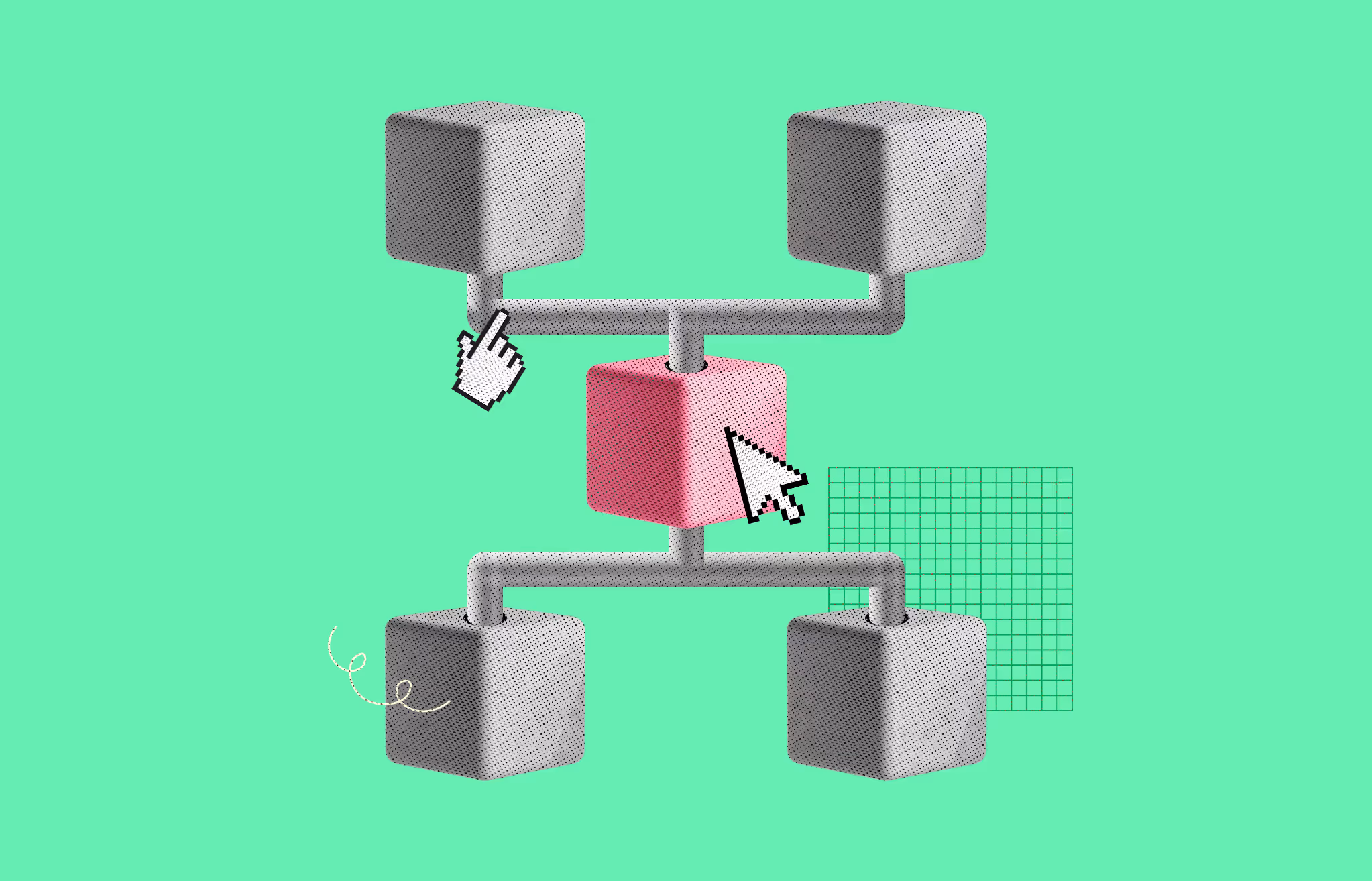
Information architecture in UX is how you organize, label, and connect the content inside a digital product so users find what they need without thinking about it. Most teams treat IA as the sitemap. That is a mistake. The sitemap is the diagram.
The architecture is the underlying logic that decides whether a checkout, a docs site, or a SaaS dashboard feels obvious or frustrating. Strong IA is invisible. Weak IA shows up as bounce rates, support tickets, and users who never reach the feature you built for them.
This guide skips the textbook framing and walks through what actually ships in product teams: the four systems from Rosenfeld and Morville, Dan Brown's eight principles, a seven-step process you can run this quarter, and the validation methods that prove the structure works.
Information architecture, or IA, is the practice of structuring, organizing, and labeling content so users can find it and complete tasks.
The Nielsen Norman Group describes IA as having two components: the identification and definition of a site’s content and functionality, plus the underlying organization, structure, and nomenclature that defines how those pieces relate to one another.
Read that sentence twice. IA is not the menu. The menu is a surface that exposes the architecture. The architecture lives underneath, in spreadsheets, taxonomies, and diagrams that most users never see but feel every time they click.
Two names anchor the field. Louis Rosenfeld and Peter Morville published Information Architecture for the World Wide Web through O’Reilly in 1998, which most practitioners still call the polar bear book.
Dan Brown, who co-founded Eigh Shapes in 2006, codified eight working principles for IA in a 2010 paper for the Bulletin of the American Society for Information Science and Technology. Together, those two references still define how serious teams think about IA today.
A clean IA pays back in five places at once.
The cost of weak IA shows up later, not at launch. Users do not file a ticket that says “your taxonomy is wrong.” They just leave.
Rosenfeld and Morville broke IA into four interlocking systems. Treat these as the spine of your work.
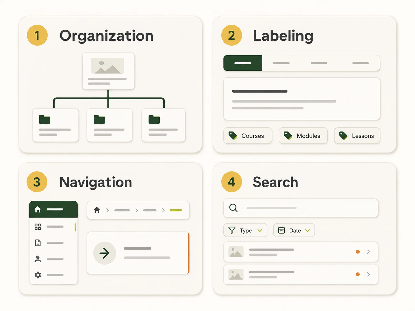
How you group content. Three classic schemes show up across most products:
Structure type matters too. Hierarchical trees fit most websites. Sequential structures fit checkouts and onboarding. Matrix structures fit content libraries where users want to slice by multiple attributes. Database or faceted structures fit large catalogs.
The words users see. Labels include menu items, page titles, headings, link text, form fields, and microcopy. Good labels match the user’s mental model, stay consistent across the product, and avoid internal jargon.
A common mistake: labeling navigation by department. “Marketing,” “Operations,” “Finance” tells users about your org chart, not about what they can do. Task-based labels (“Get a quote,” “Track an order,” “Manage billing”) put the user first.
How users move through the structure. Three layers show up in most products:
NN/G’s intranet study across 77 organizations found an average of 7.6 top-level categories with a median of 7. That benchmark is not a rule. It is a signal that breadth has limits before scanning gets hard.
A search box, filters, facets, autocomplete, and the results page itself. On a catalog or large content site, search carries as much weight as the main nav. Treat it like a product, not a checkbox. A dead-end search result is a tax on every visitor who clicks it.

Dan Brown laid out these principles in 2010 to give teams a shared vocabulary for IA decisions. Each one is a quick lens.
Print these and tape them next to your monitor. They will catch more design issues than any heuristic checklist.
This is the working process. Each step has an input, an output, and a validation method.
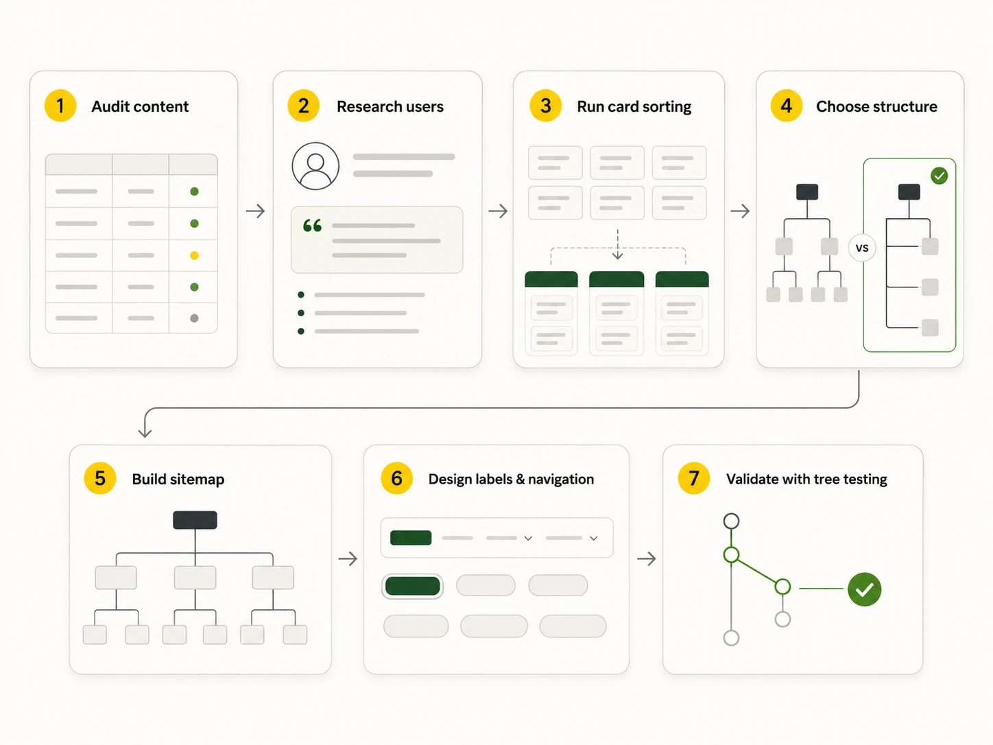
List every page, screen, or piece of content the product currently has or plans to have. Capture title, URL or screen path, content type, owner, last update, and traffic if available.
Output: a content inventory spreadsheet.
Cut what is duplicate, outdated, or unused. Mark what is missing. This audit usually reveals more than the rest of the process combined. If you are redesigning, you cannot skip it.
You cannot organize content for users you do not understand. Run user interviews, review analytics for the paths people actually take, and synthesize findings into personas with primary tasks and jobs-to-be-done. The goal is to learn the vocabulary users bring to your product, not to invent vocabulary you wish they used.
If you serve multiple audiences, build separate task lists for each. SaaS dashboards for admins and end-users almost always need different IAs even when they share the same backend.
Card sorting reveals how users naturally group content. NN/G’s IA research stack puts card sorting at the core of any IA project.
Three formats to know:
Tools like Lyssna, Optimal Workshop, and Maze let you run unmoderated studies with 20-30 participants and produce dendrograms that show which items group together statistically.
Pick the structure that matches user tasks and content volume. Match it back to the schemes in the four-systems section.
Most products land on hierarchical with faceted layers inside specific sections.
Translate the structure into a sitemap. NN/G is clear that a sitemap is a visual artifact, not the IA itself. The sitemap communicates the architecture to stakeholders. The architecture is the underlying logic.
Define your taxonomy at the same time. That means a controlled vocabulary for tags, categories, and metadata. Consistent metadata is what makes “related content” and search actually work later.
Output: a sitemap diagram (FigJam, Miro, Lucid chart, OmniGraffle, or Axure RP work well) plus a taxonomy spreadsheet.
Now translate the structure into the surface. Write labels that match user vocabulary, build global, local, and contextual navigation patterns, and decide on supporting components like breadcrumbs, mega menus, faceted filters, and search.
Two practical rules:
Card sorting shapes the architecture. Tree testing and first-click testing prove it works.
Aim for success rates above 70 percent on core tasks before launch. Anything lower means the structure or labels need another pass.
Three quick walk-throughs from products you probably know.
E-commerce (Amazon-style). Hierarchical top-level categories (Electronics, Books, Home) layered with faceted filters (price, brand, rating, shipping). Multiple classification: users can browse departments or search by exact product name. Strong exemplars: each category preview shows top items so labels are not the only clue.
SaaS dashboard (Linear, Notion, Asana). Object-driven IA. Projects, tasks, issues, and pages are objects with their own attributes and behaviors. Navigation is mostly task-based (“Inbox,” “My Issues,” “Projects”) rather than feature-based. Search and command palettes carry as much weight as the sidebar.
Documentation site (Stripe, MDN). Hierarchical with a strong table of contents per page, breadcrumbs for context, and search as a first-class entry point. Disclosure is everywhere: short summaries lead, full detail sits one click deeper.
Each one applies the four systems differently. None of them invented a new framework.
These four terms get used as synonyms. They are not.
A solid IA is the foundation. Good navigation exposes it. A clean sitemap communicates it. UX wraps all of that into an experience users do not have to think about.
Five patterns show up over and over.
Catch these in the audit step and you will save weeks of post-launch rework.
A short, working stack:
Pick one in each row. Switching tools is cheap. Switching structure after launch is not.
Most in-house teams can run a card sort and draw a sitemap. The cases where outside help pays back:
Musemind handles IA work as part of UI/UX design, SaaS design, and MVP development engagements. The same team that maps your structure also designs the wireframes, builds the system, and validates it with users. That continuity is the point.
Information architecture in UX is the practice of structuring, organizing, and labeling content inside a digital product so users can find information and complete tasks. It covers four systems: organization, labeling, navigation, and search.
The four components, defined by Louis Rosenfeld and Peter Morville, are organization systems, labeling systems, navigation systems, and search systems. Organization handles how content is grouped. Labeling handles what things are called. Navigation handles how users move between content. Search handles direct retrieval.
Objects, choices, disclosure, exemplars, front doors, multiple classification, focused navigation, and growth. Brown published these in 2010 to give designers a working framework for IA decisions.
Information architecture is the underlying structure and logic of the content. Navigation is the UI surface that exposes that structure. NN/G makes this distinction explicit: IA lives in diagrams and spreadsheets, navigation lives on the screen.
A sitemap is a visual representation of the IA, usually a hierarchy of pages or screens. The IA is the underlying conceptual organization. A sitemap is one deliverable that comes out of IA work, not the work itself.
Card sorting is a research method where users group content items into categories that make sense to them. Open card sorts let users name their own groups. Closed card sorts ask users to sort into categories you provide. Hybrid combines both.
Tree testing is a method where users try to find specific items inside a text-only version of your IA, with no visual design or navigation styling. It isolates whether the structure itself works. Use it after card sorting and before high-fidelity design.
There is no single rule. NN/G’s intranet study across 77 organizations found an average of 7.6 top-level categories with a median of 7. Treat that as a signal, not a target. The right number is whatever fits your users’ tasks and content scope.
For a focused product or marketing site, plan on two to four weeks for audit, research, card sorting, and a first sitemap. Enterprise products and large e-commerce catalogs often take eight to twelve weeks because the content inventory and taxonomy work scales with the catalog.
Review the IA every six to twelve months, and any time you add a major content category, launch a new audience, or see search and navigation analytics start to degrade. An IA is not a one-time deliverable. It is a living system.


An Experience Design Agency focusing on building functional, simple, human-centered digital products for future.