Research shows that 94% of users say a website's design is the most important factor in their first impression. Also, studies reveal that conversion rates can increase by up to 200% with a well-designed interface. That's why an outstanding UI can drive tremendous business results.
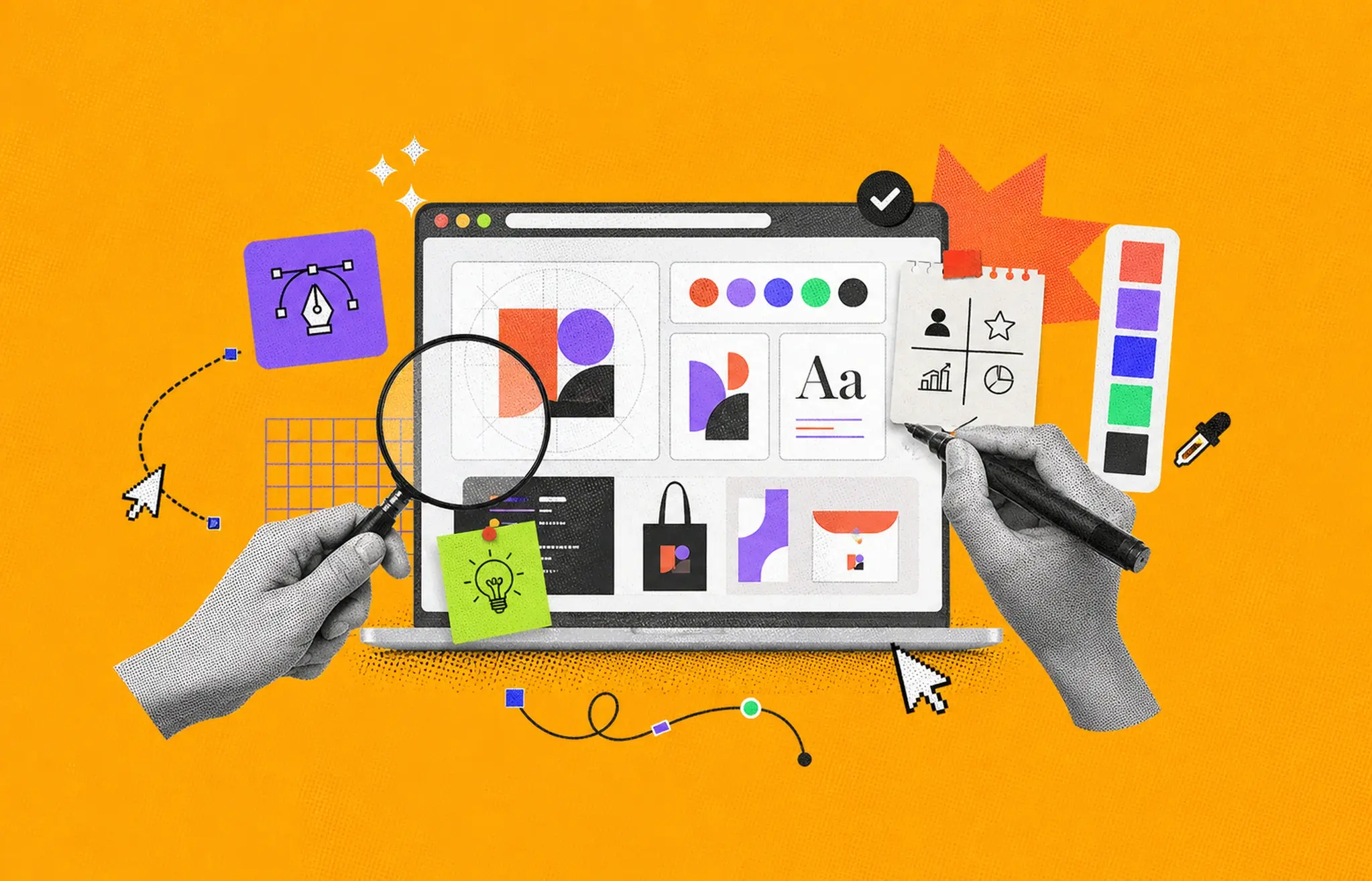
But what is UI design? Well, the user interface (UI) design creates visually appealing and user-friendly interfaces for digital products like websites or apps. It mainly focuses on layout, colors, typography, and interactive elements.
As we move into 2026, the need for clean, modern, and user-friendly design continues to grow. So, let's investigate UI design, its process, best practices, and many other steps you can follow to create interfaces that impress and perform.
UI, or User Interface, refers to the visual design of a digital product. It includes elements like buttons, text, links, and forms that users interact with. UI design focuses on creating and improving these elements to make them clear and easy to use. When it's a website or a mobile app, a well-designed UI confirms users can navigate and complete tasks without confusion.

UI design means creating the look and feel of digital products like apps and websites. It focuses on how users see and interact with buttons, menus, and screens. A good UI design makes everything simple, straightforward, and easy to use. Designers choose colors, fonts, and layouts to improve the experience.
Their goal is to guide users smoothly so they can complete tasks without confusion. A clean and user-friendly design saves time and reduces frustration. UI design helps people enjoy using digital products and makes the interaction smooth and enjoyable.

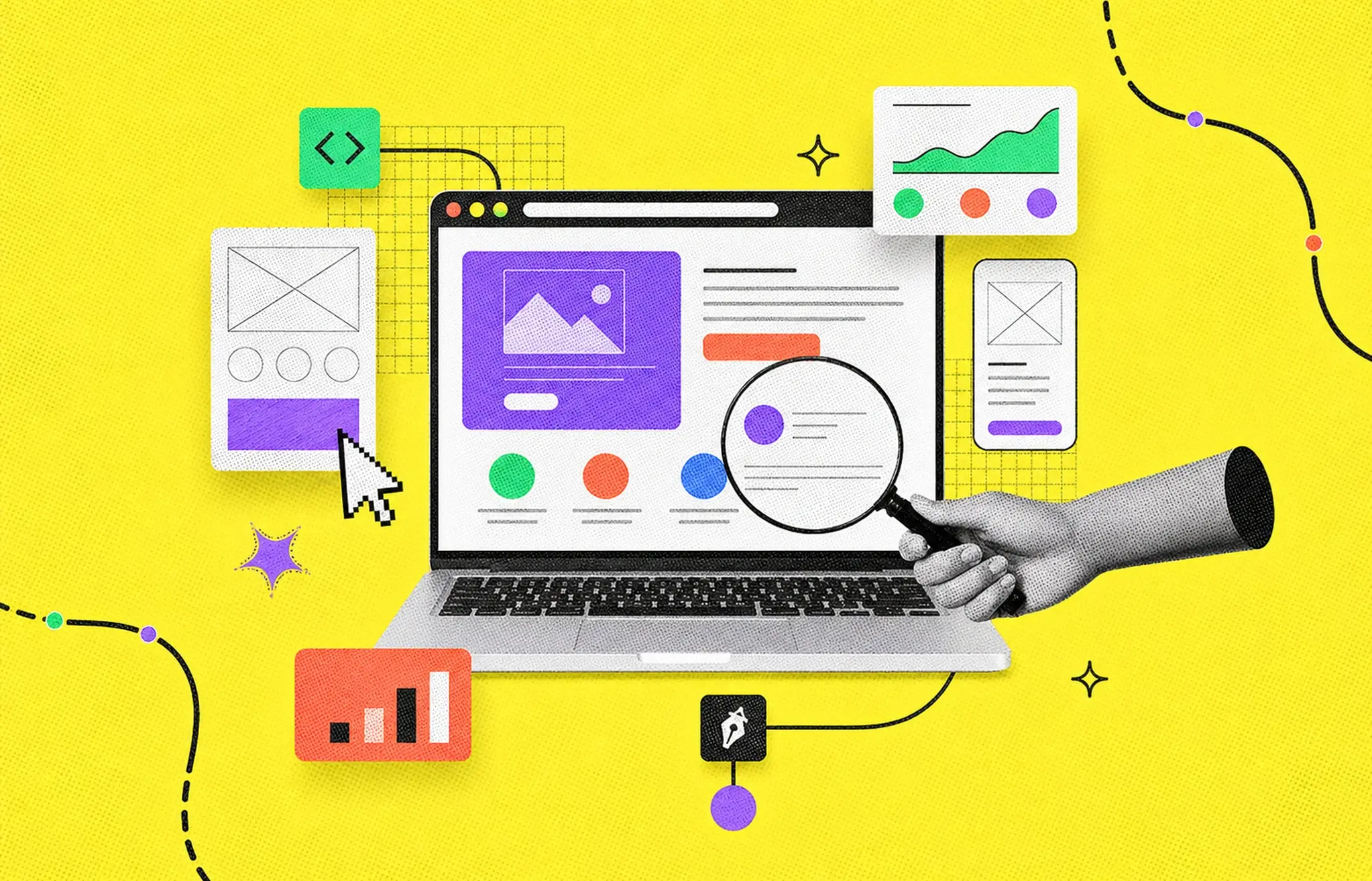
UI/UX visual design shapes how people interact with digital products. It involves creating clear layouts, choosing colors, and selecting readable fonts. Designers start by planning how a user will move through each screen. They consider where to place buttons, text fields, and other elements that help users complete tasks.
The user interface often includes four main parts. First are navigational elements, like slide bars, search bars, and back arrows. They guide users from one section to another. Next are input controls, such as text fields, checkboxes, and buttons. These let users enter information or confirm choices.
Informational components present data or feedback to users, such as progress bars that show how far they are in a process. Lastly, containers group related content, like accordion menus that reveal or hide details.
A good UI/UX visual design keeps elements simple, consistent, and easy to find. Designers reduce clutter and avoid confusing layouts. They pick colors that match the product's purpose. They also use clear labels and icons and maintain uniform spacing to aid concentration. Through meticulous preparation, UI/UX graphic design clarifies actions and locations, and facilitates seamless user engagement.
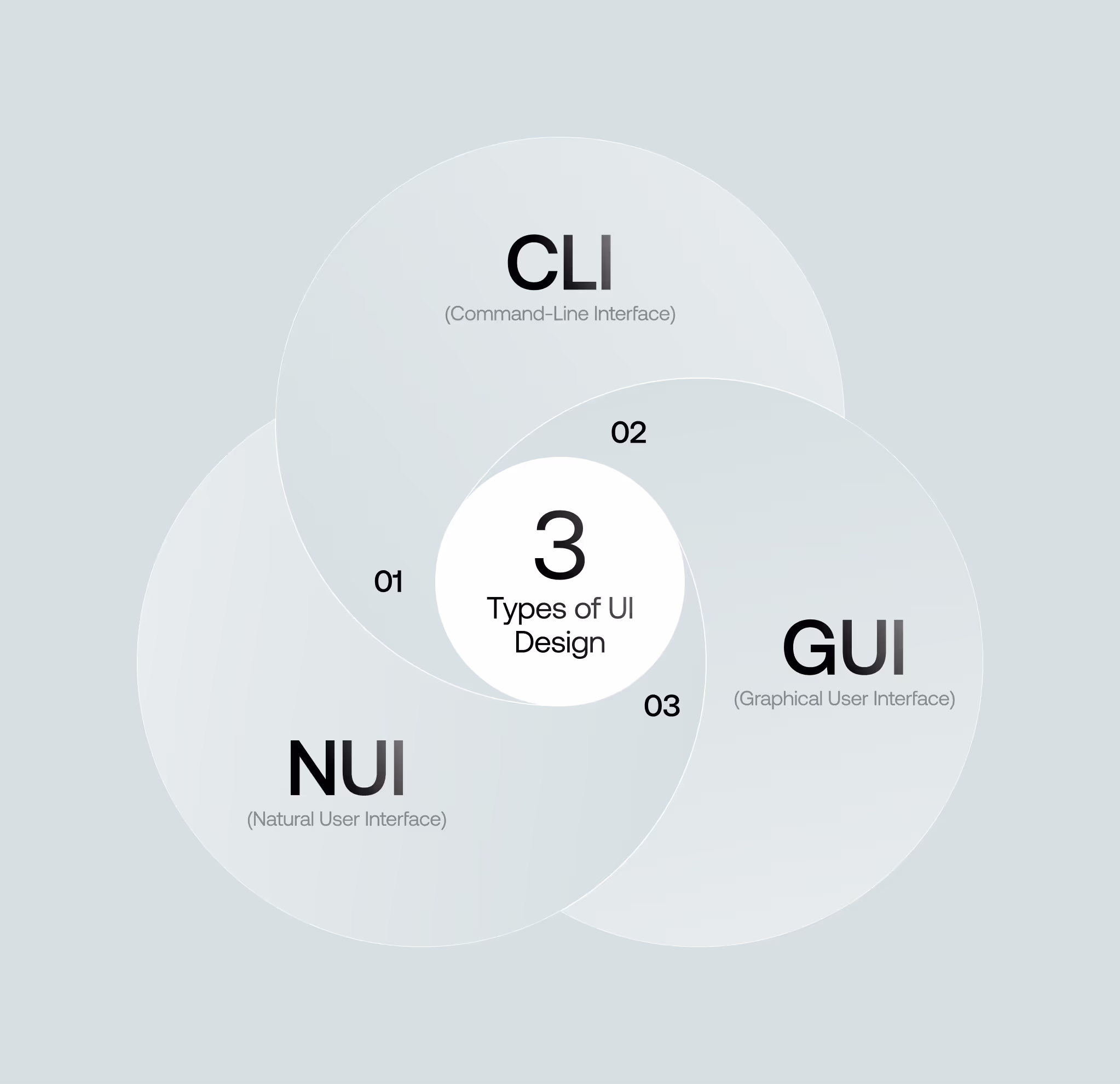
UI design focuses on creating interfaces that allow users to interact with digital systems effectively. There are three key types of UI design, each serving different user needs and contexts:
CLI relies on text-based commands for interaction. Users type specific commands to perform tasks. It's a highly efficient method for advanced users familiar with the required syntax. However, its steep learning curve makes it less ideal for beginners. Developers and IT professionals often use CLI for tasks requiring precision and speed.
To facilitate easy and intuitive interaction, GUIs use visual components such as buttons, menus, and icons. They're the most common type of interface found in applications, websites, and operating systems like Windows and macOS. GUIs reduce the need for memorizing commands, making them accessible to a broader audience. The combination of visuals and interaction assures ease of use for most users.
NUI enables interaction through natural behaviors such as touch, gestures, or voice. Examples include touchscreens on smartphones, voice commands for virtual assistants and gesture-based gaming systems. NUI focuses on seamless and intuitive user experiences, removing the need for complex inputs or devices.
UI (User Interface) and UX (User Experience) are related but serve different purposes in design. UI focuses on the look and feel of a product, where UX focuses on how it works and how users feel when interacting with it.
UI deals with a product's visual elements, including colors, buttons, typography, icons, and layout. A UI designer makes the interface attractive and consistent so users can interact with the product visually without confusion.
UX, on the other hand, is about the overall experience. It involves understanding user needs and designing the product to be intuitive and enjoyable. UX designers focus on user research, wireframes, and testing to create smooth navigation and functionality.
The main difference of UI vs UX design lies in their roles. UI shapes what users see, while UX shapes how users feel. Both work together to create products that are visually appealing and easy to use. Without UI, the product may lack appeal, and without UX, it may be difficult to use. Combining both finalizes a product that looks good and performs well.
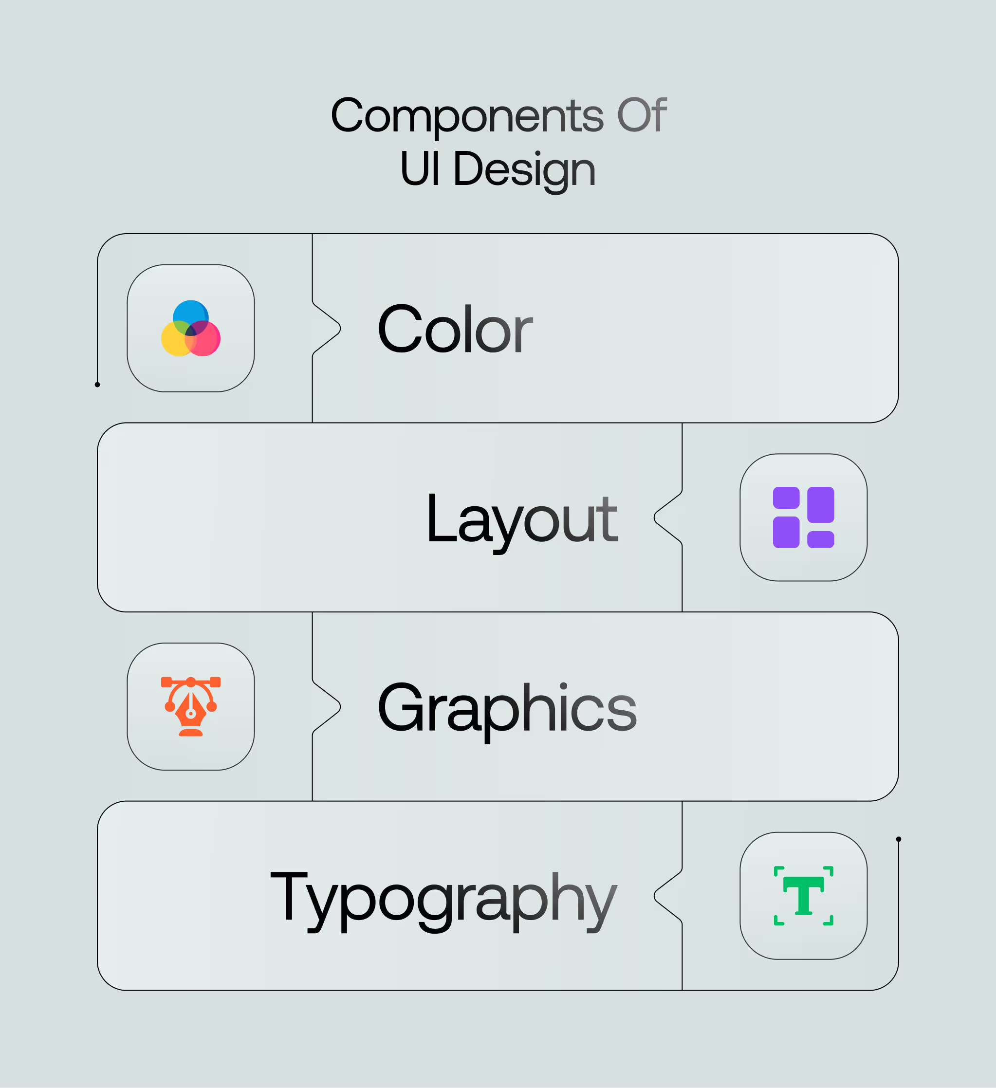
A user interface (UI) design includes several key components that work together to create a positive user experience. When you understand each element, you can build an interface that feels simple, looks appealing, and helps users achieve their goals.
One of the most noticeable elements in UI design is color. Choose colors that match your brand identity and attract your target users. For example, a fitness website should use bright, energetic colors rather than dull shades of gray. The right color choices can inspire users and help guide their actions.
The layout also plays a crucial role. You should arrange items in a way that makes sense and feels easy to follow. Place navigation elements where users expect to find them and organize the overall design. A clean layout encourages users to explore and click on calls to action.
Graphics add life and personality to your UI. You can create custom images, icons, and illustrations that support your message. Use graphics carefully, so they serve a purpose rather than distract. The right visuals help users understand your content without extra words and keep them engaged.
Users' opinions of your interface are influenced by typography in design. Choose fonts that are clear, readable, and appropriate for your brand. Avoid silly fonts in severe settings. Clean and consistent typography helps users scan information and makes your website or app look professional.
User Interface (UI) design ensures people can interact quickly and efficiently with digital products. Following the correct principles makes interfaces visually appealing, functional, and intuitive. Here are some key principles of UI design explained in detail:
Good UI design always prioritizes the user. Before creating the interface, designers should study user needs, behaviors, and preferences. This helps design a product that meets the user's expectations. Start by identifying your users and what problems they need to solve. Test designs early and often to confirm they fit user goals. Users who feel comfortable and understood are more likely to enjoy and continue using the product.
Consistency makes navigating an interface easier. The design uses the same fonts, colors, button styles, and layouts. Users should feel confident that actions and icons behave the same across different screens. Consistency also applies to the language you use. If "Submit" is used in one form, avoid switching to "Send" elsewhere. Keeping everything uniform reduces confusion and speeds up learning.
A simple design reduces clutter and enhances usability. Focus on what's essential. Avoid adding unnecessary features, text, or graphics. Minimalism helps users complete tasks quickly without distractions. Use whitespace effectively to create a clean and organized look. Simple designs are intuitive, easier to navigate, and more enjoyable.
Important options and functions should be easy to find. Make sure key features are displayed and accessible without requiring extra clicks. Use recognizable icons and labels to guide users. Good visibility ensures that users can interact with the interface efficiently. For example, a search bar should always be visible in an e-commerce app. Don't hide crucial elements behind menus unless necessary.
Feedback confirms user actions and helps them understand what is happening. For example, a button should visually change when clicked, showing that the action is processed. Clear and immediate responses improve trust in the system. Progress bars, error messages, and success notifications also provide feedback. With proper feedback, users may feel safe and confident if their actions are successful.
UI designs should be usable for everyone, including people with disabilities. Accessibility features such as keyboard navigation, screen reader support, and high-contrast modes are essential. These features shows that people with visual, auditory, or motor impairments can interact with the interface effectively. Testing designs for accessibility improves inclusivity and expands the product's reach.
Preventing errors is better than fixing them later. Design interfaces that guide users to take the proper steps. For example, turn off a "Submit" button until all required fields are filled. Use clear error messages when mistakes happen. Provide options like "Undo" to make recovering from errors easy. In this way, you can minimize user frustration and encourage continued use.
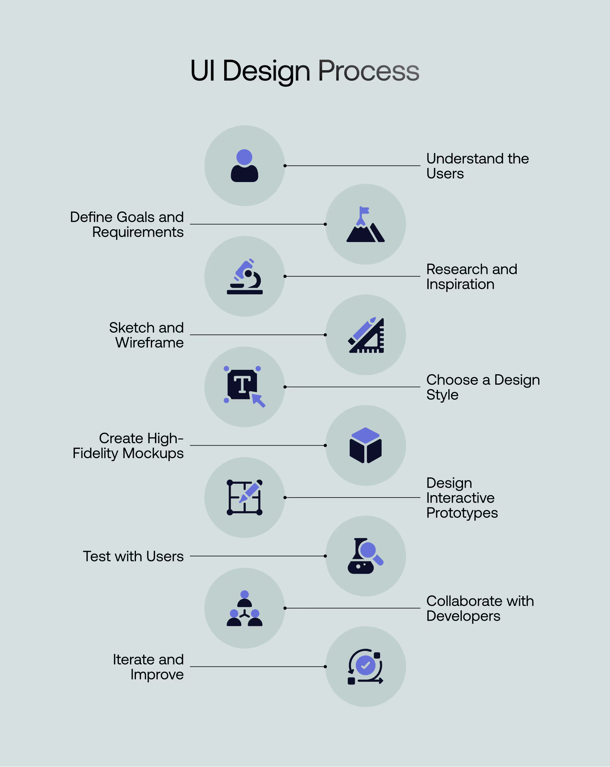
The User Interface (UI) design process transforms ideas into functional and appealing digital products. A structured process assures that the design meets user needs, looks great, and works effectively. Here's a detailed look at the UI design process:
The first step is understanding who the users are and what they want. Gather data about their goals, preferences, and challenges. Use interviews, surveys, and user testing to collect insights. Focus on their needs to confirm the design solves real problems. This step provides a foundation for creating a user- centered interface.
Set clear goals for the product. Identify what it needs to achieve for both users and the business. For example, a mobile app might aim to simplify booking services or increase sales. Gather functional requirements, such as the features and tasks the interface should support. Clear goals and requirements guide the entire design process.
Study competitors and similar products to understand industry standards. Analyze what works well and identify gaps you can address. Look for inspiration in successful designs. Collect examples of effective layouts, colors, and features to spark ideas.
Begin by sketching ideas on paper or using design tools. Focus on structure and layout without worrying about details. Create wireframes, which are the design’s basic outlines of each screen. Wireframes show where elements like buttons, images, and text will go.
Select the design style based on the product's purpose and audience. Choose a color palette, typography, and iconography that match the brand and user journey. For example, a financial app might use clean, professional designs, while a children's app may use bright colors and playful fonts. Consistency in style strengthens the design's identity.
Turn wireframes into detailed mockups. Add colors, images, and typography to make the design realistic. Mockups provide a preview of how the final product will look and feel. Focus on visual hierarchy to guide users' attention to key elements. Use contrast and spacing to make the design easy to read and navigate.
Create interactive prototypes to show how the interface works. These low fidelity prototyping let users click buttons, navigate screens, and see the flow. This step helps you test the design before starting development. Use tools like Figma or Adobe XD to build the prototypes.
Testing them is important because it helps you find any usability issues early. Prototypes make the design feel real and give everyone a clear idea of how the final product will work. It also gives you a chance to improve the design based on real user feedback.
You need to do usability analyses to learn how your design works in the real world. Watch how users engage with the interface and note any issues you see. Then, put the design, functionality, and vibe to the test and see what they think. Use what they tell you to find and correct any issues. This way, you can be confident that the end result will be exactly what they were hoping for.
Work closely with developers to turn the design into a functional product. Share detailed design specifications, including dimensions, fonts, and colors. Provide assets like icons and images. Maintain clear communication to confirm the design translates accurately during development. Regular collaboration avoids misunderstandings and makes a smooth handoff.
Even after the product is launched, the design process isn't over. Gather feedback from users and monitor performance metrics. Identify areas for improvement and refine the design as needed. Continuous iteration confirms the product stays relevant and user-friendly.
Creating exceptional user interfaces requires a blend of creativity, usability, and attention to detail. Below are some best practices for UI design that go beyond standard recommendations, ensuring your designs stand out.
Users can handle the information simultaneously by designing interfaces with progressive disclosure. This approach involves showing essential information upfront and allowing users to access additional details as needed. It keeps the interface clean while providing depth for those requiring it. For example, on a settings page, display standard options first and group advanced settings under expandable menus. Simplicity is prioritized while varied user demands are accommodated by this strategy, which promotes usability.
Visual hierarchy organizes content so users can quickly identify what is most important. Designers can guide user attention effectively by varying the sizes, colors, and placements of elements. For example, they could use larger and bolder fonts for headlines, contrasting colors for primary buttons, and logical alignment for readability.
This practice improves navigation and ensures users engage with the most critical parts of the interface. A strong visual hierarchy creates a smooth and intuitive user experience.
Microinteractions are small, subtle animations or responses that occur during user actions, like a button changing color when clicked or a typing indicator appearing in a chat. These details provide feedback and make the interface feel alive.
Thoughtfully designed microinteractions enhance the user experience by adding personality and improving usability. They also help communicate system status, such as loading animations or success notifications, which keep users informed.
Cognitive load refers to the mental effort required to use a product. A well-designed UI reduces this by limiting the number of decisions users must make at any given time. Layouts should be simple, avoid overcrowding, and group related items logically.
For example, instead of presenting users with multiple navigation options, categorize them under clear, distinct sections. By simplifying choices, you confirm users can focus on their goals without confusion or frustration.
White space, or negative space, is the empty area between elements on a screen. It is not wasted space but a vital component of good design. Proper white space improves readability, draws attention to essential elements, and creates a sense of elegance. For instance, spacing between text blocks makes content easier to read, while sufficient padding around buttons improves clickability. A balanced layout with adequate white space feels uncluttered and user-friendly.
With mobile devices being the primary way users access digital products, adopting a mobile-first design approach is essential. This means designing for smaller screens first and then scaling up for larger devices. The mobile-first design ensures that the core functionalities work seamlessly on the most restrictive screen size. Key considerations include optimizing touch targets for ease of use, avoiding horizontal scrolling, and designing lightweight interfaces that load quickly. A mobile-first mindset helps create interfaces that are functional and accessible across all devices.
Dark mode has become popular across applications, offering users an alternative to traditional light-themed interfaces. Consider contrast, color choices, and legibility when implementing dark mode to assure the interface remains functional and visually appealing. Avoid pure black backgrounds; use dark grays to reduce eye strain. Similarly, ensure text and buttons maintain enough contrast to stay readable. Offering users the ability to toggle between light and dark modes enhances personalization and usability.
Using familiar metaphors and analogies helps users understand digital interfaces quickly. For example, a trash bin icon for deleting items or a shopping cart for e-commerce sites are real-world references that feel intuitive. These metaphors bridge the gap between the physical and digital worlds, making the interface more approachable. However, avoid overloading the design with outdated or unnecessary metaphors. Modern users value simplicity, so they only use analogies when they genuinely enhance understanding.
A slow interface frustrates users and can lead to drop-offs. Optimize design elements for faster load times, especially for web and mobile applications. Compress images, use optimized fonts, and minimize heavy scripts to make a smooth user experience. Incorporating loading animations or progress bars helps manage user expectations during unavoidable delays. A performance-optimized design keeps users engaged and improves overall satisfaction.
UI design tools are vital for creating modern, user-friendly digital experiences. Designers use these tools to sketch ideas, create high fidelity prototypes, and collaborate effectively with teams. Here are eight widely used UI design tools, explained in detail:
Figma is a cloud-based design tool that supports collaboration in real-time. It's perfect for remote teams because everyone can contribute to the same design. Its features include vector editing, prototyping, and design systems management. Designers can easily create reusable components to maintain consistency across projects. Figma's browser-based nature eliminates the need for installations, and its version history gurrants that changes are tracked smoothly.
Figma also integrates with tools like Slack, Trello, and Zeplin, simplifying workflow management. Its user-friendly interface makes it accessible for both beginners and professionals. The tool's ability to function on any operating system, including Windows, macOS, and Linux, has made it a favorite for teams of all sizes.
Among the most widely used vector-based UI design tools is Sketch. Known for its clean and simple interface, it focuses on UI and UX design tasks. Sketch is widely used for wireframing, prototyping, and creating high-fidelity mockups. It supports plugins and integrations that extend its capabilities, such as exporting designs to HTML or collaborating with developers.
Sketch's "Symbols" feature allows designers to reuse elements across multiple pages, ensuring consistency. However, it is available only for macOS, which can be a limitation for cross-platform teams. Despite this, Sketch remains a strong contender due to its extensive library of resources and templates.
Adobe XD is part of Adobe's Creative Cloud suite and focuses on UI and UX design. It is designed to create interactive prototypes and wireframes. Photoshop and Illustrator users may easily use Adobe XD since it connects with them. Adobe XD's responsive resize feature automatically adjusts components when resizing artboards, saving time during design iterations.
The repeat grid feature allows designers to replicate elements such as lists or galleries efficiently. Adobe XD also supports voice prototyping. It also enables designers to add voice interactions to their prototypes. This tool's compatibility with both macOS and Windows platforms increases its reach. Its frequent updates confirms designers have access to the latest features and improvements.
The flexible design tool InVision Studio enables vector-based editing, rapid prototyping, and animation. UI designers will find it very useful for designing complex animations and transitions. InVision Studio supports collaborative workflows, allowing teams to quickly gather feedback and make revisions.
The platform offers tools for managing design systems to make uniformity across projects. It allows designers to import files effortlessly with its integration with Sketch, Figma, and Photoshop. The ability to share prototypes and gather real-time feedback makes it a preferred choice for teams working on complex projects.
Axure RP is another powerful tool for creating wireframes, flowcharts, and interactive prototypes. It is often used in projects that require detailed documentation and advanced functionality, such as enterprise software or complex web applications. Axure allows designers to create realistic user experience simulations with features like conditional logic, multi-step interactions, and dynamic content.
Axure has a steeper learning curve compared to some other tools. However, its advanced features make it invaluable for teams needing high-fidelity prototypes with detailed functionality. It also supports team collaboration that allows multiple designers to work on a project simultaneously.
You may use Marvel, a web-based design tool, to make wireframes and mockups, and prototypes easier. Its intuitive drag-and-drop interface makes it accessible for beginners and experienced designers alike. Marvel's integrated user testing features enable teams to collect feedback directly from users, streamlining the design iteration process.
Teams can collaborate more effectively because of the platform's real-time collaboration capability. In addition to being compatible with Jira and Slack, Marvel is also simple to integrate into current processes. It is an excellent option for organizations that value usability because of its straightforwardness and emphasis on user testing.
Proto.io focuses on creating fully interactive prototypes that mimic the final product's functionality. Designers might include transitions, motions, and animations in their prototypes to make testing more realistic. Its drag-and-drop interface simplifies prototyping, even for those without technical expertise.
Proto.io includes a library of pre-built UI components, speeding up the design process. It supports integration with usability testing platforms, making gathering feedback from real users easy. Proto.io's ability to simulate native app functionality makes it an excellent choice for mobile app design.
For quick prototypes, try using Balsamiq, a wireframing tool. Ideal for initial ideation and validation, its low-fidelity wireframes let designers concentrate on utility and structure rather than aesthetic elements.
The tool's simple interface allows designers to sketch ideas quickly. Its drag-and-drop library includes UI elements like buttons, menus, and text fields. Balsamiq benefits teams that must iterate rapidly and gather feedback before moving on to detailed designs.
UI design is a growing field with many job opportunities worldwide. The global UI design market was valued at approximately USD 1.87 billion in 2023 and is expected to reach USD 4.52 billion by 2030, growing at a compound annual growth rate (CAGR) of 15.2% during the forecast period.
Job vacancies for UI designers are plentiful. For instance, a recent search on Indeed.com listed over 2,400 UI designer positions available in various locations worldwide.
The demand for UI designers increases as businesses recognize the importance of user-friendly interfaces in digital products. This trend will continue, offering promising career prospects for aspiring UI designers globally. Pursuing a career in UI design can be both fulfilling and financially rewarding, especially for those dedicated to honing their skills and staying updated with industry trends.
UI designers are integral in crafting user-friendly digital experiences, but their work is deeply collaborative. Here are the key collaborators a UI designer works with:
UI designers collaborate closely with UX designers to create cohesive user experiences. UX designers focus on the product design’s overall functionality, user flows, and structure, while UI designers handle the visual aspects like layout, typography, and color schemes. This partnership assures that the product is both functional and visually appealing. UX designers often provide foundational work, such as wireframes and user research, which UI designers use to develop polished interfaces.
Product managers guide the direction of the product by defining goals, requirements, and timelines. They act as a bridge between design, development, and business teams. UI designers work with product managers to confirm their designs align with the product's purpose and deliver value to the target audience. Product managers provide UI designers with information on customer wants, market requirements, and company objectives as they work on the user interface.
Developers, particularly front-end developers, are essential collaborators for UI designers. Developers turn static designs into fully functional interfaces. UI designers work closely with them to make certain the designs are implemented accurately and maintain their intended appearance and functionality. Sharing design assets, specs, and comments throughout development is a common part of this cooperation. It helps address technological restrictions and maintains design integrity.
Graphic and UI designers collaborate to maintain a cohesive visual identity throughout the product. Graphic designers focus on creating branding elements like logos, icons, and other visual assets, which are then integrated into the user interface. Cooperation like this boosts the product's aesthetic value and keeps the user interface consistent with the brand.
Marketing and content teams shape the messaging and visuals within the interface. UI designers work with content writers to create text for buttons, labels, and other elements. Marketing teams provide insights into how the interface can support campaigns or highlight key features.
While not directly involved in the design phase, quality assurance (QA) teams confirm the design is implemented as intended. UI designers often collaborate with QA teams to address issues related to alignment, responsiveness, or inconsistencies in the interface. Working together guarantees that the result is true to the initial concept.
UI designers often interact with stakeholders or clients to present their designs and gather feedback. These individuals provide input on how well the designs align with the project's overall goals. Through this partnership, the design is guaranteed to meet both user requirements and corporate goals.
UI design is essential for creating user-friendly and visually appealing digital products. Understanding the UI design process and following best practices will help businesses stay competitive as technology evolves. A well-designed interface enhances user experience and boosts engagement and conversions.
Focusing on clear layouts, thoughtful colors, readable typography, and interactive elements can help designers meet user expectations and deliver outstanding results. Staying updated with trends and tools will be key to success in 2026. If you're a designer or a business owner, investing in strong UI design ensures happier users and better business growth.
Good UI design makes navigation simple and intuitive. When users can easily find what they need and interact without confusion, their experience improves, leading to satisfaction and loyalty.
A high-fidelity prototype is a detailed, interactive version of the design. It lets users click, navigate, and experience the interface like a real product. Tools like Figma and Adobe XD help create these prototypes.
Common mistakes include cluttered layouts, poor color choices, unreadable fonts, inconsistent design elements, and confusing navigation. These issues can frustrate users and harm the overall experience.
Responsive design is an essential part of modern UI design. It ensures the UI looks good and works well on all screen sizes, including desktops, tablets, and smartphones.
UI designers are in demand across tech, e-commerce, healthcare, finance, education, gaming, and media. Any industry with digital products or services needs effective user interfaces.


An Experience Design Agency focusing on building functional, simple, human-centered digital products for future.
