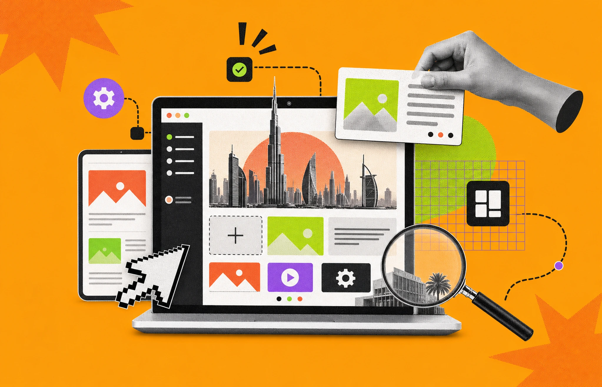
Wireframe vs mockup is one of the most common points of confusion in product design. Use the wrong one at the wrong stage and you waste hours on polish nobody asked for, or ship a layout nobody tested. This guide breaks down the difference clearly, explains where prototypes fit in, and gives you a practical decision framework so you know exactly what to produce at each phase of a project.
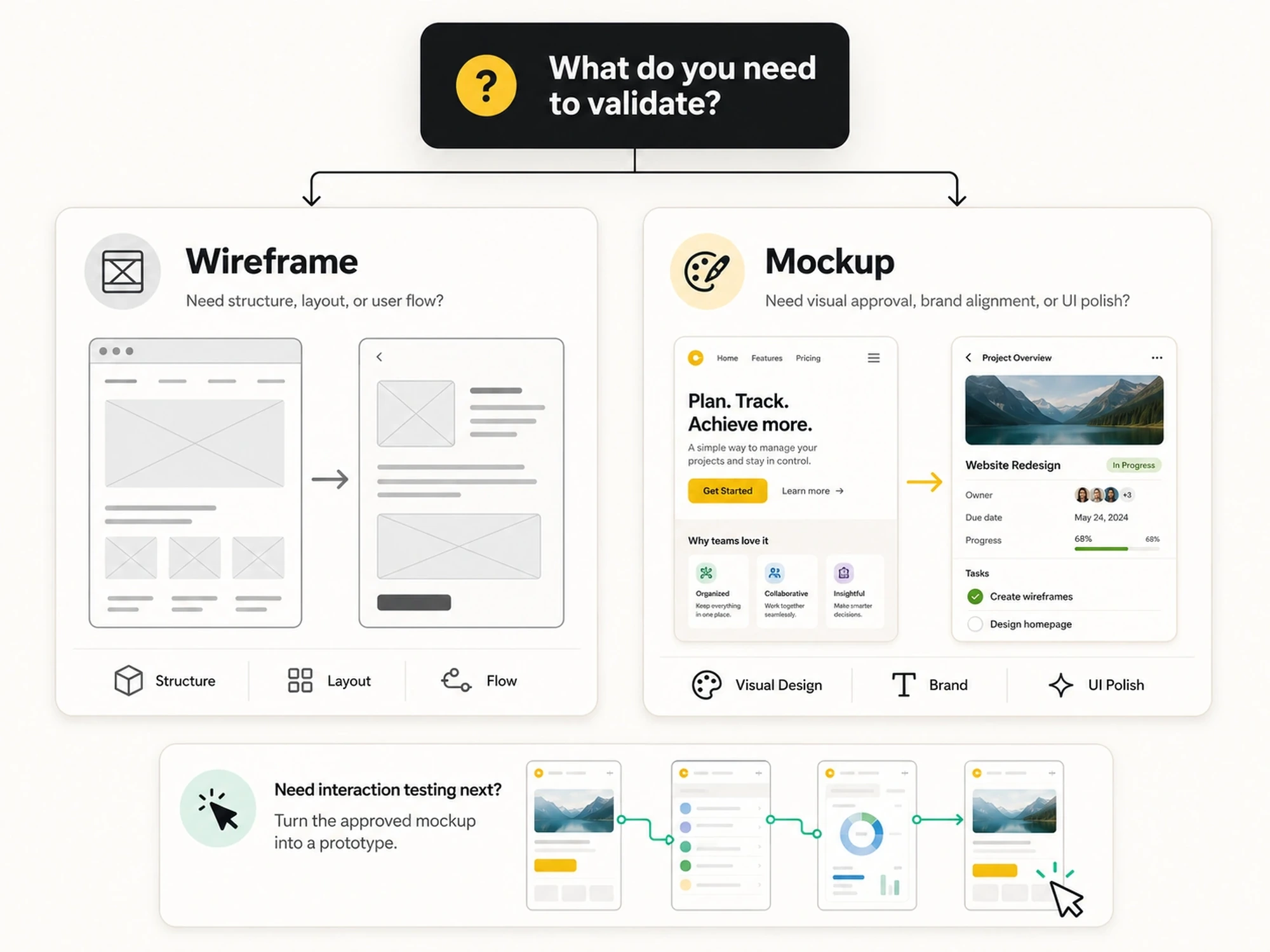
A wireframe is a low-fidelity structural layout of a digital product. It maps out the placement of elements, the navigation flow, and the content hierarchy without adding any visual design. No colors. No typography choices. No branding. Just structure.
Think of it the way an architect thinks about a floor plan. The floor plan doesn’t tell you what color the walls are. It tells you where the walls go, how rooms connect, and how people move through the space. A wireframe does the same thing for a screen.
Wireframes come in two main forms:
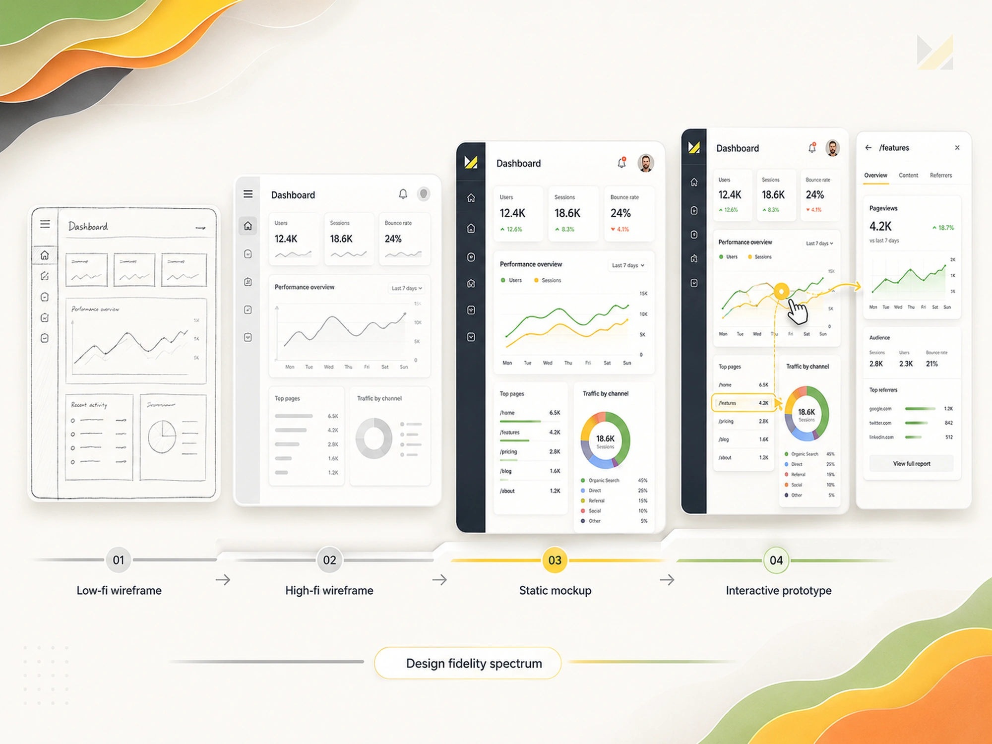
Low-fidelity wireframes are rough sketches, either on paper or in a tool like Balsamiq. They’re fast to produce and easy to revise. Teams use them in early discovery sessions to explore layout ideas and get fast feedback before committing to any direction.
High-fidelity wireframes are more refined. They’re built in tools like Figma or Sketch and include accurate spacing, real component sizing, and sometimes placeholder text. They’re still grayscale but closer to the actual design structure. At Musemind, high-fidelity wireframes often serve as the handoff point between UX and visual design.
Wireframes are produced by UX designers or product managers. They don’t require visual design skills. What they require is a solid understanding of user behavior, information architecture, and product goals.
Use a wireframe when you need to:
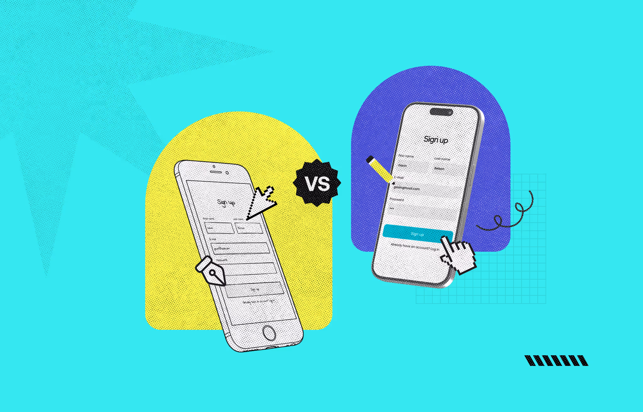
A mockup is a high-fidelity, static visual representation of a finished design. It looks like the real product. It includes real colors, typography, iconography, imagery, and brand elements. What it doesn’t include is interaction. You can’t click through a mockup. It doesn’t simulate a user journey.
A mockup takes the approved wireframe structure and applies the visual layer on top. At this stage, decisions about color palettes, font pairings, spacing systems, and UI component styles get finalized. The goal is to show stakeholders and clients exactly what the product will look like before a single line of code is written.
Most projects produce more than one mockup option. Presenting two or three visual directions gives stakeholders a meaningful choice and generates better feedback than asking them to react to one predetermined version.
Use a mockup when you need to:
Mockups are the responsibility of visual or UI designers. Tools like Figma, Adobe XD, and Sketch all support high-fidelity mockup creation. At Musemind, Figma is the standard because it keeps clients connected to live updates throughout the process.
Wireframe vs mockup is the right comparison for the structural vs visual design question. But prototypes answer a separate question: does this design actually work for real users?
A prototype is an interactive, high-fidelity simulation of a product. It connects mockup screens into clickable flows. Users can navigate, tap buttons, scroll through content, and experience the product without any development happening. The design looks and behaves like the real thing. It just isn’t built yet.
Prototypes are used for usability testing before development begins. They catch interaction problems, confusing navigation, and UX dead-ends early, when fixing them is cheap. Every issue found in a prototype test is an issue that won’t require a development sprint to resolve later.
The sequence is intentional. Wireframe first, mockup second, prototype third. Skipping a step usually means finding problems later at higher cost.
Fidelity describes how closely a design artifact resembles the final product. It’s the lens that makes wireframe, mockup, and prototype differences easier to understand at a glance.
The progression from low to high fidelity mirrors the progression from uncertainty to commitment. Early stages stay low-fi intentionally. It keeps the conversation focused on structure and logic rather than aesthetics. Once structure is approved, fidelity increases.
One mistake teams make is jumping to high fidelity too early. Building a polished mockup before wireframe approval wastes visual design time if the layout changes. Worse, it anchors stakeholders to visual choices before structural problems are resolved.
The right artifact depends on two factors: what question you’re trying to answer and who you’re trying to answer it with.
Produce a wireframe when:
Produce a mockup when:
Produce a prototype when:
Some teams skip wireframes for simple or time-constrained projects, going straight to high-fidelity mockups. That’s a judgment call based on project scope. But for anything with real UX complexity, wireframes save time overall by catching layout issues before they’re locked into visual designs.
The right tool depends on the artifact and your team’s workflow. These are the most widely used options across each stage.
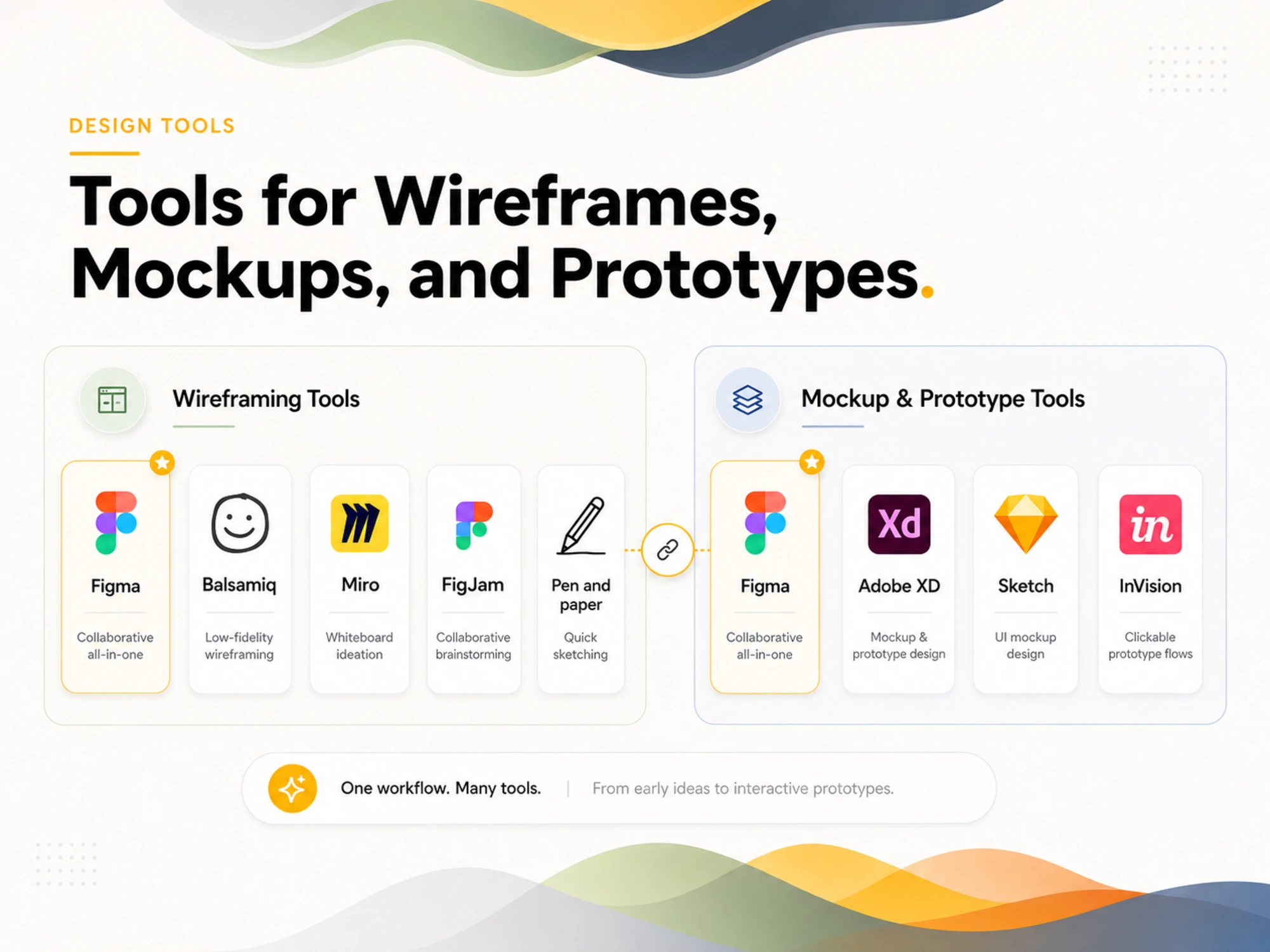
Figma is the most common choice for professional teams. Its collaborative features let multiple designers and stakeholders work in the same file in real time. Musemind’s team uses Figma by default because it keeps clients connected to design progress without requiring file exports.
Balsamiq is purpose-built for low-fidelity wireframes. Its sketch-like interface intentionally keeps designs rough, which helps teams stay focused on structure rather than visual decisions.
Miro and FigJam work well for early whiteboard-style wireframing in distributed teams. They’re better for ideation than for structured wireframe production.
Pen and paper is still a legitimate starting point. Sketching before opening a design tool keeps the focus on thinking, not tool mechanics.
Figma handles mockups and prototypes in the same file. Designers build components, apply styles, and link screens for interactive flows without switching tools. This single-tool workflow reduces handoff friction significantly.
Adobe XD supports mockup and prototype creation in a single file, similar to Figma. It integrates well with other Adobe products, which makes it a good fit for teams already in the Adobe ecosystem.
Sketch is popular for mockup-focused workflows on Mac. It pairs with tools like InVision or Zeplin for prototype linking and developer handoff.
InVision is a prototype-first tool. It allows designers to link static mockups into clickable flows for user testing. It’s less common now as Figma has absorbed most of this workflow.
Wireframes are internal tools. They’re built for teams, not clients. Showing a client a grayscale low-fi wireframe without context almost always creates confusion or unearned criticism. Clients react to visuals. If you need to involve a client in structural decisions, use an annotated high-fi wireframe or a brief walkthrough with narration.
A wireframe with color is no longer a wireframe. It’s an early mockup. Colors shift the conversation from structure to aesthetics immediately. Keep wireframes monochrome until the structural phase is complete.
“We know what we’re building” is the most common justification for skipping wireframes. It’s also the most common precursor to expensive redesigns. The more complex the product, the more a wireframe is worth. Complex navigation, multi-step flows, and content-heavy layouts all benefit from low-cost structural validation before high-cost visual design begins.
A mockup is a decision-making tool. It’s not a contract. Stakeholders who treat approved mockups as locked deliverables create friction when usability testing or development reveals necessary changes. Set the expectation upfront that mockups inform, and prototypes validate.
A mockup is static. A prototype is interactive. Sending a Figma file with linked screens to a developer as “the prototype” when it’s actually a clickable mockup creates scope misalignment. Use consistent terminology inside your team from day one.
At Musemind, every product design engagement follows a phased approach that moves from structure to visual design to interaction, in that order.
Discovery starts with competitive analysis and user research. Once we understand the product goals and user behavior, we build low-fidelity wireframes to align the client on structure, navigation, and user flow. We share these in Figma so clients can see the work live and leave comments directly on the frames.
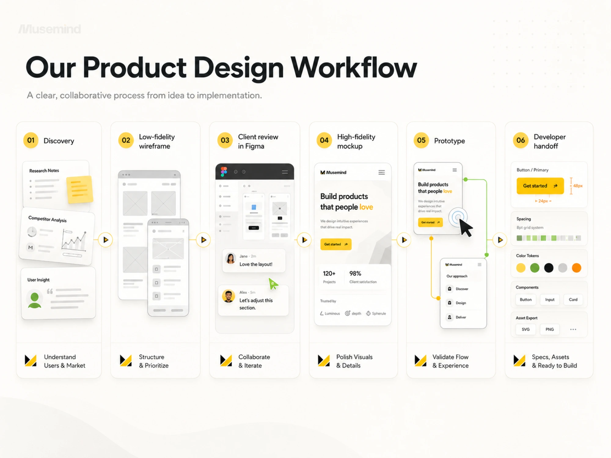
After wireframe approval, the visual design phase begins. We build high-fidelity mockups that bring the client’s brand into the UI. Typography, color, spacing, and component systems all get resolved here. We typically present two to three visual directions and refine the selected direction based on client feedback.
Prototyping follows mockup sign-off. We link screens in Figma to create clickable flows that can be tested with real users or shared with developers as an accurate representation of expected interactions.
This sequence keeps each phase focused, prevents wasted work, and gives clients clear visibility at every stage. It’s the same process whether we’re designing a SaaS dashboard, a Webflow site, or a mobile app.
A wireframe is a low-fidelity structural layout that shows how elements are organized on a screen. A mockup is a high-fidelity, static visual design that shows how the finished product will look, including colors, typography, and brand elements. Wireframes focus on structure. Mockups focus on visual design.
In most cases, yes. Wireframes resolve structural and layout questions before visual design begins. Skipping wireframes and going straight to mockups risks spending significant design time on a visual direction that requires structural changes later. For simple, low-risk pages, experienced designers sometimes skip to direct mockup work. For anything with real UX complexity, wireframes are worth the time.
No. Mockups are static. They show what the design looks like but don’t simulate user interactions. Prototypes are the interactive version of a design. They link mockup screens into clickable flows for user testing and developer reference.
The most common tools are Figma, Balsamiq, Sketch, and Miro. Pen and paper is a legitimate option for early low-fidelity sketching. Figma is the most widely used professional wireframing tool because it supports collaboration, annotation, and smooth progression into high-fidelity mockup design within the same file.
A low-fidelity wireframe is a rough, fast sketch of a layout using basic shapes and placeholder text. It’s typically grayscale and created in minutes. A high-fidelity wireframe is a more precise, digitally structured version that reflects accurate spacing, real component sizing, and sometimes real content. Both are still wireframes; high-fidelity wireframes are a step closer to a mockup without including visual design.
Founders should use wireframes whenever the product has multiple user flows, complex navigation, or features that haven’t been validated with users yet. Wireframes let you test structure and logic quickly before committing a design budget. If the concept is simple and the design scope is narrow, a skilled team may go straight to high-fidelity mockup work.
Wireframes are typically created by UX designers or product managers. They require an understanding of user behavior and information architecture, not visual design skills. Mockups are created by UI or visual designers who specialize in applying color, typography, and brand systems to approved layouts. On smaller teams, the same person often handles both.
Not effectively. Mockups are static, so users can view but not interact with them. User testing on a mockup can generate visual feedback but won’t reveal interaction problems, navigation confusion, or task-completion issues. Prototypes are the appropriate tool for usability testing because they simulate real interactions.
A high-fidelity prototype is an interactive simulation of a finished product. It uses real visual design from approved mockups, connected into clickable screens that simulate how a user would navigate the product. High-fidelity prototypes are used in moderated usability tests and in developer handoffs to show exact interaction expectations before coding begins.
Musemind starts with wireframes after a discovery phase that includes competitive research and user insights. Low-fidelity wireframes go into Figma so clients can review and comment directly on the structure. After wireframe approval, the team builds high-fidelity mockups in Figma, typically presenting two to three visual directions. Mockup sign-off is followed by Figma prototype creation, which serves both usability testing and developer handoff purposes.


An Experience Design Agency focusing on building functional, simple, human-centered digital products for future.